At its core, digital photography works by transforming the visual world into a language of numbers. This conversion process is fundamental to how images are captured, displayed, and manipulated, especially within powerful software like Adobe Photoshop. However, the way these colors are represented and interpreted can be complex, involving different concepts such as color models, color spaces, and color profiles. Understanding these elements is crucial for achieving predictable and accurate color reproduction across various devices and output mediums. While the terms are often used interchangeably, they each represent distinct but interconnected aspects of digital color.
The Foundation: Color Models
Color models provide the fundamental frameworks for describing and creating color. They are essentially different systems for defining how colors are generated and perceived. The choice of color model is often dictated by the intended output or the technology being used.
RGB: The Additive Approach to Light
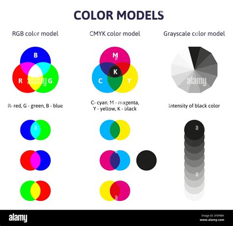
The RGB color model is a cornerstone of digital imaging, particularly for displays. It is an additive color model, meaning it builds colors by adding light. The primary colors in this model are Red, Green, and Blue (RGB). When these three colors of light are mixed together in varying intensities, they can create a vast spectrum of other colors. As illustrated in Figure 1, when all three primary colors are combined at their maximum intensity, they produce white light. Conversely, the absence of all light results in black. This additive nature makes RGB ideal for devices that emit light, such as computer monitors, televisions, and smartphones.
Each pixel on a screen is composed of red, green, and blue light emitters. By controlling the intensity of each of these emitters, a wide range of colors can be displayed. For example, a pixel might have an R value of 246, a G value of 20, and a B value of 50, resulting in a specific shade of reddish-orange. In an 8-bit-per-channel system, each of these values can range from 0 to 255, allowing for over 16.7 million possible colors per pixel (256 x 256 x 256). This depth of color provides a rich and nuanced visual experience on digital displays.
CMYK: The Subtractive Method of Ink
In stark contrast to RGB, the CMYK color model operates on a subtractive principle. This model is primarily used in commercial printing and involves the use of four ink colors: Cyan, Magenta, Yellow, and Key (Black). As depicted in Figure 2, inks work by absorbing certain wavelengths of light and reflecting others. When white light strikes a printed surface, the cyan ink absorbs red light, the magenta ink absorbs green light, and the yellow ink absorbs blue light. The colors we perceive are the result of the light that is not absorbed. Mixing cyan, magenta, and yellow inks theoretically produces black, but in practice, a pure black is often achieved by adding black ink (K) to enhance contrast and depth, especially for text and fine details.

The CMYK model is essential for print production because it directly relates to the behavior of inks on paper. Printers lay down layers of these inks to create the final image. For instance, a particular shade of dark brown might be achieved with 2% cyan, 93% magenta, 90% yellow, and 0% black ink. The percentages represent the amount of each ink applied to the paper. This subtractive process is fundamentally different from the additive nature of RGB, and the translation between these two models is a common task in graphic design and photography.
CIELAB and CIE XYZ: Approximating Human Vision
Beyond RGB and CMYK, there are other color models designed to more closely mimic how humans perceive color. CIELAB and CIE XYZ are two such models. They are particularly important in color management because they encompass a much wider range of colors than either RGB or CMYK, aiming to represent all the colors that a person with normal vision can see.
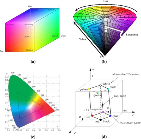
CIELAB, often referred to as L*a*b*, uses three channels to describe color: Lightness (L*), and two color channels representing opposing values: red-green (a*) and yellow-blue (b*). The L* channel ranges from 0 (black) to 100 (white), while the a* and b* channels can range from +127 to -128. This model is unique in that it is both a color model and a device-independent color space. Device-independent means its color values are absolute and not tied to any specific hardware. This independence makes CIELAB an invaluable tool for color translation.
These models, CIELAB and CIE XYZ, are often used as "profile connection spaces" (PCS). When converting colors from one color model or space to another-for example, from an RGB space to a CMYK space-these PCS act as an intermediary. Photoshop, for instance, uses CIELAB as a reference when converting between different RGB profiles and uses CIE XYZ when converting from RGB to CMYK. This ensures a more accurate and consistent translation of color information.
Defining the Spectrum: Color Spaces
While color models provide the theoretical basis for color, color spaces are specific, practical implementations of these models. A color space defines a particular range or "gamut" of colors that can be represented within a given color model. Think of a color model as the alphabet, and a color space as a specific language written with that alphabet, with its own vocabulary and grammar.
The Many Flavors of RGB and CMYK
There are numerous color spaces within both the RGB and CMYK models, each with its own unique gamut-the range of colors it can describe. As illustrated in Figure 4, some color spaces are significantly larger than others. For example, ProPhoto RGB encompasses a much wider spectrum of colors than Adobe RGB (1998), which in turn is broader than sRGB.

When you convert an image from a larger color space to a smaller one, any colors that exist in the original space but not in the destination space are considered "out of gamut." These colors cannot be accurately represented in the new, smaller space. Photoshop provides tools to visualize these out-of-gamut colors, allowing you to see which colors will be clipped or re-mapped during the conversion process.
Key RGB Color Spaces in Photography and Design
Photographers and designers typically work with a few key RGB color spaces, each suited for different purposes:
sRGB: This is the smallest and most common RGB color space. It dates back to the mid-to-late 1990s and was designed for CRT monitors. Due to its widespread support, sRGB is often considered the "lowest common denominator." It is the standard for web content, as most web browsers do not support color management, and it's a safe choice for sending images to consumer-level minilabs. While it may not capture the full range of colors from high-end cameras, its universality ensures that most viewers will see the colors as intended.
Adobe RGB (1998): Developed by Adobe in the late 1990s alongside their color management implementation, Adobe RGB offers a wider gamut than sRGB. It captures more of the colors that digital cameras and scanners can record, making it a popular choice for professional photographers. Many DSLR cameras offer Adobe RGB as a JPEG color space option. It provides a good balance between color reproduction and compatibility, and it is widely supported.
ProPhoto RGB: This is a very large, wide-gamut color space designed for high-bit image editing. It is intended to encompass all the colors that the human eye can perceive. While ProPhoto RGB offers the greatest flexibility for editing, it comes with its own challenges. Because its gamut is so vast, it includes colors that are beyond the display capabilities of most monitors and even beyond human vision. This can lead to unexpected color mapping during editing, and it is not suitable for 8-bit images due to the increased risk of banding. It is generally recommended for 16-bit workflows.
CIELAB: As mentioned earlier, CIELAB is also a color space. It is used internally by Photoshop for color conversions and is device-independent. While not intuitive for most users, some find its separation of luminance from color information useful for specific image manipulation tasks.
The Blueprint: Color Profiles
A color profile is essentially a numerical description of a specific color space. It acts as a translator, providing the operating system and applications with the information needed to correctly interpret and render color values. Without a color profile, color values are just abstract numbers; the profile gives them meaning by defining the precise characteristics of a color space.
How Profiles Define Color Spaces
Color profiles can be implemented in different ways. Matrix-based profiles use mathematical formulas to describe the three-dimensional color space, making them relatively small. Table-based profiles, on the other hand, use a large table of sample points, known as a Look-Up Table (LUT), to define the color space. These LUT-based profiles are more customizable and are particularly useful for describing the color characteristics of specific devices or for translating color information between different spaces.
There are two main categories of color profiles:
- Device-Independent Profiles: These are theoretical profiles that describe a color space without being tied to any particular hardware. They define a standard way to represent color numerically.
- Device-Dependent Profiles: These profiles are created to compensate for the unique color signature of a specific device, such as a monitor, scanner, or printer. They aim to ensure that the colors produced by that device are consistent and accurate.
Working, Device, and Output Spaces
In the context of a photographer's workflow, color spaces can generally be divided into three groups:
- Working Spaces: These are color spaces chosen for image editing. They are typically large RGB spaces that offer a wide gamut, allowing for maximum flexibility during color and tonal adjustments. Adobe RGB (1998) and ProPhoto RGB are common choices for working spaces.
- Device Spaces: These refer to the color spaces that specific devices can reproduce. For example, a monitor has its own device space defined by its capabilities, and a printer has a device space defined by its ink and paper combination. Monitor RGB and Desktop printer profiles fall into this category.
- Output Spaces: These are the color spaces intended for the final output of an image. This could be the sRGB space for web display, Adobe RGB for commercial printing, or a specific CMYK profile for a particular printing press.
Bridging the Gap: Color Management and Conversions
The process of ensuring that colors appear consistently across different devices and media is known as color management. This is where the interplay between color models, color spaces, and color profiles becomes critical.
The Role of Embedded Profiles
When an image file is saved, its associated color profile can be embedded within the file. This embedded profile tells any application opening the image how the colors within that file should be interpreted. If an image lacks an embedded profile (it's "untagged"), the software has to guess which profile to apply, which can lead to significant color shifts. For most untagged RGB images, assigning sRGB is a common starting point, as many consumer cameras capture in sRGB but don't always embed the profile.
Converting Between Color Spaces
There are numerous scenarios where converting a file from one color space to another is necessary. The most common is converting from a working space to an output space, especially when moving from a larger RGB space to a smaller CMYK space for printing.
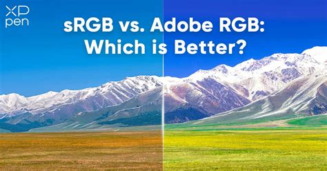
Figure 4 shows a clear example of this. The left image, converted to sRGB, appears reasonably accurate on most displays. The right image, in Adobe RGB, looks darker and more muted to most viewers because their displays and browsers may not be able to render the full Adobe RGB gamut, or they might not be interpreting the embedded profile correctly. This highlights the importance of converting to the appropriate space for the intended output.
Rendering Intents: The Art of Color Translation
When converting colors from one space to another, especially when the destination space has a smaller gamut, a strategy is needed to handle the "out-of-gamut" colors. This strategy is called the rendering intent. The ICC (International Color Consortium) profile specification defines four primary rendering intents:
Perceptual: This intent attempts to preserve the overall visual relationship between colors, even those outside the destination gamut. It "compresses" the entire gamut of the source space to fit within the destination space, which can lead to some changes in the colors that were originally within the gamut. It's good for preserving the general look and feel of an image, especially when there are many out-of-gamut colors.
Saturation: This intent prioritizes preserving color saturation. It's useful when you need to maintain the vibrancy of colors, even if it means slightly altering the hue or lightness. It's often used for graphics and charts where bright, saturated colors are important.
Relative Colorimetric: This intent maps out-of-gamut colors to the nearest reproducible color within the destination gamut, while leaving in-gamut colors unchanged. It also adjusts the white point of the source space to match the white point of the destination space. This intent aims for accurate reproduction of colors that can be reproduced.
Absolute Colorimetric: Similar to Relative Colorimetric, this intent maps out-of-gamut colors to the nearest reproducible color. However, it does not adjust the white point. Its primary use is for proofing, where the goal is to simulate the exact color rendition of a specific output device and paper combination.
The best way to understand the effect of each rendering intent is to use Photoshop's "soft proofing" feature, which allows you to preview the conversion before committing to it.
Practical Application in Photoshop
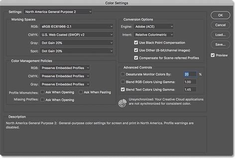
Photoshop offers robust tools for managing color. The "Color Settings" dialog (Edit > Color Settings) is the central hub for configuring your color management workflow. Here, you can define your working spaces, set policies for handling embedded and missing profiles, and choose the engine for color transformations.
Setting Up Your Workflow
For most photographers working primarily in 8-bit images, setting Adobe RGB (1998) as the RGB working space is a safe and effective choice. It provides a good balance of gamut size and compatibility. For those working with 16-bit images and requiring the widest possible color range, ProPhoto RGB is often preferred, though it demands careful management.
When opening an image, Photoshop will check for an embedded profile. If one is found that doesn't match your working space, you'll be prompted to either convert the image to your working space, assign your working space profile, or keep the embedded profile. Generally, it's best to "preserve the embedded profile" when opening an image unless you have a specific reason to change it.
When sending an image for output, such as to a printer or for web use, you'll typically convert it to the appropriate output color space. For web images, sRGB is almost always the correct choice. For print, you might convert to a specific CMYK profile provided by your print service. It's crucial to perform these conversions on a duplicate copy of your image to preserve the original working file.
Camera Raw and Profiles
Camera Raw files (like .CR2, .NEF, .ARW) do not have a conventional embedded profile because they are essentially unprocessed sensor data. However, when you open a Camera Raw file in Photoshop and render it into a format like TIFF, JPEG, or PSD, you will be prompted to choose a working space. Selecting your preferred working space at this stage is important if you plan to perform further editing. If you are creating a derivative file directly for output, you should choose the appropriate delivery space.
Avoiding Common Pitfalls
A common misconception is that all color spaces are created equal. While sRGB is ubiquitous, it may not capture the full color information from your camera. Conversely, overly wide spaces like ProPhoto RGB can be challenging to manage without proper knowledge and a 16-bit workflow.
Another pitfall is not understanding the implications of converting between spaces. When converting from a larger gamut to a smaller one, information is lost. This is why it's vital to choose your working space wisely and only convert to output spaces as a final step, ideally on a duplicate.
Colour Management in Adobe Photoshop And Photography
Ultimately, achieving consistent color relies on a firm understanding of these fundamental concepts. By correctly setting up your color settings in Photoshop and being mindful of the color spaces and profiles involved in your workflow, you can ensure that the colors you see on your screen are the colors that ultimately reach your audience, whether they are viewing your work online or holding a printed photograph. The goal is to bridge the gap between the digital representation of color and its physical manifestation, ensuring fidelity and accuracy at every step.