Infographics possess the remarkable ability to invigorate editorial designs, brochures, and company annual reports. Much like a photograph serves as a supporting asset to a profile or story, infographics fulfill a crucial purpose. They effectively convey supplementary statistics, figures, and other pivotal information, thereby enriching a brand's message or narrative. This tutorial will guide you through five distinct methods for designing and incorporating simple charts, graphs, and figures into your Adobe InDesign infographic layouts. For illustrative purposes, we will draw upon information compiled about climate change to construct a straightforward infographic.
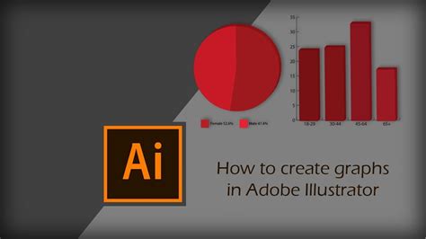
Creating Pie Charts in Adobe Illustrator
Adobe Illustrator offers robust tools for chart creation, making it a prime candidate for generating visually appealing pie charts that can then be seamlessly integrated into InDesign.
The Pie Graph Tool in Action:
Begin by locating the Column Graph Tool in Illustrator. Click and hold this tool to reveal a flyout menu, from which you can select the Pie Graph Tool. Hover your cursor over the artboard and drag to define the desired size for your pie chart. It's important to note that this dimension can be adjusted later if needed.
Once the chart is placed on your artboard, a data window will appear, featuring rows and cells where you can input your figures. For this tutorial's example, we'll create a pie chart with two fields, representing 25% and 75%. After entering these values, click the checkmark to apply them and close the window. A helpful tip before proceeding: create a duplicate of this initial graph and move it to the pasteboard. This precautionary measure is beneficial if you anticipate needing another version of the graph later on.
With the pie graph selected using the Selection Tool, navigate to Object > Ungroup. This action disassembles the graph into individual components, allowing for granular formatting of each slice. It is crucial, however, to ensure your figures are finalized before ungrouping, as the graph will no longer be editable in terms of data input.
To create a donut-style pie chart, select the Ellipse Tool and position its center at the core of your pie graph. Holding down the Shift + Option (or Shift + Alt on Windows) keys, drag outwards to create an elliptical shape. This should leave a portion of the graph visible, typically about an inch or so.
Now, with the Selection Tool, drag a marquee to select both the pie graph and the newly created ellipse shape. Subsequently, activate the Shape Builder Tool. While holding down the Option key on a Mac or Alt on Windows, click on the inner part of the circle. This action will effectively remove the unwanted inner segment, resulting in a hollowed-out pie chart.
Congratulations! You have successfully created a pie chart in Illustrator. The next step is as simple as copying this vector object and pasting it directly into your Adobe InDesign layout. A significant advantage of this method is that the chart retains its vector properties, allowing you to easily modify the colors of each individual pie slice within InDesign.
Designing Line Graphs in Adobe Illustrator
The process for creating line graphs in Illustrator shares similarities with that of pie charts, with a few key distinctions in their implementation.
Constructing a Line Graph:
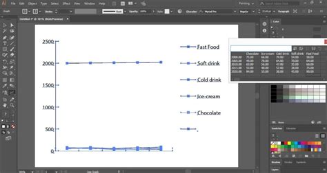
Return to the graph tool flyout menu, where the Pie Graph Tool resides. Hold down on this tool to reveal the options, and select the Line Graph Tool. As before, hover over your artboard and drag to define the desired size of your line graph. This size can be modified later.
Upon placing the graph, a data window will appear, prompting you to input your figures. For our example, we will construct a graph featuring four distinct lines. You can refer to the accompanying video or slide for precise numerical values if you aim for an identical visual representation, or feel free to input your own data.
Once your figures are entered, click the checkmark to apply the data and close the window. With the Direct Selection Tool, you can then select individual line segments within the graph to individually format and recolor them, allowing for precise visual customization.
Building Bar Graphs Natively in InDesign
While Adobe Illustrator offers built-in bar graph functionalities, this tutorial explores an alternative method for constructing bar graphs directly within Adobe InDesign, leveraging its powerful design tools.
InDesign Bar Graph Construction:
Begin by selecting the Rectangle Frame Tool. Draw a long, rectangular shape with a depth of approximately 0.2 inches. Apply your desired fill color to this shape. With the shape still selected by the Selection Tool, locate and click on the small, yellow square icon. This icon is typically situated beneath the upper top-right handle of the frame. Upon clicking this yellow square, all four yellow handles will illuminate. Now, by dragging any one of these handles inwards, you can create rounded corners for your rectangle.
With the shape still selected, navigate to Edit > Paste in Place. This command duplicates the selected shape directly on top of the original. Using the Selection Tool, click on the top shape and drag its right handle inwards, adjusting its length to achieve your desired bar graph appearance. This method allows for the creation of individual bars that can be colored and styled independently.
How to make a bar graph in Adobe InDesign
Exploring Advanced Charting Techniques
Beyond the fundamental graph creation tools, several other methods offer unique advantages for incorporating charts into your InDesign projects. These range from specialized fonts to scripting solutions.
Utilizing Chartwell Fonts for Dynamic Charts
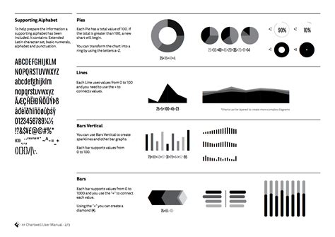
Chartwell is a unique font family designed by Travis Kochel, enabling the creation of various charts directly within InDesign using OpenType ligatures. This eliminates the need for external design software for basic chart generation.
Implementing Chartwell Fonts:
The fundamental principle behind Chartwell fonts is to input numerical data separated by a plus sign (+). Each numerical value can then be assigned a specific color, which will translate into the corresponding slice or segment of the chart. For instance, to create a pie chart, you would select the "Chartwell Pies" font.
After inputting your data and assigning colors, you'll need to enable discretionary ligatures in the OpenType menu. This option can be accessed through the panel menu of the Control panel or the Character panel. Once enabled, the text will render as a functional chart, incorporating the assigned colors. It is crucial to maintain a tracking value of 0 when using Chartwell fonts to ensure the chart's visual integrity. The manual accompanying the Chartwell font provides further details on advanced customization techniques.
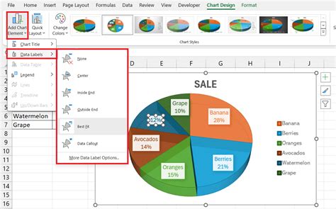
Leveraging Excel Data for InDesign Charts
Microsoft Excel is a powerful tool for data analysis and chart creation. While InDesign cannot directly import Excel charts, there are effective workarounds to integrate them into your designs.
Integrating Excel Charts:
One approach is to save your Excel chart as a PDF file, which can then be placed into InDesign. However, this method may offer limited control over the PDF conversion process. Furthermore, Excel's default color space is RGB, which may not be ideal for professional print workflows.
A more versatile option involves copying the chart from Excel and pasting it into Adobe Illustrator. This technique preserves the visual fidelity of the Excel chart and imports it as vector data, allowing for subsequent editing within Illustrator. You can then adjust colors, including the RGB black that Excel often generates, and save the file as an Illustrator document before placing it into your InDesign layout. This ensures a high-quality, editable graphic element within your infographic.
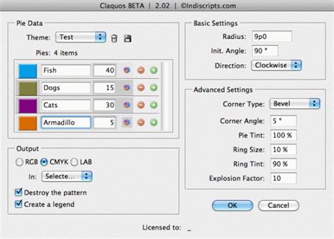
The Claquos 2 InDesign Script
For those seeking a direct charting solution within InDesign, the Claquos 2 script offers a powerful and free beta option. This JavaScript allows for the creation and customization of pie charts using native InDesign objects.
Using the Claquos 2 Script:
To utilize Claquos 2, you first need to install it within the Scripts panel in Adobe InDesign. Once installed, double-clicking the script will launch the Claquos dialog box. Here, you can define various properties of your pie chart, including labels and values for each wedge, color modes (RGB, CMYK, LAB), and legend creation. Advanced settings allow for control over corner styles, tints, and explosion factors for individual wedges.
Upon clicking "OK," Claquos 2 generates a pie chart composed of native InDesign objects, which are then grouped for easy manipulation. This means that once generated, the chart remains fully editable within InDesign, offering immense flexibility for design adjustments. While the script is currently in beta, it provides a robust method for creating sophisticated pie charts directly within your InDesign workflow.
Infographics: Enhancing Your Designs
Infographics are invaluable assets for bringing editorial designs, brochures, and company annual reports to life. They serve a critical function by presenting additional statistics, figures, and key information, thereby reinforcing a brand's message or narrative. By employing the methods outlined above, you can effectively integrate compelling charts and graphs into your InDesign layouts, transforming data into visually engaging and easily understandable visual stories. Whether you choose the precision of Illustrator, the dynamic capabilities of specialized fonts, the data-driven power of Excel, or the integrated convenience of InDesign scripts, mastering these techniques will undoubtedly elevate the impact and clarity of your infographic designs.