Creating a compelling movie poster is an art form that blends visual storytelling with striking graphic design. Photoshop, with its vast array of tools, offers a powerful platform for aspiring designers to craft professional-looking movie posters. This tutorial delves into the essential techniques for achieving a dynamic, blended image style often seen in contemporary movie posters, drawing inspiration from cinematic aesthetics and offering a step-by-step guide to achieving professional results.
Preparing and Merging Images for a Seamless Blend
The foundation of any effective movie poster lies in its imagery. To begin crafting your movie poster template in Photoshop, the first crucial step is to open the images you intend to blend together. Imagine you have a primary image, let's call it "Image A," and a secondary image, "Image B," each currently residing in its own separate document. The objective is to bring these disparate elements into a single, cohesive workspace.
To achieve this, select "Image B" and drag its tab up and onto the tab of "Image A." This action will bring "Image B" into the same document as "Image A." Once both images are visible within the same canvas, you'll need to position them appropriately. Often, one image might be too large or too small relative to the other. For instance, a horse image might appear too wide to fit harmoniously within the other image.
Resizing is a common necessity. To resize an image while maintaining its proportions, press and hold your Shift key. For enhanced control, simultaneously hold down the Alt key (on Windows) or Option key (on Mac) as you click and drag any of the corner handles of the image's bounding box. This combination of keys ensures that the image scales uniformly from its center. After resizing, you may also need to reposition the image. With the Free Transform box still active, click inside it and drag the image to its desired location. Similarly, you might want to move the first image, "Image A," higher up in the document. In Photoshop CC, you can achieve this by clicking on the lock icon associated with its layer. Ensure "Layer 0" (or the relevant layer name) is selected. Then, with the Move Tool still active, click on the image and drag it up into its correct position.
The Art of Blending: Utilizing Layer Masks
Once your images are in their optimal positions, the next critical step is to seamlessly blend them together. This is where the power of layer masks in Photoshop truly shines. A layer mask allows you to selectively reveal or hide parts of a layer without permanently altering the pixel data.
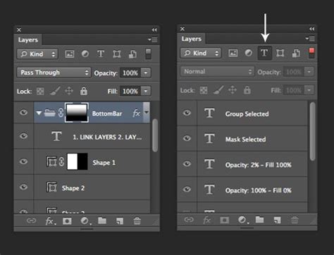
To apply a layer mask for blending, select the layer of the image you want to blend (in this case, let's assume it's "Image B" which you want to partially reveal over "Image A"). Navigate to the Layers panel and click the "Add layer mask" icon, which typically looks like a rectangle with a circle inside. A white thumbnail will appear next to your layer thumbnail, indicating that the mask is currently active and revealing the entire layer.
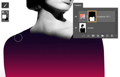
Now, select the Gradient Tool (G). In the options bar at the top, choose the "Black to White" gradient preset. This gradient will be used to paint on the layer mask, controlling the transparency of the layer. Click and drag out a gradient across the specific area where you want the two images to blend together. For example, if you want "Image B" to transition smoothly into "Image A," you would click just below the top of "Image B" to set the starting point for the gradient and drag downwards. As you drag, a black-to-white gradient will be applied to the layer mask. Where the mask is black, the layer will be hidden; where it is white, the layer will be fully visible; and shades of gray will create semi-transparency, allowing the layer below to show through. Back in the Layers panel, you will see your gradient depicted in the layer mask thumbnail, offering a visual representation of the blend.
Enhancing Cohesion: Texture, Black and White Conversion, and Colorization
Even with a well-executed mask, the blended images might still appear disjointed due to differences in texture and color. To unify them and create a more cinematic feel, several advanced techniques can be employed.
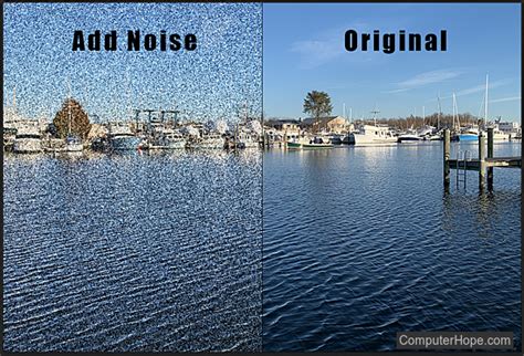
First, to help the images blend more seamlessly together, consider adding a subtle texture. This can mask minor imperfections in the blend and add a tactile quality to the poster. A common method is to add noise. Create a new layer above your blended images and fill it with a neutral gray (Edit > Fill > 50% Gray). Then, go to Filter > Noise > Add Noise. In the Add Noise dialog box, set the Amount to a low value, typically around 2 to 4%, depending on the resolution and size of your images. Ensure the distribution is set to "Gaussian" and "Monochromatic" is checked to avoid adding color noise. Change the blend mode of this noise layer to "Overlay" or "Soft Light" to integrate the texture subtly with the underlying images.
The next significant step is to address color inconsistencies. Often, images captured under different lighting conditions will have clashing colors. A powerful way to harmonize these is to convert the entire composition to black and white and then reintroduce color selectively.
To do this, merge your two image layers onto a new layer positioned above them. Make sure the top layer is still selected. On a Windows PC, press Shift+Ctrl+Alt+E on your keyboard. On a Mac, press Shift+Command+Option+E. This creates a merged copy of all visible layers without flattening the original layers, preserving your flexibility.
Now, with this new merged layer selected, add a Black & White adjustment layer (Layer > New Adjustment Layer > Black & White). This will convert the entire image to grayscale, providing a neutral base.
The problem at this point is that the original colors in the images don't match, and the grayscale conversion has removed them entirely. To bring back color in a controlled and artistic manner, we'll use a Hue/Saturation adjustment layer. Add a Hue/Saturation adjustment layer (Layer > New Adjustment Layer > Hue/Saturation) and clip it to the Black & White layer below (Alt/Option-click between the layers in the Layers panel).
The controls for the Hue/Saturation adjustment layer will appear in the Properties panel. This is where you can truly customize the look. To colorize the effect with your own chosen color, start by dragging the Hue slider. Experiment with different values until you find a hue that complements your poster's theme. For example, setting the Hue value to 30 might produce a warm, slightly reddish tone.
Next, set the intensity of the color with the Saturation slider. A higher saturation will result in more vibrant colors, while a lower saturation will produce a more muted, subtle effect. You can also use the "Colorize" checkbox within the Hue/Saturation adjustment layer itself to apply a single hue and saturation to the entire image.
For even finer control over the color balance and brightness of different tonal ranges, consider using a Levels adjustment layer before the Hue/Saturation layer, or even a Color Balance adjustment layer after. The Levels adjustment layer, for instance, allows you to adjust the brightness and contrast of different parts of the image based on their original color values. Dragging the Reds slider, for example, will lighten or darken any areas that originally contained red, offering precise control over the color cast.
Create a Cinematic Color Grade in 90 Seconds!
If, after applying these color adjustments, the contrast is too strong or the colors are overwhelming, you can easily fine-tune the results by lowering the opacity of the relevant adjustment layer. This provides a non-destructive way to dial back the intensity of any effect until it perfectly matches your vision.
Exploring Diverse Movie Poster Design Styles
The techniques discussed above form a solid foundation for creating a versatile movie poster. However, the world of movie poster design is rich with diverse styles, each with its unique appeal. Understanding these different approaches can inspire your own creative direction.
One popular style emulates the low-fi, gritty aesthetic often associated with punk rock gig posters and revolutionary propaganda. This approach might involve distressed textures, bold typography, and a limited color palette. For instance, one might draw inspiration from the trailer for a new sci-fi film, like Rogue One, to create a Star Wars-themed design that captures a sense of urgency and rebellion.
Another compelling style is the cinematic movie poster, which aims for a grand, epic feel. This often involves dramatic lighting, high-contrast imagery, and sophisticated typography. Tutorials for this style might focus on using specific typefaces, such as the 'Versus' typeface from Latinotype, to achieve a powerful visual impact.
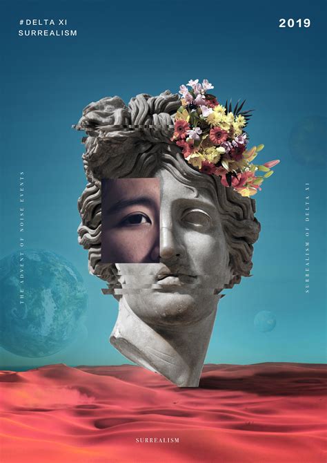
The surreal and fantastical realm of movie posters is also a fertile ground for creativity. Inspired by films that play with perceptions of reality, such as Inception, designers can create dreamlike compositions. This can involve extensive photo manipulation to construct impossible scenarios, drawing parallels to the work of artists like M.C. Escher, who masterfully created illusions of reality. A surreal photo-manipulation piece featuring a sci-fi space scene, for example, can be achieved using specialized asset packs like the Ultimate Universe Creator.
For those drawn to a more retro aesthetic, mimicking the airbrushed painted look of classic film posters from the 70s, 80s, and 90s is a popular choice. This style, often seen in the original Star Wars trilogy or Indiana Jones movies, can be recreated using a mix of Photoshop filters and adjustments. The goal is to achieve a smooth, vibrant, and slightly idealized appearance.
Vintage film posters, particularly those from the sci-fi genre, offer a wealth of inspiration. The artwork and typography of these posters are often captivating, sometimes even overshadowing the films themselves. Exploring these vintage designs can lead to unique and nostalgic poster creations.
For a more streamlined approach, especially for those who may not have extensive Photoshop experience, online poster creators offer a valuable alternative. Platforms like Placeit provide mockup templates, flyer templates, and specifically, movie poster templates that are easy to customize. These online editors allow users to create visually appealing posters with minimal effort by simply swapping out images and text within pre-designed layouts.
Finally, specific film aesthetics can be replicated. For example, creating a poster with a stripe pattern mask, reminiscent of the movie poster for The Bourne Legacy, involves using precise masking techniques in Photoshop CS6 or later versions.
Expanding Your Design Toolkit: Resources and Further Learning
Beyond the core techniques of image blending, masking, and color correction, a comprehensive movie poster design workflow often benefits from a broader understanding of design principles and access to a rich library of resources.
For those looking to deepen their Photoshop skills specifically for poster design, exploring curated collections of tutorials is highly recommended. Such collections often cover a wide range of fundamental and advanced techniques, catering to all levels of expertise, from beginners to seasoned professionals. They serve not just as compilations but as curated guides to the best available resources for mastering poster design.
Furthermore, having access to a vast library of design resources can significantly enhance the quality and efficiency of your work. This includes resources such as Photoshop brushes, which can add unique textures and effects, and vector resources, which are scalable graphics that can be used for logos, icons, and background elements without losing quality. These assets are invaluable for adding that extra polish and distinctiveness to your movie posters.
To truly excel in movie poster design, continuous learning and experimentation are key. By understanding the fundamental techniques, exploring diverse stylistic inspirations, and leveraging available resources, you can create movie posters that are not only visually striking but also effectively communicate the essence of the film they represent.
This post is an excellent resource for anyone looking to improve their skills in creating movie-style poster designs using Photoshop. The collection of tutorials provided covers a wide range of fundamental techniques that are essential for mastering poster design. In this roundup, you will find a diverse selection of tutorials that cater to all levels of expertise.
Acess to a huge libary of design resources from Photoshop brushes to vector resources.