The world of printing relies on a sophisticated understanding of color, and at its core lies the CMYK color model. CMYK, an acronym for Cyan, Magenta, Yellow, and Key (Black), is the foundation of the four-color printing process. This model is distinct from RGB, the color model used for digital displays, and understanding its nuances is crucial for anyone involved in creating or producing printed materials. From the simplest business card to the most complex packaging, CMYK dictates how your designs will come to life on physical media.
Understanding CMYK: The Subtractive Color Process
CMYK is a subtractive color model, a concept that explains how colors are created by absorbing certain wavelengths of light and reflecting others. In this model, colors are generated by applying inks to a white surface, typically paper. Each of the four CMYK inks has a specific role in absorbing light.
- Cyan (C): This bluish-green ink absorbs red light, reflecting blue and green light.
- Magenta (M): This purplish-red ink absorbs green light, reflecting red and blue light.
- Yellow (Y): This bright yellow ink absorbs blue light, reflecting red and green light.
- Key (K): Black ink is used to create depth, contrast, and darker tones.
When these four colors are combined in varying percentages, they subtract different parts of the light spectrum, allowing us to perceive a vast array of colors. For instance, mixing cyan and yellow inks, when printed on white paper, will absorb both red and blue light, resulting in green light being reflected. The interplay of these inks, applied in tiny, precisely spaced dots, allows printers to reproduce a wide spectrum of colors with remarkable accuracy.
The Role of "Key" (Black)
The inclusion of black (K) in the CMYK model is particularly important. While theoretically, mixing equal amounts of pure cyan, magenta, and yellow should produce black, in practice, impurities in the inks result in a dark brown or muddy color rather than a true black. The "Key" plate, historically the plate that provided the sharpest details and darkest areas in traditional printing, is represented by black ink. This is why it's referred to as "K" and not "B" for black, to avoid confusion with "Blue" in other color models and to maintain the historical printing terminology. Black ink is essential for achieving deep, rich blacks and providing contrast and depth to images, especially in large solid areas where a "rich black" (a combination of CMYK inks) is often used for greater intensity.
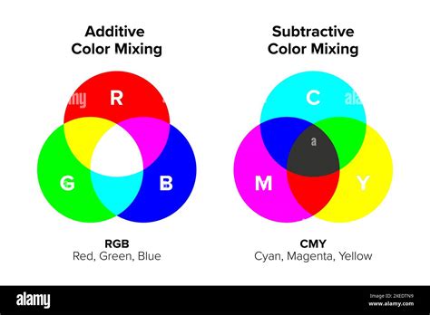
CMYK vs. RGB: A Fundamental Difference
The most common point of comparison for CMYK is the RGB (Red, Green, Blue) color model. The fundamental difference lies in their approach to color creation:
- RGB is an additive color model: It starts with black (the absence of light) and adds red, green, and blue light in various intensities to create colors. When all three primary colors of light are combined at their maximum intensity, they produce white. RGB is optimized for digital displays, such as monitors, smartphones, and televisions, where colors are generated by emitting light.
- CMYK is a subtractive color model: It starts with white (the color of the paper or substrate) and subtracts light by applying inks. When all four CMYK inks are combined at their maximum intensity, they theoretically produce black. CMYK is optimized for printing, where colors are created by reflected light.
This difference explains why colors can appear vibrant on a screen but muted or different when printed. RGB's ability to emit light allows for brighter, more saturated colors than CMYK, which is limited by the inks' ability to absorb and reflect light. Therefore, designing for print necessitates working within the CMYK color space to ensure accurate color representation.
The Printing Process: Dots and Halftoning
In CMYK printing, full-color images are created by using tiny dots of cyan, magenta, yellow, and black inks. These dots are carefully arranged and overlapped to achieve the desired colors. The process of using varying sizes and spacing of these dots to simulate continuous tones is called halftoning or screening.
Printers use specific patterns and angles for each CMYK color plate. The different angles of these "printing screens" allow the dots to overlap visually without creating distracting moiré patterns. From a distance, the human eye perceives these densely packed dots as solid colors or gradients.
- Larger, closely spaced dots create darker areas in the print.
- Smaller, more spaced-out dots result in lighter shades.
This meticulous arrangement of dots allows for the reproduction of a wide spectrum of colors and tonal variations, leading to high-quality prints. The density of these dots, measured in dots per inch (dpi), is a critical factor in print resolution and detail. Industrial offset printing, for example, often requires 300 dpi to achieve adequate image quality.
Trick Photoshop Into Creating Classic Print Halftones
Advantages of CMYK for Printing
CMYK printing offers several distinct advantages for physical media:
- Color Accuracy for Print: While RGB colors may appear brighter on screen, CMYK can reproduce colors more accurately in print, ensuring that what you see in your design software closely matches the final printed product.
- Consistency: CMYK printing is known for its consistency. Even across multiple print runs, the finished products will remain uniform, which is crucial for brand integrity and marketing materials.
- Industry Standard: Due to its reliability and ability to produce a wide range of colors with a limited number of inks, CMYK has become the industry standard for color printing worldwide.
- Cost-Effectiveness: Using four primary inks allows for a broad color spectrum without the need for an extensive and costly array of specialized inks for every conceivable color.
When to Use CMYK
The CMYK color model should be your go-to choice for any design project intended for physical printing. This includes:
- Business cards
- Brochures and flyers
- Posters and banners
- Product packaging
- Stationery
- Menus
- Magazines and books
- Swag items like t-shirts, mugs, and pens
Designing in CMYK from the outset helps ensure that colors remain within the printable gamut, preventing unexpected shifts when the design is prepared for print. If a design is created in RGB, it must be converted to CMYK before printing. While this conversion can sometimes lead to subtle color changes, designers can mitigate this by working with CMYK profiles and understanding the CMYK color gamut.
Beyond CMYK: Spot Colors and Pantone Matching
While CMYK is incredibly versatile, there are instances where achieving an exact color match solely through the CMYK process is challenging. In these situations, printers utilize spot colors, also known as Pantone colors.
The Pantone Matching System (PMS) is a proprietary standardized color matching system that assigns unique codes to specific ink colors. This system allows designers to select and specify precise colors that can be accurately reproduced, regardless of the printing method. When a brand has a critical color that must be exact, such as a specific corporate blue or red, Pantone colors are often the preferred choice.
While CMYK can simulate many Pantone colors, the exact brilliance and shade may not always be achievable. For projects where absolute color fidelity is paramount, incorporating Pantone colors into the CMYK workflow, or using them exclusively, can ensure higher color accuracy and maintain brand consistency across all printed materials. Some printing presses can accommodate both process colors (CMYK) and spot colors in a single print job.
Ink Types and Their Applications
The type of ink used can also influence the final print quality and durability. The two primary types of ink are:
- Dye-based inks: These are made of color pigments dissolved in a liquid, typically water. They are commonly found in most inkjet printers and are generally less expensive. Dye-based inks can produce vibrant colors but are more susceptible to fading from UV exposure and water damage.
- Pigment-based inks: These inks contain solid pigment particles suspended in a liquid medium, making them insoluble. Pigment-based inks are more durable, waterproof, and UV-resistant, making them ideal for outdoor displays, archival prints, and applications where longevity is crucial. However, they are typically more expensive and may require specific printing conditions.
Color Management and Achieving Consistency
Achieving consistent color across different devices and print outputs is a complex but vital aspect of graphic design. This involves understanding color management systems and calibrating devices.
- Color Profiles (ICC Profiles): These are data sets that describe how a particular device (like a monitor or printer) interprets and reproduces color. By using standardized ICC profiles, designers and printers can ensure that colors are translated accurately across different stages of the design and printing process.
- Monitor Calibration: Regularly calibrating your monitor ensures that the colors you see on your screen are as accurate as possible, providing a more reliable preview of how your CMYK designs will print.
- Soft Proofing: This technique allows designers to simulate how their CMYK designs will appear on a specific printer or paper type, using color profiles to preview potential color shifts before printing.
- File Preparation: When creating print files, it's essential to set the correct color mode to CMYK from the start. If a file is created in RGB, it must be converted to CMYK using design software such as Adobe Photoshop or Illustrator. Designers should also be mindful of the CMYK color gamut, avoiding colors that fall outside this range to prevent unexpected results.
- Rich Black: For deep, solid black areas, using a combination of CMYK inks (e.g., C=60%, M=60%, Y=60%, K=100%) often produces a richer, more opaque black than 100% black ink alone.
The Future of Print Color
The field of print technology continues to evolve. Extended color systems, such as CMYK+OGV (Orange, Green, Violet), are emerging, allowing printers to achieve a wider range of vibrant brand colors with even greater accuracy. Artificial intelligence is also playing a role, with AI-powered proofing tools that can analyze artwork and flag potential color issues before they reach the printing press.
Regardless of these advancements, a solid understanding of the CMYK color model remains fundamental for anyone involved in creating high-quality printed materials. By grasping its principles, understanding its relationship with RGB, and employing proper color management techniques, designers can ensure their creations translate beautifully from screen to page, delivering impactful and consistent results.