Hot pink is a color that doesn't shy away from attention. It's a bold, vibrant shade that sits energetically between red and purple on the color wheel, masterfully blending the passionate intensity of red with the charming allure of purple. This striking combination inspires a sense of fun, fashion, and uninhibited self-expression. Whether you're a seasoned designer or just beginning to explore the world of color, understanding the nuances of hot pink, from its precise digital and print codes to its psychological impact and complementary pairings, can elevate your creative projects.
Decoding Hot Pink: Essential Color Codes for Design
To ensure consistency and accuracy when incorporating hot pink into your designs, it's crucial to utilize its specific color codes across various platforms and mediums. These codes act as a universal language for color, guaranteeing that your intended shade of hot pink is rendered faithfully, whether on a screen or in print.
For digital applications, where designs are viewed on screens, the RGB (Red, Green, Blue) color model is paramount. In this system, hot pink is defined by a specific combination of red, green, and blue light. The provided information details hot pink with RGB values of R: 255, G: 105, B: 180. This translates to a digital representation where red is at its maximum intensity (100%), green is at 41.2%, and blue is at 70.6%. Another way to express this digital composition is through the HSL (Hue, Saturation, Lightness) model, which describes hot pink as having a hue angle of 330°, a saturation of 100%, and a lightness of 71%. For projects requiring percentage representation in a digital context, hot pink is made of 100% red, 41% green, and 71% blue.
When your design project is intended for print, you'll most likely be working within the CMYK (Cyan, Magenta, Yellow, Black) color space. This model uses inks to create color, and the percentages of each ink determine the final hue. For hot pink, the CMYK breakdown is 0% cyan, 59% magenta, 29% yellow, and 0% black. This means that the vibrant pink is achieved primarily through magenta and yellow inks, with no cyan or black contributing to its core saturation. The provided information also specifies CMYK values as c: 0%, m: 59%, y: 29%, k: 0%, and in another instance, c: 0, m: 0.59, y: 0.29, k: 0. These figures precisely capture the ink composition required for a print project to achieve the desired hot pink.
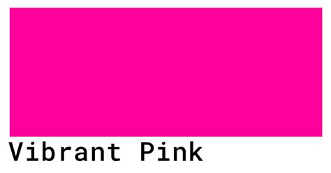
The HEX code for hot pink, a six-digit alphanumeric code used primarily in web design and digital graphics, is #FF69B4. This hexadecimal representation is a concise way to define the exact color, easily copied and pasted into design software. Another provided HEX code, #FF46A2, suggests a slightly more intense and purplish variation of hot pink, emphasizing the spectrum of this vibrant shade.
Exploring Hot Pink's Visual Spectrum: Variations and Palettes
Hot pink, while a distinct color, exists within a spectrum of similar vibrant shades, each offering a slightly different emotional and visual impact. Understanding these variations allows for more nuanced design choices.
- Rose (#FF1D8D): This variation ramps up the intensity, presenting a more saturated pink that leans closer to red, offering a deeper, richer feel than standard hot pink.
- Neon Pink (#FF13F0): Electrifying palettes, neon pink possesses an intense purple undertone, giving it a fluorescent, almost luminous quality that demands attention.
- Amaranth (#E83256): Leaning darker and more red, amaranth is an energetic shade that provides a grounded yet still vibrant option within the pink family.
The power of hot pink is often amplified when paired with carefully selected complementary colors. These pairings can create striking contrasts, harmonious blends, or visually balanced compositions.
- Cyan (#00FFFF): The direct complement to red on the color wheel, cyan offers an energizing, vibrant contrast to hot pink, creating a dynamic and visually stimulating combination.
- Jade Green (#00BB77): This specific shade of green acts as a soothing and grounding element against hot pink's intensity, offering a balanced and refreshing aesthetic.
- Soft Pink (#E89EB8): For a more delicate and subtle approach, pairing hot pink with a softer shade of pink can mellow its boldness and lend a gentle, approachable touch to the palette.
Beyond these direct pairings, other colors can be considered to complement hot pink's vibrancy:
- Black: Creates a dramatic and sophisticated contrast, allowing hot pink to truly pop.
- Teal: Boldly contrasts hot pink's warmth with its cool, deep tones, resulting in a modern and eye-catching combination.
- Burgundy: Grounds hot pink for a refined and elegant aesthetic, adding depth and a touch of richness.
Conversely, certain color combinations can overwhelm or clash with the inherent vibrance of hot pink, detracting from its intended impact. Designers should exercise caution when pairing hot pink with:
- Moss Green (#7E8C54): Its dark, desaturated shade can dull hot pink’s vibrance, creating a muted and less energetic effect.
- Navy Blue (#000080): The stark contrast between navy's dark, cool tones and hot pink's bright, warm energy can lead to a disjointed and visually jarring pairing.
- Cream (#FDFBD4): With its strong yellow undertones and pale hue, cream can wash out hot pink, diminishing its impact and creating a less dynamic contrast.
- Amber (#FFBF00): This bright, warm color can create a jarring contrast when paired with vibrant hot pink, leading to a chaotic visual experience.
- Red-brown (#942222): Leaning more towards dark red, this color can conflict with hot pink’s purple-red undertones, resulting in a muddied and less defined color relationship.
The Psychology and Historical Significance of Hot Pink
The impact of hot pink extends beyond its visual appeal; it carries significant psychological weight and has a rich history tied to self-expression and cultural movements.
In terms of color psychology, hot pink is strongly associated with excitement, energy, optimism, and joy. It's a hue that can inspire creativity and a sense of freedom, evoking strong emotions and stimulating engagement. This energetic quality makes hot pink a powerful tool in design, capable of conveying a sense of urgency and importance, or establishing a playful, contemporary aesthetic.
Historically, hot pink's journey is fascinating. It emerged as a product of avant-garde fashion in 1937, pioneered by Elsa Schiaparelli, a designer renowned for her bold and rebellious style. By the mid-20th century, hot pink had become a significant color within counterculture and youth movements, particularly embraced by artists who championed non-conformity. The burgeoning popularity of hot pink during this era symbolized a powerful rise in individuality, self-expression, and rebellion against established norms. While it may no longer carry the same rebellious connotations, hot pink undeniably remains a bold, energetic shade that effectively grabs attention and generates excitement.
Symposium | Dr. Valerie Steele “Pink: The History of a Color”
Strategic Applications of Hot Pink in Design
The inherent boldness of hot pink makes it an exceptionally effective accent color, particularly in User Interface (UI) and User Experience (UX) design. Its ability to capture a user's attention in a fun and contemporary manner is invaluable. However, due to its intensity, designers often use hot pink strategically as an accent rather than a dominant color to avoid overwhelming the user.
Here are some key ways hot pink can be incorporated into designs:
- Establish Visual Hierarchy: Hot pink is naturally eye-catching. Its strategic use can guide user interaction by drawing attention to crucial elements. For instance, a hot pink Call to Action (CTA) button, set against a more neutral background palette, will stand out prominently, encouraging users to engage with the intended action.
- Convey Urgency and Importance: The exciting and compelling energy of hot pink can be leveraged to highlight time-sensitive information. Notifications, expiring offers, or critical alerts presented in hot pink can prompt users to take immediate action.
- Create a Playful, Contemporary Aesthetic: Its bold and bright nature makes hot pink an ideal choice for designs aimed at younger demographics or for brands seeking to convey high energy and fun. It injects a sense of vibrancy and modernity into any visual.
When designing for a global audience, it's essential to remember that the meaning and perception of colors can vary significantly across cultures and over time. Therefore, thorough research into color considerations for specific regions is a crucial step in ensuring your design choices resonate appropriately.
Design Tools and Resources for Hot Pink
For those looking to implement hot pink and explore its potential in their designs, various tools and platforms offer robust features and user-friendly interfaces.
PicMonkey, for example, is highlighted as a platform that simplifies the design process. It boasts a minimal learning curve with easy and intuitive tools, allowing users of all skill levels to create "spectacular designs immediately." The platform offers an extensive feature set, including professionally designed templates and high-powered tools for custom image creation from scratch. PicMonkey's pricing model emphasizes value, providing comprehensive tools for a low price without hidden costs or one-off purchases, making it an accessible option for "fabulous images."
Figma, another prominent design tool, emphasizes the importance of accessibility in design. It offers plugins within its Community section specifically designed to help ensure that designs meet Web Content Accessibility Guidelines (WCAG). This is particularly relevant when using bold colors like hot pink, as designers need to consider contrast ratios and potential impacts on users with color vision deficiencies. For instance, a contrast ratio of 3.16 between large text in hot pink (#FF46A2) and a white background (#FFFFFF) might be considered a "Fail" for accessibility standards, while a contrast ratio of 6.65 would be a "Pass." This highlights the need for careful consideration of text and background color pairings to ensure legibility and inclusivity.
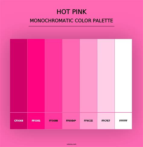
Understanding Color Terminology: Shades, Tints, Tones, and Hues
To fully grasp the nuances of hot pink and its place within the broader color landscape, it's helpful to understand fundamental color terminology:
- Hue: This refers to the pure color itself, such as red, blue, or in this case, hot pink. It's the primary characteristic that distinguishes one color from another.
- Shade: A shade is created by adding black to a pure hue. This deepens the color, making it darker while retaining its original character. For hot pink, adding black would result in a darker, more muted version.
- Tint: A tint is achieved by mixing white with a pure hue. This lightens the color, making it paler and often softer. Adding white to hot pink would create lighter, pastel-like pinks.
- Tone: A tone is produced by adding gray to a pure hue. This desaturates the color, making it less intense and more subdued. Adding gray to hot pink would result in a less vibrant, more muted shade.
Color Harmonies and Custom Palettes
Beyond simple pairings, understanding color harmonies can lead to more sophisticated and visually pleasing designs. Common color harmonies include:
- Complementary: Colors directly opposite each other on the color wheel (e.g., hot pink and cyan).
- Split-Complementary: A variation of complementary, using the two colors adjacent to the complementary color, offering high contrast but less tension.
- Triadic: Three colors evenly spaced around the color wheel, creating vibrant and balanced palettes.
- Tetradic (Square): Four colors arranged into two complementary pairs, offering rich diversity but requiring careful balance.
- Analogous: Colors that are next to each other on the color wheel, creating a harmonious and cohesive feel.
- Monochromatic: Various tints, tones, and shades of a single hue, offering a subtle and unified aesthetic.
For those seeking unique color combinations, custom palettes can be generated. Examples of custom palettes that might incorporate or complement hot pink include:
- Fancy That: Suggests an imaginative and perhaps whimsical collection of colors.
- Vivacity: Implies a lively and energetic palette.
- Radiant Retro: Hints at a vintage yet vibrant color scheme.
- Contrast 3.16: Specifically calls out a color combination with a particular contrast ratio, likely for accessibility considerations.
- Contrast 6.65: Another reference to a contrast ratio, indicating a higher level of distinction between colors.
These diverse approaches to color selection, from precise code adherence to psychological impact and historical context, underscore the multifaceted nature of hot pink and its enduring appeal in the world of design.