Procreate Pocket provides a versatile suite of tools to manage and apply color, catering to diverse artistic workflows. Understanding these features, from basic color selection to advanced techniques like ColorDrop and Recolor, is crucial for any digital artist looking to enhance their creative process. This tutorial delves into each aspect of Procreate Pocket's color interface, offering insights and practical advice for both novice and experienced users.
The Color Panel: Your Gateway to Hues
When you first access the color interface in Procreate Pocket, you are greeted by the Color Panel. This central hub houses several distinct tabs, each offering a unique approach to color selection: Disc, Classic, Harmony, and Value.
The Color Disc is the default view, presenting a vibrant outer ring representing Hue, surrounding an inner, zoomable Saturation disc. This visual representation allows for intuitive exploration of color relationships. The Classic tab offers a more traditional color wheel, familiar to artists accustomed to established color selection methods. For those who prefer numerical precision, the Value tab provides sliders for fine-tuning color properties, alongside precise numerical and hexadecimal values. This is particularly useful for matching specific brand colors or ensuring consistency across projects.
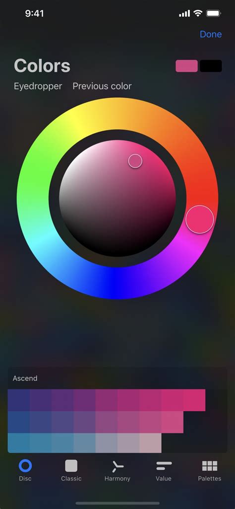
Beyond these dynamic selection tools, the Palettes tab is where you manage your saved color sets. Procreate Pocket comes equipped with several standard palettes, providing a starting point for various projects. However, the true power lies in the ability to import palettes from external sources or create your own unique collections. This allows for the development of consistent branding, thematic color schemes, or the replication of specific artistic styles.
The Active Color: Your Current Selection
Prominently displayed in the top right corner of the Procreate Pocket interface is the Active Color. This visual indicator shows your currently selected color, serving as a constant reminder of your chosen hue. A remarkably useful feature is the ability to press and hold the Active Color to instantly switch between your current and previous color. This shortcut is invaluable for quick iterative adjustments or for comparing subtle color variations without navigating back to the Color Panel.
ColorDrop: Effortless Filling and Precision Control
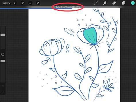
ColorDrop is a cornerstone feature of Procreate Pocket, designed for rapid and efficient color application. To initiate a ColorDrop, simply drag the Active Color onto your canvas. The color will then fill the area you drop it into. The behavior of ColorDrop can be influenced by the threshold setting, which determines how much of an area the color will fill.
To activate and adjust this threshold, drag the Active Color over the area you intend to fill, but do not release your touch immediately. After a brief moment, ColorDrop Threshold will activate. A thin bar will appear at the top of your artwork, visually representing the threshold amount. By dragging your finger to the left, you decrease the fill area, confining the color to smaller, more contained regions. Conversely, dragging to the right increases the fill area, allowing the color to spread further. Procreate Pocket intelligently remembers your chosen Threshold setting for ColorDrop until you manually change it again.
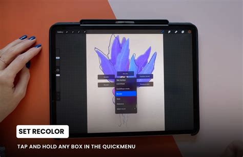
SwatchDrop and Recolor: Advanced Filling Techniques
Similar to ColorDrop, SwatchDrop allows you to drag colors directly from your palettes onto the canvas. The process of adjusting the fill threshold is analogous. To activate Threshold with SwatchDrop, touch and hold a Swatch color over the area you want to fill. While still holding down, keep holding until a blue line appears on top of your screen. Swipe your finger left or right to adjust the fill Threshold. Swiping left reduces the fill threshold, affecting smaller areas, while swiping right increases it, allowing the color to fill more broadly. Like ColorDrop, SwatchDrop remembers the last Threshold setting used until it is altered.
Following a ColorDrop or SwatchDrop, a crucial option appears in the top menu bar: Continue Filling with Recolor. This feature unlocks powerful post-fill adjustments. Upon tapping this, a small crosshair will appear in the middle of your screen. You can then slide the Flood slider located at the bottom of the screen. As you manipulate the slider, your initially dropped color will gradually be replaced by the new color you are currently selecting. This allows for dynamic color revisions and sophisticated layering effects without needing to undo and reapply. While still holding your Swatch (or after completing a Recolor operation), you can tap Done to close the Color panel and return to your canvas.
The Eyedropper: Precise Color Sampling
The Eyedropper tool is essential for capturing colors directly from your artwork or reference images. Within the Color Panel, you'll find a Modify button. Tapping this button invokes a floating Eyedropper, allowing you to sample colors with exceptional accuracy. Once activated, simply tap on any part of your canvas to sample that color. This sampled color then becomes your Active Color, ready for use.
Color Harmony and Advanced Color Theory
While the Disc, Classic, and Value tabs focus on direct color selection, the Harmony tab introduces tools that leverage color theory for more sophisticated results. This section allows you to explore complementary, analogous, triadic, and other color relationships. By understanding how colors interact, you can create more visually appealing and impactful artwork. Procreate Pocket's Harmony tools provide a visual and interactive way to experiment with these principles, making it easier to achieve balanced and harmonious color palettes.
Struggling with Color? Try This Game-Changing Tip!
Understanding Color Modes and Blending
Beyond the selection tools, Procreate Pocket's effectiveness is amplified by understanding how colors interact with each other through blending modes and layer properties. While not directly part of the color picker interface itself, these concepts are intrinsically linked to color application. Different blending modes (such as Multiply, Screen, Overlay, etc.) can dramatically alter how colors appear when layered, offering a vast range of expressive possibilities. Experimenting with these modes in conjunction with precise color selection will unlock new levels of depth and dimension in your digital paintings.
Color Management for Consistency
For professional workflows, managing color consistency across different projects and devices is paramount. Procreate Pocket's ability to save and import custom palettes is a significant advantage. Creating a brand-specific color palette, for instance, ensures that all your digital assets maintain a uniform look and feel. Furthermore, understanding the color space your artwork will be viewed in (e.g., sRGB for web, or CMYK for print, though Procreate primarily works in RGB) can inform your color choices during the creation process. While Procreate Pocket doesn't offer direct CMYK conversion, awareness of these differences is crucial for professional output.
The Nuances of Threshold Control
The Threshold slider, accessible through both ColorDrop and SwatchDrop, is a powerful yet often underutilized feature. Its effectiveness lies in its ability to control how "intelligent" the fill is. A low threshold will only fill contiguous pixels of a similar color, making it ideal for filling small, isolated areas or for precise line art coloring. A high threshold, conversely, will fill a much broader range of colors and areas, making it suitable for quickly filling large, open spaces. Mastering the threshold allows artists to avoid accidental color spills and achieve clean, defined fills, even with complex linework or textured backgrounds. The visual feedback provided by the threshold bar at the top of the screen is critical for understanding its impact in real-time.
Color Dynamics and the Future of Color Picking
As digital art tools evolve, so too do the approaches to color selection. While Procreate Pocket offers a robust and intuitive system, future iterations might explore AI-driven color suggestions, more advanced gradient tools integrated directly into the picker, or even real-time color palette generation based on uploaded images. The current suite of tools, however, provides a solid foundation for creating stunning artwork. The ability to switch between precise numerical input, intuitive visual selection, and efficient drag-and-drop filling ensures that artists have the flexibility to work in the way that best suits their individual needs and project requirements.
The interplay between the Color Disc's visual exploration, the Classic's familiarity, the Value's precision, and the Palettes' organizational power, all enhanced by the dynamic capabilities of ColorDrop, SwatchDrop, and Recolor, makes Procreate Pocket a formidable tool for color management. By thoroughly understanding and utilizing each of these components, artists can elevate their workflow and achieve greater creative control over their digital canvases.