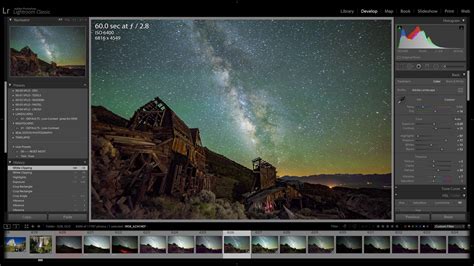
When embarking on the journey of photo editing within Adobe Lightroom Classic, seasoned photographers often begin with foundational adjustments. These typically encompass refining exposure, fine-tuning white balance, and tweaking the exposure value. However, a common artistic desire is to selectively alter the hues, intensity, or brightness of specific elements within an image, rather than applying global changes. This is precisely where the HSL (Hue, Saturation, Luminance) color controls, now known as the Color Mixer in recent versions, become an indispensable tool. These powerful adjustments, while specifically detailed here for Lightroom Classic, share fundamental principles with similar HSL adjustment tips found in other industry-standard photo-editing software such as Lightroom, Capture One, and Adobe Camera Raw.
The HSL panel, or its modern iteration, the Color Mixer, is a sophisticated feature designed to grant photographers granular control over the color palette of their images. It moves beyond the broad strokes of basic adjustments to allow for precise manipulation of individual colors, offering a nuanced approach to aesthetic enhancement. In Lightroom Classic version 13.0 and later, this panel has been thoughtfully renamed to "Color Mixer," providing a more descriptive label for its functionality. You'll find this crucial panel located within the Develop module, serving as a gateway to detailed color customization.
It's important to understand that there isn't a rigid, one-size-fits-all formula for HSL settings. The impact of these adjustments is inherently dependent on the specific colors present in your photograph and how they interact with each other. Each adjustment produces unique effects that are tailored to the individual image. This bespoke nature is part of what makes HSL controls so potent for creative expression.
Understanding the HSL Trio: Hue, Saturation, and Luminance
At its core, HSL is an acronym representing three fundamental aspects of color: Hue, Saturation, and Luminance. These three adjustments are commonly grouped together in digital editing software because they offer a comprehensive way to manage color. Each adjustment provides a set of sliders, typically divided among the primary and secondary colors that can be found in a photograph.
Hue: The Shade of Color
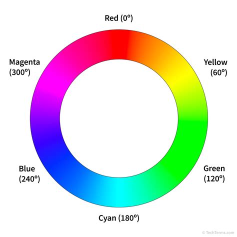
Editing the Hue slider directly manipulates the shade of a color. Think of it as shifting a color along the spectrum. For instance, by adjusting the red hue, you can transform a vibrant red into something more akin to an orange, or perhaps a deeper, blood-red tone. This control allows you to subtly change the character of a color, making it warmer or cooler, or even transitioning it into an adjacent color family. In Lightroom Classic, the Hue sliders allow you to move a selected color across the spectrum, but crucially, they confine your selection to the color's original boundaries. For example, if you adjust the red hue in an image, the software will attempt to keep the adjustment within the range of what was originally perceived as red, preventing it from drastically morphing into a completely unrelated color like green without significant slider movement.
Saturation: The Intensity of Color
The Saturation sliders control the intensity or purity of a color. Increasing the saturation slider will amplify all traces of that particular shade, making the color more vibrant and pronounced. Conversely, decreasing saturation will mute the color, making it less intense, and if pushed to its extreme, can render the color almost entirely monochrome. This is a highly utilized function within the HSL panel. For example, if you have a building in your photo that has subtle red tones, increasing the red saturation slider will make those red tones pop dramatically, causing the building to stand out from its surroundings. Conversely, if a particular color is too overpowering, reducing its saturation can bring it into better balance with the rest of the image.
Luminance: The Brightness of Color
Luminance adjusts how bright or dark a specific color appears. This is akin to a tonal adjustment, but it is applied specifically to the selected color rather than the entire image. Increasing the luminance of a color will make it brighter, revealing more detail in lighter areas. Decreasing luminance will darken the color, adding depth and drama. For instance, if you are editing a red area in your photograph, increasing the red luminance slider will make that red area appear brighter, potentially revealing nuances in texture or highlights. Moving the slider to the opposite extreme can transform the color into a much darker, richer shade, such as a deep red wine color. Luminance sliders are particularly effective for making certain areas of an image stand out or for creating a more dramatic mood.
Navigating the Color Mixer (HSL Panel) in Lightroom Classic
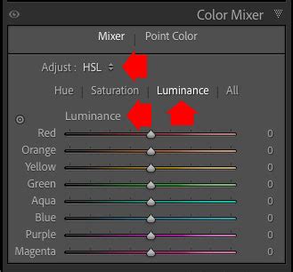
In Lightroom Classic, the HSL adjustments are accessed through the Color Mixer panel, which is conveniently located in the Develop module. In versions prior to 13.0, this panel was explicitly labeled HSL/Color. With the update to version 13.0, the panel was renamed to Color Mixer, but the underlying functionality remains largely the same, offering control over Hue, Saturation, and Luminance for specific color ranges.
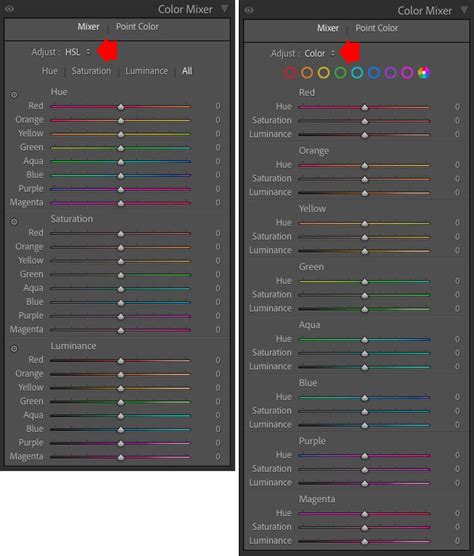
Within the Color Mixer panel, you'll find controls for eight distinct color ranges: Red, Orange, Yellow, Green, Aqua, Blue, Purple, and Magenta. Each of these colors has its own set of Hue, Saturation, and Luminance sliders. When you make an adjustment within the Color Mixer, it primarily affects the selected color and, to a lesser extent, its surrounding complementary colors, while other colors in the image remain largely unchanged. This targeted approach is what makes HSL adjustments so powerful for fine-tuning the overall color balance and aesthetic of a photograph.
The "Mixer" and "Adjust" Options
Within the Color Mixer panel, you'll notice two key dropdown menus: "Mixer" and "Adjust." When you select "Mixer," you are presented with the familiar sliders for Hue, Saturation, and Luminance, broken down by color. Underneath this, the "Adjust" dropdown menu allows you to choose between HSL (which displays all sliders for all colors at once) or to focus on individual color editing. Selecting HSL here presents all the HSL sliders on the screen simultaneously, offering a comprehensive view of all available color controls.
The Targeted Adjustment Tool
A highly valuable feature within the HSL/Color panel is the Targeted Adjustment Tool (TAT). This tool simplifies the process of identifying and adjusting specific colors. To activate it, you'll find a small circle icon located in the top left corner of each option panel (Hue, Saturation, or Luminance). Clicking this icon transforms your cursor into a targeting tool. You can then hover over any area of your photograph, and Lightroom will intelligently identify the dominant color(s) in that region. By clicking and dragging your cursor up or down within the image, you can directly manipulate the corresponding Hue, Saturation, or Luminance sliders for the targeted color(s). This is incredibly useful when you're unsure which specific color slider to adjust, or when a color in your image is a blend of multiple hues. For instance, if you click on a patch of sky that has both blue and cyan tones, the TAT can adjust both the blue and cyan sliders simultaneously, ensuring a cohesive color shift.
How to Use the Target Adjustment Tool in Lightroom CC
Resetting Sliders
For those moments when an adjustment doesn't yield the desired result, or you simply want to start over with a particular color group, Lightroom Classic provides a convenient reset function. Within the Adjust menu (when set to HSL), simply double-clicking on the text for "Hue," "Saturation," or "Luminance" will reset all sliders within that specific group back to their default zero position. This allows for quick experimentation without the need to manually drag each slider back.
Advanced Color Control: Point Color in Lightroom Classic
Adobe's continuous innovation in Lightroom Classic has introduced even more refined color editing capabilities. With the release of version 13.0, alongside the renamed Color Mixer, Adobe also introduced the "Point Color" tool. This feature offers a more precise and intuitive way to target and adjust specific colors, building upon the foundation of HSL controls.
When you access the Point Color tool, you'll initially see an eyedropper icon. By clicking this eyedropper and then moving your cursor over a photograph, Lightroom displays an enlarged, pixel-level view of the area beneath the cursor. This zoomed-in perspective aids in accurately selecting the precise color you wish to modify. To the right of the eyedropper, a color field illustrates the luminance values of the sampled color. As you adjust sliders, the Luminance Shift slider beneath this field will move to reflect the new value.
A larger color field located above the main adjustment sliders is dedicated to Saturation and Hue adjustments. Moving the circle within this field up increases color saturation, while moving it down decreases it. Simultaneously, moving this circle also adjusts the Hue Shift and Saturation Shift sliders positioned below. The color field directly above these sliders cleverly displays both the original sampled color on the left and the newly adjusted color on the right, providing immediate visual feedback on your changes.
Visualizing Color Range and Precision Adjustments
A significant advantage of the Point Color tool is its ability to visualize the range of colors affected by your adjustments. By clicking the white triangle to the right of the "Range" slider, you can reveal additional color fields. When activated, Lightroom highlights the parts of the photo that will be influenced by any color adjustments you make. This visualization is crucial for understanding the scope of your edits and preventing unintended color shifts in other areas of the image.
While the "Range" slider offers a broad adjustment to the affected color spectrum, more precise control is available through the color fields situated below it. These fields allow for nuanced adjustments to the range of colors being modified. The slider box, represented by a white rectangle, indicates the specific range of colors affected and can be clicked and dragged to fine-tune its position. Gray triangles denote the feathering of the affected color range, controlling how gradually the effect transitions. Further complexity can be added by repeating these adjustments for Hue Range and Luminance Range, though for many photographers, the primary "Range" slider will suffice for most tasks.
Point Color and Masks: A Powerful Combination
The true power of the Point Color tool is amplified by its integration with Lightroom's powerful Masking panel. This means you can now apply Point Color adjustments not just globally, but also locally to specific masked areas of your image. This capability addresses a long-standing request from photographers who desired HSL-like adjustments within masking workflows. The Mixer (formerly HSL/Color panel sliders) and Point Color sliders operate independently, meaning changes made in one do not affect the adjustments in the other. This offers unparalleled flexibility, allowing for complex and precise color grading.
Practical Applications and Workflow Recommendations
The HSL/Color controls in Lightroom Classic are not merely for cosmetic enhancements; they are powerful tools that can save significant editing time and elevate the quality of your photographs.
Avoiding Tedious Masking
One of the most time-consuming aspects of photo editing can be creating precise masks to isolate specific areas for adjustment. For example, if the only green in your image is the grass, and you wish to subtly alter its color or brightness, you might typically create a mask to select just the grass. However, with the HSL/Color panel, you can often achieve the same result much more efficiently. By simply adjusting the Luminance and Saturation sliders within the green color range, you can modify the grass without the need for complex masking. Similarly, you can often fine-tune skies or other distinct color elements using these sliders, bypassing the need for detailed selections.
Consider a scenario where you have a photograph of a cityscape at dusk. You love the colors of the sky and the city lights, but the iconic bridges appear muted and lack saturation. Instead of meticulously masking each bridge, you can utilize the HSL panel. By increasing the saturation of the yellow and orange tones, you can make the bridges pop, drawing attention to them. While this might also subtly affect other yellow or orange elements in the scene, such as reflections in the water or other lights, the overall impact can be a more visually engaging image with minimal effort.
Fine-Tuning Global Adjustments
It is generally recommended to perform global color adjustments first, using the sliders in the Basic panel such as Color Temperature, Tint, Vibrance, and Saturation. The HSL/Color tools are best employed as a means to fine-tune and perfect specific colors that may not be adequately addressed by global edits. They are not intended to be a primary solution for correcting overall color casts or exposure issues. Relying solely on HSL for these broad corrections can be tedious, inefficient, and may introduce unwanted color noise or artifacts.
For instance, imagine you've adjusted the overall white balance of a landscape photo to achieve pleasing colors in the sky and foliage. However, you notice that the warm tones of certain rocks in the foreground could be more vibrant. Instead of re-adjusting the global temperature, you can use the HSL panel. By slightly increasing the saturation and luminance of the red and orange sliders, you can enhance the natural colors of the rocks, making them stand out without oversaturating the entire image.
HSL for Black and White Conversions
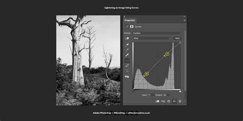
The HSL/Color panel plays a crucial role even when converting images to black and white. When you switch an image's treatment to Black & White in the Basic panel, the HSL/Color panel automatically transforms into the B&W panel. This panel contains sliders for the same eight color ranges, but here, they control the lightness and darkness of each color as it's converted to grayscale. This offers remarkable control over the tonal transitions in your black and white images, allowing you to replicate the effects of traditional color filters used by film photographers. For example, you can lighten reds and yellows to make them appear brighter in grayscale, while darkening blues and purples to create deeper shadows. This digital control provides an unparalleled ability to shape the mood and impact of your monochromatic work.
Examples of Effective HSL Color Control
The versatility of HSL controls means they can be applied in numerous creative scenarios:
- Enhancing Skies: To make a bland sky more dramatic, increase the Saturation and decrease the Luminance of the cyan, blue, and purple tones.
- Correcting "Neon" Grass: If grass appears unnaturally vibrant or has a "neon" look, try reducing its Saturation and Luminance, and perhaps subtly shifting its Hue towards yellow to achieve a more natural appearance.
- Reviving Dead Grass: To add a hint of life back into dry or "dead" looking grass, a slight adjustment to the Hue of the yellow tones, pushing them towards green, can be effective.
- Deepening Sunsets: To intensify the richness of sunset colors, increase the Saturation and potentially decrease the Luminance of the red and orange tones.
- Reducing Distracting Colors: If a particular color in the background is drawing too much attention, lower its Saturation and possibly its Luminance to make it recede and allow the main subject to stand out.
- Subtle Color Balance: A minor decrease in the Saturation of greens can often bring the color of grass back to a more realistic tone, especially if it appears overly saturated due to lighting conditions or camera settings.
The HSL/Color tools within Lightroom Classic are a testament to the power of precise control in digital photography. By understanding and effectively utilizing Hue, Saturation, and Luminance adjustments, photographers gain the ability to sculpt the color palette of their images with remarkable accuracy, leading to more compelling and artistically refined results. The introduction of the Color Mixer and Point Color tools further refines this control, making sophisticated color grading more accessible and intuitive than ever before.