Photoshop offers a robust set of tools for color selection, with the Color Picker being a central hub for defining and applying hues. Understanding its intricacies is fundamental for any Photoshop user, from beginners to seasoned professionals. This guide will delve into the various facets of the Color Picker, its relationship with other color tools, and how to leverage its full potential for your creative projects.
The Core of Color Selection: The Color Picker Interface
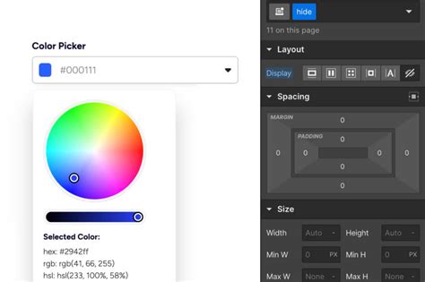
The Color Picker in Photoshop is a dialog box that provides a comprehensive interface for selecting colors. At its heart is a large color field where you can visually choose a specific hue, saturation, and brightness. This field is typically accompanied by sliders or input fields for numerical color values, allowing for precise color definition.
The Color Picker is most commonly accessed by clicking on either the foreground or background color squares located in the Tools Panel, usually found on the left side of the Photoshop interface. When you double-click on these color squares, the Color Picker dialog box will appear, ready for your input. This accessibility ensures that color selection is always just a click away, regardless of your current task.
Understanding Color Models: RGB, CMYK, HSB, and LAB
Photoshop's Color Picker supports several color models, each offering a different way to define and understand color.
- RGB (Red, Green, Blue): This is the additive color model used for digital displays like monitors and screens. Colors are created by combining different intensities of red, green, and blue light. In Photoshop, RGB values range from 0 (no intensity) to 255 (maximum intensity). White is represented as (255, 255, 255), and black as (0, 0, 0). This model results in vibrant, colorful images but also larger file sizes.
- CMYK (Cyan, Magenta, Yellow, and Key/Black): This is the subtractive color model used in printing. Colors are created by subtracting light from a white surface using inks. In CMYK, 0,0,0,0 represents white (no ink on white paper), while higher values represent darker colors. For practical purposes, Photoshop and your printer often handle the RGB to CMYK conversion automatically when sending images for printing. However, for precise control, direct CMYK value input is available.
- HSB (Hue, Saturation, Brightness): This model is more intuitive for visual color selection.
- Hue: Represents the pure color itself (e.g., red, blue, green) and is typically represented as an angle on a color wheel, from 0 to 360 degrees.
- Saturation: Refers to the intensity or purity of the color, ranging from 0% (grayscale) to 100% (fully saturated).
- Brightness: Indicates how light or dark the color is, ranging from 0% (black) to 100% (white).The Color Picker's large color field is particularly well-suited for visually adjusting saturation and brightness once a hue has been selected.
- LAB Color (L*a*b* or CIELAB): This is a sophisticated color space that is device-independent.
- L (Luminance): Represents the lightness or darkness of a color, ranging from 0 (black) to 100 (white).
- A: Represents the color channel from green to magenta.
- B: Represents the color channel from blue to yellow.A value of 0 in the A or B channels signifies a neutral gray. While working in LAB can be more complex than RGB, it offers powerful capabilities for color manipulation and is highly recommended for those serious about color quality.
The Color Picker allows you to view and input values for all these color models simultaneously, providing a comprehensive understanding of the selected color.
Leveraging the Eyedropper Tool for Precision
The Eyedropper Tool, typically found in the Tools Panel (often marked with the letter 'A'), is indispensable for selecting colors directly from an image. When activated, the cursor transforms into an eyedropper. Clicking on any pixel within your document will sample that color and set it as the foreground color.

A crucial aspect of the Eyedropper Tool's default behavior is that it usually changes the background color. However, this can be temporarily altered by holding down the Option key (on Mac) or Alt key (on Windows) while using the Eyedropper. This modifier key allows you to sample a color and have it set as the foreground color instead. This flexibility is invaluable for quickly matching colors or gathering reference hues.
You can also use the Eyedropper Tool to select colors from the Swatches palette, providing a convenient way to apply predefined colors.
The Foreground and Background Color Swatches
The Foreground and Background color squares in the Tools Panel are more than just indicators; they are interactive elements that directly influence your painting and editing tools.
- Foreground Color: This is the color you will paint with when using tools like the Brush, Paint Bucket, or Type Tool.
- Background Color: This color is used by tools like the Eraser Tool and is also the second color in gradients.
The default colors are black for the foreground and white for the background. You can easily restore these defaults by clicking on the mini-overlapping squares icon, which typically appears near the foreground and background color swatches.
Clicking on either the foreground or background color square will open the Color Picker, allowing you to select a new color. This direct access makes color management a fluid part of your workflow.
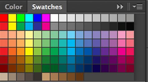
The Swatches Palette: Organizing Your Colors
The Swatches palette is a dedicated panel that allows you to store, organize, and quickly access frequently used colors. You can add colors to the Swatches palette from the Color Picker by clicking the "Add to Swatches" button or by clicking the "New Swatch" button in the Swatches panel itself.
You can also load pre-defined swatch libraries or create your own custom libraries for easy reuse across different projects. This is particularly useful for maintaining brand consistency or for specific artistic styles. Swatch libraries can be saved as files for exchange with other users or for backup.
The Info Palette: Real-time Color Data
For those who need precise color information, the Info Palette is an essential tool. When the Eyedropper tool is active and you hover over an image, the Info Palette provides a real-time readout of the RGB and CMYK values of the pixel directly under the cursor. It also displays the X and Y coordinates of that pixel, indicating its position within the image relative to the top-left corner. This detailed information is invaluable for color matching, analysis, and understanding how colors are represented digitally and in print.
Color Modes and Image Types
Photoshop, and similar image editing software, utilize different color modes that determine how color information is stored and interpreted within an image.
- Bitmap Mode: An image in this mode consists of only two colors: black and white. It's a 1-bit image, meaning each pixel is represented by a single bit of data. This mode is useful for line art or high-contrast graphics and results in very small file sizes.
- Grayscale Mode: This mode uses up to 256 shades of gray, ranging from pure black to pure white. It's an 8-bit image, where each pixel has a brightness value from 0 (black) to 255 (white). Grayscale is ideal for black and white photography.
- Indexed Color Mode: This mode restricts the number of colors in an image to a maximum of 256. Photoshop creates a color lookup table (CLUT) for the image. If a color in the original image is not among the 256 available, it's converted to its closest match. This mode significantly reduces file size but limits editing capabilities. It's often recommended to temporarily convert to RGB for editing in this mode.
- RGB Mode: As discussed earlier, this is the standard for digital displays, offering a wide spectrum of colors and detailed images, albeit with larger file sizes.
- CMYK Mode: The standard for professional printing, ensuring accurate color reproduction on physical media.
Understanding these modes is crucial for managing file sizes, ensuring compatibility with different output devices, and achieving the desired visual results.
Color Management and Gamuts
The concept of a gamut refers to the range of colors that a particular device, such as a monitor, camera, or printer, can display or reproduce. Because each device has a slightly different gamut, colors can shift when an image is moved from one device to another.
Color management is the process of translating colors between these different devices to ensure consistency. By "profiling" your devices (or using manufacturer-provided ICC profiles), you create a reference for how each device handles color. Embedding these profiles with your images makes the color information portable, allowing Photoshop and other applications to interpret and display colors more accurately across your workflow. The Color Settings menu (Edit > Color Settings) is where you manage these critical color management policies.
Advanced Color Selection Techniques
While the basic Color Picker is powerful, Photoshop offers advanced features:
- Web-Safe Colors: When selecting colors, there's an option to limit your choices to "web-safe" colors. These are a subset of 216 colors that were historically guaranteed to display consistently across different web browsers and operating systems. While less critical today with more standardized displays, it can still be useful for certain web design contexts.
- Color Dynamics: In tools like the Brush Tool, you can access "Color Dynamics" within the Brush Settings panel. This allows for more sophisticated color application, such as varying the hue, saturation, or brightness of your brush strokes based on factors like pen pressure or tilt.
- Selective Color Adjustment: For targeted color manipulation, Photoshop's Selective Color adjustment (Image > Adjustments > Selective Color) allows you to modify the amount of CMY and black inks within specific color ranges (cyans, magentas, yellows, reds, etc.). This is a powerful tool for fine-tuning color balance and achieving specific looks.
The Importance of Color Theory and Further Learning
While Photoshop provides the tools, a solid understanding of color theory is essential for making informed color choices. Concepts like color harmonies, contrast, and the psychological impact of colors can elevate your work significantly.
For those who wish to go deeper into the art and science of color in Photoshop, several resources are highly recommended:
- Books by Dan Margulis: Widely considered an authority on color in Photoshop, his books, such as "Photoshop LAB Color," are considered essential reading for mastering advanced color techniques.
- Books by Scott Kelby: Known for his accessible and practical approach, Scott Kelby's books often cover color correction and enhancement in a way that is easy for users of all levels to grasp.
- John Paul Caponigro's work: A master photographer and Photoshop artist, Caponigro's expertise in color artistry offers insights into transforming photographs into works of art through sophisticated color adjustments.
By mastering the Color Picker and understanding the underlying principles of color, you unlock a new level of control and creativity within Photoshop, enabling you to bring your vision to life with accurately chosen and beautifully rendered colors.