Adjusting the spacing and overall appearance of text is a fundamental aspect of professional document design in Adobe InDesign. This guide delves into the intricacies of controlling line spacing, paragraph spacing, and related formatting features, empowering users to achieve precise typographic control and enhance the readability of their layouts. Whether you are a beginner grappling with basic settings or an experienced designer seeking advanced techniques, understanding these tools is crucial for producing polished and effective documents.
Understanding Leading and Line Spacing
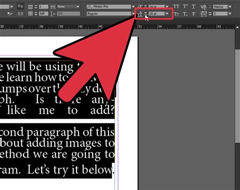
Leading, in typographic terms, refers to the vertical space between lines of text. In InDesign, this is commonly adjusted within the Paragraph panel or the Control panel. The primary setting for this is the "Leading" value. While often perceived as a paragraph-wide setting, it's important to recognize that leading in InDesign is not strictly a paragraph-wide setting. You can have, for example, a run of characters that you can set to a different leading if you like, or possibly change without intending to. This granular control allows for very specific typographic adjustments, but it can also lead to unexpected results if not managed carefully.
The Impact of Local Overrides
A common point of confusion for InDesign users is the appearance of a plus sign (+) next to a paragraph style. This symbol indicates that a "local override" has been applied. This means that some aspect of the type, which is under the control of the paragraph style, has been changed directly on a bit of text. In the context of line spacing, this is often the leading. When a local override is present, the text will reflect the manual change, but the paragraph style itself remains unchanged.
The plus sign will only show up if you have selected the text that has been locally changed. For instance, if you change the leading for a word in the middle of a paragraph, but have only clicked the cursor into the paragraph where nothing has been changed, you won't see the plus sign. To effectively manage these overrides, it's best practice to select the text exhibiting the override and then use the "Clear Overrides" function. This can be found in the fly-out menu of the Paragraph Style window. A useful shortcut for clearing overrides is to hold down the Option (Mac) or Alt (Windows) key and click on the name of the style in the style window.
Controlling Space Between Paragraphs
Beyond the spacing within a paragraph, controlling the space between paragraphs is equally vital for visual hierarchy and readability. InDesign offers two primary methods for achieving this:
Space After
The most straightforward method is using the "Space After" setting within the Paragraph panel. This value adds a consistent amount of vertical space below each paragraph. When applying paragraph styles, this is a fundamental setting to define.
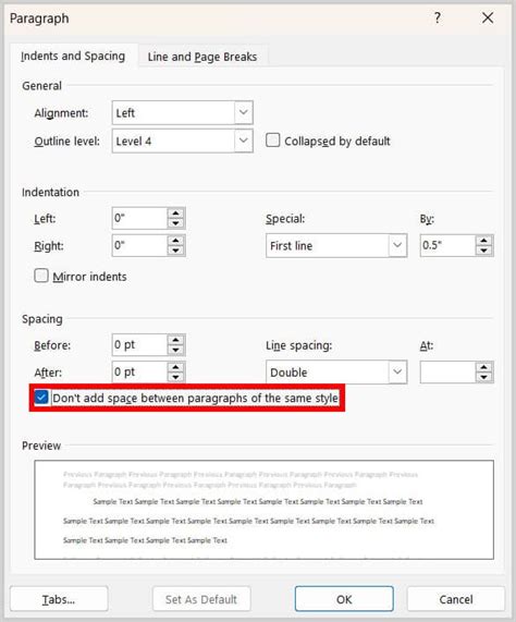
Space Between Paragraphs Having Same Style
A more nuanced control is the "Space Between Paragraphs Having Same Style" option. This setting is specifically used when two consecutive paragraphs share the identical paragraph style. In such cases, the defined "Space After" value for that style might be overridden by this specific setting, allowing for finer control over the visual separation of identical text blocks. This is particularly useful in long documents where consistent spacing is paramount, but slight variations might be desired in specific contexts.
Advanced Paragraph Formatting Techniques
InDesign provides a rich array of tools for advanced paragraph formatting that go beyond simple spacing adjustments. These features allow for sophisticated typographic control and can dramatically impact the overall design of a document.
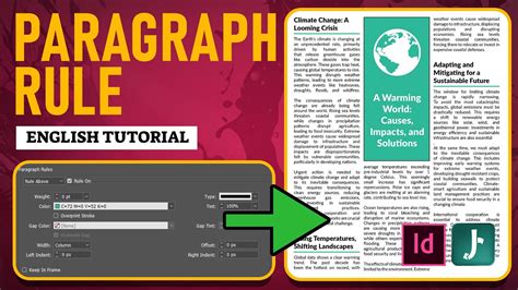
Paragraph Rules: Adding Lines Above and Below Text
Paragraph Rules enable you to draw lines directly above or below paragraphs, offering a powerful way to visually separate content or create stylistic elements.
- Rule Above Paragraph (A) and Rule Below Paragraph: These options allow you to add a rule either above or below the selected paragraph.
- Rule Settings: Within the Paragraph Rules dialog box, you can define various attributes of the rule:
- Color: Choose from the swatches available in the Swatches panel.
- Tint: Specify a tint value or use a percentage of the chosen color. The color of the rule is based on the color you specified.
- Width: This determines the thickness of the rule.
- Offset: This controls the distance of the rule from the text. For a "Rule Above," the offset is from the baseline of the first line of text to the bottom of the rule. For a "Rule Below," it relates to the space between the text and the rule.
- Length: The width of the rule is determined by the column width, extending from the left edge of the column to the right edge of the column, unless otherwise specified.
- Dashes, Dots, or Lines: You can choose the style of the rule, including solid lines, dashed lines, or dotted lines, and control the spacing between these elements.
- Projecting Cap: This feature, when applied to a rule, creates squared ends that extend half the stroke width beyond the endpoints, offering a distinct visual effect.
Keep Options: Preventing Unwanted Line Breaks
The "Keep Options" feature in InDesign is crucial for maintaining the integrity of your paragraphs and preventing awkward breaks that can disrupt the flow of text. These settings address common issues like "widows" (the last line of a paragraph appearing alone at the top of a page or column) and "orphans" (the first line of a paragraph appearing alone at the bottom of a page or column).
- Keep with Next: This option ensures that the current paragraph stays with the paragraph that follows it. This is invaluable for headings, captions, or any text that should remain visually connected to the subsequent content.
- All Lines in Paragraph: This setting prevents the paragraph from breaking across columns or pages, keeping the entire paragraph together.
- Keep Lines Together: You can specify a number of lines that should remain together at the bottom of a paragraph, ensuring that a certain amount of text from the current paragraph remains with it.
- Start Paragraph: This allows you to control where a paragraph begins. You can specify that it should start at the top of a column, page, or section, offering precise control over page breaks and layout.
- Keep In Frame: When applied to text within a text frame, this option ensures that the paragraph does not become separated from the other lines in the paragraph.
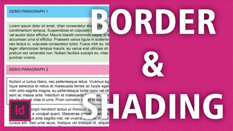
Paragraph Borders and Shading
InDesign allows you to add borders and shading to paragraphs, further enhancing their visual distinction and importance within a layout.
Paragraph Borders: You can create a border around one or more paragraphs. When defining a border, you can specify:
- Width: The thickness of the border line.
- Color and Tint: Similar to paragraph rules, you can select colors and tints for the border.
- Corner Options: You can define the shape and size of the corners, allowing for rounded or other custom corner styles.
- Offset: This controls the distance between the text and the border. The "Chain button" ensures that all offset values remain consistent.
Paragraph Shading: You can also apply a background shade to a paragraph.
- Shade Options: Similar to borders, you can specify the color, tint, and offset of the shading. The shade expands and collapses automatically as the content within the paragraph changes.
- Corner Options: You can also adjust the corner styles for the shading.
- Offset: This determines the distance between the text and the edge of the shade. The "Chain button" ensures that all offset values remain the same. The shade extends over the text in the text frame.
Leveraging Styles for Efficient Workflow
While manual formatting and overrides can achieve specific results, the most efficient and professional way to manage line spacing and paragraph formatting in InDesign is through the use of Paragraph Styles.
The Power of Styles
Styles are pre-defined sets of formatting attributes that can be applied to text with a single click. This not only ensures consistency throughout a document but also makes global changes incredibly easy.
- Creating and Applying Styles: You typically create a "BodyText" paragraph style for the main content of your document. All other styles, such as headings, subheadings, captions, and pull quotes, can then be based on this master style.
- Global Changes: If you need to adjust the leading, space after, or any other attribute for your body text, you only need to modify the definition of the "BodyText" style. All paragraphs assigned that style will automatically update, saving immense amounts of time and preventing inconsistencies.
- Nested Styles: InDesign also supports nested styles, where a specific character style is automatically applied when a defined pattern or character sequence is encountered within a paragraph. This is useful for automatically formatting the first few words of a paragraph or specific elements within the text.
Finding and Changing Formatting with Styles
For situations where manual overrides have already been applied, or you need to adjust existing formatting without necessarily creating new styles, InDesign's "Find and Change" feature, when used with formatting criteria, is a powerful tool.
- Accessing Find/Change: Open the "Find and Change" dialog box.
- Specify Format to Find: In the "Find Format" section, click the magnifying glass icon with the letter "T" to open the formatting options. Navigate to "Indents and Spacing" and set the "Space After" value to match the current spacing you want to change (e.g., 12 pt).
- Specify Format to Change: In the "Change Format" section, use the same icon to access formatting options. Set the "Space After" measurement to your desired new value (e.g., 6 pt).
- Set Search Scope: Ensure your "Search" setting is correctly configured (e.g., entire document, current story).
- Execute Change: Click "Change All."
This process will locate all paragraphs with the specified "Space After" of 12 points and change it to 6 points. However, it is strongly recommended to transition to using styles whenever possible, as this approach offers superior control and maintainability for complex documents.
Compositing and Fine-Tuning Text
InDesign offers two primary text composition engines: the Adobe Paragraph Composer and the Adobe Single-line Composer.
- Adobe Paragraph Composer: This is the default setting and is generally recommended. It analyzes the entire paragraph to achieve the most visually pleasing and balanced line breaks, considering factors like hyphenation and justification across multiple lines.
- Adobe Single-line Composer: This engine focuses on composing only the single line where the cursor is located. It provides more granular control for adjusting specific lines but can lead to less aesthetically pleasing results for the overall paragraph if used extensively without careful consideration.
You can switch between these composers in the Paragraph panel menu or the Control panel menu. When a paragraph isnât composed as desired, switching to the Single-line Composer and adjusting selected lines individually can be a useful technique.
Ensuring Text Integrity with Layout Features
Beyond line and paragraph spacing, InDesign provides features to ensure text remains cohesive and aesthetically pleasing on the page.
Text Frame and Layout Considerations
- Text Frame: The boundaries of the text frame directly influence how text flows and wraps.
- Column Width: The width of columns is a significant factor in line length and readability, impacting leading and hyphenation.
- Rule Above/Below: As discussed earlier, paragraph rules can be used to visually segment text and improve layout structure. The thickness (width) of the rule and its position relative to the text are key design decisions.
Preventing Text Separation
- Widows and Orphans: These are lines of text that become separated from the rest of their paragraph. InDesign's "Keep Options" are designed to mitigate these issues.
- Keeping Lines Together: Settings within "Keep Options" can prevent a single line from appearing at the top or bottom of a column or page.
- Keeping Paragraphs Together: The "All Lines In Paragraph" option ensures that an entire paragraph remains intact, preventing it from breaking across columns or pages.
- Keep with Next: This ensures that a paragraph, such as a heading, stays with the subsequent paragraph, preventing it from being stranded at the bottom of a page.
- Push to Next Column/Frame/Page: This advanced option can force a paragraph to move to the next available space, ensuring it doesn't break awkwardly.
Alignment and Baseline Grids
- Baseline Grid: Aligning text to a baseline grid ensures that the baselines of text in adjacent columns or frames appear perfectly aligned, creating a strong horizontal rhythm across the page. This is particularly important for multi-column layouts and complex designs where visual harmony is paramount. Misaligned baselines can make a page appear messy and unprofessional.
- Paragraph Borders and Shading: These features can be used to highlight specific blocks of text, drawing attention to important information or creating visual breaks within the content. The size and shape of corners, as well as the width of the border or shade, are customizable to match the overall design aesthetic.
Mastering these features of line spacing, paragraph formatting, and text layout in Adobe InDesign is an ongoing process. By understanding the interplay between leading, paragraph spacing, rules, keep options, and the power of styles, designers can create documents that are not only visually appealing but also highly readable and effectively communicate their intended message. The ability to fine-tune every aspect of text presentation, from the microscopic spacing between lines to the overall flow of content across pages, is what distinguishes professional typographic design.