When embarking on the journey of digital illustration, many artists begin by laying down distinct blocks of color. The subsequent challenge lies in seamlessly transitioning these colors, transforming a stark division into a harmonious blend. While the creation of a polished final image, such as the one on the right, involves more than just color blending, this tutorial will meticulously explore the diverse techniques available within Krita to achieve these smooth transitions. Krita, a powerful and free open-source painting program, offers a rich array of tools and brush presets that cater to a wide spectrum of artistic styles and desired effects.
The core objective here is to understand how to make two distinct colors appear connected, rather than sharply defined. To illustrate these methods efficiently, we will consistently apply them to a simple rectangle featuring magenta on the left and light blue on the right, focusing on how to blend them in the middle. It is crucial to remember that each blending technique possesses unique characteristics that may or may not align with your personal illustration style. Therefore, experimentation and understanding the nuances of each method are key to unlocking Krita's full potential.
The Gradient Tool: For Perfect Transitions
The most straightforward method for achieving a perfect color transition, especially for straight or perfectly circular gradients, is by utilizing Krita's "Gradient tool." This tool is accessible by pressing the letter 'G' on your keyboard or by selecting it from the toolbox.
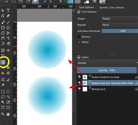
Before applying the gradient, ensure your foreground color is set to your starting color (in our example, magenta) and your background color is set to your ending color (light blue). Crucially, within the Gradient tool's options, select the "Foreground to Background" gradient preset. For all subsequent brush-based techniques, it's also advisable to activate the "Preserve Alpha" button. This ensures that your blending actions remain confined within the existing boundaries of your artwork, preventing unintended smudging outside your intended area. Once these settings are in place, a simple click-and-drag motion from left to right, while holding the Shift key to maintain a straight line, will produce a smooth, linear gradient between the two colors. This method is ideal when a precise, mathematical transition is desired.
Blender Blur Brush Preset: Effortless Smoothing
For artists seeking an easy way to achieve smooth color transitions, the "Blender blur" brush preset is an excellent choice. This preset is found within Krita's brush library and is designed specifically for softening edges and merging colors.
To employ this technique, first, activate the "Freehand brush tool." The effectiveness of the "Blender blur" is directly related to its size. Adjust the brush size to match the area you wish to smooth. You can increase the brush size by holding down the Shift key and then clicking and dragging the mouse to the right. Once the appropriate size is selected, simply make strokes across the border area where the magenta and light blue meet. The "Blender blur" will then intelligently mix the pixels, creating a soft, seamless blend. This is arguably the most intuitive and quickest method for achieving a smooth, almost airbrushed effect.
Textured Blender Blur: Naturalistic Blending
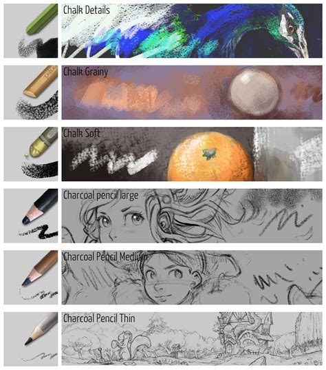
Building upon the concept of blending, Krita offers brush presets that introduce texture to the smoothing process. The "Blender texture soft" preset, often identifiable by a small water drop icon on its thumbnail-similar to the basic "Blender blur"-provides a more organic blending experience.
The key characteristic of these "blender" presets is their ability to work with existing canvas colors. When you apply a stroke with the "Blender texture soft" brush, Krita analyzes the colors beneath your brush tip. If you press firmly with your stylus and drag from the magenta towards the blue, the brush will primarily push the magenta pixels, effectively covering the blue. Conversely, dragging from blue to magenta will predominantly move blue pixels. The magic happens when you reduce the pen pressure. By applying lighter strokes, the brush will begin to mix the existing colors, creating new transitional hues in the middle. This results in a more random and less uniform color transition compared to the "Blender blur" or gradient tools, making it highly suitable for achieving natural brushstroke effects and organic textures.
Airbrush Preset: Simulating Soft Transitions
The "Airbrush" preset is a staple in many digital art toolkits, and Krita's implementation is no exception. This preset features a circular brush tip that is opaque at its center and gradually becomes transparent towards its edges.
This characteristic makes it exceptionally useful for simulating smooth color transitions, akin to what can be achieved with the "Gradient tool" or "Blender blur" brush presets. While some artists may find overly smooth transitions less desirable for certain styles, the "Airbrush" offers a clean and predictable way to blend colors. Its ease of use and predictable output make it a favored tool for artists who appreciate subtle gradients and soft atmospheric effects. By varying the pressure and brush size, artists can control the spread and intensity of the blend, creating a soft diffusion of color.
Brush Opacity - Basic: The Power of Layered Strokes
A technique favored by many artists involves manually creating color transitions through multiple brush strokes with reduced opacity. This method requires a brush preset whose opacity is dynamically controlled by pen pressure.
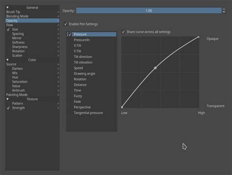
To implement this, select a brush preset that responds to pressure (many basic round brushes will suffice). The core principle is to apply numerous light strokes, gradually building up the color blend. This approach, while more time-consuming and demanding of artistic control, allows for highly randomized and varied color transitions. Each stroke adds a layer of color, and by carefully observing the buildup, artists can achieve nuanced blends that feel less artificial than those created by automated tools. The subtle layering allows for a rich depth of color and a more organic feel.
Brush Opacity - Glazing: Painterly Transitions
Similar to the "Brush opacity - basic" technique, "Brush opacity - glazing" also relies on building up color through multiple strokes with low opacity. However, the key difference lies in the brush tip's behavior. Instead of a generic circular tip, this method utilizes brush presets with characteristics closer to real-world brushes, such as the "bristles 4 glaze" preset.
The principle remains the same: apply strokes with light pen pressure, gradually layering color. To refine the blend, artists can sample the emergent transitional color in the middle by holding down the 'Ctrl' key and clicking on the desired area. This sampled color can then be used to further refine the blend by applying more light strokes. This technique yields an even more "painterly style" color transition, often preferred by artists who aim for a traditional art feel in their digital work. Despite the increased time investment, the resulting depth and texture can be significantly more rewarding than simpler blending methods.
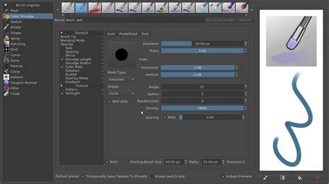
Hard Brush + 50% Color Sampler: Precise Mixing
For artists who prefer the crispness of a "hard brush," a tool with 100% opacity regardless of pressure, Krita offers a clever workaround for blending. A standard hard brush, like "Basic 5 Size," doesn't inherently blend colors by varying opacity.
The solution lies in the "Color Sampler" tool. By default, the "Blend" value in the Color Sampler is set to 100%, meaning sampled colors completely replace the active color. However, by changing this "Blend" value to 50%, the sampled color will be mixed 50% with the currently active color. For instance, if magenta is active and you sample blue with the Color Sampler set to 50% blend, the new active color will be a 50/50 mix of magenta and blue, resulting in purple. This mixed color can then be applied with the hard brush to the transitional area.
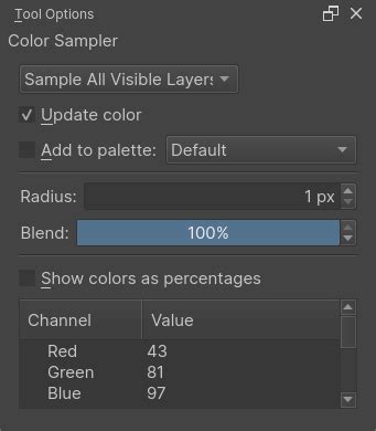
It's important to note that the Color Sampler's blend setting affects how colors are picked even when using the brush tool with the 'Ctrl' modifier. Holding 'Ctrl' and clicking samples a color, and with a 50% blend, this sampled color will be mixed with the current foreground color. To revert to picking original colors without mixing, the "Blend" setting should be returned to 100%. An efficient workflow for picking original colors without constantly adjusting the Color Sampler is to hold 'Ctrl', click, and then drag the mouse cursor around the canvas. This allows for dynamic color sampling at the desired blend percentage. This hard brush technique, while requiring a specific workflow, offers a unique, precise style of color transition.
Splatter Brush - Wall Texture: Organic Spatter Effects
Krita's "splatter brush" presets are designed to mimic the effect of randomly dispersed particles, offering unique textural blending possibilities. The "Texture big" preset is a prime example, often indicated by a small chess pattern icon on its thumbnail.
Similar to the "Brush opacity" techniques, these splatter brushes utilize pen pressure to control opacity. Therefore, when applying them, use light pen pressure to achieve a blended effect rather than a solid application of color. The resulting transition can resemble the appearance of smoke, dirt, or other particulate matter adhering to a surface, providing a gritty and organic feel to the blend.
Splatter Brush - Water Color: Textured, Flowing Blends
Expanding on the splatter concept, the "Water C special splats" brush preset offers a different textural quality to the color blend. This technique is fundamentally similar to the previous "splatter brush" and "brush opacity" methods, relying on light pen pressure for blending.
The "Water C special splats" preset, however, produces a color transition that evokes the look of a rusty metal surface or a watercolor wash. Krita boasts a wide variety of such splatter and textured brushes, encouraging artists to explore and discover presets that best suit their individual artistic vision. The variety allows for a broad range of effects, from subtle atmospheric diffusion to more pronounced textural transitions.
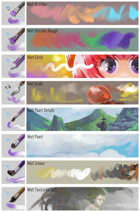
Wet Brush - Basic: Active Color Mixing
The "wet brush" presets in Krita are characterized by their ability to mix colors with existing canvas colors while also applying the active foreground color. These brushes are often visually identified by a purplish hue on their thumbnail and a water drop icon, similar to the blender brush presets.
A crucial distinction exists between "wet brush" and "blender blur" presets. While "blender blur" brushes solely mix existing colors without introducing new ones, "wet brush" presets actively blend the active foreground color with the underlying canvas colors. This means that even if you use a "wet brush" with a light touch, it will still deposit some of the active foreground color while simultaneously smudging and mixing it with the existing colors. This characteristic results in unique stroke qualities and a more dynamic blending process, where the active color plays a direct role in the transition.
Wet Brush - Textured: Hand-Painted Blends
The "wet brush" category also includes presets with more naturalistic brush tips, simulating the behavior of real-world brushes. Applying these textured "wet brush" presets follows the same principle as their basic counterparts: use light pen pressure to achieve a blend rather than an overwrite.
When used with minimal pressure, these brushes create a color transition that has a distinctly hand-painted appearance. The texture of the brush tip interacts with the underlying colors, resulting in nuanced and visually rich blends. If the pen pressure is too high, the brush will behave more like a standard brush, simply overwriting the previous color. The subtle interplay between the brush tip's texture and the blending action makes this technique ideal for achieving a more traditional, painterly aesthetic in digital art.
Pattern Brush - Halftone: Manga Shading and Unique Textures
The final technique in our exploration utilizes Krita's "pattern brush" presets. These brushes apply a repeating pattern to the canvas, and their behavior can be modulated by pen pressure. The "Halftone" or "Screentone" brush preset is a common example, often marked with a dots pattern icon on its thumbnail.
Unlike splatter brushes that use texture images, pattern brushes employ Krita's "Pattern" feature. Within the brush editor, under the "Pattern" parameters, artists can select from a variety of built-in patterns or even create their own. When applying a pattern brush, increasing pen pressure causes the pattern area to expand, while decreasing pressure makes it shrink. The scale of the pattern can be adjusted by modifying the "Pattern scale" value in the brush's properties. This technique is particularly useful for creating manga-style shading effects or for adding a unique, stylized texture to color transitions. Experimenting with different built-in patterns can lead to a wide array of creative applications.
How to blend or mix colors in Krita | 12 different methods
By exploring these twelve distinct color-blending techniques in Krita, artists gain a powerful toolkit for achieving a vast range of visual effects. From the precise gradients of the Gradient tool to the organic smudges of the wet brushes and the patterned applications of the pattern brushes, each method offers a unique pathway to seamless color transitions. Understanding the characteristics of each brush and tool, and practicing with them, will empower artists to elevate their digital illustrations with sophisticated and visually appealing color harmony.