Procreate offers a dynamic and intuitive environment for digital artists, and at the heart of its creative power lies its robust color manipulation capabilities. While the default setting for content on a layer is opaque, obscuring what lies beneath, Procreate provides a multitude of ways for objects and colors on different layers to interact and blend. Understanding these features is crucial for achieving sophisticated visual effects, refining artwork, and efficiently creating diverse color palettes for your creations. This exploration delves into the various methods for altering and enhancing color within Procreate, from fundamental layer adjustments to advanced blend modes and specialized tools.
Understanding Layer Opacity and Transparency
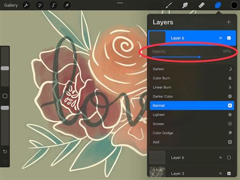
Every layer in Procreate has an associated opacity setting, which dictates how transparent or opaque its contents appear. By default, content on a layer is opaque and covers up the contents of layers underneath it. To adjust opacity, you can move a slider, typically found within the layer properties. Moving this slider to the left makes your layer more transparent, allowing the underlying layers to show through. This adjustment affects the entire layer, regardless of any current selections.
For a more streamlined approach, Procreate offers a two-finger tap shortcut on a layer to adjust its opacity. This action reveals a narrow blue bar at the top of the canvas. By sliding your finger left or right on the canvas itself, you can dynamically alter the layer's transparency. This quick method is invaluable for fine-tuning the interplay between different visual elements.
The Power of Blend Modes: How Layers Interact
The way objects and colors on two layers interact and blend is governed by Blend Modes. On the right-hand side of each layer in the Procreate interface, you'll notice one or more letters. Tapping these letters opens the Blend Modes menu, presenting a scrolling list of options. In the default 'Normal' mode, full opacity means solid objects on your layer completely block objects on the layer below. However, exploring other blend modes unlocks a vast spectrum of creative possibilities.
Darkening Blend Modes
Several blend modes are designed to darken the underlying layers, creating depth and intensity.
- Multiply: This mode multiplies the luminosity of the base color by the blend color. The result is an overall darker and more intense effect. Multiply produces different levels of darkening depending on the luminosity of the blend layer. This mode is excellent for creating shadows or deepening colors.
- Shade (formerly Darken): Since Procreate 5.4, older projects using 'Darken' have been switched to the introduced 'Shade' mode. This mode does not blend pixels but compares the base and blend colors and keeps the darker of the two. This is useful for unifying colors or darkening specific areas without affecting lighter tones.
- Color Burn: This mode is designed to mimic the use of the burn tool in traditional photography, used to darken images. It increases the contrast between the base and blend colors, resulting in higher mid-tone saturation and reduced highlights. It's effective for adding a vintage or dramatic feel.
- Linear Burn: Linear Burn decreases the brightness of the base color based on the value of the blend color. This gives a result that is darker than Multiply but less saturated than Color Burn, offering a more controlled darkening effect.
- Darker Color: This mode functions somewhat like Darken. It compares the base and blend colors and keeps the darker of the two. Unlike Shade, it can sometimes produce slightly different results depending on the specific color values.
Brightening Blend Modes
Conversely, other blend modes are used to lighten and enhance the underlying layers.
- Screen: This mode produces different levels of brightening depending on the luminosity values of the blend layer. It's the inverse of Multiply and is perfect for creating highlights, glows, or simulating light effects.
- Color Dodge: Based on the dodge tool used to brighten images in traditional photography, Color Dodge creates a brighter effect than Screen by decreasing the contrast between base and blend colors. This can lead to vibrant, luminous results.
- Add: Much like Screen or Color Dodge, Add produces an even stronger brightening result. It looks at the color information in each channel and brightens the base color, often resulting in intense, saturated glows.
- Lighter Color: This mode functions like Lighten. It compares the base and blend colors and keeps the brighter of the two. This is useful for overlaying textures or elements without darkening the original image.
Contrast and Combination Blend Modes
A third category of blend modes manipulates contrast and combines the effects of darkening and lightening.
- Overlay: Overlay works like a combination of Multiply and Screen. It both lightens and darkens images by shifting the mid-tones. Dark blend colors shift the mid-tones to darker colors, while light blend colors shift them to lighter colors. This mode is excellent for adding texture or enhancing contrast.
- Soft Light: Soft Light is like a gentler version of Overlay. It applies subtle darkening or lightening effects based on luminance values, creating a softer, more natural blend.
- Hard Light: Hard Light is a combination of Multiply and Screen, but it uses the brightness values of the Blend layer to make its calculations. Results with Hard Light tend to be more intense and punchy, as if a harsh light source is shining on the artwork.
- Vivid Light: Vivid Light is an extreme version of Overlay and Soft Light. Anything darker than 50% gray is darkened, and anything lighter than 50% gray is lightened. This mode produces very strong, high-contrast results.
- Linear Light: Linear Light combines Dodge effects on lighter pixels with Burn effects on darker pixels. It provides a strong but generally cleaner contrast enhancement than Vivid Light.
- Pin Light: An extreme Blend Mode, Pin Light performs Darken and Lighten simultaneously. It replaces pixels based on whether the blend color is lighter or darker than the base color, leading to very distinct and sometimes posterized results.
- Hard Mix: Hard Mix is an extreme Blend Mode that flattens detail. It creates a super-flat, super-saturated result that almost looks posterized. Hard Mix provides a result using only white, black, and any of the six primary colors - red, green, blue, cyan, magenta, or yellow.
Special Blend Modes
Procreate also includes blend modes that operate on color relationships and differences.
- Difference: As the name suggests, Difference uses the difference of the base and blend colors to create the resulting blend. White pixels invert the colors of the base layer, while black pixels produce no change. This mode is useful for aligning layers or creating interesting abstract effects.
- Subtract: Subtract darkens colors in a drastic manner by subtracting brightness. It's a more aggressive darkening than Burn modes and can lead to desaturated, darker results.
- Divide: Divide is the opposite of Subtract. It brightens colors by dividing the base color by the blend color, often resulting in washed-out or blown-out highlights.
- Color: This mode preserves the luminosity of the base layer while adopting the hue and saturation of the blend layer. This makes it ideal for coloring monochromatic images or quickly changing the color scheme of line art.
- Hue: Preserves the luminosity and saturation of the base layer while adopting the hue of the blend layer.
- Saturation: Preserves the luminosity and hue of the base layer while adopting the saturation of the blend layer.
- Luminance: Preserves the hue and saturation of the base layer while adopting the luminosity of the blend layer.
The Recolor Tool: A Direct Approach to Changing Colors
One of Procreate's most powerful, yet sometimes confusing, tools for altering color is the Recolor tool. It has been moved to a slightly more hidden place in recent updates, leading to some confusion for users. This tool is invaluable for illustration work and can dramatically alter your workflow.
Accessing and Using the Recolor Tool
To use the Recolor tool, you first need to access the Quick Menu. The simplest scenario for using Recolor is when you have a flat layer of a single color. Once your Quick Menu is open, you can select the Recolor box by tapping it, which will immediately make it start to work.
How To Use The Recolor Tool In Procreate
It is crucial to ensure you are on the correct layer before invoking the Recolor tool. As soon as you tap to turn it on, you'll see a small crosshair icon in the middle of the screen. Recolor works with the color you currently have selected. If the initial result seems out of control, don't worry.
Navigating Recolor's Behavior
Sometimes, the Recolor tool can produce less-than-pleasing results, such as changing the entire background color or other undesirable outcomes. If you're lucky, the color won't spill, and the element you intended to recolor will be changed. However, if you have texture on the layer you're recoloring, you'll notice that as you move the crosshairs, the color will start changing depending on the area of the object you're moving it to. This behavior is indicated at the bottom of the screen, where you can often see a preview or a color selection.
The key to mastering the Recolor tool lies in understanding its sensitivity to the underlying pixels and your selected color. Experimentation with different colors and layer types is essential to achieve the desired outcome.
Advanced Color Adjustments and Palette Exploration
Beyond blend modes and the Recolor tool, Procreate offers sophisticated adjustment layers and techniques for comprehensive color manipulation and palette creation. This is particularly useful for selling artwork online, as creating pieces in multiple color palettes can appeal to a wider audience.
Duplicating Your Illustration for Safe Exploration
Before embarking on any significant color changes, it is always recommended to duplicate your illustration. This ensures that your original work remains intact, allowing you to experiment freely without the fear of losing your progress. To duplicate an illustration, navigate to the Gallery, tap 'Select,' choose your illustration, and then tap 'Duplicate.' You will then have two identical canvases, one for your original and one for your color exploration.
Manual Color Adjustments: Precision Control
Adjusting color manually involves dropping new colors into different parts of your illustration. This technique offers a high degree of control over exact color adjustments.
- Choose a Color Palette: Start by deciding on a color palette you wish to work with. You might explore different color variations for your motif before settling on one.
- Select Your Layer: Select the layer containing the main motif you want to recolor.
- Set Default Color: Go into your Color Palettes panel, choose your desired palette, and select 'Set Default.'
- Select and Drop Color: Choose the color you want to use from your palette. Without lifting your Apple Pencil from the screen, drag the color onto the area you wish to recolor. This allows you to scrub left and right to change the intensity and amount of coverage.
- Repeat: Continue dropping new colors into your illustration until you achieve the desired result.
This method is excellent for precise color placement and for achieving specific artistic intentions.
Adjusting Color by Layer: Discovering Unique Variations
Adjusting color by layer is a less controlled but often faster and easier technique that allows for the discovery of unique color variations.
- Duplicate and Select Layer: Ensure you have duplicated your original illustration and select the layer you wish to recolor.
- Access Adjustments: Click on the Adjustments menu.
- Choose Hue, Saturation, and Brightness (HSB): Select 'Hue, Saturation, and Brightness,' and then choose 'Layer.' This applies the adjustments to the entire selected layer.
- Hue Scrubber: Adjusting the Hue scrubber is the simplest and fastest way to change the color of your illustration. Scrubbing back and forth allows you to explore all the colors of the rainbow.
- Saturation and Brightness: You can also play with the Saturation scrubber to see how it affects your illustration's vibrancy. While you can use the Brightness scrubber, many artists prefer using 'Curves' for more control over brightness adjustments.
Mastering Brightness with Curves
For more nuanced control over brightness, the 'Curves' adjustment is invaluable. Within Curves, the Gamma setting allows you to manipulate the mid-tones. By dragging the far-right and far-left areas of the spectrum inward slightly, and then pulling the center of the curve up or down, you can adjust brightness without washing out highlights or making the image too dark. This is a powerful tool for fine-tuning the overall mood and contrast of your artwork.
Gradient Maps: A Powerful Tool for Color Transformation
Another powerful color-adjusting tool is the 'Gradient Map.' Once you select a gradient, you can further refine the colors using the previously mentioned tools like Hue, Saturation, Brightness, and Curves. Gradient Maps can dramatically transform the color relationships within an illustration, allowing for bold and unexpected color schemes. For example, an illustration might start with realistic colors but end up with a turquoise body and hot pink accents, offering a unique artistic statement.
Exploring these advanced color adjustment techniques in Procreate empowers artists to move beyond basic color selection and delve into sophisticated color theory and application. Don't be afraid to experiment; this exploration will help you discover new possibilities and create unexpected, beautiful adjustments to your original artwork.