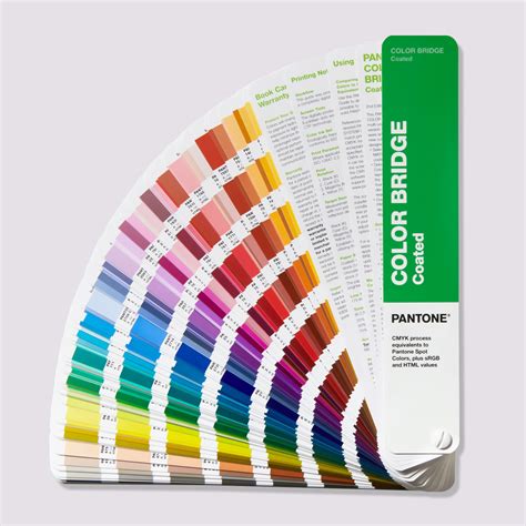
In the dynamic world of visual communication, the seamless translation of a design concept into a tangible printed product is paramount. Designers strive to create vibrant and impactful visuals, but often face the challenge of ensuring those colors are accurately reproduced across various printing technologies. This is where the Pantone CMYK Color Guide emerges as an indispensable tool, offering a bridge between the digital realm of design and the physical reality of print. With its comprehensive palette and calibrated approach, the guide empowers designers to "design with confidence, knowing your colors are achievable on almost any conventional or digital press."
A Universe of CMYK Colors at Your Fingertips
The cornerstone of the Pantone CMYK Color Guide is its extensive collection of colors. The guide contains a "whopping 2,868 CMYK colors," providing a vast spectrum for designers to explore. This sheer volume ensures that a suitable shade or hue can be found for virtually any design requirement, from subtle branding nuances to bold packaging statements. The strategic "chromatically arranged" layout further enhances the user experience, facilitating "more intuitive color browsing and selection." This organized approach allows designers to quickly navigate through the color space, making it easier to identify and compare similar shades, thereby streamlining the creative process.
Navigating Unique Hues and PMS Equivalents
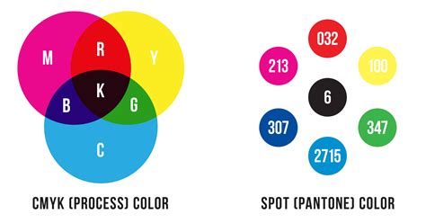
A critical feature of the Pantone CMYK Color Guide is its system for identifying the relationship between CMYK colors and their Pantone Matching System (PMS) spot color counterparts. Colors within the guide are "marked to identify which colors have a PMS Formula Guide equivalent colors." This distinction is crucial for designers who need to understand the fidelity of CMYK reproduction compared to a specific PMS spot color.
For those instances where a precise PMS match is not essential or desired, the guide highlights "colors without an asterisk," which are identified as "unique, meaning they don’t have a close Pantone Matching System (PMS) spot color equivalent." These unique CMYK colors are particularly valuable. They are "ideal for branding, packaging, and materials used in smaller brand campaigns where fresh, less exposed colors are desired." By offering a wealth of colors that deviate from established PMS standards, the guide encourages innovation and allows brands to stand out with distinctive palettes that might not be readily available through traditional spot color systems. The presence of "thousands of unique colors with no PMS equivalent" in each book underscores the guide's commitment to expanding the creative possibilities within CMYK printing.
Precision Through G7 Calibration
In the pursuit of accurate and consistent color reproduction, the Pantone CMYK Color Guide has been updated to meet rigorous industry standards. The "new CMYK Guides are now calibrated to exacting G7 specifications for more accurate, consistently achievable results in real-world printing conditions." The G7 standard is a widely recognized benchmark for color management in the printing industry, focusing on achieving visual consistency across different printing devices and conditions.
The implication of this "G7 calibrated print process" is significant for designers and print professionals alike. It means that "tints will closely match color appearance in your CMYK Guide when proofed or printed using G7 press reference conditions." This calibration ensures a higher degree of predictability, reducing the likelihood of color discrepancies between what is seen on screen or in the guide and what is ultimately printed. This level of accuracy is vital for maintaining brand integrity and ensuring that marketing materials, packaging, and all printed collateral accurately reflect the intended brand colors.
What Is The G7 Gracol Print Standard?
Empowering Collaboration with Pantone Connect
In today's collaborative design environment, effective communication and seamless workflow integration are essential. The Pantone CMYK Color Guide addresses this need through its integration with Pantone Connect. "With Pantone Connect, you can select, save, and share your CMYK color choices with everyone up and down your design workflow." This digital platform transforms the color selection process from a solitary act into a shared experience. Designers can easily curate palettes, store their chosen colors, and share them with colleagues, clients, or print providers. This ensures that everyone involved in the project is working with the same color specifications, minimizing miscommunication and rework. The ability to "select, save, and share" streamlines the entire design-to-print pipeline, fostering greater efficiency and ensuring that the final printed output aligns perfectly with the designer's vision. This connectivity is invaluable for teams working remotely or across different geographical locations, ensuring color consistency regardless of physical proximity. The platform also offers tools for managing color assets, further enhancing the overall design workflow and making the management of color choices more robust and accessible.