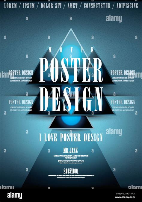
The traditional movie poster continues to play a significant role in the marketing of new releases because the images are shared and circulated by users on social media to a wider audience. If the film is part of an established franchise, fans will log into forums and comment sections to share their excitement. Some movie posters can even become cultural icons. The official poster for Alien is instantly recognisable, Jaws provokes terror, and E.T. is mesmerising. Our poster for a supernatural horror film called The Forevermore, will not be as spectacular as these terrific examples, but this tutorial will take you through some key processes in Photoshop, developing your technical proficiency in Photoshop in our step-by-step tutorial. The focus here is combining elements into a successful media product.
Step One - Creating Your Canvas: The Foundation of the Poster
To begin crafting your movie poster, the first crucial step is to establish the correct document dimensions within Adobe Photoshop. Navigate to the top-left corner of the Photoshop interface and click on “File” in the menu bar, subsequently selecting “New…” from the dropdown menu. Alternatively, a faster method is to utilize the keyboard shortcut Ctrl+N. Both actions will trigger the appearance of the New Document dialog box.
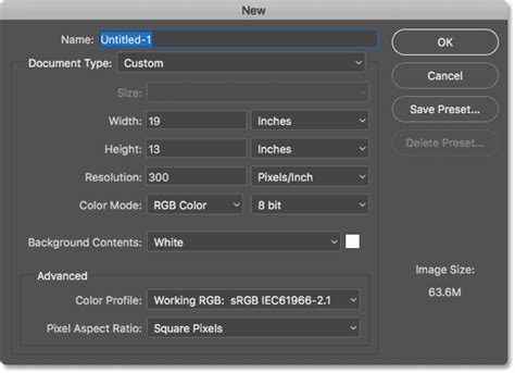
While Photoshop offers numerous presets, for a professional-grade movie poster, it's imperative to define custom values. This ensures your design meets industry standards and will render flawlessly when printed. For instance, the "broadside quad" is a common format in the UK, measuring 30 inches in height and 40 inches in width. For this tutorial, we will maintain a similar aspect ratio but switch the units to centimetres. This adjustment is practical for educational settings where computers might not always handle extremely large file sizes, and such an expansive canvas isn't strictly necessary for learning the core techniques.
Once you have input your desired dimensions, ensure the landscape orientation icon is highlighted in blue. Since this is a print product, setting the resolution to 300dpi is non-negotiable. This high resolution is essential to prevent pixelation and ensure a crisp, clear image once printed. Furthermore, it is critical to select the CMYK color mode. This mode is the standard for the printing industry, guaranteeing that the colours you see on your screen will translate accurately to printed materials. The remaining default settings should suffice for this initial setup. After configuring these parameters, click the “Create” button to generate your blank canvas.
Step Two - The Heart of the Poster: Integrating the Main Image
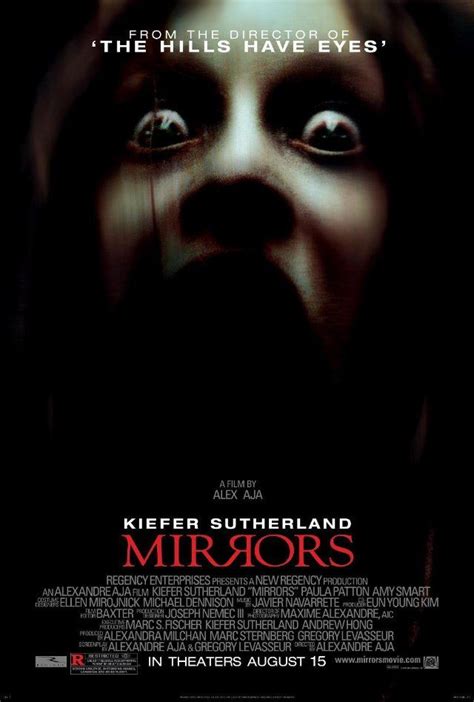
The central image of a movie poster is paramount in conveying the film's genre and tone. For The Forevermore, we are utilizing an evocative image from a Ukrainian photographer. This photograph features a hooded figure, exuding a sense of menace, positioned to threaten a young protagonist. Her expression is one of profound vulnerability, heightened by the haunting facial expression and the shadowy forest setting, which collectively amplify the feeling of dread. The period attire suggests the narrative unfolds a century or two in the past, adding a layer of historical unease.
When searching for an image to use in your own projects, prioritize visuals that possess the power to captivate and perhaps even unsettle your target audience, thereby encouraging them to invest their money at the box office. Distorted faces, menacing monsters, unsettling dolls, and isolated, atmospheric locations are all potent signifiers within the horror genre. Platforms like Unsplash offer a vast repository of high-quality, free-to-use images that can serve this purpose effectively.
There are several methods for importing an image into your Photoshop project. One straightforward approach is to go to “File” in the top menu bar and select “Open…” from the dropdown. This action will launch your computer's file browser, allowing you to locate and select the desired image file. Once selected, the image will typically open in a new tab within Photoshop. To integrate this image into your poster canvas, you need to drag it from its tab over to the canvas area of your main project tab. In the Layers panel, select the layer containing your image. Then, press and hold the left mouse button. As you move your cursor over the tab of your main project at the top of the screen, Photoshop will automatically switch to that canvas, enabling you to drop the image layer precisely where you want it.
Alternatively, for images sourced from the internet, a simple copy and paste operation can be used. However, it is crucial to ensure that the image file is of a substantial size to avoid a blurry or pixelated final product. Once the image is on your canvas, the Move tool (shortcut key V) is your primary instrument for repositioning it. If the image needs resizing or rotating to fit your composition, the Free Transform tool (Ctrl+T) is invaluable.
Step Three - The Title: Typography as a Visual Cue
Typography plays a critical role in establishing the genre and mood of a movie poster. To underscore the supernatural horror theme of The Forevermore, we have selected a font that evokes a sense of unease and mystery: Blood Crow Expanded, available from dafont.com.
To add your title, first activate the Horizontal Type tool from the toolbar. The shortcut for this tool is T on your keyboard. Once the Type tool is selected, a Control panel will appear at the top of your screen, offering various text formatting options. Within this panel, you can locate your chosen spooky typeface from the dropdown menu or by typing its name directly into the font box. For the main title, "Forevermore," we opted for a font size of 76pt and a light grey colour, represented by the hexadecimal value #f1ecec.
Clicking the Text Color picker will open the Color Picker dialog box, where you can select colours using a colour wheel or by directly inputting the hexadecimal value.
The next step involves creating the text layer for your title. Press and hold your left mouse button, then drag your cursor diagonally across the canvas to define the area for your text. Release the mouse button when the box is of an appropriate size for your title. For "Forevermore," we aimed for dimensions of approximately 20cm wide and 4cm high, but you should adjust these based on your specific design needs. After typing "Forevermore," click the tick symbol at the top of the screen to commit the text.
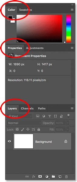
For the word "The," we created a separate text layer. This allows for independent manipulation of its size and spacing. For this smaller word, we reduced the font size to 57pt. Additionally, we adjusted the tracking to 75. Tracking refers to the uniform spacing between all characters in a text layer. Increasing the tracking value spreads the letters further apart, which can be effective in creating a more deliberate and stylized look. To adjust the tracking in your own document, navigate to “Window” in the main menu at the top of the screen and select “Character.” The Character panel will then appear within your tab group. You can input the desired tracking value, such as 75, into the VA field or select it from the dropdown menu.
Step Four - Mastering Organization: The Tidy Layers Panel
In the creation of any media product, especially a movie poster that can involve numerous visual and textual elements, maintaining an organized Layers panel is crucial for efficient workflow and easy future edits.
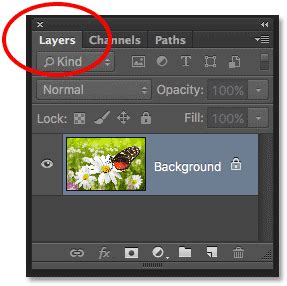
Photoshop's grouping function is an invaluable tool for this purpose. To create a new group, click on the folder icon located at the bottom of the Layers panel. By default, this new group will be named "group 1." Double-click on this name and rename it to something descriptive, such as “title,” to clearly indicate its contents. Pressing Enter will confirm the change. For further visual organization, you can assign a colour to the group. Right-click on the group layer, hover your cursor over “Color” in the list that appears, and then select your preferred colour.
Once your group is established, you can simply drag and drop the individual text layers that constitute your title ("Forevermore" and "The") into this newly created group. This consolidation means that when the group layer is selected, you can move both elements of the title simultaneously across the canvas. This feature significantly streamlines the process of adjusting the overall placement of your title and makes it much easier to locate specific layers within the title when your document becomes more complex.
Step Five - Establishing Authority: Cast and Crew Credits
Beyond the main imagery and title, the names of the director and lead actors are essential components of a movie poster, serving to leverage star power and attract a wider audience. We will add these credits around the title. You are welcome to use the provided names for your own project or substitute them with those of friends or family.
Begin by creating another new group in the Layers panel. Rename this group to “cast and crew” and assign it a distinct colour, such as orange, to differentiate it from the title layers. Select the Type tool again. For the director's name and potentially the main actors, a typeface like Century Gothic can be highly effective. Its tall, lowercase characters are particularly well-suited for headings in large print products. We will change the weight to bold and set the size to 24pt, with tracking adjusted to 75 for a balanced letter spacing. Type the director’s name, for instance, “E. Barker Coldridge.”
Subsequently, create another text layer and change the font size to 20pt. To add a touch of gravitas, we can include a phrase above the director's name, such as “from the chilling mind of.” Utilize the tracking function to ensure this line matches the visual width of the director’s name, creating a cohesive block of text. For the names of the three principal actors, we reduced the font size to 15pt. It’s important to ensure their names are aligned with the title and are evenly spaced, contributing to the overall visual harmony of the poster.
Step Six - The Hook: Crafting a Compelling Tagline
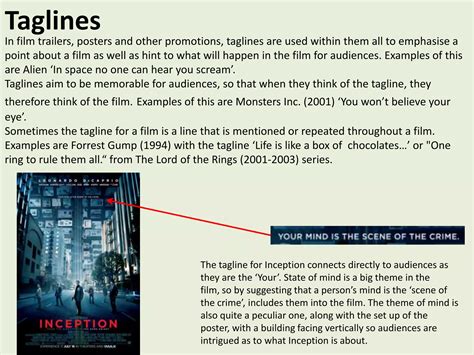
A tagline is a concise and impactful phrase that serves as a crucial element of a film’s branding. It is often disseminated across all marketing materials, including trailers, advertisements, and, of course, the movie poster. For The Forevermore, our chosen tagline, “pray before you sleep,” is intended to reinforce the horror genre and effectively set audience expectations regarding the emotional journey they can anticipate during the viewing experience.
To maintain a consistent visual aesthetic, we will again utilize the Century Gothic typeface. For the tagline, a font size of 68pt is appropriate, with the tracking set to 100 this time, providing a slightly wider and more prominent appearance than the cast and crew names. In the Layers panel, the default name of the layer will be the text itself. It is good practice to rename this layer to “tagline” for clarity. Assigning a colour, such as yellow, to this layer can further enhance its visibility and ease of location within the Layers panel.
Step Seven - The Credits: Building the Billing Block
The billing block is a standard convention on official movie posters, a meticulously arranged list of the “above the line” cast, crew, and production companies responsible for the film’s creative direction and overall production. The specific individuals and entities included in this block are typically determined by a complex interplay of industry regulations and contractual agreements. However, you can generally expect to find credits for the producers, director, cinematographer, principal designers, and sometimes key cast members.
For the billing block of The Forevermore, we will continue to use the Century Gothic typeface. Employing the regular weight, we will use a font size of 10pt for the names and a slightly smaller 7pt for their respective roles. To create a dense and professional appearance, the letters should be tightly spaced, which can be achieved by setting the tracking value to zero.
A common stylistic choice for names within the billing block is vertical scaling. To achieve this effect, select the Character panel (Window > Character) and adjust the vertical scale value to 120%. It is important to strive to keep the lines of the billing block centred on the canvas for a balanced composition. If you find yourself struggling to come up with names and roles, a valuable resource is IMDb.com. Searching for any film on this site will provide a comprehensive list of cast and crew credits, offering ample inspiration for your own poster.
Step Eight - Essential Information: Web Address and Release Date
Crucial practical information, such as the film's official website and its release date, must be clearly communicated to the audience. Create another text layer positioned below the final line of the billing block. For the website address, “www.theforevermoremovie.com,” we will use Century Gothic with a font size of 14pt.
For the release information, a common and effective convention is “In Cinemas Now.” For this final text layer, we will employ a bold weight and a font size of 20pt, ensuring it is prominent and easily readable.
Step Nine - Branding and Authority: Industry Logos
The inclusion of industry logos, such as those representing distribution companies, production studios, or technical specifications like Dolby Digital, adds a layer of authenticity and professionalism to the movie poster. You have the option to either copy and paste real logos or to design your own symbolic representations.
An effective logo should not only reinforce the brand’s identity and values but also resonate with the intended audience. Therefore, consider carefully the fonts and any accompanying symbols or icons you choose to incorporate into these layers. The strategic placement and design of these logos contribute significantly to the overall credibility and visual appeal of the poster.
Final Considerations for Poster Design
There are various types of movie posters, each serving a distinct purpose in the film's marketing campaign. Teaser posters are often released months before a film's debut to generate initial buzz, while character posters focus on individual protagonists or antagonists. Limited-edition versions are frequently produced for dedicated fans. This tutorial has concentrated on the official theatrical poster, which is typically the most comprehensive version used for broad marketing.
You could adapt this poster design for inclusion in a film festival by adding or highlighting its critical appeal, particularly if the film has garnered prestigious awards or received excellent reviews. The ultimate purpose and intended audience will invariably influence how the various design elements are arranged and emphasized.
If you are looking for a quick exercise to reinforce your ability to effectively combine image and text layers, consider working through a guide to creating an album cover. Much like a film trailer, a movie poster has the power to capture your audience’s attention and ignite their interest in your film. A well-executed movie poster should be both clear and intriguing. The number of visual elements and the overall composition on the canvas should be focused to instantaneously provide the audience with a fundamental understanding of the movie's premise. It is essential to prevent yourself from incorporating too many focal points, as this can lead to a cluttered and visually frustrating poster.
From an artistic standpoint, both professionally produced posters and those created through extensive Photoshop editing can be visually striking. However, a key principle to remember is: Keep it simple. A great movie poster does not always necessitate elaborate Photoshop editing. Sometimes, a single, compelling visual hook is all that is required - an image that hints at the plot's promise or showcases what you believe to be the most impactful moment of the film, thereby luring viewers into the theatre. An appealing image is paramount.
To begin, launch Adobe Photoshop on your computer. Click “File” (located in the top-left corner) > “New” to open the New Canvas Window. While a standardized size for a movie poster is often cited as 27″ x 41″, remember to ensure your units are set to inches. To guarantee your poster appears crisp and professional, do not forget to set the “Resolution” box to a reasonable value, such as 300 pixels/inch. Keep in mind that a higher resolution, while producing a sharper image, will also demand more processing power from your computer. To emulate the style of Hollywood-style posters, you may find it beneficial to use the standardized movie poster layout published by the New York Film Academy as a reference. Most movie posters aim to depict conflict or tension to pique the audience’s curiosity. If this is not your primary intention, it is still valuable to know how to enhance your chosen image to make it appear more official, even if it was originally captured with a phone camera. The key terms here are vibrancy and contrast. Examining successful movie posters can provide insight into how these elements are effectively utilized. This attention to detail in image editing also assists when you wish to revisit and refine filters or adjustments in the future. Ideally, your main image should fill the entire canvas, or at the very least, be expertly blended with the background colour.