Adding text to an image is a fundamental aspect of graphic design, and Adobe Photoshop offers versatile tools to achieve this. While horizontal text is the standard, there are occasions when a vertical orientation can enhance a design, add emphasis, or fit specific layout constraints. Photoshop provides a dedicated tool for this purpose, allowing users to incorporate text that flows downwards, letter by letter. This guide will explore how to effectively utilize Photoshop's Vertical Type Tool, understand its nuances, and consider best practices for its application.
The Vertical Type Tool: Your Gateway to Downward Text
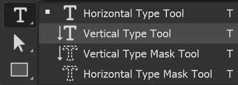
The primary instrument for creating vertical text in Photoshop is the Vertical Type Tool. This tool, accessible from the Photoshop toolbar, functions similarly to its horizontal counterpart but arranges characters in a top-to-bottom, column-like fashion.
To begin using the Vertical Type Tool, locate it in the toolbar. It is often grouped with other type tools, and a click-and-hold action on the Horizontal Type Tool icon will reveal the Vertical Type Tool. Once selected, you have two primary methods for adding text: Point Text and Paragraph Text.
Point Text: Simple and Direct
Point Text is the most straightforward method for adding vertical text. It is ideal for short phrases, single words, or titles that do not require a predefined bounding box.
- Select the Vertical Type Tool from the toolbar.
- Click once on your image canvas where you want the vertical text to begin. This action inserts a single insertion point.
- Begin typing. As you type, each character will appear directly below the previous one, forming a vertical line of text.
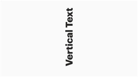
The Vertical Type Tool allows you to add text that runs down the image. Creating vertical text in Photoshop is surprisingly easy with the Vertical Type Tool. You can write using Point Text by clicking once on your canvas.
Paragraph Text: Controlled and Contained
Paragraph Text is more suitable when you need your vertical text to be confined within a specific area or to wrap within a defined boundary. This method involves creating a text box.
- Select the Vertical Type Tool from the toolbar.
- Click and drag across your canvas to define the boundaries of your text box. This creates a bounding box for your text.
- Begin typing. The text will flow vertically within the box.
Using Paragraph Text creates a similar result to Point Text in terms of vertical orientation, but it offers more control over the text's placement and flow within a defined area. Click and drag the Vertical Type Tool (T) across your canvas to create Paragraph Text. Type your text in the text box.
It's important to note that with Paragraph Text, when you type, the typing starts on the right of the box, and each new word moves left. This behavior is specific to the vertical orientation within a bounding box.
Understanding Text Behavior and Formatting
When working with the Vertical Type Tool, understanding how text behaves, especially concerning line breaks and word flow, is crucial.
If you type with the Vertical Type Tool (T) and press Enter between words - the way you would make a line break for horizontal text - the new line of text moves to the left of the first line. This can be counterintuitive compared to the downward progression of subsequent lines in horizontal text. Essentially, pressing Enter in vertical text creates a new "line" to the left, continuing the vertical flow.
The Vertical Type Tool adds text vertical, letter by letter. If you want text rotated, then use the Horizontal Type Tool and rotate the layer 90 degrees. This distinction is important: the Vertical Type Tool is designed for text that inherently flows downwards, not simply rotated horizontal text.
Font Selection and Styling
Photoshop offers robust options for font selection and styling, which apply equally to vertical text.
- Font Filtering: You can filter your font library to quickly find suitable typefaces. Options include showing Adobe Fonts (often highlighted in red), showing Variable Fonts (highlighted in green), and showing Favorite Fonts (highlighted in pink). This helps streamline the process of finding the perfect font for your design.
- Font Style: Depending on the font family, you can select specific styles such as Regular, Bold, Italic, or Light. This is crucial for achieving the desired visual impact.
- Font Size Adjustment: Changing the font size is a common requirement. You can highlight the text you wish to resize, then click on the Scrubby Slider in the Character panel and drag to the right or left. This provides an intuitive way to adjust size, similar to how it works in word processors.
Anti-Aliasing for Smoother Text
Text, by its nature, consists of many lines. To ensure these lines appear smooth and not jagged on screen or in print, Photoshop employs anti-aliasing.
Anti-alias smoothed out lines, which of course, there are a lot of in text. There are some options for different anti-alias methods available in the Options bar when a type tool is active. These methods, such as Crisp, Strong, Smooth, or None, can affect the appearance of your text's edges. Experimenting with these settings can help you achieve the best visual result for your chosen font and display resolution. This works the same as in word processors in principle, aiming to reduce pixelation.
When to Use Vertical Text and Its Limitations
Vertical text is a stylistic choice that can be highly effective when used appropriately. However, it also has limitations and is best suited for specific scenarios.
Vertical Type is best suited to short text. Horizontal text can include whole paragraphs. This is because reading vertical text can be more challenging for the reader, especially over extended lengths. For lengthy content, horizontal text is generally preferred for readability.
The Vertical Type Tool works the same as the Horizontal Type Tool in many respects, and users familiar with one will find the other intuitive.
Considerations for Complex Typography
While Photoshop is a powerful tool for image editing and graphic design, certain complex typographic manipulations might be better handled in other software. For instance, achieving highly stylized or hand-drawn lettering effects can be challenging.
Can't really do this in Photoshop. Realize that these types of type manipulations on stocks and bods were all done by hand where the craftsman painstakingly made certain every stroke and counter was "just so" to get the effect he/she wanted. In my opinion, Photoshop will only ever do a semi-satisfactory job at this type of stuff. Sure you can find a cool font and then use the warp transformations to get it to bend. But it will never look 100% correct due to the limitations of the transformations. Character stroke and counter weights can vary using transformations, note in your sample (and almost any sample you find which is similar) stroke weights do not vary unless there's an intentional reason behind it. I would do this in Adobe Illustrator and not even attempt it in Photoshop. From that point you could create outlines and refine.
This perspective highlights that for intricate, custom lettering or effects that require precise control over stroke weight variations and character forms, vector-based software like Adobe Illustrator might be a more suitable choice. In Illustrator, you can convert text to outlines, allowing for granular editing of each letterform.
Tool Presets: Saving Your Settings
Photoshop allows you to create and save Tool Presets for various tools, including the Type Tools. This feature is incredibly useful for recalling specific settings you've configured.
You can create and save a Tool Preset for any tool. This will remember settings that you choose. For instance, if you frequently use the Vertical Type Tool with a specific font, size, color, and anti-aliasing setting, you can save this configuration as a preset. Later, you can simply select this preset to instantly apply those settings, saving you time and ensuring consistency.
While presets for brushes are often considered more universally useful due to the nature of brushwork, tool presets for type can still significantly enhance workflow efficiency for repetitive tasks. If you wish to use presets, you have the option of either creating a tool preset or a brush preset.
Beyond the Basics: Creative Applications
The Vertical Type Tool, while simple in its primary function, can be employed in various creative ways:
- Sidebars and Captions: Vertical text can function as elegant sidebars for images or as concise captions that don't disrupt the main visual flow.
- Decorative Elements: In certain artistic or poster designs, vertical text can serve as a decorative element, adding visual interest and texture.
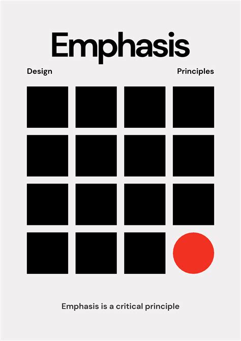
- Emphasis and Hierarchy: Placing a key word or phrase vertically can draw attention to it, establishing a unique visual hierarchy.
- Fitting Text into Narrow Spaces: Vertical text is ideal for fitting text into long, narrow areas of a design, such as the spine of a book cover mock-up or a narrow column.
Consider the context of your image. For instance, if you are working with an image of the Lake District in the UK, vertical text might be used to label a specific landmark or a geographical feature in a way that complements the landscape rather than overpowering it.
Photoshop Text effect Compilation: 18 Simple Text Effects for Beginners
By understanding the functionality of the Vertical Type Tool, its interaction with text formatting options, and its stylistic implications, designers can effectively incorporate vertical text into their Photoshop projects to enhance both form and function.