Color is a fundamental element in photography, design, and digital art, profoundly influencing the viewer's perception and the overall impact of an image. For photographers, understanding and skillfully manipulating color is paramount to achieving professional-quality results. Adobe Lightroom's HSL (Hue, Saturation, Luminance) panel, often presented alongside the "Color" adjustments, offers a powerful and nuanced approach to fine-tuning these essential color properties. This guide delves into the intricacies of Hue, Saturation, and Luminance, exploring their definitions, how they interact, and practical techniques for leveraging the HSL panel in Lightroom to elevate your photographic work.
Understanding the Core Color Attributes: Hue, Saturation, and Luminance
At its heart, every color can be described by three distinct attributes: Hue, Saturation, and Luminance. These form the basis of the HSL color model, a framework that allows for precise control over color in digital editing.
Hue: Defining the Color Itself
Hue refers to the pure color as it appears on the color spectrum - think of red, blue, green, or yellow. It's what differentiates one color from another. In simpler terms, hue defines what color something is. In photo editing software like Lightroom Classic, you can adjust the hue to understand the color shifts. For instance, shifting the hue of a blue can move it towards purple or cyan. Our eyes are highly responsive to changes in hue; a color shifting from blue to purple will catch our attention more than a shift from dark blue to light blue.
Hue is the foundation of color perception. It is what differentiates a shade of red from a shade of blue. Warm vs. Cool hues are a fundamental concept here. For example, pink and maroon share the same hue, which is red, but they differ in saturation and brightness. Modern design and photo editing tools provide precise hue adjustments. If you're working with different camera color spaces, understanding hue adjustments is essential.
Saturation: The Intensity of Color
Saturation is a parameter used to adjust the intensity or purity of colors, determining whether they appear vibrant and bold, or muted and washed out. Highly saturated colors appear vivid, while desaturated colors look muted or closer to grayscale. Saturation plays a crucial role in setting the mood of an image. For example, a bright neon sign at night has high saturation, making it eye-catching. Conversely, desaturated colors can create a nostalgic or cinematic feel.
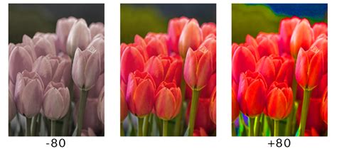
It's important to note that changing the saturation of a color can sometimes affect its perceived brightness. If you desaturate a photo (removing the saturation attribute), you'll notice that the grayscale appearance remains the same, highlighting that saturation is distinct from luminance.
Luminance: The Brightness of Color
Luminance refers to the brightness or lightness of a color. It determines how light or dark a color appears, affecting its overall visibility and contributing to depth and contrast within an image. Lightness is a simple math value based on a color's brightest and darkest channels. Luminance, however, weights red, green, and blue by how sensitive our eyes are to them, so it matches perceived brightness better than a simple mathematical average.
For example, in a range of red hues, moving from dark red to bright red involves adjusting luminance. While hue defines what color it is, and saturation defines how intense that color is, luminance defines how bright it is. Because of its straightforward nature, it's recommended to use luminance sparingly when adjusting the overall brightness of a photo. Moreover, in most cases, you'll need to combine luminance adjustments with other parameters for optimal results.
The HSL/Color Panel in Lightroom: A Closer Look
Lightroom's HSL/Color panel is designed to make targeted color corrections within your image. Unlike sliders in the Basic panel that affect the entire image at once (like the color temperature adjustment), the sliders in the HSL/Color panel only affect individual colors.
Navigating the HSL and Color Views
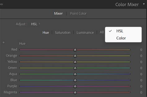
The panel is labeled HSL/Color, and you can click on the words "HSL" or "Color" in the panel header to change how the information is shown. For the most part, both HSL and Color do exactly the same thing and are simply different arrangements of the same editing options.
The HSL view shows all the color adjustment categories (Hue, Saturation, Luminance) with their respective sliders for all eight color regions simultaneously. This view is useful if you want to see all the options laid out at once.
The Color view presents the sliders one color at a time, allowing you to focus on a specific hue. Many photographers prefer working in the Color view because that’s how they tend to think about the colors in their images - one by one, rather than all at once.
The Targeted Adjustment Tool: Precision at Your Fingertips
A key feature that distinguishes the HSL view is the Targeted Adjustment Tool (TAT). This invaluable tool allows you to click directly on a color within your image and then drag your cursor up or down to adjust the corresponding Hue, Saturation, or Luminance sliders.
To use the TAT:
- Select the TAT icon, which looks like a small dot or crosshair, next to the adjustment you want to make (Hue, Saturation, or Luminance).
- Hover your cursor over the color in your image that you wish to adjust.
- Click and drag your cursor up or down. As you drag, Lightroom will automatically adjust the relevant sliders in the HSL panel.
This tool is incredibly helpful if you're not entirely sure which color group an object falls into (e.g., distinguishing between blue and aqua in your sky) or if a color is a mix of several hues. For instance, if you click on an area that contains both yellows and greens, the TAT will adjust sliders in both the Yellow and Green HSL sections simultaneously. This eliminates the need for complex masking in many scenarios, saving significant editing time.
Applying HSL Adjustments: Targeted Control
It's crucial to understand that HSL/Color adjustments, while targeted to specific colors, affect that particular color everywhere it appears in the image. This means that if you adjust the luminance of the blue sky to make it brighter, any blue clothing worn by a subject in the photo will also become brighter.
Therefore, it's essential to identify images where such global adjustments to a specific color won't negatively impact other elements. For example, if the only blue in your photo is the sky, adjusting the blue luminance is a safe bet.
Practical Application of HSL/Color Adjustments
Mastering the HSL/Color panel involves understanding when and how to apply these adjustments effectively.
1. Identify the Color(s) That Need Adjusting
The first step is to recognize which colors in your image could benefit from refinement. This might be straightforward (e.g., a vibrant green lawn or a deep blue sky), or it might require a closer look if colors are mixed. The Target Adjustment Tool is invaluable here for precisely identifying and isolating colors.
2. Make Small Changes
The sliders in the HSL/Color panel are powerful. Small, subtle adjustments often yield the best results. Pushing a hue slider too far can quickly lead to unnatural, fantasy-like colors. Think of these tools as a way to perfect a color that is already good, rather than a tool for a complete color overhaul. Significant changes in the HSL panel can also introduce color noise into your photos.
3. Make Global Adjustments First
Before diving into the HSL/Color panel, it's recommended to make your primary color and exposure adjustments in the Basic panel (e.g., White Balance, Exposure, Contrast, Vibrance, and Saturation). The HSL tools are not a substitute for correcting fundamental exposure or white balance issues. Relying on HSL/Color to fix overall color problems can be tedious, inefficient, and may lead to artifacts. Instead, use HSL/Color to fine-tune and finalize specific colors after you've established the overall look of the image.
Lightroom HSL Color Panel Sliders: A Masterclass.
For instance, if you've adjusted the white balance and global color to achieve a pleasing overall tone, you might then use the HSL panel to subtly enhance the reds and oranges in a sunset, bringing out their natural vibrancy without oversaturating the entire image.
How HSL/Color Can Save You Time
One of the most time-consuming edits in Lightroom or Photoshop is masking certain areas of a photo for targeted editing. In many cases, the HSL/Color panel can provide a much faster and more efficient alternative.
If the only green in your image is the grass, there's no need to create a complex mask of the grass just to adjust its brightness or saturation. You can simply use the Luminance or Saturation slider in the Greens section of the HSL panel. Similarly, many adjustments to a sky can be made quickly using these tools, often faster than even Lightroom's automatic sky-masking features.
Consider a scenario where the iconic bridges in a cityscape appear muted. Instead of masking the bridges, you can use the HSL panel to boost the saturation of the yellows in the image, making the bridges pop. While this might also affect other yellow elements in the photo, if those effects are not detrimental, it's a significant time-saver.
The HSL/Color Panel for Black and White Photos
When you convert an image to black and white in Lightroom, the HSL/Color panel automatically transforms into the B&W Mixer panel. While seemingly counterintuitive, this panel provides remarkable control over your black and white conversions.
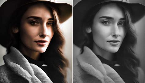
This panel allows you to control the lightness or darkness of each color as it is converted to grayscale. This digitally replicates the effect of historical black and white film photographers using color filters (like yellow, orange, or red) to alter the relative tones of objects in their photos. By adjusting the sliders in the B&W Mixer, you can lighten reds, oranges, and yellows to make them appear brighter in the black and white image, while darkening blues, purples, and aquas to make them appear darker. This gives you immense creative control over the mood and contrast of your monochrome images.
Examples of When to Use HSL/Color Tools
The applications of the HSL/Color panel are vast and often become apparent with practice. Here are some common scenarios where these tools excel:
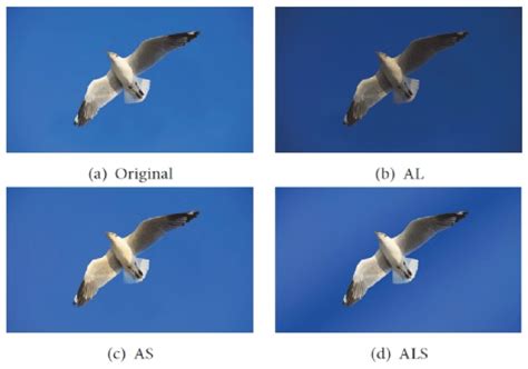
- Adjusting the Sky: Increase saturation and/or decrease luminance in cyan, blue, and purple tones to make a bland sky more dramatic.
- Fixing "Neon" or Unnatural Greens: Reduce the saturation and luminance of greens, and sometimes shift the hue slightly towards yellow, to achieve more natural-looking foliage.
- Revitalizing Dead Grass: Adjust the hue of yellows to introduce a greener tint, or subtly increase saturation.
- Deepening Sunset Colors: Increase saturation or decrease luminance in the reds and oranges to make sunsets more vibrant and impactful.
- Reducing Distracting Colors: Lower the saturation and possibly reduce the luminance of offending colors in the background to draw attention to your subject.
- Enhancing Specific Tones: For example, a subtle decrease in the saturation of greens can bring the color of grass back to a more realistic tone, or a slight hue shift can add warmth to skin tones.
- Isolating Colors for Artistic Effect: By desaturating all colors except for one specific hue (e.g., the red paint on a car), you can create striking, selective color images.
Conclusion
The HSL/Color tools in Adobe Lightroom are not just for advanced users; they are essential for any photographer looking to gain precise control over the colors within their images. By understanding the fundamental concepts of hue, saturation, and luminance, and by practicing with the Targeted Adjustment Tool and the various sliders, you can significantly enhance the visual appeal and impact of your photographs. These tools, when used thoughtfully and in conjunction with global adjustments, can save considerable editing time and unlock new creative possibilities, from subtle color refinements to dramatic artistic statements.
tags: #hue #saturation #luminance #lightroom