InDesign is a powerful tool for creating professional-looking documents, and its advanced features for typographic composition play a crucial role in achieving aesthetic and readable text. Among these features, hyphenation and justification settings are paramount, influencing the horizontal spacing of lines and the overall visual appeal of type on your pages. While often overlooked or misunderstood, mastering InDesign's hyphenation options can significantly elevate the quality of your layouts, particularly in more complex projects like book design. This guide delves into the intricacies of InDesign's hyphenation, exploring its mechanisms, settings, and best practices.
The Core of Text Composition: Composers and Their Role
At the heart of InDesign's text composition are its "Composers," sophisticated algorithms designed to manage how text flows and breaks across lines. These systems are responsible for evaluating potential breaks and selecting those that best align with your specified hyphenation and justification options. InDesign offers two primary composition methods for Roman text: the Adobe Paragraph Composer and the Adobe Single-line Composer.
The Adobe Paragraph Composer is the default setting and is highly recommended for its ability to optimize text flow across an entire paragraph. It considers a network of potential breakpoints, allowing it to make decisions on earlier lines that can eliminate unattractive breaks later on. This method aims to strike a balance between better spacing and fewer hyphens, resulting in a more harmonious and visually pleasing paragraph.
In contrast, the Adobe Single-line Composer operates by composing text one line at a time. While it offers more granular control on an individual line basis, it lacks the holistic perspective of the Paragraph Composer, potentially leading to less optimized spacing and a higher likelihood of unattractive breaks or excessive hyphenation.
For documents containing Japanese text, InDesign supports additional specialized composers: Adobe Japanese Single-line Composer and Adobe Japanese Paragraph Composer. The Adobe Japanese Paragraph Composer is the default for such documents.
Understanding Justification and Its Impact on Hyphenation
Justification is a critical aspect of typographic composition that directly interacts with hyphenation. It is controlled by several factors:
- Alignment Option: The chosen alignment (e.g., left, right, center, justified) dictates how text is arranged within the margins. For justified text, InDesign actively works to make lines appear evenly spaced, which often necessitates hyphenation.
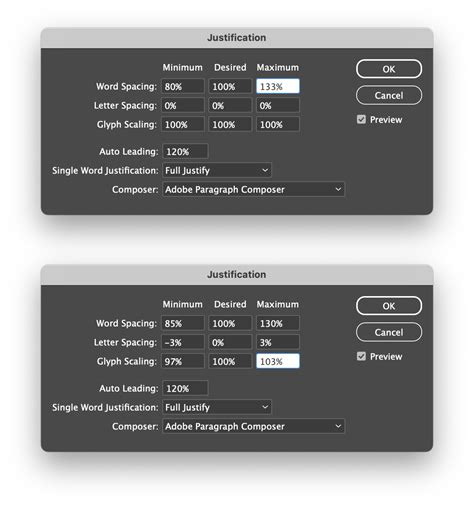
- Word Spacing and Letterspacing: The specified allowances for extra space between words and letters significantly impact how text fills a line. These settings are crucial for achieving even spacing in justified paragraphs.
- Glyph Scaling: This refers to the slight adjustment of character widths to fine-tune spacing. However, it's important to note that word spacing, character spacing, and glyph scaling settings are ignored for CJK (Chinese, Japanese, Korean) text.
The interplay between these justification settings and hyphenation options determines the final appearance of your text. When text is justified, InDesign must perform a difficult task: making lines with varying numbers of characters appear equally spaced. The Adobe Paragraph Composer excels here by adjusting letter and word spacing to achieve the best overall look for the paragraph.
The Mechanics of Hyphenation in InDesign
Hyphenation is the process of breaking a word at the end of a line to improve text flow and reduce unsightly gaps or overly stretched words. InDesign provides robust controls to manage this process.
Automatic Hyphenation: Turning it On and Off
InDesign allows you to enable or disable automatic hyphenation on a paragraph-wide basis. This is a fundamental setting that dictates whether the software will attempt to hyphenate words.
To turn on hyphenation for selected paragraphs:
- Select the text: Either place your cursor within a single paragraph or select multiple contiguous paragraphs.
- Open the Paragraph panel: Access this through the Window menu or by clicking the Paragraph panel icon.
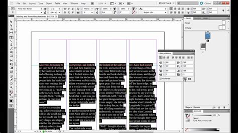
- Check the Hyphenate box: At the bottom of the Paragraph panel, you will find a checkbox labeled "Hyphenate." Ticking this box enables automatic hyphenation for the selected text.
Upon enabling hyphenation, you'll observe the text reflow, aiming for a better-balanced paragraph.
Fine-Tuning Hyphenation: The Hyphenation Settings Dialog Box
For more precise control, the Hyphenation Settings dialog box offers a deeper dive into hyphenation parameters. You can access this by clicking the "Hyphenation…" button within the Paragraph panel.
Within this dialog box, you'll find the "Hyphenate" checkbox again. More importantly, a slider near the bottom allows you to influence the balance between spacing and hyphenation. Sliding towards the left prioritizes better spacing, while sliding to the right favors fewer hyphens. This provides a quick way to adjust the overall hyphenation density.
How to Control Hyphenation Using Paragraph Styles in Adobe Indesign
Understanding Key Hyphenation Settings
The Hyphenation Settings dialog box (accessed via Paragraph Style Options > Hyphenation tab) contains several crucial settings that allow for granular control:
- Words with at Least X Letters: This setting determines the minimum length of words that InDesign will consider for hyphenation. Shorter words are less likely to be hyphenated, preventing awkward breaks.
- After First X Letters / Before Last X Letters: These options control the minimum number of characters that must remain on either side of a hyphen. For example, setting "After First X Letters" to 4 for the word "constrictor" would only allow breaks like "constric-tor," not "con-strictor." Conversely, setting "Before Last X Letters" to 4 would enforce breaks like "con-strictor" and disallow "constric-tor." These settings are vital for adhering to typographic conventions regarding word breaks.
- Hyphen Limit X Hyphens: This setting controls the maximum number of consecutive hyphens allowed within a paragraph. Setting it to "0" indicates an infinite number of hyphens, essentially disabling this limit. This is crucial for avoiding visually jarring stacks of hyphenated words.
- Hyphenation Zone: This setting is primarily relevant for non-justified text using the Single-line Composer. It defines a distance from the right margin. Words within this zone may be hyphenated to improve the appearance of the ragged edge. For justified text, this setting is less impactful as InDesign focuses on filling the line.
Advanced Hyphenation Control
Beyond the general settings, InDesign offers methods for specific word control:
Removing Hyphenation on a Single Word
There are two primary ways to prevent a specific word from being hyphenated:
Acting on Local Format (No Break Option):
- Select the word you wish to keep intact.
- In the Control panel, click the icon with three parallel lines.
- Choose the "No Break" option. This applies a local formatting override.
Applying a Character Style (Recommended):
- Create a new Character Style.
- In the Character Style Options, navigate to the "Basic Character Formats" tab.
- Activate the "No Break" option.
- Apply this Character Style to the word(s) you want to prevent from hyphenating. This method is preferred as it keeps your formatting consistent and manageable through styles.
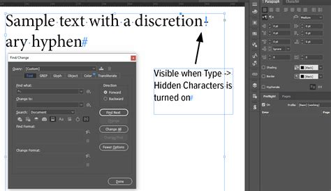
Manually Adjusting a Word's Hyphenation: The Discretionary Hyphen
In certain situations, you might want to force a word to break at a specific point, overriding the default hyphenation rules. This is achieved using the Discretionary Hyphen.
- With the Type tool, click at the precise spot within a word where you want the hyphen to appear.
- Navigate to
Type > Insert Special Character > Hyphens and Dashes > Discretionary Hyphen.
This inserts a hidden character that tells InDesign to break the word at that exact location if hyphenation is applied. It's important to remember that the document's overall hyphenation and composition settings still influence whether this discretionary hyphen is actually used.
Hyphenation and Document Styles
While local formatting can be useful for one-off adjustments, best practices in InDesign strongly advocate for using Paragraph Styles. This ensures consistency and makes global changes much easier.
Editing the [Basic Paragraph] Style
Every InDesign document includes a default "[Basic Paragraph]" style. You can modify this style to remove hyphenation from all paragraphs that use it.
- Open the Paragraph Styles panel (
Window > Type & Tables > Paragraph Styles). - Double-click on "[Basic Paragraph]" to open its options.
- Navigate to the "Hyphenation" tab.
- Deselect the "Hyphenate" checkbox to disable hyphenation for this style.
Modifying Other Paragraph Styles
The same process applies to any custom Paragraph Styles you create. By editing the Hyphenation tab within a style's options, you can globally control hyphenation for all text assigned that style. This is the most efficient way to manage hyphenation across your document.
Avoiding Hyphenation Pitfalls
Hyphenation, while a valuable tool, can lead to undesirable results if not managed carefully.
Language Settings are Crucial
One of the most common causes of poor hyphenation is an incorrect language setting. InDesign uses language-specific dictionaries for hyphenation rules. If your document is set to the wrong language, the hyphenation will be inaccurate, leading to errors. Always ensure the correct language is set for your text, especially in multilingual documents where different sections may require different language settings.
The "No Stacks" Rule and Its Implications
A common typographic guideline is to avoid having too many hyphenated words consecutively on the page, often referred to as "stacks" or "page-enders." While InDesign's "Hyphen Limit" setting helps, achieving a truly hyphen-free, well-spaced appearance often requires manual intervention. This might involve:
- Tracking: Adjusting the overall letter spacing (tracking) of a word or a small section of text to "pop" a hyphen forward or backward.
- Horizontal Scaling: Slightly scaling characters horizontally (by 1% increments) can also help shift hyphenation points.
- Rewriting: In some cases, the most effective solution is to subtly rewrite a sentence or phrase to avoid problematic words altogether.
Novels, with their typically "soft" typesetting (larger type, more leading, and looser spacing), often have enough elasticity to minimize hyphenation. Denser nonfiction layouts, however, present more challenges and may require more meticulous adjustments.
User Error vs. Software Limitations
While InDesign's hyphenation engine is sophisticated, issues can arise. Some argue that many perceived "errors" are actually a result of user error, such as incorrect language settings or a lack of understanding of the underlying typographic principles. However, even with correct settings, complex or obscure vocabulary can sometimes challenge the algorithm. In such cases, manual adjustments or discretionary hyphens become necessary.
Conclusion: The Art and Science of Hyphenation
Hyphenation in InDesign is a nuanced aspect of typography that balances algorithmic precision with aesthetic judgment. By understanding the roles of the Paragraph and Single-line Composers, the impact of justification settings, and the various controls available within the Hyphenation Settings, you can significantly improve the readability and professional appearance of your documents. Embracing Paragraph Styles for managing hyphenation ensures consistency and efficiency. While InDesign provides powerful tools, the ultimate refinement often comes from a keen eye for detail and a willingness to make subtle manual adjustments, transforming good typography into great typography.
tags: #indesign #hyphenation #options