Designing an effective and visually appealing web layout is a cornerstone of modern web design. Photoshop, a powerful and versatile tool, remains a popular choice for creating detailed web design mockups that can later be translated into functional HTML/CSS templates. This tutorial will guide you through the process of building a clean, professional, and premium-feeling homepage layout from scratch, utilizing a dark color scheme and subtle textures. We will delve into the essential steps, from initial planning and grid setup to the finer details of layer styling and element placement.
Planning and Preparation: Laying the Foundation
Before diving into Photoshop, it’s crucial to have a clear plan. This involves defining the requirements, desired look, and functionality of the website. Mockups and wireframes are invaluable tools for visualizing these ideas and ensuring flexibility in the design process. For this tutorial, we will focus on creating a 960-pixel wide layout, a common standard that fits comfortably within most screen resolutions above 1024x768px.
A wireframe, sketched using simple grey tones, helps concentrate on the overall layout and structure without the distraction of colors. This allows for quick alterations and rearrangements. A well-defined wireframe acts as a blueprint for the final design.
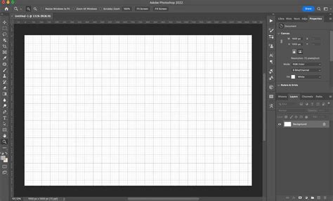
When starting a new project in Photoshop, it's recommended to create a new document with presets suitable for web design. Selecting the 'Web' preset and then a standard size like 'Web (1440x900)' provides a good starting point. Naming your project at this stage is also good practice.
Setting Up the Grid and Guides
A well-established grid system is fundamental for creating organized and balanced layouts. Guides provide intelligent foundations for all design decisions, ensuring consistency and proper alignment of elements. For this layout, we will define a 960-pixel wide work area.
To establish the content width, we first define the overall canvas. Then, by using guides, we can accurately mark off different sections and elements. For this specific design, we will set a series of vertical and horizontal guides to precisely position content, navigation, and other interactive elements.
- Vertical Guides: 320, 368, 620, 650, 698, 950, and 980 pixels.
- Horizontal Guides: 550, 580, 628, 660, 708, 740, 788, 820, and 868 pixels.
These guides will serve as boundaries for our content blocks, ensuring a structured and professional appearance. Photoshop extensions like GuideGuide can greatly simplify the process of creating complex grid systems, offering presets for popular frameworks like the Bootstrap grid system, which typically uses a 12-column grid spanning 1170 pixels on large screens.
Designing the Header Area
The header is the first impression of your website, so it needs to be impactful. We will begin by creating a dark-themed header that incorporates the site's logo or title and navigation.
First, set a horizontal guide at 65 pixels. Using the rectangular marquee tool, select everything above this guide. Create a new layer for the header. Double-click this new layer to access Layer Styles. Apply a drop shadow with 50% opacity and an angle of 90 degrees to give the header a subtle sense of depth.
Next, set the foreground color to #5f120a (a deep red) and create another new layer. Select the pencil tool with a 1-pixel square brush. Draw a one-pixel border along the bottom of the header area to define its boundary.
For the main header background, set a horizontal guide at 465 pixels. Select everything above this guide using the rectangular marquee tool. Set the foreground color to #333333 (dark gray) and the background color to #000000 (black). Initiate a radial gradient by clicking in the horizontal center of the canvas, approximately 100 pixels above the top edge. This will create a subtle, dark gradient that forms the base of the header.
Adding Texture to the Header
To enhance the premium feel, we will add a grunge texture to the header. Download a suitable grunge texture image (from resources like Design Shard's grunge texture pack). Save or copy the image into Photoshop. Desaturate it by going to Image > Adjustments > Desaturate. Crop the texture to precisely match the dimensions of the header gradient area (1600 pixels wide by 465 pixels high). Copy and paste this desaturated texture as a new layer above the gradient layer.
Typography for the Logo/Title
For the site's title or logo, we will use the ChunkFive font, which is freely downloadable. Set a vertical guide at 320 pixels to align the left edge of the text. Set the background color to #dfd9d9 (light gray) and the foreground color to #bebcbc (a slightly darker gray).
Double-click the text layer in the Layers palette to open Layer Styles. Select "Gradient Overlay" and choose a gradient that transitions from the foreground color to the background color. Then, apply a "Drop Shadow" with 50% opacity and a distance and size of 3 pixels for a refined effect.
Navigation Menu
A clean navigation menu is essential for user experience. We will place it to the right of the header. Using 14pt Arial in the color #dfd9d9, create the navigation links. Ensure sufficient spacing between menu items for readability.
Photoshop Tutorial: Make your own CUSTOM menu bar!
Designing the Hero Section
The hero section is prime real estate for showcasing featured templates or themes. We will display screenshots of these templates on the right side of the screen, with accompanying text and buttons on the left.
Start by selecting three screenshots of the templates you wish to feature. Resize each image to a width of 400 pixels. Copy the first screenshot (which will be the furthest back) and paste it onto your canvas.
Apply a drop shadow to each screenshot layer by double-clicking the layer in the Layers palette and selecting "Drop Shadow." Set the opacity to 50% and the angle to -120 degrees. Ensure "Use Global Light" is checked for consistent shadow application.
Below the hero section, add a new layer and set the foreground color to #545454 (a dark gray). Select the area below the 465-pixel mark and fill it using the paint bucket tool. This creates a distinct background for the content area.
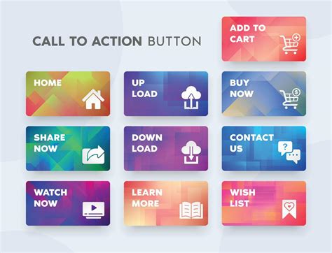
Call-to-Action Buttons
To encourage user interaction, we will add two prominent call-to-action buttons. Set vertical guides at 350 and 640 pixels, and horizontal guides at 285, 345, 375, and 435 pixels to define the button area.
Set the foreground color to #6f1910 (a deep, muted red) and the background color to #9c2f23 (a richer red). Select the rounded rectangle tool and set the radius to 10 pixels. Draw the first button shape.
Double-click the layer of the first button shape to open Layer Styles. Apply "Gradient Overlay," choosing a gradient that fades from the foreground to the background color, with the darker shade at the bottom. Then, add a "Stroke" of 1 pixel outside with the color #b34235 (a reddish-brown).
Add text on top of the buttons. For the first line, use 18pt Arial in #230a0b (a very dark brown). For the second line, use 14pt Arial in #dfd9d9.
Button Texture Enhancement
To add a subtle, artistic touch to the buttons, we can use splatter brushes. Download free splatter brushes (like those from Bittbox). Create a new layer above the button layers but below the text layers. Select a color very similar to the button's base color (e.g., #6f1910). Choose a splatter brush, resize its diameter to be between 400-600 pixels, and apply some splatter effects. This adds a unique texture without overpowering the design.
Promotional Banner
Directly below the dark textured area of the hero section, we'll create a promotional banner. Add a new layer and set the foreground color to #5f120a. Use the rectangular marquee tool to select an area 40 pixels high and spanning the entire width of the canvas. Fill this selection with the paint bucket tool.
For the text within this banner, use 18pt italic Georgia in #dfd9d9. The words "Limited Time Special:" should be in #e57b70 (a vibrant red) and also in bold. This draws attention to special offers.
Content Area: Featuring Templates and Information
The main content area will be structured into three columns. The left and center columns will list template features, accompanied by icons, while the right column will provide "About Us" information.
First, clear any existing guides (View > Clear Guides) and set the following new guides:
- Vertical Guides: 320, 368, 620, 650, 698, 950, and 980 pixels.
- Horizontal Guides: 550, 580, 628, 660, 708, 740, 788, 820, and 868 pixels.
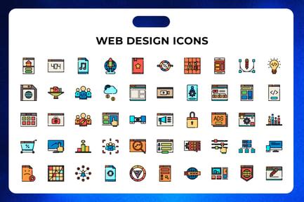
Incorporating Icons
Icons enhance visual communication and break up text. We will use icons from various sets:
- From the Flavour Extended icon set (Smashing Magazine and Oliver Twardowski): check icon, clock icon, security icon, and tablet icon.
- From the Portfolio icon set (Vandelay Design and IconShock): palette icon.
Download the icon packs and open the required icons. Icons from the Function pack and Flavour Extended pack are typically 48x48 pixels, so they can be used at this size.
Start by entering the text that will precede the list of features. Use 18pt bold Arial in #5f120a.
Now, add the icons. Copy the check icon and use the rectangular marquee tool to select the area between the vertical guides at 320 pixels and 368 pixels, and between the horizontal guides at 580 pixels and 628 pixels. Paste the icon into this designated area.
Feature Descriptions and "About Us" Section
Next to each icon, add a text box using 14pt Arial in #dfd9d9 to describe the corresponding feature.
In the right column, create a text box for the "About Us" section. Use 18pt bold Arial in #5f120a for the header, followed by descriptive text in a suitable font and size.
Footer Design
The footer typically contains essential links, copyright information, and contact details. For this layout, we will create a dark footer to maintain the overall aesthetic.
Add a new layer and set the foreground color to #424141 (a dark charcoal gray). Use the rectangular marquee tool to select the bottom area of the canvas and fill the selection with the paint bucket tool. This creates a solid, dark footer background.
Additional elements like copyright notices and social media links can be added here using appropriate typography and styling.
Photoshop Tutorial: Make your own CUSTOM menu bar!
Design Principles and Best Practices
Throughout this tutorial, several design principles have been implicitly applied. Understanding these can elevate your layout designs:
- Contrast: Ensure sufficient contrast between text and background colors for readability. Users need to be able to read your text!
- Visual Hierarchy: Use font sizes, weights, and colors to guide the user's eye to the most important elements.
- White Space (or Negative Space): Don't overcrowd your design. Ample spacing improves readability and gives elements room to breathe.
- Consistency: Maintain a consistent style for typography, colors, and spacing throughout the layout.
- User Experience (UX): Consider how users will interact with the layout. Is navigation intuitive? Are calls to action clear?
- Responsive Design Considerations: While this tutorial focuses on a fixed-width layout, modern web design demands consideration for how layouts adapt to different screen sizes (desktops, tablets, mobile phones). Thinking about how your layout will translate into code on various devices is essential.
Avoiding Clichés and Overused Elements
It's important to be mindful of design trends and avoid falling into common pitfalls. While some elements might seem appealing, overusing them can make a design feel dated or unoriginal. Be careful not to excessively use:
- Pixel-stretches
- Generic grid patterns
- "Scanlines"
- Brushes made from swirly fonts
Experimentation is key. Try to develop a unique visual language for your designs.
The Importance of Planning and Iteration
Good design takes time and iteration. Don't be afraid to experiment and refine your work. If something looks odd, take the time to understand why and fix it. Rough sketching is a quick and effective way to explore different layout ideas before committing to them in Photoshop. Tools like Typecast can help in focusing on typography without distractions.
Color Palette Selection
Choosing the right color palette is crucial. While personal taste plays a role, consider the emotions and messages you want to convey. There are many online resources for discovering or developing color palettes. The "perfect" color palette is often one that is noticeable for its influence but not for its overt presence.
Conclusion: A Foundation for Premium Design
By following these steps, you have created a solid foundation for a premium web layout in Photoshop. This tutorial has demonstrated techniques for header design, texture application, typography, button creation, and content structuring. Remember that practice and continuous learning are vital in the ever-evolving field of web design. Experiment with different tools, techniques, and visual styles to further enhance your skills and create truly unique and effective web layouts. The ability to translate a vision into a functional and aesthetically pleasing design is a testament to a designer's skill and creativity.