Creating a compelling magazine layout in Adobe InDesign is a nuanced art form that blends aesthetic principles with technical proficiency. Whether the goal is to captivate readers in print or to engage them digitally, a strong foundation in layout design is paramount. This comprehensive guide delves into the essential elements and techniques for designing world-class magazine layouts, ensuring every page is polished, cohesive, and impactful. By understanding and applying fundamental principles, designers can transform raw content into visually stunning and easily navigable publications.
Setting Up Your Magazine Document for Success
The foundational step in crafting a magazine layout within Adobe InDesign involves meticulous document setup. This initial phase dictates the structure and flow of the entire publication, impacting everything from print readiness to digital adaptability. To commence, navigate to File > New > Document. For print publications, ensure the Intent is set to Print; for digital, select Web. Subsequently, choose the appropriate page size that aligns with your magazine's intended format. The selection of Facing Pages is crucial, as it enables the design of spreads, allowing for dynamic and interconnected page layouts.
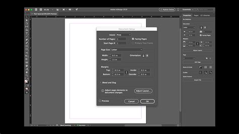
The number of pages should be adjusted to accommodate the magazine's content, with an emphasis on using an even number to maintain a balanced layout across spreads. Crucially, within this initial document window, define your margins, bleed, and slug settings. Margins create essential breathing room around content, preventing it from appearing cramped against the page edges. Bleed is a critical component for print, ensuring that design elements extending to the edge of the page are fully printed and can be trimmed precisely without leaving unprinted white borders. The slug area is designated for non-printing information, such as instructions or notes for the printer. A correctly configured document setup streamlines the subsequent design process and significantly contributes to a professional, print-ready output.
The Power of Master Pages for Consistency
Master pages in Adobe InDesign serve as the linchpin for maintaining design consistency across an entire magazine. They are essentially templates that allow for the application of recurring design elements-such as headers, footers, page numbers, and consistent graphical motifs-to multiple pages simultaneously. This feature is instrumental in saving time and ensuring a unified visual identity for the publication.
To create a master page, one would typically access the Pages panel and initiate the creation of a new master page. Within this master page environment, designers can utilize tools like the Rectangle Frame Tool to establish placeholders for images, the Type Tool for text elements like running headers or footers, and the Swatches Panel to define and apply a consistent color palette. Once a master page is fully configured with its intended design elements, it can be applied to any page within the document by simply dragging the master page icon from the Pages panel onto the desired page thumbnail. This efficient workflow guarantees that elements like page numbers or recurring graphic elements are automatically updated across the entire magazine, reinforcing a professional and cohesive aesthetic from the cover to the final page.
Building a Robust Grid Layout and Organization
A well-defined grid layout forms the structural foundation of any successful magazine design. It provides an invisible framework that guides the precise placement of text and images, ensuring visual harmony and logical flow. To establish a grid, the Layout > Create Guides command is utilized. This dialog box allows designers to specify the desired number of columns and rows for their pages, effectively dividing the page into a series of uniform modules.
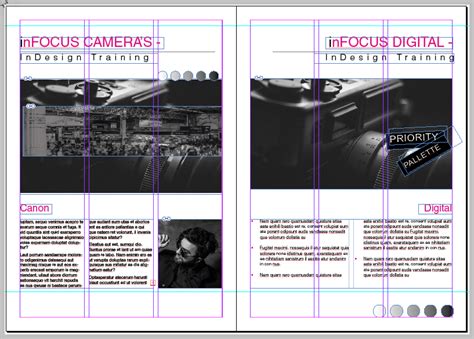
The gutter setting within this command dictates the spacing between these columns and rows, creating visual separation and improving readability. With the grid established, content is then incorporated using tools like the Text Frame Tool for articles and the Image Frame Tool for photographs. This systematic approach ensures that all elements are aligned with the grid, resulting in a visually balanced and organized layout that is both aesthetically pleasing and easy for the reader to navigate. The discipline of adhering to a grid prevents visual chaos and elevates the magazine's overall professionalism.
Essential Layout Design Principles for Impact
Effective magazine layout design hinges on a delicate balance of clarity, visual interest, and strategic organization. A core principle is the thoughtful arrangement of text and imagery, always ensuring ample white space. White space, or negative space, is not merely empty area; it's a crucial design element that prevents pages from appearing cluttered, enhances readability, and directs the reader's eye to important content.
Adherence to a consistent font and color scheme is also paramount. The Swatches Panel in InDesign is invaluable for managing color choices, ensuring chromatic harmony across the publication. Headings and subheadings serve as vital signposts, breaking up lengthy blocks of body text and guiding the reader through the narrative. Meticulous attention to alignment and spacing further refines the layout, creating a sense of order and professionalism. Finally, rigorous proofreading of all text is non-negotiable; errors can undermine the credibility of even the most visually stunning design. By integrating these principles, designers can craft magazine layouts that not only look professional but also actively engage and retain reader interest from the outset.
Typography: The Voice of Your Magazine
Typography plays an indispensable role in editorial design, acting as the primary conduit for conveying information and establishing the magazine's tone. The way text is presented-its size, weight, spacing, and style-profoundly impacts readability and the overall reader experience.
Point Size: The chosen point size must be legible for the target audience, considering whether the magazine will be viewed on a printed page or a digital screen. A common range for body text in print is between 9 and 12 points, but this can vary based on the typeface and publication style.
Line Length: The ideal line length for optimal readability typically falls between 50 and 70 characters per line. Shorter lines can lead to excessive hyphenation and cause the reader's eye to jump back and forth too frequently, disrupting the reading flow. Conversely, excessively long lines make it difficult for the reader to locate the beginning of the subsequent line, leading to fatigue and disengagement.
Amount of Copy: Large, unbroken blocks of text can appear intimidating and deter readers. Breaking up extensive copy into smaller, digestible chunks through the strategic use of subheadings, pull quotes, and imagery is essential for maintaining reader interest and improving comprehension.
The ULTIMATE Guide To Typography For Beginners
Navigating Margins, Columns, and Gutters
Understanding the interplay between margins, columns, and gutters is fundamental to creating structured and visually appealing magazine layouts in InDesign. These elements work in concert to define the spatial relationships between content elements and the page edges.
Adjusting Margins and Columns
To modify the page margins and column structure, the command Layout > Margins And Columns is employed. Within the dialog box that appears, the link option in the Margins section should be ensured to be active if uniform margins are desired. Adjusting these margin guides sets the preferred distance from the page edges. For asymmetrical margins, such as those often required for print production where inside margins need to accommodate the binding, the link option can be deselected. This allows for independent adjustment of each margin. A practical tip for quickly increasing an outside margin, for instance, is to insert the cursor after the existing value and type *2, effectively doubling it.
Utilizing Create Guides for Precision
For more granular control over layout divisions, the Create Guides command offers significant flexibility. This tool is invaluable for visually dividing a layout into precise thirds, quarters, or any desired proportion, or for adding a guide to the exact center of the layout, either vertically or horizontally. Within the Create Guides dialog box, the number of Rows and Columns can be specified. To create single, distinct guides rather than a grid of multiple guides, the gutter value can be set to 0. This allows for the precise placement of guides that act as visual aids for aligning content.
Managing Text Frames and Flow
Dividing larger text areas into multiple columns within a single frame, or creating distinct frames that flow into one another, is achieved through text frame options. To divide a frame into columns, select the frame and navigate to Object > Text Frame Options. Here, the number of columns and their associated gutters can be defined.
To enable text to flow seamlessly between separate text frames-a common requirement for articles that span multiple pages or sections-these frames can be "threaded" together. This process involves clicking the first frame to select it, then clicking its out port (the small square in the lower-right corner of the frame) and releasing. The cursor will then transform into a loaded text icon, allowing you to click into the next frame where the text should continue. This threading ensures that as text is added or edited, it automatically reflows through the connected frames, maintaining narrative continuity.
Understanding Crops and Bleeds for Professional Printing
Crops and bleeds are critical concepts in professional print design, ensuring that finished printed pieces have clean edges and that no essential content is accidentally trimmed away. Confusion surrounding these elements is common among budding designers, but understanding their purpose is vital for industry-standard results.
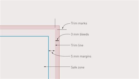
Bleed: Bleed refers to the area of an image or design element that extends beyond the trim edge of the page. When a magazine is printed, it's typically done on a larger sheet of paper that is then cut down to the final page size. By extending the design elements past the intended trim line, a small margin is created to account for slight variations in the cutting process. This ensures that when the page is trimmed, the background color or image extends all the way to the edge without any unprinted white borders. The amount of bleed required can vary, but a common standard is 0.125 inches (or 3mm) on all sides.
Crop Marks: Crop marks, also known as trim marks, are thin lines printed on the bleed area of a page that indicate where the final page should be cut. They are not part of the final design itself but serve as guides for the printing press operator or the finishing service to ensure accurate trimming. In InDesign, crop marks are typically added during the export process.
Working with Crops and Bleeds in InDesign: When setting up a new document for print, it's essential to define the bleed area. This is done in the New Document dialog box under the "Bleed and Slug" section. After setting the bleed values, InDesign will display a visual indicator (usually a red line) showing the bleed area. When placing images or extending background colors, ensure they extend to this red line. During the export process to PDF for printing, navigate to File > Export. In the export dialog, under "Marks and Bleeds," select "Crop Marks" and ensure "Use Document Bleed Settings" is checked. This will embed the necessary guides for the printer.
General Tips for Polished Magazine Layouts
Beyond the fundamental technical aspects, several general tips can elevate a magazine layout from competent to exceptional, ensuring a polished and professional appearance. These insights, often gleaned from experienced designers, focus on the subtle details that contribute to a superior reader experience.
The Importance of Details
In magazine design, the adage "the devil is in the details" holds particularly true. Small elements, when executed with care, contribute significantly to the overall quality. This includes meticulous attention to typographic details, such as consistent leading (line spacing) and kerning (space between specific letter pairs), ensuring that text is not only readable but also aesthetically pleasing. Precise alignment of all elements, even those not directly on a grid, creates a sense of order and intentionality. Proofreading, as mentioned, is paramount, but it extends beyond mere grammatical errors to include checking for consistent formatting, correct image resolution, and accurate placement of all content.
Quick Hacks for Efficiency and Impact
Experienced designers often develop "quick hacks" or efficient techniques to streamline their workflow and enhance their designs. One such technique involves using InDesign's built-in features to create visual interest without excessive complexity. For instance, text wrap options can be manipulated beyond simple rectangular boundaries. Experimenting with wrapping text around irregular shapes or using anchored objects can create dynamic layouts that feel less grid-like and more organic.
Another impactful technique is the strategic use of color. Beyond a consistent color palette, consider using accent colors sparingly to draw attention to key elements like headlines, call-to-action buttons, or important statistics. The Swatches panel is your best friend here for maintaining consistency.
Leveraging Tools for Maximum Effect
Adobe InDesign offers a powerful suite of tools designed specifically for editorial design. Understanding how to use these tools to their best effect is key. For example, the Paragraph and Character Styles panels are indispensable for managing typography. By defining styles for headings, subheadings, body text, captions, and other recurring text elements, designers can ensure consistency and make global changes rapidly if needed. If a particular font or size needs to be updated throughout the magazine, modifying the style definition will update all instances automatically.
Similarly, leveraging the Layers panel (Window > Layers) can help organize complex layouts. By grouping elements onto different layers (e.g., background elements, text, images), designers can easily isolate and manipulate specific parts of the design without affecting others. This is particularly useful when creating complex visual compositions or when collaborating with other designers or editors.
Simple Advice for Enduring Quality
Ultimately, some of the most effective advice for magazine layout design is deceptively simple:
- Know Your Audience: Design with your target reader in mind. What are their preferences? What is their level of familiarity with the subject matter?
- Tell a Story: Every page, and indeed every spread, should contribute to a larger narrative. Consider how elements flow and guide the reader's eye through the content.
- Embrace White Space: Do not be afraid of empty areas on the page. They are crucial for visual breathing room and focus.
- Consistency is Key: Maintain a consistent visual language throughout the magazine, from typography and color to spacing and image treatment.
- Iterate and Refine: Design is an iterative process. Be prepared to experiment, get feedback, and refine your layouts until they achieve the desired impact.
By internalizing these principles and techniques, designers can confidently approach the creation of professional, engaging, and visually stunning magazine layouts using Adobe InDesign.