Photopea, a powerful and accessible online photo editor, offers a robust suite of tools for manipulating text, making it an excellent platform for creating visually striking text effects. Whether you're a beginner looking to add a simple shadow or an experienced designer aiming for complex typographic art, Photopea's capabilities can help you achieve professional-quality results. This tutorial will guide you through the fundamental and advanced techniques for applying and customizing text effects, ensuring you can transform ordinary text into compelling design elements.
Understanding Photopea's Text Engine
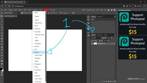
At its core, Photopea's text functionality is built upon a sophisticated engine that allows for precise control over typography. When you select a type layer in the Layers panel, a wealth of options becomes available, enabling you to modify its appearance. This is analogous to how text is handled in many desktop publishing applications, providing a familiar yet potent environment for text manipulation.
Character and Paragraph Styles: The Foundation of Text Formatting
Photopea distinguishes between two primary categories of style parameters: Character Style and Paragraph Style. Understanding the difference and application of these styles is crucial for effective text formatting and the creation of advanced text effects.
Character Styles focus on the appearance of individual characters or selected portions of text. These settings affect specific glyphs and can include attributes like font family, size, color, leading (line spacing), kerning (space between specific pairs of characters), tracking (overall letter-spacing), and baseline shift. For example, you might use character styles to make a single word bold, change its color, or slightly raise it above the rest of the text for emphasis.
Paragraph Styles, on the other hand, govern the overall appearance of a block of text. These settings apply to an entire paragraph and control attributes such as alignment (left, right, center, justified), indentation, spacing before and after paragraphs, and hyphenation. When you apply a paragraph style, it affects the entire paragraph, ensuring consistency in layout and readability.
Applying Styles: Direct Manipulation and Layer Properties
There are several ways to alter the style of your text within Photopea. The most straightforward method involves selecting the type layer in the Layers panel. Once selected, you can access and modify various style attributes directly through the options that appear, often in a dedicated text properties panel or within the main menu. This allows for global changes to the entire text layer.
Alternatively, for more granular control, you can enter the text layer itself. This is typically done by double-clicking the text thumbnail in the Layers panel or by using a dedicated editing tool. Once inside the text editing mode, you can select specific parts of the text - a single character, a word, or a phrase - and apply character-level styling. This is invaluable for creating emphasis or intricate typographic designs where different parts of the text need distinct appearances.
Advanced Text Effects: Beyond Basic Formatting
While fundamental styling is essential, Photopea truly shines when it comes to creating dynamic and engaging text effects. These effects are often achieved through a combination of the layer's blending options and the application of various filters and adjustments.
Layer Styles: The Powerhouse of Visual Effects
Photopea's Layer Styles are a central component for creating sophisticated text effects. These non-destructive effects can be applied to any layer, including text layers, and allow for a wide range of visual enhancements. Common layer styles include:
- Drop Shadow: Adds a shadow effect behind the text, giving it depth. You can control the color, opacity, angle, distance, spread, and size of the shadow.
- Inner Shadow: Similar to a drop shadow but applied from within the text, creating an embossed or inset effect.
- Outer Glow: Creates a luminous halo around the text. This can be used for a glowing effect or to help text stand out against a busy background.
- Inner Glow: Applies a glow effect from the inside edges of the text, often used for a subtle highlight or a metallic sheen.
- Bevel and Emboss: Mimics the appearance of raised or indented text by simulating light and shadow on the edges. This is a fundamental technique for creating 3D-like text. You can adjust the style (inner/outer bevel, stroke emboss), technique (smooth, chisel hard, chisel soft), depth, direction, and shading.
- Satin: Applies a subtle overlay of color and texture, often used to create a silk-like finish or to add subtle gradients to the text.
- Color Overlay: Fills the text with a solid color, overriding the original text color.
- Gradient Overlay: Fills the text with a gradient, allowing for smooth color transitions. This is a popular choice for modern and eye-catching text.
- Pattern Overlay: Fills the text with a repeating pattern image.
- Stroke: Adds an outline around the text. You can control the size, color, position (inside, outside, center), and blend mode of the stroke.
- Drop Shadow, Inner Shadow, Outer Glow, and Inner Glow: These specific effects are available as individual options within the Layer Styles menu, offering dedicated controls for each.
These layer styles can be combined in numerous ways to achieve complex and unique looks. For instance, a combination of Bevel and Emboss, a Gradient Overlay, and a subtle Drop Shadow can create a convincing metallic or 3D effect.
Blending Modes: Interacting with Underlying Layers
Blending modes dictate how a layer's pixels interact with the pixels of the layers beneath it. When applied to a text layer, blending modes can create fascinating effects, especially when the text is placed over textured or image-based backgrounds. For example, using the "Multiply" blend mode with white text over a colored background will make the text appear as if it's been "stamped" onto the background, with the background colors showing through. Conversely, "Screen" mode can make dark text appear lighter and interact with the colors beneath it in different ways. Experimenting with various blend modes like "Overlay," "Soft Light," "Color," and "Luminosity" can yield surprising and creative results.
Filters and Adjustments: Adding Texture and Dimension
Beyond layer styles, Photopea's extensive filter library can be applied to text layers (though often it's beneficial to rasterize the text layer first, or apply filters to duplicate layers to maintain editability).
- Distort Filters: Filters like "Wave," "Twirl," "Ripple," and "Spherize" can warp and distort text, creating dynamic and abstract effects. These are excellent for creating energy or movement within text.
- Stylize Filters: Filters such as "Wind," "Extrude," and "Emboss" can add textures or depth to text, simulating effects like rough surfaces or carved lettering. The "Extrude" filter, when applied, can create a 3D extrusion effect by generating depth from the text shape.
- Artistic Filters: Filters like "Plastic Wrap," "Posterize," and "Cutout" can dramatically alter the appearance of text, giving it a painted, graphic, or textured look.
- Blur Filters: While not typically used for direct text effects, subtle blurs can be used to soften edges or create depth-of-field effects when combined with other techniques.
Adjustment layers, such as "Hue/Saturation," "Levels," and "Curves," can also be clipped to a text layer to non-destructively alter its color and tonal range, further enhancing the applied effects.
Retro Text Tutorial | Photopea Tutorials
Working with Fonts in Photopea
The choice of font is paramount to the overall impact of any text effect. Photopea provides access to a vast library of fonts, ensuring you have the creative freedom to select the perfect typeface for your project.
Royalty-Free Fonts and Custom Font Integration
Photopea boasts a huge database of royalty-free fonts, readily available for use in your designs. These fonts cover a wide spectrum of styles, from classic serifs to modern sans-serifs, decorative scripts, and more.
For any other fonts you wish to use - perhaps specific branded fonts or unique finds from other sources - Photopea allows you to open them directly. You can import TrueType (.TTF) or OpenType (.OTF) font files just as you would open any other file. This is achieved through the "File - Open" menu, or by simply dragging and dropping the font file into the Photopea interface. Once loaded, these custom fonts become available for selection within Photopea's text tools, expanding your typographic palette significantly.
Advanced Text Manipulation Techniques
Beyond the direct application of styles and filters, Photopea offers techniques for more intricate text manipulation.
Text on a Path: Creative Layouts
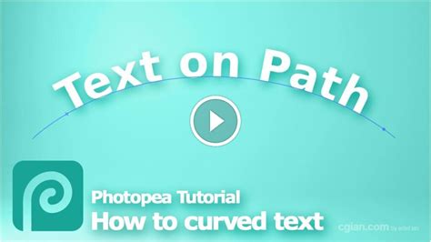
One powerful feature is the ability to place text along a custom path. This allows for circular text, text that follows a wavy line, or any other complex contour you can draw using Photopea's vector tools (like the Pen Tool).
- Create a Path: Use the Pen Tool or shape tools to draw the desired path on your canvas.
- Select the Text Tool: Activate the Horizontal Type Tool.
- Hover over the Path: Move your cursor over the path you created. The cursor icon will change, indicating that the text will now follow the path.
- Click and Type: Click on the path and begin typing. Your text will conform to the shape of the path.
- Editing Text on a Path: You can adjust the position of the text along the path, its orientation, and spacing using the direct selection tool (white arrow) to manipulate path anchor points, and the text tool to modify text properties. You can also apply layer styles to text on a path.
This technique is invaluable for logos, badges, and designs requiring text to be integrated seamlessly with graphic elements.
Bidirectional Text and Punctuation Handling
For projects involving languages that read from right to left (like Arabic or Hebrew), Photopea supports bidirectional text. This ensures that characters, words, and punctuation are displayed and formatted correctly according to the linguistic rules of the language. When working with bidirectional text, Photopea's engine accounts for the flow of text and the appropriate placement of punctuation marks, which can be a complex requirement in typography.
Text Alignment: Precision in Layout
The alignment of text is crucial for readability and aesthetic appeal. Photopea offers standard alignment options: left, center, right, and justified.
- Point Text Alignment: When you use "Point Text" (clicking once with the Type Tool to create a single line or short phrase), alignment is computed relative to the point of origin. This means that centered text will be centered on that initial click point, left-aligned text will start from that point, and right-aligned text will end at that point.
- Paragraph Text Alignment: When you create a "Paragraph Text" box by clicking and dragging with the Type Tool, alignment applies to the entire block of text within that box, aligning it to the edges of the bounding box.
Understanding these alignment behaviors is key to achieving precise layouts, especially when working with multiple text elements or complex compositions.
Tips for Creating Impressive Text Effects
- Start with a Strong Font: The foundation of any good text effect is a well-chosen font. Consider the mood and message of your design when selecting a typeface.
- Experiment with Layer Styles: Don't be afraid to combine multiple layer styles. This is where much of the magic happens. Adjust the opacity, color, and settings of each style to achieve unique looks.
- Use Gradients Effectively: Gradients can add depth, color, and a professional finish to your text. Experiment with different gradient types (linear, radial, angled) and color combinations.
- Consider the Background: The text effect should complement, not clash with, the background. Use blending modes and layer styles to ensure your text is legible and visually integrated.
- Don't Overdo It: While Photopea offers many powerful tools, sometimes less is more. A subtle shadow or a clean gradient can be more effective than an overly complex effect.
- Rasterize Smartly: While it's often best to keep text layers editable, you may need to rasterize them to apply certain filters or advanced pixel-based manipulations. Consider duplicating your text layer before rasterizing to retain an editable version.
- Leverage Color Theory: Understand how colors interact. Using complementary colors for text and background, or creating harmonious gradients, can significantly enhance the visual appeal.
- Practice and Patience: Creating sophisticated text effects takes practice. Experiment with different tools and techniques, and don't be discouraged if your first attempts aren't perfect.
By mastering Photopea's text tools and exploring the vast possibilities of layer styles, filters, and font integration, you can elevate your designs from ordinary to extraordinary. The platform's accessibility and powerful features make it an ideal environment for anyone looking to craft compelling typographic content.