Screen printing, a technique celebrated for its vibrant results and tactile appeal, relies heavily on meticulous artwork preparation. Achieving the nuanced shading and textured depth characteristic of traditional screen prints within a digital workflow is entirely possible, and Adobe Photoshop serves as a powerful tool in this endeavor. This guide delves into the essential steps and considerations for preparing your designs in Photoshop for screen printing, focusing on the creation of halftones and effective color separation.
Understanding the Fundamentals of Screen Printing Artwork
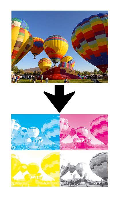
Commercial reproduction of artwork for screen printing, especially when it involves more than one color, necessitates a process known as color separation. This involves preparing individual "master plates," with each plate corresponding to a single color that will be printed. The most common ink set for commercial reproduction is cyan, magenta, yellow, and black (CMYK), which, when combined, can create a wide spectrum of colors.
The quality of the final print is intrinsically linked to the resolution of both the image file (pixels per inch or ppi) and the output device (dots per inch or dpi). For professional screen printing, it is generally recommended that your image files have a resolution of 300 dpi or higher, with many professional facilities requiring 1200 dpi or even more for optimal results. When preparing files for commercial printers, it is crucial to learn their specific requirements, as they may need prepress-specific settings.
Preparing Your Photoshop Document for Print
Before diving into the specifics of halftones and separations, setting up your Photoshop document correctly is paramount. This involves establishing the appropriate document size, resolution, and color mode.
Document Setup: Size, Resolution, and Color Mode
The base output size of an image is determined by the document size settings in the Image Size dialog box. When setting up a new document, aim for canvas dimensions that align with standard apparel print areas, as these correspond to the typical printable areas on most garments. Always work at a minimum of 300 DPI; this is the standard for creating high-quality screen print effects. If your artwork is at a lower resolution, it is far better to recreate it at 300 DPI rather than attempting to upscale it, which often leads to a loss of clarity.
For designs destined for commercial printing, it is essential to set the color mode to CMYK. CMYK (Cyan, Magenta, Yellow, and Key/Black) is designed for printing on white paper and is considered a subtractive coloration mode. It creates hues by subtracting from the paper's brightness to achieve the final target value. This method yields more accurate colors than the other popular color method, RGB (Red, Green, Blue). At professional print shops, they often request files in CMYK because that is the toner their printing presses use. If your design is primarily for digital mockups, you can initially stick with RGB.
Achieving the Screen Print Aesthetic: Halftones and Textures
Screen-printed graphics are often characterized by their unique textured appearance and layered depth, which can be achieved digitally through halftones and the strategic application of textures.
Creating Halftone Patterns
Making halftone patterns for screen printing is a great way to add shading and texture to your designs. A halftone is essentially a reproduction of a continuous-tone image using dots of varying sizes and/or spacing.
The process of converting an image to a halftone pattern in Photoshop typically involves several steps:
- Image Size Adjustment: Head over to the Image tab and select Image Size. Ensure the resolution is at least 300 dpi (though 600 dpi or higher is often preferred for finer detail) and then hit OK.
- Convert to Grayscale: Navigate to Image > Mode > Grayscale. If you were to bitmap the image without adjusting the levels first, it might result in a loss of detail or an undesirable appearance. It is often beneficial to adjust the tonal range of your image before converting to grayscale. Use Image > Adjustments > Levels or Curves to fine-tune the highlights, midtones, and shadows. This allows you to control the contrast and ensure that important details are preserved.
- Convert to Bitmap: Once you are satisfied with the grayscale image, go to Image > Mode > Bitmap.
- Halftone Screen Settings: After clicking OK, a window will appear where you can set the halftone dot size and frequency. To determine the lines per inch (LPI) for your halftone, a common guideline is to divide the mesh count of the screen you are using by 4 or 4.5. For instance, if you are using a 230 mesh count screen, dividing by 4.5 gives you approximately 51 LPI. It's often advisable to round down to a simpler number, such as 50 LPI, for easier management. You can then set the screen angle to achieve the desired dot pattern. Experiment with different angles to avoid moiré patterns, which can occur when halftone screens interact in undesirable ways.
Halftone Dither Effect in PHOTOSHOP
Incorporating Textures for Authenticity
Screen prints often possess subtle imperfections and tactile qualities that add to their charm. Replicating this in Photoshop can be achieved by incorporating textures.
- Using Photoshop Filters: One simple method is to use Photoshop’s Clouds filter. Create a new layer, fill it with 50% gray, then go to Filter > Render > Clouds. You can then adjust the Blending Options for this layer, perhaps using the Pattern Overlay option with textures like canvas or rough paper to mimic the feel of real materials.
- Scanning Real Textures: For a truly authentic effect, consider scanning an actual screen-printed garment or a textured material like rough paper or canvas. Convert the scanned image to grayscale and adjust the levels to clean up the texture. You can then save this as a custom pattern for future use.
- Subtlety is Key: When applying textures, it's important to keep them subtle. Low opacity often works best to enhance your design without overpowering it. Layer masks are invaluable here; they allow you to control precisely where textures and effects appear, painting with black to hide, white to reveal, and gray for partial transparency.
Color Separation: The Foundation of Multi-Color Prints
When your artwork contains more than one color, preparing separate files for each ink is crucial. This process is fundamental to commercial printing and ensures accurate color reproduction.
Working with RGB and Converting to CMYK
It is often recommended to work entirely in RGB mode during the initial editing stages of your image. RGB mode offers a wider color gamut, which can be beneficial for editing. Ensure that your image file is tagged with the RGB working space profile. Once you have finished editing your image and are ready for print preparation, convert the image to CMYK mode. Make any additional color and tonal adjustments in CMYK, paying special attention to the highlights and shadows. Tools like Levels, Curves, or Hue/Saturation adjustment layers can be used for these corrections, but these adjustments should generally be minor.
Creating Individual Color Layers
For better control and to mimic the traditional screen printing process, separate different elements of your design into individual layers. For example, place text, graphics, and background elements on their own layers.
The next step is breaking your design into individual color layers.
- Threshold Adjustment: For simple black and white separations, use the Threshold adjustment layer. This tool converts your design into pure black and white, which is ideal for creating the base layer of your screen print effect.
- Black & White Adjustments and Masks: For more detailed separations, combine Black & White adjustment layers with layer masks. This approach gives you precise control over how colors in your original design translate to individual layers.
- Channels Panel: The Channels panel is another powerful tool for color separation. By viewing individual channels (Red, Green, Blue in RGB, or Cyan, Magenta, Yellow, Black in CMYK), you can see how your design naturally breaks down. Often, one channel will provide a great starting point for a specific color separation.
As you separate colors, create a new layer for each ink color you plan to use. Clearly label these layers, for example, "Base White," "Red Ink," or "Black Details." Keep each layer as a solid color initially; you will apply halftone effects and textures to these layers in subsequent steps.
Refining Your Artwork for Commercial Printing
Beyond halftones and color separations, several other considerations are vital for ensuring your Photoshop files are print-ready for commercial reproduction.
Incorporating Bleed and Trim Marks
For artwork that extends to the edge of the printed piece, a concept called "bleed" is essential. Bleed is when an image or other print element extends beyond the trim edge, leaving no white margin after the piece is cut. A document with bleed must be printed on a larger sheet of paper and then trimmed down to the appropriate size. The standard bleed size in the print industry is typically 1/8th inch on each side of the page.
When preparing to print, Photoshop's Print dialog box offers options for positioning and scaling your image. You can adjust the position and scale of an image using options in the Print dialog box. Scaling an image in the Print dialog box changes the size and resolution of the printed image only; it does not alter the document size settings in the Image Size dialog box. For example, if you scale a 72-ppi image to 50% in the Print dialog box, the image will print at 144 ppi, but the document's inherent resolution remains unchanged.
The Print dialog box also allows for the addition of various marks that aid in the printing and trimming process:
- Crop Marks: These indicate where the page is to be trimmed. You can choose to print crop marks at the corners or as center crop marks.
- Registration Marks: These are used to align different color plates accurately.
- Calibration Bars: These bars provide a gradient tint bar and a grayscale step bar (an 11-step grayscale, a transition in density from 0 to 100% in 10% increments) for color calibration.
- Labels: You can print any description text entered in the File Info dialog box, up to about 300 characters, and the file name above the image.
These marks, along with calibration bars and registration marks, are typically printed only if the paper size is larger than the printed image itself.
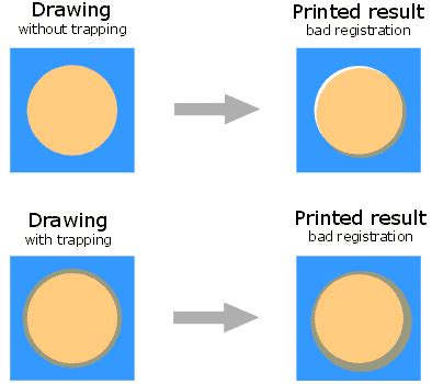
Understanding Trapping
Trapping is a technique used in color separation to correct the misalignment of solid colors that can occur during the printing process. It involves intentionally overlapping adjacent colors slightly.
- How Trapping Works: Lighter colors are usually spread under darker colors. For example, yellow might spread under cyan, magenta, and black. Pure cyan and pure magenta spread under each other equally.
- The Risk of Over-Trapping: While trapping is essential for preventing unwanted white gaps between colors, excessive trapping can produce an undesirable outline effect around objects. It's important to note that trapping effects may not be visible on-screen and might only show up in the final print. Professional print shops often handle trapping automatically or have specific requirements for how it should be applied.
Using Page Layout Programs for Final Output
In general, most images intended for commercial printing are not printed directly from Photoshop but are instead placed into a page-layout program like Adobe InDesign or an illustration program like Adobe Illustrator. These programs offer more sophisticated control over page imposition, color management, and final output preparation.
When you use Photoshop EPS images to place into a page layout program, it is advisable not to embed the halftone screen frequency in each image within Photoshop. Instead, allow the page-layout program or the commercial printer to handle the halftone screening.
If you use a desktop printer to preview the appearance of the final printed piece, remember that a desktop printer cannot faithfully replicate the output of a commercial printing press. If you have a profile from a commercial press, you can choose it with the Proof Setup command in Photoshop and then view a soft proof using the Proof Colors command. This gives a more accurate on-screen representation of how the colors will appear after printing.
Some printers may prefer to receive your documents in PDF format, especially if the documents need to conform to PDF/X standards, which are designed to ensure that PDF files are suitable for print production.
Finalizing and Exporting Your Files
Once your artwork is prepared, separated, and refined, the final step is exporting it in a format suitable for the print shop.
File Formats and Resolution
Photoshop images used for print purposes are best saved as TIFF, EPS, native PSD, or PDF files.
- TIFF: A widely used format that supports layers and high-resolution images without loss of quality.
- EPS (Encapsulated PostScript): Often used for vector graphics and can contain both raster and vector data.
- PSD (Photoshop Document): Your native Photoshop file, which preserves all layers, masks, and editing capabilities. It's always a good practice to save a layered PSD file as a backup.
- PDF (Portable Document Format): A versatile format that can embed fonts, images, and layouts, making it ideal for sharing and printing. For commercial printing, PDF/X standards are often preferred.
Always ensure that your exported files maintain the high resolution (300 dpi or higher) and correct color mode (CMYK for print) that you established during the setup phase.
Exporting for Review and Print
- For Client Review: Export a flattened TIFF at 300 DPI or a high-resolution PNG at 150-200 DPI for digital review.
- For Print: Export as a high-resolution PDF, adhering to any specific guidelines provided by your print service provider.
To maintain order in your file, rename layers with clear, descriptive labels. For more complex designs, consider using color labels to code your layer groups. After refining your design and organizing your layers, save the master file as a PSD and include the date in the filename (e.g., MM/DD/YYYY) to keep track of versions. Document your export settings and file naming conventions in a text file saved alongside your project files for consistency.
By diligently following these steps, you can transform your digital designs in Photoshop into high-quality artwork ready for the vibrant and tactile world of screen printing.
tags: #photoshop #for #silkscreen