Photoshop's Gradient Map adjustment layer is a powerful and versatile tool that allows for creative color grading and unique visual effects. Far from being just a simple color wash, the Gradient Map fundamentally alters an image by mapping its tonal values to a chosen gradient. This tutorial delves into the intricacies of this adjustment, exploring its application for everything from subtle color enhancements to dramatic artistic transformations.
Understanding the Core Concept of Gradient Maps
At its heart, a Gradient Map in Photoshop replaces the existing tonal values of an image with colors defined by a gradient. This is achieved by analyzing the image in grayscale. The darkest areas of the image are mapped to the beginning of the gradient (typically the left side), the lightest areas are mapped to the end of the gradient (typically the right side), and all the intermediate grays are mapped to the colors in between.
This fundamental principle distinguishes Gradient Maps from other gradient-related tools. While a Gradient Fill adds a directed wash of color that can be linear, radial, or reflected, a Gradient Map specifically targets and reinterprets the existing luminosity of an image. For instance, if you apply a black and white gradient, the darkest parts of your image will become black, and the lightest parts will become white, with shades of gray in between. This forms a foundational understanding for more complex color manipulations.
The "Gradient Fill" is often mentioned in conjunction with Gradient Maps, but it's crucial to understand their difference. A Gradient Fill is essentially a directed wash of color, offering various directional options like linear, radial, and reflected. It's most effective as an adjustment layer, working harmoniously with blend modes and opacity for striking visual outcomes. The Gradient Tool itself can be thought of as a directed paint bucket. The Gradient Map, however, operates on a different principle; it maps the tonal values within an image to the colors of a selected gradient.
Installing and Accessing Gradients in Photoshop
To begin harnessing the power of Gradient Maps, you'll first need to ensure you have gradients readily available. Photoshop comes with a substantial library of presets, and you can also import custom gradient packs.
To install new gradients, you'll need to download them first. A popular source for custom gradient maps is Supply Family's CC Library of custom gradients. Once downloaded, head over to Photoshop. Navigate to Window > Gradients to open the Gradients panel. Within this panel, click on the menu icon (usually three horizontal lines or a gear icon) and select Import Gradients. You can then browse to the downloaded gradient files (typically with a .grd extension) and import them.
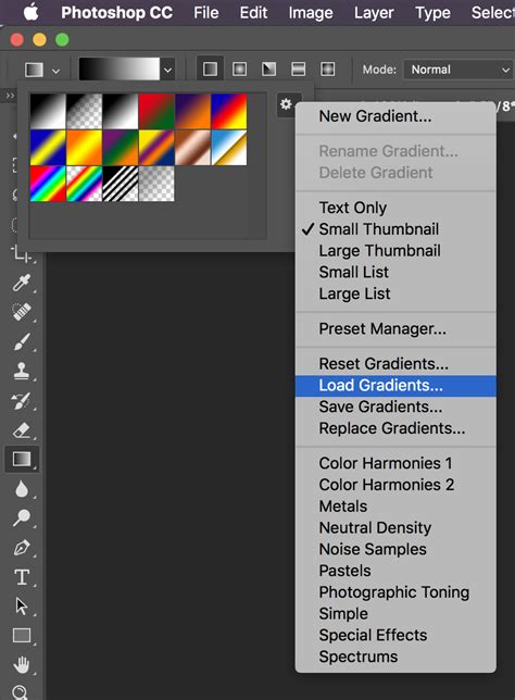
The Gradients panel will then display your newly added gradients, ready for use. You can expand out gradient entries such as legacy default gradients and select and apply them. With the most recent release of Photoshop, the gradient map presets are now massive with hundreds of entries available to be used.
Applying Gradient Maps to Your Artwork
There are several ways to apply a Gradient Map adjustment in Photoshop, each offering different levels of flexibility and control.
Using Adjustment Layers (Recommended for Non-Destructive Editing)
The most recommended method for applying Gradient Maps is through adjustment layers. This approach is non-destructive, meaning it doesn't permanently alter your original image pixels and allows for easy modifications later in your workflow.
- Open Your Image: Start by opening the photo or image you wish to edit in Photoshop.
- Add a Gradient Map Adjustment Layer:
- Go to the
Layermenu, selectNew Adjustment Layer, and then chooseGradient Map. - Alternatively, you can click on the
Adjustmentsicon at the bottom of the Layers panel (a half-filled circle) and selectGradient Map. - If you're working in the Photography Workspace, the Adjustments panel often comes pre-selected.
- You can also access it via
Image >> Adjustments >> Gradient Map, but this is a destructive method that directly alters the image layer.
- Go to the
- The Layers Panel: When you add a Gradient Map as an adjustment layer, it appears in your Layers panel. This layer can be moved, duplicated, masked, or deleted at any point in the creative process, or flattened to retain the adjustment.
- The Properties Panel: Once the Gradient Map adjustment layer is created, the
Propertiespanel should open automatically. If it doesn't, you can open it by double-clicking the adjustment layer's thumbnail in the Layers panel.
Applying Gradients within a Layer Folder
For a structured workflow, particularly when working with pre-made templates or specific project setups, you might be instructed to add your artwork within a designated folder.
- Locate the Folder: In the Layers panel, find the folder labeled, for example, “Add your design in this folder.”
- Add Your Image: Create a new layer inside this folder and import your photo or image of choosing. It is crucial that this layer containing your image is placed on top of any default example image that might be present.
- Apply Gradient Map: With your image layer selected, you can then apply a Gradient Map adjustment layer above it. To ensure the gradient map only affects your image layer, you can use a Clipping Mask. Right-click on the Gradient Map adjustment layer and select
Create Clipping Mask.
Modifying and Customizing Gradient Maps
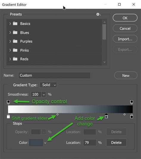
The true power of Gradient Maps lies in their customizability. The Gradient Editor provides a comprehensive interface for fine-tuning your color transitions.
The Gradient Editor Interface
When you click on the gradient preview in the Properties panel of a Gradient Map adjustment layer, the Gradient Editor opens. Here you'll find several key components:
- Gradient Presets: At the top, you'll see a selection of pre-defined gradients. You can pick from these or create your own.
- Gradient Slider: This is the main visual representation of your gradient. It displays the colors and their transitions.
- Color Stops: These are the small squares (or dots) located at the bottom of the gradient slider. Each stop represents a specific color within the gradient. The left stop corresponds to the darkest tones (shadows) in your image, and the right stop corresponds to the lightest tones (highlights).
- Midpoints: Between color stops, you'll see diamond-shaped indicators. These are midpoints that control the transition point between two colors, influencing how smoothly they blend.
- Opacity Stops: Located at the top of the gradient slider, these control the opacity of the gradient at different points. While less commonly used for direct color manipulation in Gradient Maps, they are part of the Gradient Editor's functionality.
- Reverse Checkbox: This option allows you to swap the color stops around, effectively reversing the gradient without manually rearranging the stops.
- Dither Checkbox: Enabling dither helps to reduce color banding and create smoother transitions, especially in areas with subtle tonal changes.
- Method: This dropdown offers different algorithms for how the colors in the gradient map blend together (e.g., Classic, Linear, Perceptual). Experimenting with these can subtly alter the final look.
Changing and Adding Colors
- Selecting a New Color: To change the color of an existing stop, you can:
- Double-click the color stop. This will open the
Color Picker, allowing you to choose any color. - Single-click the color preview for the selected stop in the
Propertiespanel, then use theColor Picker. - Sample a Color: With a color stop selected, you can move your cursor over your image or even outside the Photoshop window. The cursor will turn into an eyedropper, allowing you to sample colors directly from any area.
- Double-click the color stop. This will open the
- Adding New Colors: To introduce more colors into your gradient, simply click below the gradient slider where you see the hand cursor appear. A new color stop will be created. You can then assign a color to this new stop using the methods described above.
- Duplicating Color Stops: To quickly create a new stop with the same color, you can
Alt/Option-drag an existing color stop sideways. - Deleting Color Stops: To remove a color stop, you can either drag it away from the gradient slider until it disappears, or select it and press the
Deletekey.
Adjusting Transitions and Midpoints
The diamond-shaped midpoint indicators are crucial for controlling the blend between colors. Dragging a midpoint closer to one color stop will make that color dominate the transition area. Conversely, moving it away will give more influence to the other color stop. This allows for precise control over how smoothly or abruptly colors change across the tonal range of your image.
Saving Custom Gradients
Once you've created a gradient that you're particularly happy with, you can save it for future use. In the Gradient Editor, after setting up your gradient, give it a name in the Name field and click the New button. Your custom gradient will be added to the presets. It's good practice to organize these into folders for easier management.
Creative Applications of Gradient Maps
Gradient Maps are incredibly versatile and can be used for a wide array of creative purposes, from subtle enhancements to dramatic artistic reinterpretations.
Color Grading and Toning
One of the primary uses of Gradient Maps is for color grading images. This can involve:
- Warming or Cooling an Image: By choosing a gradient that shifts from a warm color (like orange or yellow) to a cooler color (like blue or purple), you can subtly alter the overall mood and temperature of a photograph. For example, a blue gradient map can counteract a reddish color cast from artificial lighting.
- Creating Specific Moods: A gradient that moves from deep blues and purples to soft pinks and oranges can evoke a twilight or dreamy atmosphere.
- Enhancing Color Themes: You can use Gradient Maps to emphasize specific colors already present in an image or to introduce a complementary color scheme for a more eye-catching effect. For instance, using complementary colors in the shadows and highlights can make a photo more visually dynamic.
Color Grading Images in Photoshop with Gradient Maps
Black and White Photography Enhancement
For photographers who appreciate black and white imagery, Gradient Maps offer a new level of manual control and creative possibilities beyond traditional black and white conversion. While a standard black and white gradient maps the darkest tones to black and the lightest to white, custom gradients can introduce subtle or dramatic color tints to specific tonal ranges, adding a unique artistic signature.
Duotones and Monotones
By using a gradient with just two colors, you can easily create duotone or monotone effects. This is a classic graphic design technique that can lend a sophisticated or retro feel to images.
Abstract and Surreal Effects
Gradient Maps can be pushed to create highly abstract and surreal imagery. By using gradients with multiple color stops, unusual color combinations, or by applying them with specific blend modes and opacity settings, you can transform photographs into painterly or otherworldly compositions.
Text Effects
Gradient Maps are not limited to photographic images. They can be used to create interesting text effects, such as distress, inner glow, or sharpening effects. The process often involves applying a blur to the text first, then applying the Gradient Map. The adjustment layer does not use transparency information but purely color, allowing for vibrant and unique text treatments.
Advanced Techniques and Considerations
To achieve the most impactful results with Gradient Maps, consider these advanced techniques and best practices:
Blend Modes and Opacity
The true potential of Gradient Maps is often unlocked when used in conjunction with blend modes and opacity adjustments.
- Blend Modes: Experiment with various blend modes in the Layers panel (e.g.,
Soft Light,Vivid Light,Hard Light,Overlay,Multiply).Soft Lightis often a good starting point for subtle color grading.Vivid LightorHard Lightwith lower opacity can create more intense effects. - Opacity: Adjusting the opacity of the Gradient Map layer allows you to control the intensity of the color effect, ensuring it integrates seamlessly with your original image.
Photographic Toning Presets
Photoshop CC offers specific "Photographic Toning" presets within the Gradient Editor's dropdown menu. These are designed to emulate classic photographic toning techniques and can be a great starting point for achieving specific looks.
Layer Masks for Targeted Application
As with any adjustment layer, Gradient Maps can be used with layer masks. This allows you to apply the gradient effect to only specific parts of your image. By painting on the layer mask, you can selectively reveal or conceal the Gradient Map's influence. You can even use the Gradient Tool directly on the mask to create smooth transitions of the effect.
Using Smart Objects
When working with text or vector elements, applying Gradient Maps as Smart Filters to Smart Objects ensures that the effect remains non-destructive and editable. This means you can change the text or vector shape, and the Gradient Map will update accordingly, or you can disable, change, or delete the effect at any point without permanently altering the underlying object.
Pre-processing and Post-processing
- Contrast Adjustment: For more precise control over tonal areas, it's often beneficial to adjust the contrast of your image beforehand, perhaps using a Curves adjustment layer. This ensures that the Gradient Map has a well-defined range of tones to work with.
- Further Adjustments: Don't hesitate to layer multiple adjustments. You can apply a Gradient Map, then follow it with other adjustments like
HDR Toning,Oil Paint filter, or even anotherGradient Mapwith a different preset or blend mode to create complex and unique looks.
Considerations for Color Selection
- Subtlety is Key: While dramatic effects are possible, the difference between a garish palette and a stunning one is often extremely subtle. Restraint and careful color selection are crucial.
- Value Matters: Be mindful of the overall value (lightness/darkness) of the colors you choose for your gradient. This will directly impact how they are mapped to your image.
- Research and Inspiration: Look at the work of other artists and photographers. Use tools like "Adobe Color Themes" or simply experiment with sampling colors from images you admire to build effective gradients.
Gradient Maps vs. Color LUTs
It's worth noting the comparison between Gradient Maps and Color Look-Up Tables (LUTs). While both can be used for color grading, they operate differently. LUTs often cause a more radical change across mid-tone subjects like skies and trees, whereas simpler gradients tend to leave these areas relatively untouched. However, the effect of both is influenced by the preexisting white balance in the image. Customizing a gradient map to suit an image can eliminate the need for prior white balance adjustments, offering greater control.
Conclusion
The Gradient Map is a remarkably powerful tool in Photoshop that opens up a world of creative color manipulation. By understanding how it maps tonal values to color gradients and by mastering the Gradient Editor, blend modes, and layer masks, you can elevate your images from ordinary to extraordinary. Whether you're aiming for subtle color enhancements, dramatic artistic transformations, or unique text effects, the Gradient Map adjustment layer is an indispensable asset in your digital editing arsenal. Practice, experimentation, and a keen eye for color will undoubtedly lead to stunning results.