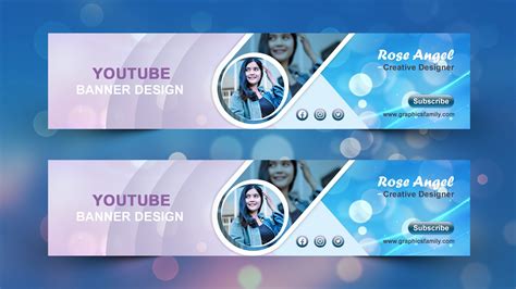
Designing visually appealing, clean, and functional web layouts is a cornerstone of web design. This tutorial will guide you through the process of creating a professional web layout from scratch using Adobe Photoshop. Along the way, you will discover and implement useful methods for design creation.
The Importance of Planning and Wireframing
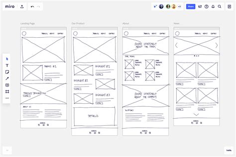
Before diving into the visual design phase, it is crucial to meticulously plan the project's requirements, desired aesthetics, and essential functionalities. This initial planning stage allows for the seamless integration of these ideas into a cohesive layout. Mockups and wireframes are invaluable tools for developing flexible layouts. For this tutorial, we will begin by creating a wireframe using only grayscale tones. This deliberate elimination of color at the outset allows for a concentrated focus on the overall layout structure, preventing premature distractions with color choices and providing greater freedom to quickly modify and rearrange elements. A mockup can be as detailed as you deem necessary; for our purposes, a relatively simple one will serve as a blueprint for our layout.
Setting Up Your Photoshop Workspace
To begin, we will establish a work area of 960 pixels in width, a common standard for web layouts.
- Define the Work Area: Navigate to
Select > Transform Selection. Adjust the selection to precisely 960 pixels in width. - Create Padding: To ensure adequate spacing between the outer borders and the content that will be added later, we need to introduce some padding. With the 960-pixel selection still active, return to
Select > Transform Selection. Resize this selection to 920 pixels wide. This will create a 20-pixel buffer on each side.
Building the Header Element
The header is a critical component of any web layout, often serving as the primary brand identifier and navigation hub.
- Create the Header Area: Use the Marquee Tool to define the area for your header. A common height might be around 100-150 pixels, but this can vary based on your design.
- Initial Fill: Fill this selected area with a neutral gray value. This provides a base that is easy to work with.
- Applying Layer Styles for Color and Gradients: Later, we will leverage Photoshop's Layer Styles to introduce color and gradients, adding depth and visual interest to the header.
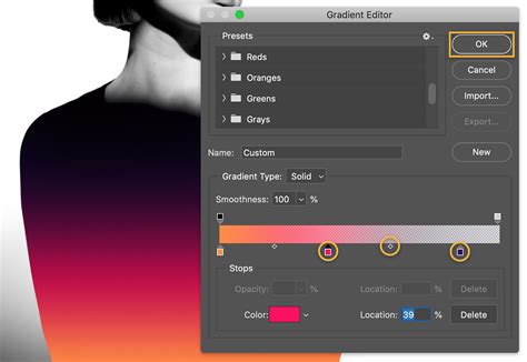
- Gradient Overlay: Double-click on the header layer's thumbnail in the Layers panel to access Layer Styles. Select
Gradient Overlay. - Custom Gradient: Create a two-color gradient that complements your intended color scheme. For instance, a subtle transition from a lighter gray to a slightly darker shade can provide a professional look.
- Gradient Overlay: Double-click on the header layer's thumbnail in the Layers panel to access Layer Styles. Select
Incorporating a Quick Page Layout (Digital Scrapbooking Context)
While the initial focus was on a general web layout, the provided information includes a detailed tutorial on using a "quick page" in Photoshop, often used in digital scrapbooking. This demonstrates a specific application of Photoshop for layout design, which can be adapted for other purposes.
If you are new to digital scrapbooking and Photoshop, this section offers a foundational understanding. For those already familiar with quick pages, this serves as a refresher and a specific example.
Downloading and Opening the Quick Page:
- Download Resource: Obtain the "chasing the sun quick page no. 2." You will likely need to be logged into the store where it's hosted.
- Open in Photoshop: Navigate to
File > Openand locate the downloaded quick page file (e.g.,paislee-chasingthesun-QP2-wtitle.PNG). Select it and clickOPEN.
Adding and Adjusting Photos:
- Open Photo File: Follow the same
File > Openprocedure for the photograph you wish to incorporate into your layout. - Drag and Drop Method: With the
MOVE TOOLselected, click on your photo file and drag it directly onto the open quick page document. Release the mouse button to place it.- Centering Tip: To automatically center the photo during the drag-and-drop process, hold down the
SHIFTkey while dragging.
- Centering Tip: To automatically center the photo during the drag-and-drop process, hold down the
- Close Photo File: Once the photo is placed, you can close its original file to keep your workspace tidy. Select the photo file and go to
File > Close, or click the close button associated with that tab. - Layer Management: Ensure that your quick page layer is positioned at the top of the Layers panel, above the photo layer. This allows the quick page's design elements to overlay the photo correctly. Your layout should now show parts of the photo peeking through the designated windows of the quick page.
Resizing and Positioning the Photo:
- Visibility of Bounding Box: If the bounding box corners are not fully visible, you may need to resize the photo. At the top of the navigation bar, you'll find
W(width) andH(height) boxes, usually displaying 100%. - Percentage Reduction: To make the bounding box visible, reduce the percentage value (e.g., to 70% for both width and height). This allows you to see all four corners.
- Manual Resizing: With the bounding box visible, grab any corner and drag it towards the center to resize the photo to your desired dimensions. You might further reduce it to around 49.9%, for example.
- Fine-Tuning Position: If your photo wasn't perfectly centered initially, use your mouse to move it around the layout until it's positioned exactly where you want it.
- Accept Changes: Once satisfied with the size and position, click the checkmark (arrow) button on the navigation bar to accept the transformations.
Adding Text:
- Select Quick Page Layer: Ensure the quick page layer is selected in the Layers panel before adding text. This guarantees that your text will appear on top of the quick page elements.
- Customizing Text: You can extensively customize your text by altering the font, size, and color. These text properties are accessible in two primary locations:
- At the top of the navigation bar (when the
TEXT TOOLis active). - Within the
CHARACTER PALETTE(accessible viaWINDOW > CHARACTER).
- At the top of the navigation bar (when the
Further Customization and Finalizing:
You can continue to enhance your layout by adding more text elements, decorative embellishments, or other graphics. To add these, simply repeat steps 2 and 3 for opening and placing new elements.
Finalizing the Layout:
- Flatten Image: Once you are completely satisfied with your design, flatten the image to combine all layers into a single background layer. Go to
Layer > Flatten Image. - Save as JPG: Save your completed layout as a high-resolution JPG file for web use. Go to
File > Save Asand chooseJPEGas the format.
Advanced Layout Construction Techniques
Let's return to building a more general web layout, incorporating elements like navigation, content areas, and footers.
Implementing a Footer with Copyright Information
A footer typically contains essential information such as copyright notices, sitemaps, and contact details.
- Set Background to Black: If your background is not already black, set it to black. This is often achieved by filling the background layer or creating a new black background layer.
- Create Copyright Layer: Add a new layer by clicking the "Add New Layer" icon in the Layers panel. Name this layer "copyright."
- Design Copyright Banner:
- Select the
Rectangle Marquee Tool. - Drag to create a horizontal banner at the bottom of your layout. Aim for a width of approximately 750 pixels and a height of about 21 pixels.
- Fill this selection with the color code
#303030.
- Select the
- Add Copyright Text:
- Choose the
Horizontal Type Tool. A new text layer will be automatically generated. - Enter your copyright text, for example, "All Rights Reserved."
- Choose the
Designing Navigation Bars
Navigation bars are crucial for user experience, allowing visitors to easily move through your website. We will create two distinct navigation areas.
Top Banner Navigation:
- Create Top Banner: Using the
Rectangle Marquee Tool, define the area for your top navigation banner. - Add Button Text:
- Select the
Horizontal Type Tool. - Enter your navigation links, such as "home | sitemap | news | downloads."
- Select the
Second Top Banner (for additional links):
- Add Separator Line:
- Create a new layer.
- Use the
Marquee Toolto draw a single-pixel horizontal line. - Go to
Edit > Stroke. Set theStroke widthto 1 pixel, choose the color#808080, and ensure theLocationis set toCenter. ClickOK.
- Duplicate Lines: Right-click on the line layer and select
Duplicate Layerthree times. This will give you four lines. - Position Lines: Distribute these lines appropriately to create visual separation for your navigation elements.
- Add Button Text:
- Select the
Horizontal Type Tooland create a new layer. - Enter your secondary navigation links, such as "About us | services | products | clientele | contact us."
- Select the
Learn How to Design a Nav Bar in Adobe Photoshop | Dansky
Defining and Populating the Logo Area
The logo area is a prime location for your brand identity.
- Define Logo Area: Use the
Rectangular Marquee Toolto outline the space for your logo. - Add Border: Go to
Edit > Stroke. Set theStroke widthto 1 pixel, use the color#808080, andLocationtoCenter. - Fill with Black: Use the
Paint Bucket Toolto fill the inside of this selection with black. - Placeholder for Logo Image: This area can also accommodate a logo image. To do this, open your logo file separately. Then, select the
Move Tool, drag your logo image file into the main layout, and position it within the defined logo area.
Creating Image Boxes and Borders
This section details how to create distinct areas for displaying images, complete with borders and labels.
- Draw Image Boxes:
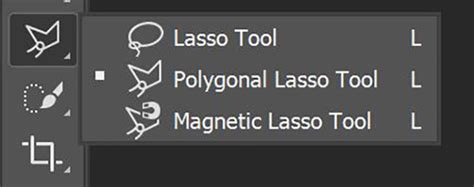
- Select the
Polygonal Lasso Tool. - Draw the shapes for your image boxes on the right side of the layout.
- Go to
Edit > Stroke. Set theStroke widthto 1 pixel, use the color#808080, andLocationtoCenter. - Name this layer "borderpics."
- Select the
- Create Multiple Boxes: Create two more similar boxes, ensuring they are equally spaced and aligned on the right side of your layout.
- Insert Images:
- Open your desired image files individually.
- Use the
Move Toolto drag each image into the main layout and position it within its corresponding box. - Name each image layer appropriately (e.g., "pic1," "pic2," "pic3").
- Layering Borders: Drag the "borderpics" layer to the top of the three image layers in the Layers panel. This ensures that the borders visually frame the images correctly, effectively cropping them to the design of the box.
Adding Text Labels to Images
To provide context or titles for the images, you can add text labels.
- Create White Bands:
- Use the
Rectangle Marquee Toolto draw white rectangular bands at the bottom of each image box. - Fill these selections with white using the
Paint Bucket Tool. - Name these layers "whitebandpics."
- Use the
- Add Text:
- Select the
Horizontal Type Tool. A text layer will be created automatically. - Enter the desired text for each image (e.g., "Gifts," or any other relevant label).
- Follow the same procedure for the rest of the pictures.
- Select the
You can find sample images to use for this purpose by referring to the provided links if they were available.
By following these steps, you can construct a well-organized and visually engaging web layout in Photoshop, incorporating essential elements like headers, navigation, logos, and image displays. The flexibility of Photoshop allows for extensive customization, enabling you to translate your design vision into a functional digital product.