In the dynamic world of creative endeavors, color combinations wield immense power. Whether you’re developing a new brand identity, creating marketing materials, or designing a post for social media, mastering two-color combinations can transform your work from ordinary to extraordinary. A two-color combination design can form the backbone of an impactful creation. Colors evoke emotions, boost brand recognition, and can guide viewers’ attention. Establishing a solid understanding of color theory isn’t just knowing how colors work together visually; it’s about harnessing their psychological and aesthetic impact.
Understanding the Foundation: The Color Wheel
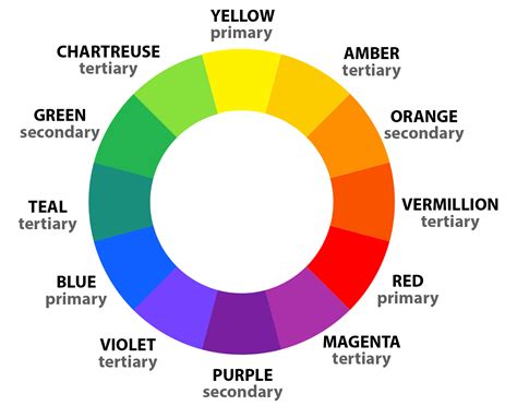
The color wheel is so much more than a circle of colors. Think of the color wheel as a map of complementary, analogous, and triadic color schemes. Isaac Newton invented the color wheel in 1666, bringing together art and science to help guide which colors work together and why. The color wheel is exactly what it sounds like. There are two main types of color wheels, and both serve a different purpose. The RYB (Red, Yellow, Blue) color wheel is typically used by artists and is useful when combining colors for painting. The second color wheel is the RGB (Red, Green, Blue) color wheel, commonly used in digital design and display technologies.
Colors are arranged on a color wheel according to their chromatic relationship to each other. The main aspects of the color wheel are primary colors. Primary colors are the basic colors that cannot be created by mixing other colors. They are positioned an equal distance from each other on the color wheel. In between them, the wheel is filled in with secondary colors and tertiary colors. Secondary colors are made by mixing two primary colors. Tertiary colors are made by mixing primary colors and secondary colors.
Exploring Color Harmony and Schemes
Color wheels can help you find color harmonies by using the rules of color combinations. These established relationships allow for predictable and pleasing aesthetic outcomes.
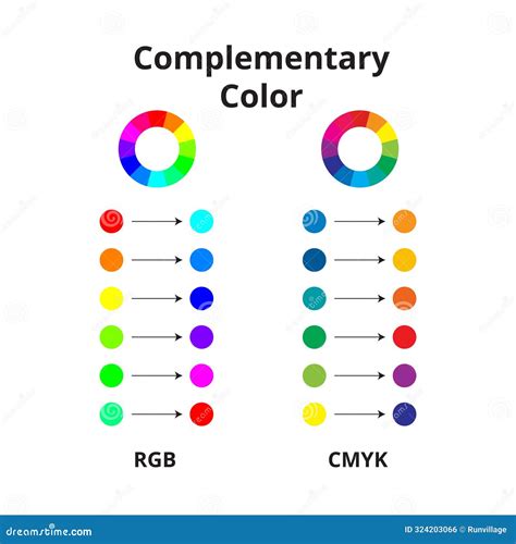
Complementary Colors
Complementary colors are two colors that are opposite each other on the color wheel. They create a high-impact, high-contrast color combination. Common examples of complementary color palettes are yellow and purple, or red and green. You often see these complementary colors used together in school and sports logos or for holiday color palettes because they work well together. This high-contrast pair demands attention, making it ideal for designs that need to stand out.
Analogous Colors
Analogous colors are three colors that are side by side on the color wheel. Think of color blocking for this one. It’s a strong look with one base color and the others used as accents. This scheme provides a sense of harmony and unity, as the colors are closely related.
Triadic Colors
Triadic colors are three colors that are evenly spaced out on the color wheel. This scheme offers vibrant and balanced combinations, providing more creative possibilities than complementary or analogous schemes.
Tetradic Colors
Tetradic colors are similar to triadic colors, but rather than three swatches, there are four. The more colors you have in your palette, the more you can get creative! Just make sure you are still maintaining a balance to avoid a chaotic visual experience.
Monochromatic Colors
Monochromatic colors consist of the three shades, tones, and tints of one primary color. This approach offers a sophisticated and subtle aesthetic, creating a sense of depth and refinement within a limited color palette.
Harnessing Color's Emotional Impact
In addition to being visual elements, colors are emotional triggers. Although not every color induces the same emotion from person to person, some colors have a common effect on the mainstream. Understanding these common associations can significantly enhance the effectiveness of your designs.
- Blue: This timeless duo exudes trust and professionalism. Blue is often associated with calmness, stability, and reliability, making it a popular choice for corporate branding and professional services.
- Red: This high-contrast pair demands attention. Red is a powerful color that can evoke passion, energy, and urgency. It's often used to highlight important elements or to create excitement.
Implementing Color Effectively in Design
Knowing great color combinations is just the beginning. Implementing them effectively requires skill and consideration. Several factors should influence your choices.
Consider Context
Remember that colors can appear differently on screens than in print. Screen colors are typically rendered using RGB, while print uses CMYK. This difference in color models can lead to variations in hue, saturation, and brightness. Furthermore, the ambient lighting where a design is viewed can also alter color perception. Always test your designs in their intended viewing environment if possible.
Building a Cohesive Palette
There are several strategic approaches to building a cohesive color palette beyond simply picking colors at random:
- Select a single color and build a palette using various shades, tones, and tints. This is the essence of a monochromatic scheme, offering a sophisticated and unified look.
- Instead of direct complementary colors, select one color and then two colors that are adjacent to its complementary color on the color wheel. This creates a split-complementary scheme, offering high contrast but with less tension than a direct complementary pairing.
- Leverage existing inspiration. Draw inspiration from nature, art, or even your existing photography.
Picsart Tools for Precision Color Selection
Getting the perfect combination can be difficult. Many of us like to stick to the colors we know or are comfortable with and rarely like to branch into uncharted colorscapes. If this describes you, don’t worry. Picsart offers a suite of tools designed to make color selection intuitive and precise.
The Picsart Color Picker
Select your color tones with precision by using the Picsart Color Picker. It allows you to conveniently find the exact color codes you are looking for. This tool is invaluable for ensuring consistency across different design elements and platforms.
When you open the Color Chooser in Picsart, your first option is to use the HSB (Hue, Saturation, Brightness) model. First, select your hue by tapping your finger on the outer color wheel. This will change the value on the H slider. Once you have selected your color, select the saturation and brightness by tapping on the inner square. As you move the cursor throughout the square, you’ll see the saturation and brightness sliders moving. Once you’ve made your selection, you can make minor adjustments using the sliders to find the perfect color.
To switch to the RGB (Red, Green, Blue) model, simply tap RGB and an alternative set of sliders will appear. Once again, select the color you’d like to use by tapping the outer color wheel. As you move through the color wheel, you’ll notice that the R, G, and B slider values change. For example, when you select red, the R slider will jump to 255, while the G and B sliders fall down to 0. Next, select the shade you’d like to use by tapping in the inner square. Once you’ve made a selection, you can fine-tune the color using the sliders.
Creating Palettes from Images
We love color and are obsessed with images and profiles that have a unique, eye-catching aesthetic. If you’re not sure where to start with making a custom color palette, we have a cool creative hack for you. The easiest way to create a cohesive aesthetic across all of your photos is to create a color palette from an image you like. Want to create a color palette for yourself? You can easily create a color palette that pulls from the primary or secondary colors in your image using Picsart.
Creating a color palette from an image is a cool and easy way to ensure a consistent look and feel for your online brand presence, social media accounts, moodboards, and so much more!
Here’s how to create a color palette from an image in Picsart:
Step 1: Open the Picsart mobile app and tap the plus sign (+) to start a new project.Step 2: Select an image from your photos folders to open it in the Editor.Step 3: Scroll across the bottom toolbar and tap on the Draw icon.Step 4: While in the Draw Tool, tap on the Shape icon in the bottom toolbar (it looks like an overlapping square and circle).Step 5: Tap on the rainbow Color Chooser in the bottom left corner of the toolbar.Step 6: Now use your finger to draw a shape in that color over any part of the photo. You’ll see the shape and color you selected populate. Drag to position and size it as you like.Step 7: Want to get a little fancy? Tap on the Shape Tool again, select the Stroke option, and slide to adjust the thickness of the outline. Tap on the color chooser and select the color white.
This process effectively extracts dominant colors from your chosen image, providing a ready-made palette for your design projects.
Using Quicktools by Picsart
Quicktools by Picsart offers a free color palette generator that’s fast and fun to use. Simply type in the RGB color code and it’ll generate a unique color palette with additional colors that pair well with the shade you added in. This is an excellent way to discover new color combinations and ensure harmonious pairings.
Inspiration for Your Next Palette
There are endless possibilities when it comes to creating custom color palettes and creating your own color combinations. So how do you choose? You can start by picking colors from an image that you love, drawing inspiration from nature, looking at your social feed to see what color patterns catch your eye.
- Pastels: We like a combination of #FFAEBC, #A0E7E5, #B4F8C8, and #FBE7C6. These soft hues evoke a sense of calm and gentleness.
- Deep Sea: Who doesn’t love picking colors from an image of nature? Think deep blues, teals, and sandy beiges for a serene and grounding palette.
- Pop Star: Bubble gum pink, yellow, and blue serve up some real ’80s and 2000s pop star vibes. This combination is energetic and playful.
Looking for more inspiration? Consider turning to the seasons for color palette ideas. Make your own fall-inspired color palette or turn up the heat with some hot summer shades.
90 Sec Autumn Color Inspiration | Cozy Seasonal Color Palette Book Flip Through #adultcoloringbook
Navigating Potential Color Issues in Picsart
Occasionally, users might encounter issues with color display in Picsart, particularly concerning text colors. If you're finding it difficult to change text colors in Picsart, or if your text appears with unwanted black or white borders, this could be due to your device's High Contrast mode.
Understanding High Contrast Mode
High Contrast mode is a feature designed to improve readability by converting text to pure black or white, adding thick borders. While this works well for enhancing visibility, it can override the custom colors you select in Picsart, leading to unexpected color results.
Resolving Text Color Issues
To resolve these issues, you may need to disable High Contrast mode on your device:
- Open Settings: Go to your device's Settings app.
- Accessibility: Scroll down and select Accessibility.
- Vision/Display Options: Tap on Vision or Display enhancements.
- Toggle Off High Contrast: Locate the setting for High contrast text and switch the toggle to Off.
After making these changes, restart the Picsart app to refresh the color settings on your text canvas. Occasionally, a simple restart of the Picsart app can help. This refreshes the canvas, ensuring that new settings are applied correctly. If the text still appears incorrect, make sure your device software is fully updated.
FAQ:
- What if the issue persists even after I've disabled High Contrast mode and restarted the app?Ensure your device software is up to date. If that doesn't work, try reinstalling Picsart or contact our support team.
- Is it possible to use High Contrast mode for other applications?Yes, you can enable High Contrast mode for other apps when you're not editing in Picsart. However, make sure to turn it off while using Picsart for true color representation.
- Why is High Contrast mode useful?High Contrast mode is mainly useful for improving the readability of text for users who have visual impairments.
Dipping your toes in color theory can help you create complementary designs of all kinds. The perfect color combination should align with your brand identity, resonate with your target audience, and achieve your overall design objectives. Don’t hesitate to step out of your comfort zone and experiment. Keep exploring and refining your color choices. As you gain more knowledge and experience using color theory, you’ll develop an intuitive sense of what color combinations work best for different projects and audiences.
Picsart is a photo and video editing platform and creative community, a top 20 most downloaded app worldwide with over 150 million monthly active users. Its AI-powered tools enable creators of all levels to design, edit, draw, and share content anywhere. The platform has amassed one of the largest open-source content collections in the world, including photos, stickers, backgrounds, templates, and more. Used by consumers, marketers, content creators, and businesses, Picsart tools fulfill both personal and professional design needs. Picsart has collaborated with major artists and brands like BLACKPINK, Taylor Swift, Lizzo, Ariana Grande, and Warner Bros.