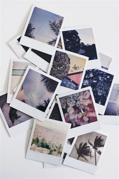
The allure of the instant photograph, with its nostalgic charm and unique visual signature, has captivated audiences for decades. The Polaroid aesthetic, characterized by its muted colors, soft focus, and distinct borders, evokes a sense of tangible memory and timeless appeal. While the era of instant film may have waned, the desire to capture that inimitable feel in our digital photography persists. This guide delves into the intricacies of recreating the vintage Polaroid look within Adobe Lightroom, offering a detailed exploration of the techniques and adjustments necessary to transform your digital images into evocative, retro-inspired masterpieces.
Understanding the Polaroid DNA: More Than Just Nostalgia
The enduring appeal of the Polaroid aesthetic transcends mere nostalgia. It is rooted in a tangible quality, a one-of-a-kind print that evokes a sense of physical presence in an increasingly digital world. This feeling is what we strive to replicate. Before diving into Lightroom's tools, it's crucial to understand the fundamental visual elements that define a Polaroid photograph:
- The Colors: This is perhaps the most immediately recognizable trait. Polaroid film produced distinct color casts due to its chemical processes. Greens often metamorphosed into muted, warm yellows or teals, while blues frequently transformed into signature cyans or teals.
- Milky Blacks: A hallmark of the Polaroid look is the lifted black point. This means that true, deep black rarely exists in these images; instead, blacks appear as a softer, milky gray.
- Soft Highlights: Conversely, the white point is typically dropped, meaning pure white is also uncommon. Highlights tend to be softer and less blown out than in modern digital photography.
- Color Shifts: The inherent nature of the film chemistry led to predictable color shifts. These shifts contribute significantly to the unique, vintage character of Polaroid images.
- Softness: Original Polaroid cameras were not equipped with high-end, sharp lenses. This resulted in a naturally softer focus and a less crisp image compared to contemporary digital outputs.
- Vignetting: It's common for Polaroid photos to exhibit darker edges than the center of the image, a subtle vignetting that draws the viewer's eye inward.
Understanding these core visual characteristics is paramount. It’s about grasping the "why" behind the look before attempting to replicate the "how." This foundational knowledge empowers you to make informed adjustments, moving beyond a mere imitation to a true emulation of the Polaroid aesthetic.
Laying the Foundation: Initial Image Adjustments for an Authentic Effect
To begin crafting an authentic Polaroid effect in Lightroom, certain initial image adjustments are essential. These form the bedrock upon which the more nuanced stylistic elements will be built.
Before even opening Lightroom, consider slightly overexposing your original image. This initial step helps to mimic the tendency of Polaroid film to perform better with a bit more light.
Once you're within Lightroom and have your chosen image ready, it's time to "wipe the slate clean" and begin the transformation. These initial adjustments will set the stage for the magic that is about to unfold.
Contrast and Tonal Balance
- Contrast: Begin by reducing the overall contrast. A setting of -20 is a good starting point. This immediately begins to flatten the image, a crucial step in achieving the characteristic Polaroid softness.
- Highlights and Shadows: Next, let's address the highlights and shadows. Set your Highlights to -10 and your Shadows to -20. These adjustments help to recover detail in the brighter and darker areas of your image, preventing harsh clipping and contributing to the softer tonal range.
- Whites and Blacks: Fine-tuning the Whites and Blacks sliders is critical for maintaining detail and achieving the characteristic "milky" blacks. While specific values can vary greatly depending on the original image, remember the goal: to lift the blacks and soften the whites, avoiding true black and pure white.
These initial adjustments are your foundation. They set the stage for the more creative and stylistic elements that will follow, ensuring your image has the underlying tonal structure of a vintage Polaroid.
Enhancing Texture and Softness: The Nuances of Detail
With the basic tonal structure in place, we can now focus on enhancing specific aspects of detail and softness that are integral to the Polaroid aesthetic.
The Texture and Clarity Sliders
Texture: The Texture slider can be a powerful tool for crafting an authentic Polaroid look. Bumping it up by +10 can enhance fine details, giving your image a classic, defined appearance without introducing excessive harshness. This subtle boost can help recover some of the detail that might be lost in the softening process.
Clarity: Clarity, on the other hand, needs to be used judiciously. While more clarity often equates to a sharper, more defined image, this is precisely what we want to avoid for a Polaroid effect. Dial it down to -20 to soften the image and create that dreamy, nostalgic feel that is so beloved in Polaroids. This reduction in clarity contributes significantly to the characteristic gentle focus of instant film.
Dehaze for Subtle Refinement
- Dehaze: The Dehaze adjustment, when used with a gentle hand, can be beneficial. A slight boost of +10 can help to clarify muted areas within the image while still preserving that soft, vintage vibe. This can be particularly useful for images that might appear a bit too flat or washed out after initial adjustments.
Mastering Color: The Soul of the Polaroid Effect
The distinctive color palette of Polaroid photos is arguably their most defining feature. Recreating this requires careful attention to vibrance, saturation, and, most importantly, color grading.
Vibrance and Saturation: A Delicate Balance
- Vibrance and Saturation: To achieve the Polaroid effect, it's essential to play with Vibrance and Saturation. The key here is balance; these adjustments keep things colorful without going overboard into oversaturation, which would detract from the vintage feel. While specific values will depend on the original image, a slight reduction in saturation is often beneficial to mute the colors, followed by a subtle increase in vibrance to bring back a pleasing richness without artificiality.
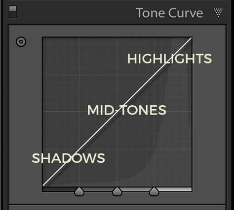
The Tone Curve: The Heart of the Transformation
Ready to plunge into the heart of your Polaroid effect? It's time to tackle the Tone Curve, a powerful tool that shows you how to transform your image's contrast and depth. Don't worry; we'll take it step by step!
The Tone Curve allows for precise control over the tonal range of your image. To emulate the Polaroid look, we'll manipulate this curve to achieve the characteristic lifted blacks and softened highlights.
- Adding Control Points: Start by adding three control points to your tone curve: one for shadows, one for mid-tones, and one for highlights.
- Lifting the Shadows: First, lift your shadows slightly by raising the black point. This is achieved by clicking the dot at the far bottom-left of the graph and dragging it straight up. You will see the blacks in your photo instantly turn a milky gray, a fundamental characteristic of the Polaroid aesthetic.
- Adjusting Mid-tones: Next, let's jazz up the mid-tones. Adjust the control point in the mid-range to boost contrast subtly, but remember to keep things smooth. This helps to add a bit of dimension back into the image without creating harsh transitions.
- Balancing Highlights: Now, onto the highlights. Tweak the control point in the highlight region to balance out those bright spots. Click the dot at the far top-right and drag it straight down to soften the brightest areas.
As you work with the Tone Curve, keep comparing your before and after. It's like a game called "Spot the Difference," but way more fun! This iterative process is crucial for dialing in the perfect tonal response.
Color Grading: The Secret Sauce
And hey, while you're at it, why not experiment with color grading? Color wizardry awaits as we plunge into color grading techniques, the secret sauce of your Polaroid effect. This is where we can introduce those characteristic color casts.
Introducing a Yellow Hue: To achieve that classic yellow tinge that screams "vintage Polaroid," start with some color-grading magic. In the Color Grading panel (formerly Split Toning), focus on the Highlights. Set the Hue to approximately 60 and bump the Saturation to +15. This will imbue the brighter areas of your image with a warm, vintage yellow cast.
Fine-tuning Other Colors: But don't stop there! You can fine-tune other colors to complement your subject and enhance the vintage feel. Consider adding a touch of aqua or teal in the shadows for a more authentic Polaroid blue, or a subtle magenta in the highlights for a unique vintage warmth. Experiment with the Shadows and Highlights color wheels in the Color Grading panel, adjusting hues and saturation to achieve your desired effect. The Blending slider can also be adjusted to favor either shadows or highlights, and the Amount slider controls the overall intensity of the color grade.
Adding the Finishing Touches: Sharpening and Noise Reduction
With the core tonal and color adjustments complete, we move to the final touches that refine the image and enhance its filmic quality.
Sharpening and Luminance Noise Reduction
- Sharpening: While we've softened the image significantly, a touch of sharpening can bring back a desirable level of definition without making the image look overly digital. Be cautious here; the goal is subtle refinement, not crispness.
- Luminance Noise Reduction: To further enhance the film-like quality and maintain a smooth appearance, crank up the Luminance Noise Reduction to +20. This helps to reduce digital noise while contributing to a softer, more organic feel, akin to the grain found in analog film.
COLOR GRADE in Lightroom Like a PRO // Cinematic Color Grading
Creating the Polaroid Border: The Iconic Frame
A crucial element of the Polaroid aesthetic is its distinctive border. While not strictly a photographic adjustment, it's an essential component for completing the look.
Cropping for the Polaroid Ratio
To create a Polaroid photo effect, you'll need to add a border. The most straightforward way to achieve this in Lightroom is by cropping your image to a 4x5 ratio. This aspect ratio closely mimics the dimensions of a classic Polaroid print. Once cropped, you can further refine the border by using the Post-Crop Vignetting tool in the Effects panel, adjusting the size, feather, and midpoint to create a realistic-looking frame around your image. Alternatively, dedicated border effects or external plugins can offer more advanced control over border creation.
The Limitations of Static Presets and the Power of AI
Many photographers turn to presets as a quick solution for achieving specific looks. However, a "Polaroid Lightroom preset" is often a one-size-fits-all setting that can lead to more problems than it solves.
Why Presets Fall Short
A preset is essentially a saved text file (.xmp) that records the exact slider positions you've set. It is static and does not adapt. A preset made for a bright, backlit photo will likely destroy a photo taken indoors. It breaks easily and is often unprofessional because it doesn't account for the unique characteristics of each individual photograph. As professionals, consistency is key, and relying on static presets often leads to spending more time fixing the preset's shortcomings than actually editing.
The Professional Solution: AI Profiles
This is where truly intelligent solutions come into play. Instead of a static preset, tools like Imagen create a Personal AI Profile that learns your unique style. This allows you to access professional styles instantly, with edits that adapt to your photos.
Understanding the "Why" Before the "How": As a professional photographer, clients rarely ask for just a "photo"; they ask for a feeling. Few things evoke a stronger feeling than the classic Polaroid. This soft, faded look transports us instantly. It’s nostalgic, tangible, and beautifully imperfect. Capturing that specific vibe inside a powerful digital tool like Adobe Lightroom requires understanding the DNA of the look.
The Imagen Workflow:
- Create Your Style: Edit a lot of photos manually, understanding the nuances.
- Teach Imagen: Point the Imagen desktop app to your edited Lightroom catalogs.
- Imagen Builds Your Profile: Imagen's AI analyzes all your edits. It doesn’t just copy sliders; it learns how you make decisions - how you treat skin tones in harsh light, how you adjust the "fade" in backlit scenes.
- Apply Your Profile: Upload a new, unedited shoot to Imagen and select your Personal AI Profile. Every single photo is edited individually, with the correct base exposure and white balance, applying your learned style dynamically.
This is not a hypothetical. Imagen is a desktop app that integrates directly with Lightroom Classic catalogs, solving the exact problem of static presets. It offers the speed of a preset with the consistency and quality of a custom edit on every single photo.
AI Profiles vs. Traditional Presets
| Feature | Traditional Preset | Imagen AI Profile |
|---|---|---|
| How it Works | Static. Applies the same settings to all photos. | Dynamic. Applies an intelligent style to each photo. |
| Adaptability | Poor. Breaks in different lighting or with different cameras. | Excellent. Analyzes and adapts to each photo’s unique needs. |
| Core Edits | Can’t adjust fundamental Exposure or WB correctly. | Edits Exposure and WB first, then applies the style. |
| Consistency | Inconsistent. | Consistent. A great edit starts in-camera. |
Embracing the Polaroid Spirit: In-Camera Techniques
While Lightroom offers powerful tools for emulation, some in-camera approaches can further enhance the Polaroid aesthetic.
- On-Camera Flash: Don’t be afraid of on-camera flash! Even in the daytime, a harsh, direct flash is a hallmark of the Polaroid look. Embrace it to create strong shadows and a distinct pop.
- Simple Compositions: Polaroids were about capturing a moment. Don't overthink compositions. Center your subject, get close, and embrace simplicity.
- "Bad" Light: Harsh midday sun or deep shade can all work to your advantage. Focus on candid moments; posed, stiff shots often feel out of place with this aesthetic.
Conclusion: The Timeless Appeal of the Polaroid Look
The faded, dreamy Polaroid look is timeless. You can build this look yourself in Lightroom, and you absolutely should, as it's the best way to learn. However, once you understand its nuances, you'll quickly realize the limitations of saving it as a static preset. For a truly professional workflow, a tool that combines your unique style with true intelligence is necessary. By using AI to create a Personal AI Profile, you are essentially "cloning" your own creative decisions. You get the speed of a preset, but with the consistency and quality of a manual, custom edit on every single photo. The Polaroid aesthetic, deeply rooted in nostalgia, is not a trend that's going away; it has been popular for over a decade in the digital age and shows no signs of fading.