Procreate stands as a remarkably powerful instrument for digital lettering and calligraphy. However, its vast capabilities can sometimes present a steep learning curve, making it feel initially discouraging. Fortunately, the art of blending colors is a surprisingly accessible technique that can significantly elevate your digital artwork. While in traditional modern calligraphy, blending colors with physical brush pens is a skill that demands considerable practice, the iPad and Procreate simplify this process immensely, transforming it into a matter of understanding software settings.
For those who prefer a visual learning experience, the concept of blending in Procreate can be grasped without needing to master specialized blending brushes. Instead, a fundamental tool like the Gaussian blur, with its intuitive slider, offers a straightforward approach.
The Foundation: Preparing Your Canvas for Blending
Before diving into intricate blending techniques, it's essential to establish a solid base for your artwork. This often involves preparing a background or filling in initial colors.
- Selecting Your Base Brush: Begin by navigating the Procreate brush library and selecting a brush that you find comfortable to use. It's crucial to remember that at this stage, you are not looking for a specialized blending brush. The brush chosen here primarily serves the purpose of filling your canvas or a specific area with color.
- Applying Color: Once your brush is selected, proceed to fill your canvas or the designated area with your chosen color. This step sets the stage for subsequent blending operations.
- Layering for Control: It is always advisable to work with layers. Create a new layer for your background color, ensuring it sits beneath your main artwork or lettering. This separation allows for easier adjustments and prevents unwanted color bleed.
- Initial Color Placement: Lay down your initial colors on the canvas. This might be a solid background color or the base colors for your lettering.
Gaussian Blur: A Quick and Easy Blending Solution
Gaussian blur is a powerful adjustment tool within Procreate that can be used effectively for blending, particularly for larger areas like backgrounds. While it offers a simple slider-based control, it's important to understand its limitations regarding precision.
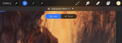
- Accessing Gaussian Blur: To utilize this tool, navigate to the Adjustments menu (the magic wand icon). From the options presented, select "Gaussian Blur."
- Applying the Blur: You have two primary methods for applying Gaussian blur:
- Layer Blur: By default, Gaussian blur will affect the entire active layer. You can adjust the intensity of the blur by sliding your finger across the canvas. Moving your finger to the right increases the blur effect, while moving it to the left decreases it. This is ideal for smoothing out large color fields or creating soft gradients across an entire background.
- Brush Blur: For more localized blending, you can choose to apply the blur using a brush. This means the blur effect will only be applied where you "paint" with your finger or Apple Pencil. This offers a slightly more controlled approach than a full-layer blur, allowing you to target specific areas where colors meet.
- Control and Limitations: While Gaussian blur is incredibly quick and effective for softening edges and creating smooth transitions, it doesn't offer a high degree of granular control. Its strength lies in its ability to rapidly blend large areas. Therefore, it's primarily used for backgrounds or broad color transitions rather than intricate details within lettering.
The Smudge Tool: Manual Blending for Precision and Control
The Smudge tool in Procreate offers a more hands-on and nuanced approach to blending, allowing artists to manually manipulate colors and create custom effects. Unlike the Gaussian blur, the Smudge tool requires active "painting" to blend.
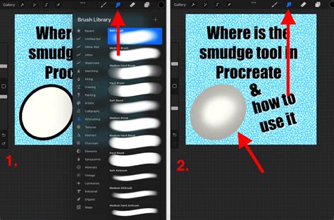
- Locating the Smudge Tool: The Smudge tool is conveniently located in the top-right toolbar, positioned between the Brush tool and the Eraser tool. It is represented by a pointing finger icon.
- Understanding Smudge Brushes: When you first select the Smudge tool, you'll notice that it doesn't paint any new color. Instead, it picks up existing colors on the canvas and pushes them around, mimicking the effect of smudging paint. Procreate allows you to use any brush from your library with the Smudge tool, effectively turning any brush into a potential smudger.
- Selecting a Smudge Brush:
- Tap the Smudge tool icon to activate it.
- Navigate to the Brush Library. You can choose any brush that appeals to you. For a softer blend, a soft brush like an airbrush or a dedicated smudge brush from a custom set is often ideal. For a more textured blend, a brush with inherent texture can be used.
- The key is that the brush's color-mixing properties will be applied when used with the Smudge tool.
- Manual Blending Technique:
- With the Smudge tool and your chosen brush active, begin to drag your Apple Pencil across the areas where two colors meet.
- Use varying pressure and stroke speed to achieve different effects. Lighter pressure and slower strokes generally result in smoother, more subtle blends.
- Experiment with different brush strokes - circular motions, back-and-forth movements, or even quick flicks - to see how they affect the color blending.
- Flexibility and Customization: The Smudge tool is exceptionally flexible. You can adjust its intensity by changing the opacity of the selected brush in the Smudge tool settings. A lower opacity will result in a more subtle smudge, while a higher opacity will create a more pronounced blending effect. This allows for a high degree of control over the final look.
- Blending After Color Laydown: A significant advantage of the Smudge tool is that you can perform blending after you have already laid down all your colors. This means you can experiment with color placement first and then refine the transitions at your leisure.
- Experimentation is Key: The Smudge tool is an excellent tool for experimentation precisely because of its flexibility. Don't be afraid to try different brushes and techniques to discover what works best for your artistic style and project.
Blend Modes: A Powerful Layer Interaction Tool
Blend Modes in Procreate offer a sophisticated way to interact with layers, allowing you to alter how colors and objects on one layer affect the layers beneath them. This is a powerful technique for creating depth, adding highlights, darkening shadows, and achieving unique color transformations.
- Understanding Layer Interaction: In Procreate, content on a layer is typically opaque, meaning it completely covers anything on the layers below. Blend Modes, however, introduce a dynamic interaction between layers. When you have two layers, the bottom layer is referred to as the "base layer," and the top layer is the "blend layer" or "color layer." Applying a Blend Mode on the top layer changes how it interacts with the base layer.
- Locating Blend Modes:
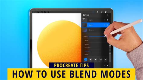
- Open the Layers panel (the stacked squares icon in the top-right corner of the Procreate interface).
- On the right side of each layer, you will see a letter (by default, 'N' for Normal). Tap this letter to open the Blend Modes menu.
- The Blend Modes Menu:
- Opacity Slider: At the top of the Blend Modes menu, you'll find the Opacity slider. This controls the transparency of the entire layer, making it more or less visible. This is separate from the individual Blend Mode effects.
- Blend Mode List: Below the Opacity slider is a list of the available Blend Modes. Procreate offers a comprehensive selection, each with a unique way of interacting with the base layer.
- Live Preview: As you scroll through the Blend Modes, Procreate provides a live preview of the effect on your canvas. The currently selected Blend Mode will be highlighted in blue.
- Applying and Confirming a Blend Mode:
- Scroll through the list to find the desired effect.
- Once you've found a Blend Mode you like, tap on the layer name again or tap anywhere on the canvas to confirm your selection. The 'N' will then change to a letter or abbreviation representing the chosen Blend Mode.
- Key Blend Modes Explained:
- Normal: The default mode. The top layer is opaque and covers the layer below. Opacity affects transparency.
- Multiply: Multiplies the base color by the blend color, resulting in a darker and more intense effect. Excellent for creating shadows or darkening images.
- Darken: Compares the base and blend colors and retains the darker of the two.
- Color Burn: Increases the contrast between the base and blend colors, often resulting in darker and more saturated tones than Multiply.
- Linear Burn: Darkens the base color based on the blend color's value, producing a darker result than Multiply but with less saturation than Color Burn.
- Darker Color: Similar to Darken but considers all RGB channels simultaneously.
- Lighten: Compares the base and blend colors and retains the lighter of the two.
- Screen: Brightens the image based on the blend layer's values. Ideal for creating highlights or lightening images.
- Color Dodge: Creates a brighter effect than Screen by decreasing the contrast between the base and blend colors.
- Add: Similar to Screen and Color Dodge but produces even stronger brightening effects by increasing brightness.
- Lighter Color: Similar to Lighten but considers all RGB channels simultaneously.
- Overlay: A combination of Multiply and Screen. It lightens or darkens the image by shifting mid-tones. Darker blend colors darken mid-tones; lighter blend colors lighten them.
- Soft Light: A gentler version of Overlay, applying subtle darkening or lightening effects.
- Hard Light: A more intense combination of Multiply and Screen, where the blend layer's brightness determines whether Multiply or Screen is applied.
- Vivid Light: An extreme version of Overlay and Soft Light. Pixels darker than 50% gray are darkened; pixels lighter than 50% gray are lightened.
- Linear Light: Combines Dodge and Burn effects; lighter pixels are dodged, darker pixels are burned, resulting in strong contrasts.
- Pin Light: Performs Darken and Lighten effects simultaneously, often resulting in a patchy look with mid-tones removed.
- Hard Mix: Flattens details to create a super-flat, saturated look using only primary colors, white, and black.
- Difference: Uses the difference between the base and blend colors. White inverts the base layer's colors; black causes no change.
- Exclusion: Similar to Difference but produces less contrast, especially with grays.
- Subtract: Drastically subtracts brightness from colors. Dark areas are less affected.
- Divide: The opposite of Subtract, where darker colors create brighter results.
- Hue: Changes the hue of the base layer while preserving its saturation and luminosity.
- Saturation: Preserves the hue and luminosity of the base layer while adopting the saturation of the blend layer.
- Color: Ideal for coloring monochrome images by applying the hue and saturation of the blend layer to the base layer's luminosity.
- Luminosity: Preserves the hue and saturation of the base layer while adopting the luminosity of the blend layer.
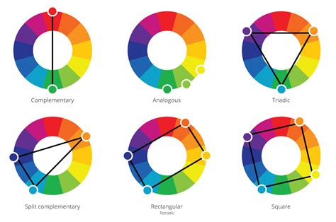
Color Theory for Seamless Blending
Understanding basic color theory can significantly enhance your blending results in Procreate. The relationship between colors on the color wheel plays a crucial role in achieving smooth, natural-looking transitions.
- Analogous Colors: For the most harmonious and easiest blends, opt for analogous colors. These are colors that sit next to each other on the color wheel, such as blue and green, or yellow and orange. Blending analogous colors typically results in smooth transitions without muddying the colors.
- Complementary Colors: Complementary colors are those found opposite each other on the color wheel (e.g., red and green, blue and orange, yellow and purple). While these can create high contrast and vibrant effects, they are often more challenging to blend seamlessly. When complementary colors are mixed, they tend to neutralize each other, leading to muddy or desaturated results if not handled carefully.
- Monochromatic Blends: Blending within a monochromatic color scheme, which is based on a single hue extended through its shades, tones, and tints, is generally straightforward and yields pleasing results.
Advanced Blending Techniques and Tips
To further refine your blending skills in Procreate, consider these advanced techniques and practical tips.
- Clipping Masks: Clipping masks are incredibly powerful for controlling where blending effects are applied.
- Create your lettering or artwork on one layer.
- Create a new layer directly above it.
- Tap on this new layer and select "Clipping Mask" from the fly-out menu.
- Now, any color or effect you apply to this clipped layer will only appear within the boundaries of the layer below it. This is perfect for applying gradients or blended colors to specific shapes without them spilling over.
- Working with Layers:
- Single Layer Blending: For many blending techniques, especially with the Smudge tool, it's often best to work on a single layer that contains the colors you wish to blend. This allows the tool to pick up and mix the adjacent colors directly.
- Multiple Layers and Merging: You can, however, create parts of your design on different layers. If you want to blend these across layers, you may need to use clipping masks and then merge the layers down once you are satisfied with the blending effect.
- Alpha Lock: To ensure your blending stays within the boundaries of your artwork on a specific layer, you can use Alpha Lock.
- Tap on your layer in the Layers panel.
- Select "Alpha Lock" from the fly-out menu.
- A padlock icon will appear next to the layer name. Now, any painting or smudging will only affect the pixels that already exist on that layer, preventing you from accidentally coloring outside your lines.
- Light Hand and Pressure Control: When using the Smudge tool or a low-opacity brush for blending, applying a light touch with your Apple Pencil is crucial. Heavy pressure can lead to harsh lines or blocky transitions. By using less pressure, you encourage smoother, more gradual blends. Varying the pressure as you blend can also create more dynamic and natural-looking transitions.
- Brush Size Variation: Adjusting the size of your brush while blending can significantly impact the outcome.
- For detailed areas or fine transitions, use a smaller brush.
- For broader blending or smoothing larger areas, a larger brush is more efficient.
- Using the Eyedropper Tool: After blending colors, you'll often create beautiful intermediate tones. Use the Eyedropper tool (hold your finger on the color you want to sample) to pick up these newly created blended colors. You can then use these sampled colors to further refine your artwork or add more depth.
- Creating Custom Blender Brushes: While Procreate offers excellent built-in tools, you can also create your own custom blender brushes. By adjusting settings within the Brush Studio, particularly under the "Dynamics" section like "Wet Mix," you can tailor brushes that offer unique blending characteristics, giving you even more creative control. The "Turpentine" brush in the Artistic folder is a good starting point to experiment with these settings.
Create Blending 3D Brush in PROCREATE
Conclusion: Embrace the Blend
Blending in Procreate is an accessible and rewarding technique that adds depth, dimension, and visual interest to your digital lettering and artwork. Whether you opt for the swiftness of Gaussian blur for backgrounds, the manual control of the Smudge tool for intricate details, or the sophisticated interactions of Blend Modes, Procreate provides a versatile toolkit. By understanding the tools, experimenting with techniques, and considering color theory, you can master the art of blending and elevate your creative projects to new heights. Remember, Procreate is a powerful tool, and with practice and exploration, you can unlock its full potential.