When you embark on a design project intended for physical reproduction, a fundamental understanding of color models becomes paramount. The colors you meticulously craft on your digital canvas must translate accurately to the printed page. This is where the CMYK color model takes center stage, serving as the bedrock for virtually all print design. Grasping its principles is not merely beneficial; it is essential for achieving color fidelity and ensuring the high-quality resolution that printed materials demand. This article delves into the intricacies of CMYK files, exploring what they are, how they differ from their digital counterparts, and why their proper utilization is indispensable for professional printing outcomes.
What Exactly is a CMYK File?
A CMYK file is a digital image file that utilizes the CMYK color model to represent colors. This model is the driving force behind color reproduction in most printing processes, from the familiar business card to elaborate billboards and intricate product packaging. The acronym CMYK itself stands for the four primary inks used: Cyan, Magenta, Yellow, and Key (which is black).
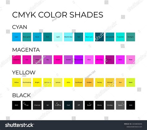
The Components of CMYK: Cyan, Magenta, Yellow, and Key
- Cyan (C): This is a bluish-green ink. In the context of subtractive color synthesis, it acts as a primary color.
- Magenta (M): This is a purplish-red ink, another primary color in the subtractive model.
- Yellow (Y): This is a bright yellow ink, completing the trio of primary subtractive colors.
- Key (K): This represents black ink. The designation "K" for black is a historical artifact from traditional printing. In the past, printers would use a "key plate" - a plate that held the most important detail and darkest tones of an image, which was typically black. This "key plate" was crucial for defining sharp details and the deepest shadows, thus associating the term "key" with black ink in the industry. It also serves to differentiate it from "Blue" if "B" were used, avoiding potential confusion.
Theoretically, by combining varying percentages of cyan, magenta, and yellow inks, one could theoretically reproduce every conceivable shade from pure white to the darkest black. However, in practice, when the maximum quantities of CMY inks are applied to paper, the resulting color is often a muddy, dark brown rather than a true, deep black. This limitation is precisely why black ink (K) was introduced. The addition of black ink allows for the creation of the deepest, purest blacks and significantly expands the achievable color gamut, ensuring richer contrast and more nuanced tones in printed materials.
The Role of Black Ink: From Theoretical Limits to Practical Brilliance
The "K" in CMYK is not just an arbitrary letter; it signifies the critical role of black ink. While CMY inks can theoretically produce black, the practical reality of ink mixing on paper often results in a less-than-satisfactory dark brown. This is a fundamental concept rooted in subtractive color theory: as you add more colored inks (CMY), you are subtracting more light from the white of the paper, leading to darker colors. However, the specific pigments used in CMY inks do not perfectly absorb all wavelengths of light when combined in equal measure.
Therefore, the addition of a dedicated black ink is essential for several reasons:
- Achieving True Black: A pure black ink allows for the creation of a deep, neutral black that cannot be reliably achieved by mixing CMY inks alone. This is crucial for text, fine lines, and areas requiring absolute darkness.
- Enhancing Contrast and Depth: Black ink provides a powerful contrast against lighter colors, making designs pop and adding a sense of three-dimensionality. This is vital for legibility in text and for creating visually impactful graphics.
- Expanding the Color Gamut: By using black ink judiciously, designers can create a wider range of colors and more subtle gradations than would be possible with CMY inks alone. This allows for richer detail and more nuanced photographic reproduction.
- Cost-Effectiveness and Efficiency: In many printing scenarios, using black ink for text and dark areas can be more efficient and cost-effective than relying solely on the complex mixing of CMY inks.
The specific application of black ink can vary. For regular black text or graphics, a simple 100% K value (C=0, M=0, Y=0, K=100) is often sufficient. However, for achieving a deeper, richer black in large solid areas, a combination of CMY inks alongside black is frequently employed. This "rich black" can help to fill in any imperfections in the black ink layer and create a more uniform, intense black. A typical rich black mix might be C=60, M=60, Y=60, K=100, though the exact percentages can be adjusted based on the printer, paper type, and desired outcome. The choice between using pure black or a rich black can often be managed through printer driver configurations, either automatically or manually, depending on the user's expertise and the specific printing job.
The Crucial Difference: CMYK vs. RGB
To truly appreciate the significance of CMYK files, it's essential to contrast them with the color model most people encounter daily: RGB.
RGB: The Realm of Light and Screens
RGB stands for Red, Green, and Blue. This is an additive color model, meaning it works by adding light. Devices like computer monitors, televisions, smartphones, and tablets emit light through red, green, and blue sub-pixels. When these lights are combined in different intensities, they create the vast spectrum of colors we see on screens.
- Additive Nature: The more light that is added, the brighter and whiter the color becomes. For instance, combining red, green, and blue light at their maximum intensity produces white.
- Screen Dominance: RGB is the standard for all digital displays because it leverages the way our screens produce color.
- Wider Gamut (for Screens): RGB generally boasts a wider color gamut than CMYK, meaning it can display a broader range of vibrant and luminous colors, especially those in the blue and green spectrum. This is why a neon blue might look dazzling on your screen but appear duller when printed.
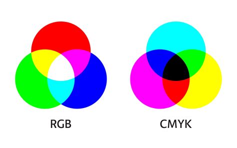
CMYK: The Realm of Ink and Subtraction
As discussed, CMYK is a subtractive color model. It operates on the principle of subtracting light. When inks are applied to a surface, they absorb certain wavelengths of light and reflect others. The reflected light is what we perceive as color.
- Subtractive Nature: The more ink you add, the more light is absorbed, resulting in a darker color. Combining cyan, magenta, and yellow inks aims to absorb all light, theoretically producing black.
- Print Dominance: CMYK is the standard for printing because it mimics how inks interact with paper.
- Gamut Limitations: The CMYK color gamut is generally smaller than RGB's. This means that some of the vibrant, luminous colors achievable in RGB cannot be accurately reproduced using CMYK inks.
Why This Difference Matters for Designers
The fundamental difference between additive (RGB) and subtractive (CMYK) color models has profound implications for anyone involved in print design.
- Color Shifts: If you design a logo or graphic in RGB and then send it directly for printing, you are likely to encounter color shifts. The bright, vivid colors that looked spectacular on your screen may appear muted, desaturated, or simply "off" when printed. This is because the printer is attempting to replicate RGB colors using a limited CMYK ink set, and some colors simply fall outside the achievable CMYK gamut.
- Brand Consistency: For businesses and brands, maintaining color consistency across all marketing materials is crucial for brand recognition and integrity. A logo that changes color significantly between a website (RGB) and a business card (CMYK) can dilute brand identity.
- Avoiding Misinterpretations: Understanding these differences helps designers communicate effectively with printers and clients, ensuring that expectations for the final printed product are realistic.
The Indispensable Role of CMYK in Printing
The CMYK color model is not just a technical detail; it is the very foundation upon which professional printing relies for consistent and high-quality results.
Ensuring Color Consistency
One of the primary reasons CMYK is vital for printing is its ability to provide color consistency across various printed materials. Whether you are printing a batch of business cards, a large-format poster, or custom merchandise, the CMYK model ensures that the colors are reproduced as uniformly as possible. This uniformity is critical for:
- Brand Integrity: Brands invest significant effort in defining their color palettes. CMYK printing helps ensure that these brand colors are maintained across all physical touchpoints, reinforcing brand recognition and trust.
- Design Accuracy: Designers spend hours calibrating colors to achieve a specific look and feel. CMYK printing strives to match these intended colors as closely as possible, preserving the integrity of the original design.
- Material Versatility: The CMYK model is designed to work effectively on a wide range of substrates, including paper, cardstock, fabric, and more. This adaptability makes it suitable for diverse printing applications.

File Formats Supporting CMYK
To ensure that your designs are prepared correctly for the printing process, it's important to use file formats that natively support CMYK color mode. While many software programs can handle CMYK, not all file types are equally suited for preserving this color information.
Here are some of the most common and recommended file types for CMYK print design:
- Portable Document Format (PDF): PDFs are a highly versatile and widely accepted format in the printing industry. They are excellent for packaging CMYK files because they can embed fonts, maintain vector and raster information, and are compatible with a vast array of printing workflows and software. PDFs are often the preferred format for final print-ready files.
- Adobe Illustrator (.AI) files: Adobe Illustrator is a vector graphics editor, and its native .AI format is ideal for creating logos, illustrations, and other graphics intended for print. AI files fully support CMYK color mode, allowing designers to work with print-ready colors from the outset.
- Encapsulated PostScript (.EPS) files: EPS files are another vector-based format that has long been a standard in the print industry. They are capable of supporting CMYK color mode and are often used for logos and graphics that need to be scaled without losing quality.
- Tagged Image File Format (.TIFF): For raster images (like photographs) intended for print, TIFF files are a robust choice. They support CMYK color mode and can be saved with high color depth and without lossy compression, preserving image quality.
While other formats might be used during the design process, these are the go-to formats for delivering final artwork to a professional printer.
When to Embrace CMYK: A Practical Guide
The decision to use CMYK is straightforward: if your design is destined for print, you should be working in CMYK. The specific applications are vast and cover almost every tangible marketing and communication material.
Here's a comprehensive list of instances where CMYK is the appropriate color model:
- Business Cards: Small yet impactful, business cards require precise color reproduction for logos and contact information.
- Posters and Flyers: These are common promotional tools where vibrant colors and sharp details are essential for attracting attention.
- Billboards and Large-Format Signage: For outdoor advertising, CMYK ensures that colors remain visible and impactful from a distance.
- Stationery: Letterheads, envelopes, and other branded stationery need to maintain consistent brand colors.
- Promotional Merchandise (Swag): T-shirts, mugs, pens, and other items bearing a brand's logo or design rely on CMYK for accurate color transfer.
- Brochures and Catalogs: Multi-page documents with detailed imagery and text demand CMYK for professional presentation.
- Product Packaging: The colors on packaging directly influence consumer perception and brand appeal, making CMYK essential.
- Menus: Restaurants and cafes use CMYK for menus to ensure food photography and branding look appetizing and accurate.
- Banners and Flags: Whether for events or permanent displays, banners need CMYK for their intended visual impact.
For brands that operate in both the digital and print realms, the ability to seamlessly transition designs between RGB and CMYK is critical. Tools and platforms that facilitate this conversion are invaluable.
The Transition: Converting RGB to CMYK
Designing in RGB is often the default for digital work, but when the project shifts to print, a conversion to CMYK is a necessary step. This process, however, is not always as simple as a single click.
Understanding the Conversion Process
When you convert an image or design from RGB to CMYK, you are essentially asking the software to find the closest possible representation of those RGB colors using the CMYK ink set. Because CMYK has a smaller gamut, some colors, particularly bright, saturated ones, may appear noticeably different after conversion.
- Subtle Adjustments: The conversion process might involve subtle shifts in hue, saturation, and brightness. It's common for vibrant blues, greens, and some reds to become less luminous.
- Fine-Tuning is Key: To maintain the integrity and vibrancy of your original design as much as possible, it's crucial to review the converted CMYK file carefully. You may need to make manual adjustments to colors to compensate for the gamut shift and achieve the desired aesthetic. This might involve slightly desaturating overly bright colors or adjusting hues to find pleasing CMYK equivalents.
- Color Profiles: Professional design software uses color profiles to manage color conversions. Ensuring you are using the correct CMYK profile for your intended print process (e.g., SWOP for North America, FOGRA for Europe) can significantly impact the accuracy of the conversion.
Tools for Seamless Conversion
Many professional design applications, such as Adobe Photoshop, Illustrator, and InDesign, offer built-in functionalities to convert documents or specific elements from RGB to CMYK. These tools typically allow you to select the target CMYK profile.
For designers working with platforms primarily focused on digital interfaces, like Figma, specialized plugins are available to assist with CMYK conversion. Plugins such as "Print for Figma" can help bridge the gap, allowing designers to prepare their UI designs or marketing materials for print by converting them to CMYK, ensuring that the colors translate more accurately to the printed output.
Maintaining Color Consistency with Figma and Beyond
Color consistency is a cornerstone of professional design, and modern tools are making it more manageable than ever. While Figma is renowned for its UI/UX design capabilities, its ecosystem, including plugins, extends its utility to print workflows.
- Figma's Role: Figma's native color system is based on RGB, making it ideal for screen-based design. However, for print projects initiated in Figma, designers must be aware of the need for CMYK conversion.
- Leveraging Plugins: Plugins are essential for extending Figma's functionality. For CMYK conversion, plugins can analyze your design and provide options for approximating CMYK values. While these might not always be as precise as dedicated print design software, they offer a valuable starting point.
- Collaboration with Printers: The most effective way to ensure color consistency, especially when working with tools like Figma, is through close collaboration with your print provider. They can offer guidance on color expectations, provide CMYK profiles to work with, and perform final checks on your files before printing. Understanding their specific workflow and requirements is crucial.
Ultimately, whether you're using industry-standard software like Adobe Creative Suite or more modern platforms like Figma, the principle remains the same: if your design is for print, it must be prepared using the CMYK color model. By understanding its nuances, mastering the conversion process, and collaborating with printing professionals, you can ensure that your printed materials not only look good but also accurately reflect your intended vision.