The world of printing relies heavily on a specific color model that dictates how vibrant images and text appear on paper. This model, known as CMYK, is a cornerstone of the printing industry, enabling the creation of a vast spectrum of colors through the precise combination of four primary inks: Cyan, Magenta, Yellow, and Key (Black). While the acronym might seem straightforward, the nuances of how these colors interact, particularly the role of yellow, and why 'K' is used instead of 'B' for black, are often misunderstood. This article aims to demystify the CMYK color model, exploring its subtractive nature, the function of each color, and the practical implications for designers and anyone involved in the printing process.
The Subtractive Nature of CMYK
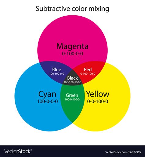
Unlike additive color models like RGB (Red, Green, Blue), which are used for digital displays and create colors by emitting light, CMYK operates on a subtractive principle. In subtractive color models, inks are applied to a light or white background (typically paper), and they absorb or "subtract" certain wavelengths of light. The color that we perceive is the light that is reflected off the surface. White is the absence of ink, meaning the white of the paper is what we see. Conversely, black is achieved by combining the four inks, which absorb almost all light, leaving very little to be reflected.
This subtractive process is fundamental to understanding how CMYK achieves its color range. The inks work by reducing the amount of light reflected from a white or light background. When light hits a printed surface, the cyan ink absorbs red light, magenta ink absorbs green light, and yellow ink absorbs blue light. By controlling the amount of each ink applied, printers can manipulate which wavelengths of light are absorbed and which are reflected, thus creating a wide array of colors.
The Four Pillars of CMYK: Cyan, Magenta, Yellow, and Black
Each of the four components in the CMYK model plays a distinct and crucial role in the final printed output.
Cyan: The Red Absorber
Cyan is a greenish-blue color. In the CMYK model, cyan ink is responsible for absorbing red light. When cyan ink is applied to a white surface, it prevents red wavelengths from being reflected back to the viewer's eye. This allows other colors, like blues and greens, to be perceived more prominently. While it might seem counterintuitive, cyan's primary function is to subtract red from the visible spectrum.
Magenta: The Green Absorber
Magenta is a purplish-red color. Its role in the CMYK model is to absorb green light. By absorbing green wavelengths, magenta ink allows red and blue light to be reflected, contributing to the creation of colors like reds, oranges, and purples. The intensity and amount of magenta ink used directly influence the warmth and vibrancy of the final color.
Yellow: The Blue Absorber and Beyond
Yellow is a bright, primary color that plays a vital role in the CMYK system. Its primary function is to absorb blue light. When yellow ink is applied, it subtracts blue wavelengths, allowing red and green light to be reflected. This is key to producing colors like greens, oranges, and yellows themselves.
However, yellow's significance extends beyond just absorbing blue. Pairwise combinations of cyan, magenta, and yellow inks produce secondary colors:
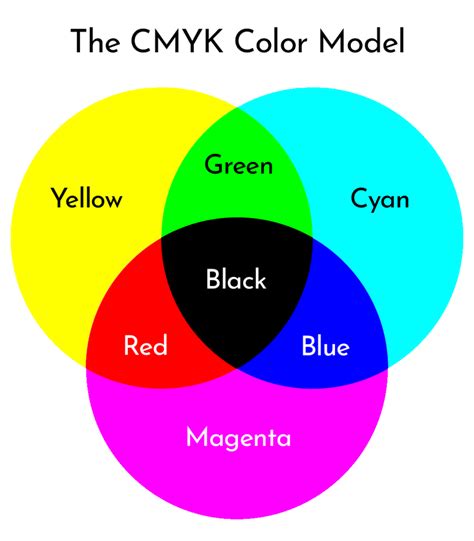
- Cyan + Magenta = Blue: When cyan subtracts red and magenta subtracts green, the remaining reflected light is predominantly blue.
- Magenta + Yellow = Red: When magenta subtracts green and yellow subtracts blue, the reflected light is predominantly red.
- Yellow + Cyan = Green: When yellow subtracts blue and cyan subtracts red, the reflected light is predominantly green.
The interplay between these three inks allows for the creation of a broad spectrum of colors. Yellow, in particular, is crucial for achieving bright, luminous greens and vibrant reds, and it significantly impacts the overall saturation and hue of many colors. Without sufficient yellow, greens can appear dull, and reds can lack warmth. The precise control over the percentage of yellow ink is essential for achieving accurate color reproduction.
Black (K): The Key to Depth and Detail
The 'K' in CMYK stands for "Key." This term originates from traditional printing practices where the black ink plate was considered the "key plate." This plate was crucial for aligning the other color plates (cyan, magenta, and yellow) to ensure proper registration and detail. In modern printing, the 'K' unequivocally refers to black ink.
The inclusion of black ink is not merely an addition; it's an essential enhancement to the CMY model. While mixing cyan, magenta, and yellow inks can theoretically produce black, in practice, this often results in a muddy, dark brown rather than a true, deep black. This is due to the impurities in the inks and the limitations of the subtractive process.
Adding black ink allows for:
- True Blacks and Grays: Black ink provides the deepest blacks and allows for a wider range of neutral grays by mixing it with white or with varying percentages of CMY.
- Enhanced Detail and Contrast: Black ink is vital for printing sharp text, fine lines, and intricate details that might be lost or appear fuzzy if rendered solely by the CMY inks. It significantly improves the contrast and legibility of printed materials.
- Cost-Effectiveness: Using black ink for text and line art is generally more economical than attempting to create black by mixing CMY inks, especially in large-scale printing.
Why 'K' and Not 'B' for Black?
The choice of 'K' for black, rather than 'B', is a common point of confusion. The primary reason is to avoid ambiguity. In the design and printing world, 'B' is often used to represent Blue, particularly in the context of the RGB color model. Using 'B' for black could lead to significant confusion, especially when communicating color specifications or troubleshooting print issues. The term "Key" or "Key Plate" in historical printing contexts, which was typically the black plate, naturally led to 'K' becoming the universally accepted designation for black in the CMYK model.
How Do CMYK Process Colors Blend On Paper?
Halftoning: Creating Continuous Tones from Dots
A fundamental technique that underpins CMYK printing is halftoning, also known as screening. Since printers lay down ink in discrete dots, creating the illusion of continuous tones and subtle color variations requires a clever approach. Halftoning allows printers to produce continuous tones by varying the size and spacing of small ink dots.
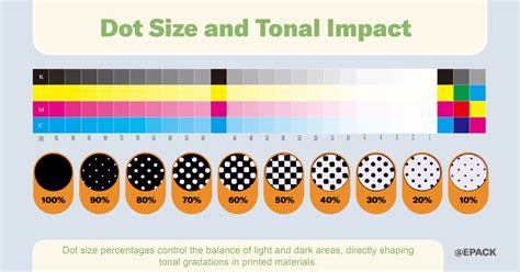
In this process, the original image is separated into its CMYK components. Each component is then rendered as a series of tiny dots. By controlling the size and density of these dots for each color, and by printing them at different angles, the human eye perceives a smooth blend of colors. For instance, a light shade of pink might be created by using a sparse pattern of magenta dots with a small percentage of yellow. A deep, rich red would involve a denser pattern of magenta and yellow dots. This technique is what allows a printer to produce the thousands of color variations from just four inks.
CMYK vs. RGB: A Tale of Two Models
The distinction between CMYK and RGB is crucial for anyone working with digital design and print.
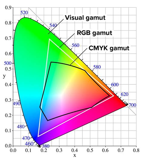
RGB (Red, Green, Blue): This is an additive color model used for digital displays such as monitors, televisions, and smartphone screens. Colors are created by emitting light, and combining all three primary colors at full intensity results in white. Black is the absence of light. RGB has a wider gamut (range of colors) than CMYK, meaning it can display colors that cannot be accurately reproduced in print.
CMYK (Cyan, Magenta, Yellow, Key/Black): This is a subtractive color model used for printing. Colors are created by absorbing light from a white background, and combining all four inks results in black. CMYK has a smaller gamut than RGB, which is why designs created in RGB often need to be converted for print, and some vibrant RGB colors may appear duller or different when printed.
When a design is created in RGB and intended for print, it must be converted to CMYK. This conversion process can sometimes lead to a "gamut warning" in design software, indicating that certain colors in the RGB file fall outside the printable range of the CMYK model. Designers must then adjust these colors to ensure they can be accurately reproduced by the printer.
Understanding CMYK Values and Gamut
CMYK values are typically expressed as percentages, ranging from 0% to 100%. A value of 0% for a color means no ink of that type is applied, while 100% means the maximum amount of that ink is used.
It's important to note that CMYK values are not always unique. For instance, achieving a neutral gray might involve different combinations of CMY and K values depending on the specific printing profile and ink characteristics. This is unlike RGB, where each color has a unique combination of red, green, and blue values.
The "gamut" refers to the range of colors that a particular color model or device can reproduce. The CMYK gamut is inherently smaller than the RGB gamut. This means that some colors that appear brilliant on a screen (in RGB) cannot be precisely replicated using standard CMYK printing inks. When converting from RGB to CMYK, design software and color management systems attempt to find the closest printable equivalent, often issuing warnings for out-of-gamut colors.
Practical Considerations for CMYK Printing
For designers and businesses, understanding CMYK is crucial for achieving desired print results.
Color Accuracy and Consistency
While CMYK printing aims for accurate color matches, slight variations can occur due to factors like the specific printing press, ink types, paper stock, and even environmental conditions. This is why commercial printers often ask for files to be submitted in CMYK format â it ensures the files are prepared for the printing process and minimizes unexpected color shifts. Designers may use color charts and values to preview how colors will appear in print, but it's always wise to perform test prints for critical projects.
Achieving Specific Colors in CMYK
- Rich Black: For deep, solid blacks, especially for large areas or text, a "rich black" is often recommended. This is typically achieved by combining CMYK values like C:60%, M:40%, Y:40%, K:100%. This blend creates a black that is darker and has more depth than 100% black alone. Standard black (K) alone is often made from shades of gray.
- Reds: Reds can sometimes appear orange or rusty in print. This is often due to an imbalance in magenta and yellow. If red looks too pinkish, it indicates too much magenta. Adjusting the levels of magenta and yellow is key to achieving a true red.
- Greens: Cyan and yellow combine to produce green. Setting these values to equal parts and ensuring they are dense can lead to vibrant results.
- Blues: Blue is one of the more challenging colors to reproduce accurately in CMYK. Balanced mixtures with even values, such as C:100%, M:50%, Y:0%, K:0%, are often recommended.
- Pinks: Pinks are heavily reliant on magenta. For vibrant pinks, high magenta levels with low cyan, yellow, and black are typically used.
- Metallics: True metallic finishes like gold or silver cannot be achieved with standard CMYK inks. While a representation of metallic colors can be printed using CMYK, it will be a flat, non-metallic effect. Specialized metallic inks or finishes are required for actual metallic appearances.
Paper and Ink Types
The choice of paper and ink also significantly impacts the final CMYK print. Dye-based inks are less expensive and produce bright colors but can fade over time. Pigment-based inks are more durable, waterproof, and UV-resistant, offering higher quality prints. UV inks cure quickly under ultraviolet light, producing vibrant, high-definition prints. The paper stockâwhether coated, uncoated, or Kraftâwill also affect how ink is absorbed and how colors appear.
In essence, the CMYK color model, with its subtractive principles and the critical role of yellow in achieving specific hues, is a sophisticated system that underpins the vast majority of printed materials we encounter daily. Understanding its mechanics, from the function of each ink to the technique of halftoning and the nuances of color conversion, is essential for anyone seeking to translate digital designs into tangible, high-quality printed products.