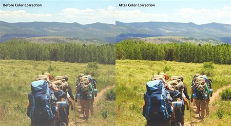
Correcting color in images is about removing unwanted color casts. The “unwanted” part is important because some color casts are desirable. For instance, you wouldn’t want to neutralize the warm hue of a sunset. However, you might want to remove the blue color cast that sometimes pervades photos taken on overcast days or in hazy conditions. The content of a photo will dictate how you edit it, so you shouldn’t obsess over correcting color in every photo. Many times, you’ll want to do little or nothing to the color.
When working with curves, histograms, and RGB numbers, it’s useful to know what the histogram is telling you. By looking at all three RGB (red, green and blue) histograms at once, you can immediately get an idea of whether or not the image has a color cast. If there’s no color cast, the three histograms will look very similar. A black and white RGB image illustrates this perfectly because it’s completely neutral. In this black and white RGB image, you can see that the red, green and blue histograms are identical. Whenever a photo contains an area that should be neutral gray in your estimation, you can use the mid-tone eyedropper tool in either levels or curves to quickly correct any color cast. Simply clicking on the supposedly gray portion of the image will correct the color. It’s usually worth clicking a few times in different areas until you achieve a result that pleases you. By dragging the eyedropper tool over this gravestone, we can see that the green value is less than that of red or blue. By opening curves or levels and clicking on the stone using the middle eyedropper, the magenta cast is corrected.
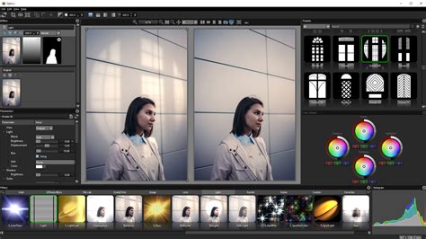
By introducing the info palette into the equation, you can make far more precise color corrections. The technique you’re about to learn also teaches you to evaluate and edit photos by the numbers. Think about this - when you have nothing to compare an image to-no alternative version-it often looks “okay” at first glance. Before you proceed, it’s important to note that an image always needs “neutral” areas for color correction to succeed. That’s because a neutral tone provides a known reference point that you can work from. Neutral pixels always have identical RGB values (e.g. 128, 128, 128). Any photo that doesn’t contain a neutral tone is difficult to accurately correct. This is true whether you’re adjusting color yourself or hitting an auto-color-correct button.
This is a picture of a hotel in Switzerland before any color correction. Hover the eyedropper tool over a diffuse white highlight in the photo with RGB values in the 230s or 240s (try to avoid high 250 values). Hovering the eyedropper tool over diffuse white highlights, I can see the blue channel has consistently higher numbers than red or green. Hold down the Shift key and click to create a sample point from this white area, which will show in the info palette as #1. Here, we’re creating a mid-tone sample point. Again, you can see from the numbers (RGB 111, 120, 137) that there’s a strong blue presence. Do the same thing with any black, shadow areas with values of about 10-30. After that, you’ll have created three sample points. A shadow sample point from the trash bag records at RGB 20, 21, 29. We can see now that a cold color cast runs through the entire image from highlights to shadows. Looking at the three RGB samples you’ve created, you should get an idea of any color casts that are present. You’ll typically see the same problem across all tones from highlights to shadows, though not always. Remember that a low RGB value in any of the three channels indicates an opposite color cast. Thus, a low red value indicates a cyan cast, low green is magenta, and low blue is yellow. This only applies in areas that should be neutral in color (i.e.
The Power of Curves for Color Correction
One of the most powerful Photoshop tools at your disposal is Curves. Though it’s often only used to tweak contrast, the curves tool is also hugely effective in correcting color. What’s more, learning how to use it gives you a greater knowledge of image editing in general.
To begin correcting color using Curves, open a Curves adjustment layer. Hold down the Ctrl and Shift (Cmd + Shift on a Mac) keys and click once again exactly on the center of the second, mid-tone sample point you created (#2). Holding down Ctrl + Shift (Cmd + Shift in Mac) and clicking with the eyedropper tool places a sample point on each of the three RGB curves. This is useful for adjusting specific mid-tones. Here, I’ve opened the red channel to illustrate this.
Now it’s time to correct the color cast. On a curves graph, the top right point represents highlights and the lower left shadows. Starting with highlights (your #1 sample), open the individual red, green and blue curves channels one at a time and move the top right point either left or down along the outer edge of the graph so that, eventually, the three values match. This is an exaggerated example of a curves highlight adjustment in the blue channel. I’ve pulled the highlight point to the left, which has added blue to the image (far too much blue). Moving the point down the right-hand side of the graph would increase yellow. In reality, these edits will usually be very slight, moving only a small amount either way.
Repeat this process with the mid-tone and shadow points, so that all of the chosen neutral points in the image are in fact neutral. The bottom-left shadow point is also moved along the outer edge of the graph, either upwards or right. The mid-tone point you’ll drag either up or down. If the color looks wayward at the end of this process, it typically means that you’ve picked a sample point that wasn’t neutral. Ensure that your sample points contain no color noise or reflected color.
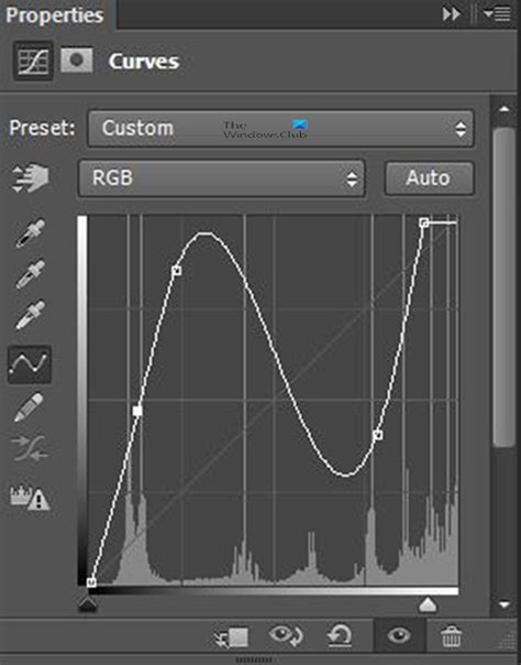
Now all points are roughly similar, in other words, all the sample points I took that were estimated to be neutral have been made neutral. Note that the numbers don’t have to match perfectly like this as long as they’re close. In the curves graph, the red channel has been lifted and the blue channel pulled down slightly as a result of my edits. Once the correction is complete, the sample points are removable by holding down Ctrl + Alt (Cmd + Option) keys and clicking on them. You should see the scissor icon when you hold these keys down.
This is the color-corrected image. With the blue cast gone, other colors in the photo can breathe.
Tip: Since moving the endpoints of the curve line affects all highlights and shadows, you should edit conservatively. In particular, avoid choosing the highest of the three RGB values as the target when matching red, green and blue highlight channels. Otherwise, you may find that you blow out wanted detail in the brightest part of the image. Flaws in the shadows are generally less noticeable, but you still risk blocking detail if you adjust all the shadow RGB points to the lowest of the three values.
Alternative Color Correction Techniques
The types of correction discussed in this article work best when there are naturally occurring color casts in the image. In mixed lighting, where the light sources are radically different (e.g. incandescent lighting and daylight), you’ll need to painstakingly address each affected area of the image using layers in Photoshop or the adjustment brush in Lightroom. I don’t expect that you’ll use these techniques on every image, but I hope they’ll improve some of your pictures and that you’ll enjoy experimenting using curves in Photoshop.
Merely hovering the eyedropper tool over a picture while watching the numbers will tell you something about it.
Using the Color Balance Adjustment Layer
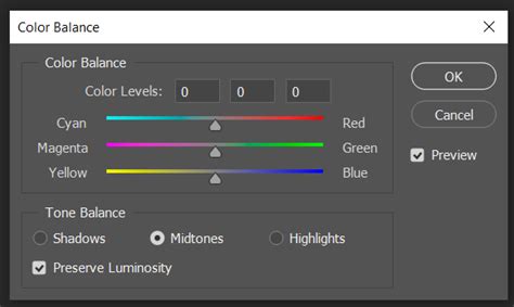
Another effective method for color correction is the Color Balance adjustment layer. Select “Color Balance” from the menu. Aim for natural-looking skin tones. Repeat these steps for Midtones and Shadows if needed. Always pay close attention to how color casts affect the shadows on your subject’s face. To assess the effectiveness of your edits, the Layers panel provides a handy trick. Click the eyeball icon next to the Color Balance Adjustment Layer.
Leveraging Levels Adjustment Layers
Sometimes your image might require additional adjustments beyond Color Balance. In these cases, Levels Adjustment Layers can be a helpful next step. They provide precise control over the overall brightness and contrast of your image. Think of Levels as a histogram that shows the distribution of light and shadows in your photo. With practice, using Color Balance Adjustment Layers will become second nature, allowing you to consistently achieve natural-looking skin tones in every portrait.
Embrace Experimentation and Refinement
Remember, color correction is subjective. Revisit and Refine: The Color Balance Adjustment Layer is always editable.
Adjustment Layers vs. Adobe Camera Raw
Two ways to adjust image tone and color are to use adjustment layers or to edit in Adobe Camera Raw. Both offer a wide range of control and flexibility, without permanently altering or damaging the original image information. The integrity of your original images is preserved. With adjustment layers, you apply edits on a separate layer in the image file, leaving the original image (background layer) intact. The easiest way to access the adjustment layer tools is clicking an icon in the Adjustments panel. You can add more than one adjustment layer for more complex image editing. You can also use a mask to apply the adjustment to a specific part of the image.
Adobe Camera Raw is a Photoshop plug-in for making color and tonal adjustments. In its editing window, there is a large preview image and the adjustment tools are laid out in the order that you would normally use them. Despite its name, Adobe Camera Raw can edit JPEGs and TIFFs in addition to camera raw files. Unless a specific adjustment isn't available as an adjustment layer or in Camera Raw, don't use the commands in the Image > Adjustments menu. In addition to the two workflows described above, you can also use Smart Objects for editing layers nondestructively.
A Practical Example: Correcting a Dull, Bluish Image
This exercise is excerpted from Noble Desktop’s past Photoshop training materials and is compatible with Photoshop updates through 2020.
Exercise Overview: The original version of this photo is washed out, without contrast or vivid color. While retouchers hope to get a great image with properly balanced color, shadows and highlights, in the real-world not all of us get those images. This snapshot is dull and bluish. Let’s color correct it and give it more contrast for punch. As shown below, you can see that the image contains no true blacks, and a lot of tones are concentrated at the midtones, especially the darker midtones. Do NOT click OK until we tell you to! Before we do more color correction, let’s set up the Properties panel so it’s easier to use. Click OK. Much better. Using the menu at the top of the Curves adjustment, look through the RGB channels to see what the Auto feature has done for you.
Beyond Curves: Exploring Other Color Tools
Hue and Saturation
Dan Rodney has been a designer and web developer for over 20 years. He creates coursework for Noble Desktop and teaches classes. One of the reasons Photoshop is so daunting is the seemingly never-ending number of things to learn. On the other hand, that’s also why it’s so great. Almost all of the tools I’ll be mentioning here can be used for the same purpose. The main difference is the way you get there. By that, I’m referring to their interfaces and the control that each tool gives you. I’ve already written an article about one way I use Hue and Saturation, which you can find here. In that article, I talk about using it to correct or unify skin color. The same (or opposite) can be done when editing any color in your images. I use Hue and Saturation as a quick and easy way to edit pre-existing colors, and, in conjunction with masks, to quite drastically change a particular color. For example, I recently changed the color of some petals using Hue and Saturation. The beauty of Hue and Saturation is it’s easy, and it has that nifty slider at the bottom. The usefulness of that slider cannot be underestimated.
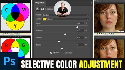
Selective Color
Selective Color has become one of my favorite ways to gain very precise control. I use it mostly for correcting color casts and for actual color grading. I love the level of control it provides. For the purpose of demonstration, I used Selective Color to remove the red shades in the fog, to the right of the frame and make it seem closer in color to the fog on the left side of this image. The benefit of Selective Color, compared to any other method, is the level of control. As a result, I find it much more enjoyable to use for color grading. Hue and Saturation is a little too basic for me in this regard and hence, is better suited to the other tasks mentioned above. By clicking on the colors drop down, we are given six color options to adjust, as well as the highlights, shadows and mid-tones (whites, blacks, and neutrals). So, if I love the control of Selective Color so much, why don’t I use it all the time? Simple, it’s a little too time consuming. As you become more familiar with the tools in Photoshop, you’ll realize the limitations of each and which one is best utilized to save time. There are moments when only Selective Color will do, but usually, I revert to something a little quicker.
Understanding the Color Wheel in Curves
And now we come to what so many would consider the holy grail within Photoshop. They kind of are, but there are so many other tools that get overshadowed by their dominance. In terms of color, I group them together as they are essentially the same with different interfaces. Looking at the photo above, I’ll explain it from the top down. The first arrow you see is our channel selection. Click on that drop down menu and you can edit the reds, greens or blues. Moving the line up will add the color you are working on, whereas moving it down will add the opposing color on the color wheel. The second part you must understand with curves is the histogram. All you need to know is that the right side depicts the highlights of your image, and the left shows the darks. Everything in the middle is the mid tones. Therefore, if we want to add blue to the highlights, we would move the line up on the right side. At first glance, Curves does appear complex, and it can take a little getting used to, but once you get your head around it, you’ll find it’s quite simple. The differences compared to Selective Color, for instance, are that we are only editing the colors within the Highlights, Shadows, and Midtones. We cannot select an actual color and alter the appearance of that throughout our photo. There is nothing wrong with that but it doesn’t give us the added control that Selective Color provides. Despite this, I often find the level of control provided by Curves is more than enough; it’s relatively fast and intuitive.
Photo Filters and Blend If
I don’t tend to use photo filters very often. We can either select one of the presets from the filter drop down menu or choose “Color” and select our own (see photo below). Having found a color you find pleasing, try double-clicking on the layer and using “blend if” to refine the area of your image the effect is applied to. Take a look at this tutorial where I talk in depth about the use of “blend if” for dodging and burning. Rather than adding totally new colors, I usually use this technique to accentuate what’s already there. With this photo, I wanted to exaggerate the difference between the left and right of the frame, specifically the reds on the right and blues to the left. To do so, I selected the colors I wanted to add by using the color picker tool. I then added a little more saturation to each and applied a gradient to two separate layers so that they could be adjusted individually. Finally, I used “blend if” to refine where these colors would be present and ended up with the image below.
Workflow Considerations: Photoshop vs. Lightroom
As I have demonstrated, there are many ways to arrive at the same place in Photoshop. Photoshop is perfect for when you want to get heavily into a photo. It’s not always necessary though and can end up being a giant, time-wasting, rabbit hole. Make sure you’re prepared before you jump down it! Lightroom, on the other hand, is an indispensable tool that is useful for every job. Make sure you check out the SLR Lounge Preset System to speed up your workflow.
Advanced Color Correction with Color Sampler Tool
The process relies on reading data from the image and then adjusting the numbers that the image provides. It’s a way to remove a color cast that is relatively simple and which involves reading and setting RGB values rather than making objective decisions about an image. To get started, open an image that you think has a color cast. Choose Window > Info to display the Info palette. To make the color correction I’ll use the Info palette to display information about the image. To do this I’ll need to make some color sample points on the image and I’ll do this using the Color Sampler tool which shares a toolbar position with the Eyedropper. Click the Color Sampler tool and, from the toolbar, select the 3 x 3 Average Sample. Now locate a place on the image which should be white or a light neutral gray in color. Click on it with the color sampler tool and you’ll see a marker appear on the image with the number 1 beside it. Repeat the process, this time clicking on another point which should be either white, black or a neutral gray. This gives you a second sample point. You can continue and add a total of four markers if desired. Check back in the Info palette to read the color information for each of these points. For the lightest points you should see values of around 245 for the R, G and B channels. For the darkest points the value should be around 15 for each of the channels. If your image has a color problem you’ll find that the numbers at each point are not within a range of 2 or 3 values of each other. To color correct the image what you’ll do is adjust the curves for each of these channels to bring them closer to each other. Choose Layer > New Adjustment Layer > Curves and click Ok. You’ll be correcting individual channels so from the Channel dropdown list select Red and then Ctrl + Click on the first point that you marked in your image. Identify whether you need to increase or decrease the value at this point. To increase it, drag upwards and to decrease the value drag downwards. When you’re done, click Ok to close the Curves dialog.
Dream it. color components in an image. the other primary colors. of an image while leaving the cyan in the blue component unaltered. in the Channels panel. Choose Layer > New Adjustment Layer > Selective Color. Color. to the image layer and discards image information. Choose the color you want to adjust from the Colors menu in the Properties panel. or black by its percentage of the total. magenta (10% of 50% = 5%) for a total of 55% magenta. Adjusts the color in absolute values. The adjustment is based on how close a color is to one of the options in the Colors menu. For example, 50% magenta is midway between white and pure magenta and receives a proportionate mix of corrections defined for the two colors.
Color Grading: Enhancing Mood and Vibe
Photographers should constantly try to create outstanding and captivating images, and even when the shot is not perfect, they can still accomplish great results in post-production. One of the most common techniques to improve photos is color grading to enrich your composition's vibe, evoke new feelings, or enhance the mood of the original picture. Color grading has become so popular that every photo editor and even social media apps have filters that use color grading. Is there an Instagram filter you love? You can replicate or improve it with color grading in Photoshop or Lightroom. In this article, you will learn to color grade in Lightroom and Photoshop using its built-in color grading tools and Optics, a Boris FX plug-in to enhance your photography composition skills. Let’s dive in!
What is Color Grading in Photography?
Color grading is a post-production process to manipulate the color of an image to enhance the look and change the scene's mood. With photo editing software, you can control the color hue, saturation, and luminance of different elements in the photo, like shadows, highlights, and mid tones. Color grading is used in photography and film to create awesome colors. Movies like Blade Runner have a unique color grading that gives the feeling of being in a cyberpunk city, and The Twilight Saga uses cold colors to bring a dark and mysterious atmosphere to the town. Looking at stills from these and other movies, you will notice that color grading is essential in how you perceive the composition.
How to Color Grade in Lightroom
This first-step-by-step guide is for color grading in Lightroom. You will only need Lightroom and your photos.
Step 1: Import PhotoImport your images into Adobe Lightroom from File > Import Photos and Video. Working with RAW format files is more suitable when you edit pictures in Lightroom.
Step 2: Prepare Photo for Color GradingWhen you switch to the Develop panel, you’ll have a few tabs with color tools. Adjust color using contrast, exposure, white balance, tint sliders, and the tone curve, among other settings. Editing your photo before the color grading process will allow you to have your images ready with balanced colors and good exposure to add a more dramatic and cinematic look to your photo. Is this step necessary? That will depend on whether the photo needs color correction or is already perfect for color grading.
Step 3: The Color Grading ToolAccess the color grading tool from the Develop panel. Scroll down until you find the color grading tab, and click on it to display its settings. You will not have this tool if you use an older version of Lightroom Classic (2020 or older). However, you will see the Split Toning tool, which works similarly but has limited tools compared to the new color grading panel. The color grading tool offers you different workflows: the three-way wheel, the one you see by default, and the most common in many other photo editing software. The mid tones, shadows, and highlights wheels independently for a more detailed color grading process of each one, and a global wheel that applies color grading to the entire image.
Step 4: Color WheelsLet’s use the default view: the three-way color wheels. This view allows you to work with mid tones (top wheel), shadows (left wheel), and highlights (right wheel). Each wheel has a little circle in the middle as a handle, which you can drag with your mouse. The hue (color shade) will change as you move the handle in circles. Moving the handle from the center to the edge will change the saturation, and the slider on the bottom of each color wheel controls the luminance. These controls apply to all color wheels. In landscape photography, it's common to add orange or yellow colors in the highlights wheel for a sense of warmth in a sunset image while using a blue tone in the shadows to make the night sky darker.
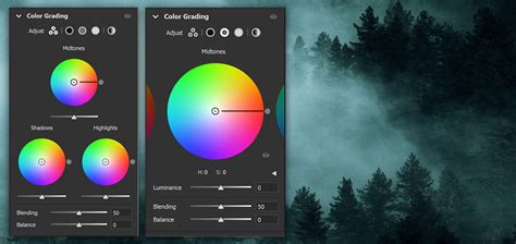
Step 5: Blending and Balance SlidersYou'll notice Blending and Balance sliders at the bottom of each color wheel. These two sliders are quite self-explanatory. The Blending slider controls how much the three-color wheels overlap. For example, increasing the blending will make a smoother blend but mix the color tones. It is set in the middle by default, so you can adjust it as you see fit. The Balance slider controls the relation between the highlights and shadows. Adjust it to the left for more shadows and to the right for highlights.
Step 6: ExportOnce you finish color grading your photo, export the new image in your desired format.
How to Color Grade in Photoshop Using the Camera Raw Filter
Photoshop also has a color grading tool that’s accessible to all users. I recommend working with RAW format for better results. You can use JPEG files, but it’s best to work with a RAW format image to appreciate the color grading.
Step 1: Import Your Media for Color GradingIn Photoshop, open your image files from File > Open. Browse the photo that you want to color grade and click Open. Do the editing you need before color grading.
Step 2: Camera Raw FilterThe color grading tool in Photoshop is located under Filter > Camera Raw Filter. In the camera raw filter window, you have all the color-related tools. You have the basics for white balance adjustments, temperature, tint, the tone curve, a color mixer, color grading, and effects, among other valuable tools.
Step 3: Color Grading ToolClick on Color Grading to display its settings. If you have used Lightroom or other photo editing software, it would look familiar. The steps for color grading in Photoshop and Lightroom are the same, but if you jump straight to this section, here’s what you need to know. Color grading is done using three-color wheels. One controls the shadows, another the mid-tones, and the third the highlights. If you’re color grading a night shot and want to add a blue tone to enhance the shadows, go to the shadows color wheel and move the handle in the middle of the wheel (the small circle). You adjust the color tone (hue) by dragging the circle around. Moving the handle closer to the edge will alter the saturation to change its intensity. The slider below each color wheel adjusts the luminance. At the bottom of the color wheels, you have blending and balance settings to adjust how the color wheels overlap in your photo and balance the mid-tones, shadows, and highlights.
Step 4: Alternative Color Wheels ViewsBesides the default 3-way color wheel view, you can have more control and a detailed view of each color wheel. You select it by changing the icon above the mid tones wheel next to Adjust. The last view mode is the global wheel. It allows you to color grade more quickly using a pre-established balance between the mid tones, shadows, and highlights. The global wheel is perfect when you have a color in mind for your scenes but don’t need to adjust any parameter to achieve it. You don’t need to use every view and every wheel for color grading. You can get away with only adjusting the shadows and highlights to add warm and cold colors. Experiment with the color grading tool to find exciting effects that you can apply.
Step 5: ExportSave or export your photo in PNG or the format you need.
How to Color Grade in Photoshop with Optics
Optics by Boris FX is a great tool for Lightroom and Photoshop (also available as a standalone app) to create captivating cinematic effects for your photos and help you improve your photo composition skills. Working with Optics is super simple and fun. It takes time to get used to the tools, explore each, and experiment with tweaking their parameters to create unique looks for your photos. The following step-by-step guide will provide the basics for color grading in Lightroom or Photoshop with Optics.
Step 1: Add Optics in Lightroom and PhotoshopImport your photos to Photoshop or Lightroom. Right-click your image to use Optics in Lightroom and select Edit In > Boris FX Optics. In Photoshop, go to Filter > Boris FX > Optics. I recommend converting your photo to a smart object in Photoshop before applying Optics to be able to make changes later. Do it by right-clicking the layer and selecting Convert to Smart Object. If you use the standalone application, just run Optics and click File > Open to import your photos.
Step 2: Optics Filters and PresetsOptics offers a plethora of filters for natural, bold, and eccentric looks organized in ten different categories. For each category, you can find thousands of customizable presets. Something I like about Optics is that it's very visual: you can quickly apply filters in real time without waiting for them to render. In the categories Color, you can find the tone curve and color wheels, among other color tools, and in Grads/Tints, you will find the color grading filters that you can apply and tweak.
Step 3: Color Grading in OpticsThe main difference between working with Optics rather than using Lightroom and Photoshop's built-in color grading tools is that you can have a big jump start. Instead of manually choosing the color and trying to find and match what you have in mind, you can select a preset and save a lot of time. Optics has the Sunset filter for sunset shots with presets for images with grass and sky or sunsets over the water. If you’re unhappy with the look, you can fine-tune the preset parameters on the right panel. You can change the color, opacity, highlights, and more to create customized presets. Before a big project, take your time to see all the tools and presets Optics offers. There is so much to discover that you will never stop finding creative color-grading filters.
Step 4: Export to your HostTo export your work in Optics back to Lightroom and Photoshop, click Apply on the bottom right corner of the screen, and you will instantly return to your host with all the color grading done to continue editing or apply other Photoshop or Lightroom effects. To export from the standalone application, go to File > Save As.
Final Thoughts on Color Correction and Grading
Learning color grading can feel a bit overwhelming at first, but trust me, it will make a huge difference in the long run! The steps to adjust colors are simple, but knowing how to get the color tones you want is what makes the best of color grading, and that comes with practice. A few things you should consider for better results in color grading are color theory, learning about complementary colors, and using masks to isolate color grading to specific sections of the image.
Try Optics now for free and get a fast-processing color grading tool and thousands of presets to mesmerize your audience with your photos. Good luck!
FAQ: Color Correction vs. Color Grading
What is the Difference Between Color Correction and Grading?The difference is that color correction fixes and balances the color in your photo with the goal of achieving a natural-looking photo.
Color Correction with Easy "4-Point" Technique! - Photoshop Tutorial
tags: #adobe #photoshop #for #color #correction