In the realm of graphic design, the ability to seamlessly integrate and manipulate images is paramount. Adobe InDesign, a powerhouse for page layout, offers a suite of tools that allow designers to achieve sophisticated visual effects. Among these, blending modes play a crucial role in how layers interact with each other, creating depth, mood, and unique visual styles. While often associated with image editing software like Adobe Photoshop, understanding and effectively utilizing blending modes within InDesign can significantly elevate the quality and efficiency of design workflows, particularly when dealing with complex image compositions and color treatments. This article delves into the intricacies of InDesign's blending modes, exploring their functionality, practical applications, and how they can be leveraged to achieve results that might otherwise require extensive Photoshop workarounds.
The Challenge of Layered Images and Consistent Backgrounds
A common scenario faced by designers involves incorporating multiple images that share a consistent visual element, such as a background. For instance, a series of product shots taken against a marble slab requires that all marble backgrounds within the InDesign layout precisely match. This ensures a cohesive and professional appearance. A proposed workflow often involves preparing these images in Photoshop with precise masking of the main elements and a softer mask for shadows, with the intention of setting the shadow layer to a "darken" or "multiply" blending mode. The expectation is that when these Photoshop files are placed in InDesign, the blending mode would be preserved, allowing a single, blank marble slab in InDesign to serve as the consistent background for all placed images.
However, a frequent hurdle encountered is that InDesign does not always interpret Photoshop's layer blending modes in the same way, or at all, when importing PSD files. The "darken" or "multiply" blending mode, for example, might not carry over as expected, leading to the shadow layer in InDesign "knocking out" underlying objects rather than blending with them. This necessitates workarounds, such as placing two copies of the PSD file, turning off specific layers in each, and grouping them - a process that is not only time-consuming but also increases file size and the potential for errors when updating linked files. The desire for InDesign to natively support and interpret these Photoshop blending modes directly is a significant pain point for many designers aiming for efficiency.
Understanding InDesign's Blending Mode Capabilities
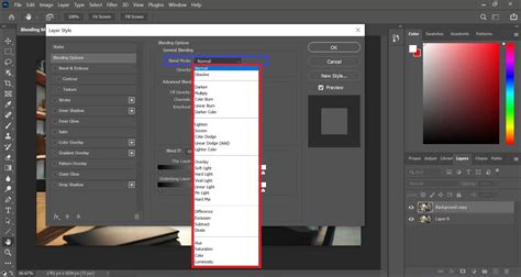
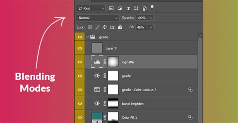
While the direct translation of Photoshop's extensive blending mode options into InDesign might not be entirely comprehensive, InDesign does offer a robust set of blending modes that can be applied to objects and groups directly within the application. These modes allow for sophisticated interactions between the colors of selected objects and the underlying artwork. The blending modes are accessible through the Effects panel (Window > Effects) and can be applied to any selected object, including frames, text, and imported graphics.
The core principle behind blending modes is how the "blend color" (the color of the object to which the mode is applied) interacts with the "base color" (the color of the objects beneath it). Different blending modes create different visual outcomes based on mathematical operations applied to these color values.
Key Blending Modes in InDesign and Their Effects:
- Normal: This is the default mode. The blend color covers the base color.
- Darken: This mode compares the base and blend colors and displays the darker of the two. It's crucial for effects where you want to retain the darker tones of an image or graphic. For instance, if you have a dark shadow layer, "Darken" will show the shadow where it is darker than the background. It produces black if the base and blend colors are the same.
- Multiply: Similar to "Darken," "Multiply" darkens the base color by multiplying the color values. This mode is exceptionally useful for simulating shadows and transparency, as it preserves the darker areas of both the blend and base colors while lightening areas are often rendered as white. When working with grayscale images or shadows, "Multiply" is a go-to for achieving realistic integration.
- Lighten: This mode compares the base and blend colors and displays the lighter of the two. It's the inverse of "Darken" and is useful for creating highlights or overlaying light effects.
- Screen: The inverse of "Multiply," "Screen" lightens the base color by inverting the blend and base colors, multiplying them, and then inverting the result. This is ideal for creating glowing effects, light leaks, or subtly brightening an image. Areas lighter than the blend color do not change.
- Overlay: This mode combines "Multiply" and "Screen." It darkens the base color where the blend color is dark and lightens it where the blend color is light. It's effective for adding contrast and texture without losing the detail in either the highlights or shadows.
- Soft Light: This mode is similar to "Overlay" but with a gentler effect. It brightens the base color to reflect the blend color, creating a diffused lighting effect.
- Hard Light: This mode is also similar to "Overlay" but with a harsher effect. It darkens or brightens the base color to reflect the blend color, similar to shining a harsh spotlight.
- Color Dodge: This mode brightens the base color to reflect the blend color, decreasing contrast. It's useful for adding highlights and creating vibrant, glowing effects.
- Color Burn: This mode darkens the base color to reflect the blend color, increasing contrast. It's useful for adding depth and intensity to colors.
- Difference: This mode subtracts the darker color from the lighter color. It's often used for subtle effects or to create interesting abstract patterns, especially when working with black and white. Areas lighter than the blend color do not change.
- Exclusion: This mode is similar to "Difference" but creates a lower-contrast effect.
- Hue, Saturation, Color, Luminosity: These modes allow you to control specific color attributes.
- Hue: Creates a color with the hue of the blend color and the saturation and luminance of the base color.
- Saturation: Creates a color with the saturation of the blend color and the hue and luminance of the base color.
- Color: Creates a color with the hue and saturation of the blend color and the luminance of the base color. This is excellent for tinting grayscale images.
- Luminosity: Creates a color with the luminance of the blend color and the hue and saturation of the base color.
It's important to note that the effectiveness and appearance of these blending modes can be significantly influenced by the color model of your document (RGB vs. CMYK) and the flattener settings used during PDF export. For print materials, working in CMYK can alter how blending modes behave compared to RGB.
Applying Blending Modes to Grayscale Images and Tinting
One of the most practical applications of InDesign's blending modes is applying color tints to grayscale images. Previously, this often necessitated opening each grayscale graphic in Photoshop, adding a color layer, saving it as a new file, and then relinking it in InDesign - a tedious and time-consuming process.
A more efficient method involves applying a color fill to a frame that contains the grayscale image and then using blending modes within InDesign to combine the color with the image.
Workflow for Tinting Grayscale Images in InDesign:
- Place the Grayscale Image: Import your grayscale TIFF or PSD file into InDesign.
- Create a Color Frame: Using the Rectangle Frame Tool, draw a frame that precisely matches the dimensions of your image.
- Apply a Color Fill: Select the frame and apply a desired color fill from the Swatches panel.
- Adjust Blending Mode: With the frame (containing the color) selected, open the Effects panel (Window > Effects). From the "Blending Mode" dropdown menu, choose a mode such as "Color," "Overlay," or "Soft Light."
- Color Mode: This mode applies the hue and saturation of the blend color (your frame's fill) to the luminance of the base color (your grayscale image). This is an excellent way to apply a specific tint.
- Overlay/Soft Light: These modes can also be used to tint images, often adding more contrast and a richer blend than the "Color" mode alone.
- Refine and Adjust: Experiment with different color fills and blending modes to achieve the desired tint. You can also adjust the opacity of the frame to further control the intensity of the color.
This technique allows for on-the-fly color adjustments directly within InDesign, saving significant time and effort.
The "White Arrow" and Vector Graphics
The Direct Selection Tool, often referred to as the "white arrow," is another powerful, albeit sometimes overlooked, tool in InDesign for manipulating grayscale and bitmap images. It allows for precise selection and editing of individual elements within a graphic frame. While it works exceptionally well with grayscale images, its functionality with vector files, such as Illustrator (.ai) files, is more limited.
If you need to convert a black and white Illustrator file to color within InDesign, and the graphic contains numerous individual elements with distinct stroke and fill colors, the "white arrow" alone may not be sufficient for a quick conversion. In such cases, the traditional workflow of returning to the original Illustrator file to modify colors remains the most reliable.
Copying and Pasting Between Illustrator and InDesign
A clever workaround for handling Illustrator graphics that need color modification within InDesign is to leverage the copy-paste functionality between the two applications.
- Copy from Illustrator: Select the elements within your Illustrator file whose colors you wish to change. Copy them (Ctrl+C or Cmd+C).
- Paste into InDesign: Paste the copied elements into your InDesign layout (Ctrl+V or Cmd+V). The pasted object will be an editable InDesign object, retaining its vector properties, including editable points, strokes, and fills.
- Edit Colors in InDesign: You can now use InDesign's tools to change the colors of these pasted elements directly.
- Considerations: Be aware that this pasted object will not retain any link information to the original Illustrator file. If you need to manage the source file name or other metadata, consider adding a note on a non-printing layer or using the Articles panel for organization.
This method offers a significant advantage over re-importing and relinking, especially when dealing with graphics that undergo frequent color changes.
Stop Wasting Time in InDesign - Do These 7 Things
Advanced Transparency and Knockout Group
InDesign's transparency features extend beyond simple blending modes. For more complex compositions involving multiple objects with applied blending modes, the "Isolate Blending" and "Knockout Group" options become invaluable. These features control how blending effects interact within groups of objects, preventing unintended blending with elements outside the group.
Isolate Blending:
When applied to a group of objects, "Isolate Blending" ensures that the blending modes applied to objects within that group only affect each other and do not interact with objects outside the group. This is crucial for maintaining predictable results when working with layered effects. To apply it, select the group, open the Effects panel, and check the "Isolate Blending" option.
Knockout Group:
The "Knockout Group" option, also found in the Effects panel, determines whether objects within a group that have transparency settings or blending modes should "knock out" or "block out" underlying objects within the same group. If "Knockout Group" is enabled, objects with transparency or blending modes will essentially create holes in the objects below them within that group. If it's disabled, blending modes will interact as expected within the group, and transparency will not knock out.
These advanced options are particularly important when exporting to PDF, as they influence how the transparency is flattened and rendered in the final output. Ensuring correct settings in the PDF export dialog box, especially concerning the color profile and flattener, is vital for preserving the intended visual appearance.
Practical Workflow Example: Product Photography with Shadows
Let's revisit the scenario of product photography with shadows. A common and effective workflow in Photoshop is to create two layers:
- Top Layer: The product image itself, set to "Normal" blending mode.
- Bottom Layer: The shadow of the product, set to "Multiply" blending mode.
When this PSD is placed in InDesign, the "Multiply" blending mode for the shadow layer is often not interpreted correctly. Instead of darkening the underlying InDesign background (like the marble slab), it can appear to "knock out" anything beneath it in the InDesign document.
The workaround mentioned earlier involves placing two copies of the PSD file:
- First PSD Instance: Set the "shadow layer" to be visible, but the "product layer" to be invisible using InDesign's Object Layer Options. This effectively places only the shadow.
- Second PSD Instance: Set the "product layer" to be visible, but the "shadow layer" to be invisible. This places only the product.
- Grouping: Group these two instances together.
This workaround, while functional, is cumbersome. If InDesign could reliably interpret the "Multiply" blending mode from the Photoshop file directly, it would streamline the process significantly, reduce file sizes, and minimize potential errors. The ideal scenario is for InDesign to honor the blending modes as defined in the source Photoshop document, allowing for a more intuitive and efficient workflow for integrating layered images with complex transparency effects.
Conclusion: Embracing InDesign's Transparency Tools
Mastering blending modes and transparency settings in Adobe InDesign is essential for designers seeking to create sophisticated and visually engaging layouts. While challenges can arise from the interpretation of Photoshop's layer effects, InDesign offers a powerful set of tools that, when understood and applied correctly, can achieve remarkable results. From tinting grayscale images with color to managing complex layering with knockout and isolation options, InDesign empowers designers to elevate their work beyond basic image placement. By understanding the nuances of each blending mode and employing efficient workflows, designers can save valuable time, reduce file complexity, and ultimately produce more polished and impactful designs. The continuous evolution of Adobe's software aims to bridge the gap between applications, and with each update, the seamless integration of features like blending modes becomes more refined, promising even greater creative freedom for designers.