Creating a professional and visually appealing brochure is a crucial aspect of marketing and communication for many businesses. While dedicated design software like Adobe InDesign is often preferred for print projects, it's entirely possible to design a high-quality three-fold brochure using only Adobe Photoshop. This guide provides a practical, step-by-step approach, ideal for beginners and those looking to expand their print design skills within Photoshop. We will move from fundamental setup to intricate design elements, ensuring a thorough understanding of the process.
Understanding Brochure Fundamentals: Size, Fold, and Concept
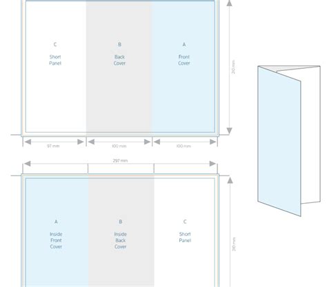
Before diving into Photoshop, several key considerations lay the groundwork for a successful brochure design. The size of the brochure, its shape, and the folding type are paramount. For a three-fold brochure, the most common format is a standard letter-size paper, typically 11 by 8.5 inches. This size allows for six distinct panels when folded. The concept itself, the core message and visual identity, should also be established early on.
A crucial initial step, often overlooked in digital design, is to begin with pen and paper. Literally sketching out your ideas on a folded piece of paper that mimics the final brochure's dimensions can provide invaluable spatial understanding. This draft helps visualize how content will flow across the panels and where images and text will best reside. It’s a practical way to organize information and ensure the layout facilitates reader comprehension.
Setting Up Your Photoshop Document for Print
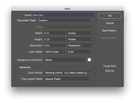
Accurate document settings in Photoshop are vital for professional print results. To begin, create a new document by pressing Command + N. For print design, adhere to the following critical settings:
- Resolution: Set to 300 pixels per inch (PPI). This high resolution ensures sharp, detailed printing.
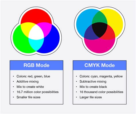
- Color Mode: Select CMYK color. CMYK (Cyan, Magenta, Yellow, and Key/Black) is the color model used in professional printing, whereas RGB (Red, Green, Blue) is for digital screens. Designing in CMYK from the start prevents color shifts when the file is sent to print.
Name your document something intuitive, like "Brochure - Front."
Establishing Print Boundaries: Main Area, Bleed, and Safety Margins
Once the document is created, establishing clear boundaries within your canvas is essential for print accuracy.
1. Showing Rulers and Setting Units:To display rulers, go to View > Rulers or press Command + R. To ensure your measurements are in inches, Alt-click on the ruler itself and select Inches from the options menu.
2. Defining the Main Print Area:The "Main area" represents the actual size of your brochure after it’s been trimmed, which is 8.5 x 11 inches in this case. To define this, draw four Guides by dragging from the rulers to the edges of your document. These guides mark the 8.5 x 11-inch boundary. You can toggle the visibility of guides by navigating to View > Show > Guides.
3. Adjusting Canvas Size for Bleed:To accommodate the printing process, an extra area called "bleed" is necessary. Go to Image > Canvas Size. Add 1 inch to both the Width and Height values, making your canvas 12 x 9.5 inches. Ensure the anchor point is centered. This added space will extend beyond the trim edge.
4. Adding the Bleed Area:The bleed is an additional margin that extends beyond the trim line. This ensures that no unprinted white edges appear if the cutting process is slightly off. Draw four new guides 0.25 inches inside the current document edges (or 1/4 inch before the Main Area guides). These guides mark the bleed area, extending to the very edge of your 12 x 9.5-inch canvas.
5. Implementing Safety Margins:A "safety margin" or "caution line" is a recommended area within the main print area where critical content, such as text and important logos, should be kept. Drag four guides 1/4 inch inside the "Main area" guides (the 8.5 x 11-inch guides). This creates a buffer zone, ensuring no essential elements are accidentally trimmed off.
Creating Column Guides for Panel Division
A three-fold brochure divides the page into three equal columns for content. While precise calculations can be tedious, Photoshop offers a straightforward method using temporary shapes.
1. Using Temporary Rectangles:Select the Rectangle Tool. Draw a narrow rectangle across the width of your document, ensuring it spans from the top bleed guide to the bottom bleed guide. The width of this initial rectangle isn't critical at this stage.
2. Duplicating and Aligning:Duplicate this rectangle twice. Place the second rectangle immediately next to the first, with its left edge touching the first rectangle's right edge. Repeat this for the third rectangle. Ensure there are no gaps and no overlapping between these temporary shapes.
3. Creating Column Guides from the Middle Rectangle:With the three rectangles perfectly aligned, select the middle rectangle using the Move Tool (V). Now, activate the Transform Controls (if not already visible, go to Window > Options). Use the transform bounds of this middle rectangle as a limit to create two new vertical guides. You can do this by dragging guides from the ruler or by using the "New Guide" function and entering precise pixel locations derived from the transform box.
4. Adding Security Margin Guides:Finally, add 1/4 inch security margin guides adjacent to these newly created column guides, both on the left and right sides of each column. This provides an additional buffer for text and important elements within each panel.

Designing the Brochure: Adding Backgrounds, Textures, and Visual Elements
With the structural guides in place, the creative design process can begin.
1. Background Color:To add a background color, select the Foreground color picker and choose a CMYK color. For example, a subtle combination of 15% Yellow and 10% Black can create a muted tone. Draw a Vector Rectangle from the top-left to the bottom-right corner of the Bleed Guides. This rectangle will automatically fill with your chosen foreground color.
2. Incorporating Textures:Photoshop excels at blending layers and incorporating textures. Find a suitable texture image. Paste it into your document as a new layer, perhaps named "BG Texture." Use the Move Tool (V) and Free Transform (Command + T) to scale and position the texture precisely within the Bleed Guides. If the texture has imperfections, like stock image watermarks, use the Clone Stamp Tool to clean them up.
3. Understanding Blending Modes in CMYK:A crucial point for CMYK design in Photoshop is understanding how Blending Modes function differently compared to RGB. While RGB blending modes primarily use light mixing, CMYK modes rely on ink percentages. Modes like "Multiply" operate differently, potentially yielding varied results. Experimentation is key to achieving the desired effect.
4. Designing with Stripes and Gradients:Let’s begin building the visual elements. Draw a long rectangle spanning the page, extending to the bleed edges. Apply a Gradient Overlay layer style, transitioning from a dark red to a lighter red. You can input CMYK values directly or use the Color Picker. Add a significant Drop Shadow to this layer for depth.
5. Applying Textures to Elements:To integrate the background texture with your stripe element, select all (Command + A), copy the "BG Texture" layer (Command + C), and paste it into a new layer above the "Stripe" layer (Command + V). Stretch the height of this new texture layer. Then, Command-click on the "Stripe" layer's Vector Mask thumbnail. Go to Select > Inverse, and then delete the excess texture, leaving only the portion that covers the stripe. Change the "Stripe Texture" layer's Blending Mode to Linear Burn.
6. Rotating Elements for Dynamic Layout:Select the "Stripe" folder and use Edit > Transform > Free Transform (Command + T). Rotate the design by -15 degrees. Commit the transform and position the stripe. A good reference point is the intersection of the stripe's bottom border and the right "Main Area" guide.
7. Adjusting Gradient Angles:The rotation of the stripe can affect the appearance of the gradient overlay. If the gradient appears uneven, adjust its angle within the layer styles to achieve a balanced look.
8. Creating Layered Stripes:Duplicate the "Stripe" folder (Alt-click and drag). Darken the duplicated stripe by adjusting its Gradient Overlay colors. Rotate this "Stripe copy" slightly, perhaps to -5 degrees, and position it a few millimeters below the first stripe. Ensure these stripes are horizontally aligned using the Align Horizontal Center option in the tool options panel.
9. Adding a Ribbon Element:Create a new group named "Ribbon" between the stripe layers. Inside this group, draw a new, narrower yellow Vector Rectangle. To shape it into a ribbon, add a temporary vertical guide in the middle. Use the Pen Tool to add an anchor point, then switch to the Convert Point Tool to delete curve handles, making it a sharp corner. Select the new anchor point with the Direct Selection Tool and move it upwards slightly to create the ribbon's characteristic fold. Apply a Gradient Overlay (dark yellow to yellow) to this ribbon layer.
10. Enhancing the Ribbon with Shadows:To add depth, create a shadow for the ribbon. Duplicate the ribbon layer, fill it with 100% Black using a Color Overlay, and move it slightly to the right. Apply a Gaussian Blur filter (Filter > Blur > Gaussian Blur) with a radius of about 10 pixels. Change the shadow layer's Blending Mode to Multiply and adjust its Opacity to around 60%.
11. Warping for a Realistic Effect:To make the ribbon appear more dynamic, use the Free Transform controls (Edit > Transform > Warp). Manipulate the ribbon's shape using the handles to create a subtle, realistic warp effect. Commit the transformation.

Typography and Content Placement
Typography plays a critical role in brochure design, influencing readability and aesthetic appeal.
1. Adding Brochure Titles:Use the Type Tool (T) to add your main titles. For instance, "PSD" on the larger stripe and "TUTS+" on the smaller one. Utilize the Character panel (Window > Character) to customize font properties. A bold sans-serif font like Helvetica-Black or Arial Black works well. Apply similar layer styles as used for the stripes. Rotate the text layers slightly (e.g., -5 degrees) to match the angle of the underlying stripes.
2. Creating Text Shadows:For added depth to titles or key text elements, create a new layer beneath the text layer. Draw an ellipse using the Elliptical Marquee Tool or Ellipse Tool, fill it with black, and apply a Gaussian Blur (e.g., 20 pixels radius). Rotate this shadow layer to match the angle of the text.
3. Adding Body Content:When adding body text, prioritize legibility. Choose a clear, readable font like Arial. Use smaller text sizes, typically between 9 and 10.5 points, for body copy. Break up large blocks of text into smaller, digestible paragraphs.
4. Incorporating Rotation for Text:Applying a subtle rotation to text layers, such as -15 degrees or -5 degrees depending on their position relative to the stripes, can add a unique, dynamic touch to the design. This aligns text with the angled graphic elements.
5. Using Eye-Catching Titles and Callouts:Employ larger, bolder fonts for headings and subheadings to guide the reader's eye. Use lead-in paragraphs or callouts to highlight key information and encourage engagement.
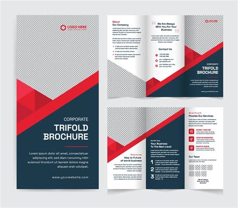
Designing the Back Side of the Brochure
The back side of a three-fold brochure typically includes the back cover, an inside flap, and another inside panel. The setup remains the same, but the content and orientation will differ.
1. Resetting the Layout:Delete or hide all content layers from the front side. Keep the background elements, such as the stripes and ribbon, as they often wrap around the brochure.
2. Flipping Elements for Continuity:Select the "Stripe Copy" folder and go to Edit > Transform > Flip Horizontal. Repeat this for the "Stripe" folder. This ensures the stripes appear to wrap around the brochure from the front to the back.
3. Adding Content with Positive Rotation:When adding text and graphics to the back side, use the same techniques as before, but with positive rotation angles (e.g., 15 degrees) to maintain visual consistency with the flipped stripes.
4. Utilizing Custom Shapes for Icons:Photoshop's Custom Shapes feature is excellent for creating simple icons. For example, pre-made icons can be used for service lists or contact information.
5. Creating Photo Mockups:To showcase images, consider creating elements like a "Polaroid" effect. This involves using a placeholder shape and then masking a photograph within it. Add a black rectangle behind the Polaroid shape, apply a Gaussian Blur, and set its blending mode to Multiply with reduced opacity to create a subtle shadow.
6. Rotating Entire Sections:For a cohesive look, you can group elements for a specific panel (e.g., "Face 5") and rotate the entire group a few degrees to the right.
Finalizing and Exporting Your Brochure
Once the design is complete, preparing it for print is the final crucial step.
1. Removing Trim Guides:Before exporting, hide or delete the trim guides to ensure they don't appear in the final print file.
2. Exporting for Print:The preferred format for professional printing is often a TIFF file or a high-quality PDF.
- For TIFF: Go to File > Save As and choose TIFF. Ensure the settings are appropriate for your print provider.
- For PDF: Go to File > Save As and choose Photoshop PDF. Under "Adobe PDF Settings," select PDF/X-1a:2001. This preset is designed for reliable print output and embeds all necessary color information.
3. Considering Print Service Requirements:Always check the specific file requirements of your chosen print service. They may have preferences for file format, color profiles, or specific bleed and trim dimensions.
Best Practices for Brochure Design
Beyond the technical steps, several design principles contribute to an effective brochure.
- Purpose and Strategy: Clearly define the brochure's objective, target audience, and budget before starting. This informs content and design choices.
- Pacing and Flow: Treat the brochure as a narrative. Vary the pacing of content with a mix of text, images, and white space to keep readers engaged.
- Image Consistency: If using stock photos, choose images that share a consistent style, color palette, or photographer to maintain brand cohesion. Adobe Stock and similar services offer tools to find stylistically similar images.
- Legible Typography: Select fonts that are easy to read. Use body fonts for main text and display fonts for headlines. Pair serif and sans-serif fonts for contrast. Limit the number of font families and styles to avoid a cluttered look.
- Skimmable Content: Design for readers who will skim. Use short paragraphs, clear headings, and ample white space. Provide multiple entry points for information.
- Review a Hard Copy: Always print a draft of your brochure to check type size, balance, and proportion in a physical format before final output.
- Consistency: Establish design rules for typography, color, and layout, and adhere to them throughout the brochure for a professional and unified appearance.
- Inspiration: Look to design platforms like Behance for inspiration, but always adapt ideas to your specific brand and message.
How to Make a Tri-Fold Brochure Template in Photoshop
By following these detailed steps and design principles, you can successfully create a professional, print-ready three-fold brochure using Adobe Photoshop, regardless of your prior experience with print design software. The key lies in meticulous setup, thoughtful design execution, and a clear understanding of print production requirements.