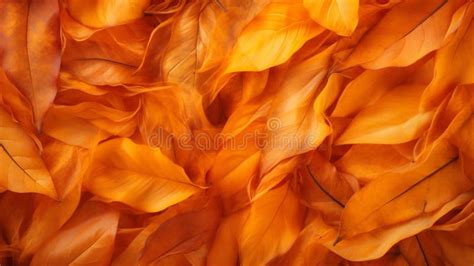
Burnt orange, a color that evokes the rich tapestry of autumn and the enduring warmth of baked earth, has cemented its place as a perennial favorite in fashion, design, and beyond. Often referred to by a spectrum of evocative names such as Spice, Copper, Sugar Almond, Dark Nutmeg, and Cognac, this deep, warm shade masterfully blends the inherent vibrancy of orange with a subtle infusion of brown. This fusion results in a hue that is both energetically stimulating and profoundly grounding, exuding a sense of cozy invitation. Positioned on the red-orange side of the color wheel, burnt orange embodies enthusiasm while simultaneously offering a comforting embrace, making it a versatile and compelling choice for a wide array of applications.
The Color's Identity: Defining Burnt Orange
At its core, burnt orange is characterized by its unique color composition. It is a deep, warm shade that artfully combines the vibrancy of orange with a subtle infusion of brown, bestowing upon it a rich, earthy quality. This distinctive blend places it firmly on the red-orange spectrum, allowing it to convey energy and enthusiasm while maintaining an inviting and cozy feel. To ensure consistency across various digital platforms and design projects, burnt orange is precisely defined by its color codes. The HEX code for this captivating hue is #BE5103. In the RGB color space, it is represented by a value of 74.5% red, 31.8% green, and 1.2% blue. This precise formulation is crucial for designers and developers aiming to achieve an exact visual representation, especially when considering accessibility. Figma, for instance, offers plugins within its Community to ensure that designs adhere to Web Content Accessibility Guidelines, a critical aspect of modern UX and UI design.
A Spectrum of Possibilities: Variations and Complements
While #BE5103 serves as a definitive representation, the burnt orange family encompasses a range of related shades, each offering a slightly different nuance. Dark orange, for example, at #C76E00, presents a deeper, richer orange with a less pronounced brown undertone. Red-orange, at #FF4D00, leans more intensely towards red, offering a more fiery and vibrant expression. Cinnamon, at #D47E30, provides a softer, more muted iteration, characterized by a gentle brown influence. The fundamental brown undertone, present in shades like #895129, is what imbues burnt orange with its characteristic earthiness and depth.
To create harmonious and visually engaging palettes, burnt orange pairs exceptionally well with a variety of complementary colors. Forest green (#2E6F40) fosters a calming and organic aesthetic, making it an ideal choice for fall-inspired designs. Taupe (#54463A) introduces a touch of understated elegance, allowing burnt orange to command attention as the focal point. Teal (#069494) offers a modern and vibrant contrast, perfect for contemporary applications. Cream (#FDFBD4) acts as a softening agent, tempering the intensity of burnt orange and cultivating a warm, inviting atmosphere. Other noteworthy pairings include navy blue for a touch of formality, muted greens like sage for an earthy feel, and charcoal gray to provide a cool, grounding contrast that accentuates burnt orange's warmth.
However, certain color combinations can prove challenging. Bright, unadulterated orange (#FFA500) can compete with burnt orange, creating a visual discord due to their proximity on the color wheel. Neon green (#2CFF05), with its intense saturation, can overwhelm the warmth and richness of burnt orange. Soft colors like lavender (#D3D3FF) may clash with the inherent depth of burnt orange, while strong colors like burgundy (#660033) can lead to an overly busy and unbalanced visual presentation when paired indiscriminately.
Burnt Orange in Practice: Design and Application
The inherent qualities of burnt orange lend themselves to a multitude of design applications, particularly in UX and UI. Its boldness makes it an excellent choice for Calls to Action (CTAs), progress bars, or crucial notifications, especially when paired with cooler tones to establish a clear visual hierarchy and ensure prominence. The color's ability to foster warmth and comfort makes it suitable for background elements in areas where user engagement is desired, such as product pages or reading sections. Lighter shades can further enhance this inviting quality. Furthermore, burnt orange's vibrancy makes it an effective accent color for buttons, icons, and hover effects, effectively drawing attention and encouraging user interaction. When used in conjunction with cool blues and grays, it contributes to balanced and inviting CTAs.
Crucially, maintaining balance is key when incorporating burnt orange into a design. Its inherent richness means it is often best used sparingly, complemented by neutral tones such as white, gray, or beige to achieve a harmonious palette.
A Journey Through Time: The Historical and Cultural Resonance of Burnt Orange
The appeal of burnt orange is not a modern phenomenon; its roots stretch back millennia. Naturally present in clay and ochre, this hue has been a constant in human artistic expression, appearing in ancient cave paintings and pottery. Its rich, earthy character made it a staple throughout art history, including during the Renaissance and Impressionist periods.
The specific designation "burnt orange" gained traction in the English language around 1915. Its association with a distinct identity was significantly amplified in 1966 when the University of Texas adopted it as the official color for its Longhorns football team. This adoption was so impactful that the university even trademarked the color, solidifying its visual association with the team.
The 1970s saw burnt orange flourish in both fashion and interior design, becoming a hallmark of the era's aesthetic. While the subsequent decade favored brighter orange variations, burnt orange experienced a notable resurgence in 2019, with Etsy identifying it as a top trending color, underscoring its enduring appeal.
Color Psychology and Symbolism: The Emotional Impact of Burnt Orange
In the realm of color psychology, burnt orange carries significant meaning. It is a powerful symbol of warmth, confidence, creativity, and emotional strength. The color derives its potency from the amalgamation of orange's inherent energy with brown's grounding depth, creating a feeling that is simultaneously bold and secure. This duality allows burnt orange to evoke a sense of security and relaxation, akin to the comforting ambiance of a crackling fireplace. Simultaneously, the vibrant orange undertones can stimulate creativity and encourage social interaction, making it a dynamic and multifaceted hue. This psychological resonance contributes to its widespread use in spaces intended to foster connection and inspiration.
Beyond the Hue: Understanding Color Variations and Harmonies
To fully appreciate burnt orange, it's essential to understand the broader spectrum of color theory. Shades are created by adding black to a pure hue, deepening its intensity. Tints are formed by adding white, resulting in lighter, softer versions. Tones are achieved by introducing gray, which moderates the color's saturation. Hues represent the pure, unadulterated color itself.
Understanding color harmonies is also crucial for effective design. Complementary colors, positioned opposite each other on the color wheel, create high contrast. Split-complementary schemes offer a similar contrast but with less visual tension. Monochromatic palettes utilize variations of a single hue, creating a cohesive and subtle effect. Analogous colors, found next to each other on the wheel, produce harmonious and tranquil combinations. Triadic schemes involve three colors evenly spaced on the wheel, offering vibrancy and balance. Square palettes use four colors evenly spaced, providing a rich and diverse range of options. Custom palettes allow for highly specific and personalized color combinations.
Practical Applications and Considerations
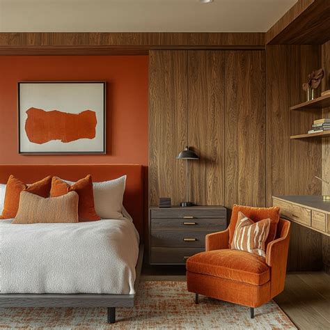
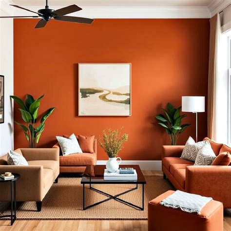
The versatility of burnt orange extends to various practical contexts. In interior design, it complements a broad range of styles, from bohemian and mid-century modern to Indian traditional, rustic, and contemporary spaces. Its warmth and richness make it suitable for accent walls or as a dominant color in larger rooms, while in smaller spaces, it is often best employed as an accent or in lighter shades to prevent the space from feeling overwhelmed.
For those seeking to incorporate this dynamic hue into their living or working environments, custom-sized, eco-friendly wallpapers in beautiful burnt orange tones offer a readily available solution. This accessibility further underscores the color's enduring popularity and its ability to transform spaces with its inherent warmth and character.
The practical application of color also extends to digital interfaces. In UX/UI design, understanding contrast ratios is vital for accessibility. For instance, #BE5103 text on a #FFFFFF background achieves a contrast ratio of 4.81, which passes WCAG AA standards for large text and is a good choice for normal text as well. Similarly, #BE5103 on a #FFFFFF background provides a contrast of 4.37, also meeting accessibility requirements. When #cc5500, another shade of burnt orange, is considered in an RGB color space, it is composed of 80% red, 33.3% green, and 0% blue. In CMYK, it translates to 0% cyan, 58.3% magenta, 100% yellow, and 20% black, with a hue angle of 25 degrees, a saturation of 100%, and a lightness of 40%. This specific shade can be achieved by blending #ffaa00 with #990000. The hexadecimal color #cc5500 has RGB values of R:204, G:85, B:0 and CMYK values of C:0, M:0.58, Y:1, K:0.2. This level of detail is crucial for designers to ensure brand consistency and optimal user experience across all platforms.
How To Use Color Psychology In Marketing And Branding (Choose Your Brand Colors)
A Color for All Seasons, A Hue for Every Purpose
While often closely associated with the autumn season, burnt orange's inherent warmth and versatility allow it to transcend seasonal boundaries. It serves as a powerful tool for designers, artists, and individuals alike, offering a rich palette of emotional resonance and aesthetic appeal. From its historical significance embedded in natural pigments to its contemporary application in digital interfaces and fashion, burnt orange continues to captivate with its earthy depth and vibrant spirit. It is a color that speaks of comfort and energy, tradition and innovation, making it a truly timeless and universally appreciated hue.