Unlocking creativity and learning to draw exquisite chalk filigrees in Procreate is an achievable goal for artists of all levels. Filigree art, characterized by its intricate details and balance, offers a unique avenue for digital expression. This tutorial will guide you through the process, from initial composition to adding the final textured touches, utilizing the power of specialized Procreate brushes and techniques.
The Art of Chalk Filigree Design
Filigrees are fundamentally about intricate details and balance. The journey of creating a chalk filigree begins with deciding on the overall composition of your design. This initial step sets the stage for the entire piece. Once you have a clear vision for the layout, it's time to give your filigree some shape by drawing the outlines. It's advisable to start with the largest shapes and gradually add smaller details. Don't hesitate to get creative and experiment with different shapes and patterns; this is where your unique artistic voice can truly emerge.
To imbue your filigree with depth and dimension, the addition of shading is crucial. A highly effective technique involves using a chalk brush, such as the Sharp Chalp brush, as an eraser. Begin by applying shadows, starting with the darkest areas and progressively working your way towards the lighter ones. This layering of light and shadow will bring your filigree to life. For an enhanced chalk effect, change the opacity of your lettering layer to 80% and create a new layer on top, setting its blend mode to "Add." This subtle adjustment can significantly impact the perceived texture and depth.
Patience and Practice: The Cornerstones of Filigree Art
It is important to remember that filigree art takes time and practice to master. Drawing chalk filigrees in Procreate is an art form that rewards patience and practice. As you explore this captivating world of intricate designs, remember that every artist starts somewhere. The key is to keep experimenting, keep creating, and keep pushing your creative boundaries.
Unleashing the Chalk Script Procreate Brush & Template Pack
For those looking to streamline their workflow and achieve a highly realistic chalk lettering look, specialized tools can be invaluable. One such powerful kit is the Chalk Script Procreate Brush & Template Pack. This comprehensive pack contains 25 chalk brushes and 17 high-resolution graphics, which can be combined for infinite chalk lettering compositions. My Chalk Script Procreate Brush Kit has everything you need to draw realistic chalk lettering layouts on your iPad. The brushes are optimized for drawing calligraphy and flourishes with a realistic chalk texture. With the addition of flourished borders, layout grid templates, and hi-res chalkboard backgrounds, you will be able to create endless, beautiful lettering compositions.
Selecting a Chalk Letter Guide Template
A practical approach to creating polished chalk lettering layouts involves utilizing templates. Today, we will demonstrate the Chalk Script Procreate Brush Set by creating a chalk lettering layout design using one of the templates that comes in the kit. Open one of the horizontal templates from the chalk lettering kit. These templates often feature a nice flourished border and blank template lettering grids, allowing you to fill in your own quote and customize it into a layout design that you like. This is precisely what we will do, and throughout the process, we will explore the chalk brushes included in the kit. For the moment, it can be beneficial to turn off the flourish elements of the template to ensure your lettering layout can be accommodated without obstruction. If necessary, the flourish can be tweaked or adjusted later.
Sketching Your Lettering into the Template Guides
With the template ready, create a blank layer. Ensure your color palette is set to a true white or a very light off-white for sketching. Now, open your Chalk Script Procreate Brush Set. You will find a wide array of options, including cool texture brushes like flakes, smudges, and streaks. For the initial sketching or lettering layout phase, the "Chalk Pencil" brush is an excellent choice. Tap on the brush to ensure "Streamline" is turned off, which will provide a more natural, less corrected stroke.
On your blank layer, quickly sketch out the quote you have in mind. Focus on ensuring it fits within the designated space and that the spacing between letters and words is appropriate. Remember to adhere to the slant and center lines provided by the template. For instance, the bottom of letters like 'E' might follow a diagonal line, while the top remains straighter. While this might appear unusual initially, when viewed as a whole with the grid lines turned off, adhering to these guidelines is essential for a balanced composition.
Let's use the quote, “The time you enjoy wasting is not wasted time.” To begin, it's often easier to start with the end of the quote and work backward. For example, placing the last word, "you," first can help establish the overall flow. Then, you can fill in the word "time" in the middle. It’s common to need adjustments early on; perhaps an 'E' is too large, or a 'U' needs to be skinnier. Even if a word like "wasting" would typically have a slanted 'W', consider making it squared off for a stronger visual impact when the grid is removed. Placing "wasting is" on the third line often works out well. Note that crossing the 'A' and the crossbar of the 'E' along the waistline or center line of the grid adds to the structure. For the fourth line, as "time" is the last word, working backward with it can be helpful. You might need to adjust the 'W' to match previous 'W's, potentially making it smaller.
Evaluating and Editing Your Draft
Once the initial sketch is complete, turn off the template layers to evaluate your draft. It should look like a promising start. You might decide to reintroduce the decorative ornament, ensuring it fits harmoniously. A quick edit might involve fixing a tilted final 'S' or ensuring all 'I's have top and bottom bars for consistency. The middle 'S' might need to be made a bit fatter for better visual weight. These are initial refinements to get the draft to a satisfactory point.
Drawing a Polished Version of Your Chalk Lettering
The goal when designing chalk lettering is to achieve a realistic look. For a polished, finished design, it's common to go over the initial lettering multiple times to create sharp edges, as sharp as chalk on a chalkboard can be. A recommended technique is to use the chalk pencil with "Streamline" turned up for the initial outline of the letters. Then, go over it again with another chalk brush. This layered effect, combining multiple textures, is what creates the most realistic chalk appearance.
On a new blank layer, begin redoing the lettering in a more refined manner. A useful Procreate hack is to draw a line and hold it; Procreate will snap it to a straight line, which can be helpful for creating perfectly straight lines according to the template. Aim to make the thick downstrokes of all letters approximately 2-3 pencil strokes wide. Going over these strokes a couple of times will further enhance the realistic texture. To complement the flourished border that will remain in the finished design, you might adjust letters like 'M' to have a distinct center crossbar, emulating the border's style and adding visual interest.
You will notice the realistic chalk pencil effect and the grain developing even in this first pass. For the next line, create a new layer. This makes it easier to tweak individual lines without affecting others, avoiding the need for the selection tool. Zoom out to assess the 'W' you've created. You might decide to make it match the 'M' better, perhaps by adding a new center stroke. Once satisfied, turn off the grid and the draft sketch layers. Reintroducing the decorative ornament will reveal how far you've come in achieving a realistic look. At this stage, the artwork might already closely resemble the chalk used for the border.
Procreate Tutorial: 3D Chalk Lettering | My Step by Step Process | iPad Pro + Apple Pencil | 2021
Adjusting Opacity for a Realistic Chalk Effect
To further enhance the chalk effect, consider playing with the opacity of your lettering layers. A useful technique is to group all lettering layers, duplicate the group, turn off the original group, and then flatten the new, copied group. By reducing the opacity of this flattened layer, you can subtly increase the perceived grain and create a more authentic-looking chalk texture.
Incorporating a Chalkboard Background
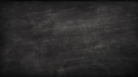
Adding a chalkboard background is a pivotal step in achieving a convincing chalk art illusion. Many brush kits, including the Chalk Script Procreate Brush & Template Pack, provide high-resolution chalkboard background images. Insert one of these backgrounds into your canvas and enlarge it to fit the screen. Dragging it to the very bottom of your layer stack ensures it sits behind all other elements. This addition makes a massive difference, as the graphic chalkboard often includes subtle details like eraser streaks and stains, enhancing its realism.
Adding More Chalky, Smudgy Texture
To elevate the artwork further, consider adding more texture. On a new blank layer, select a different brush from your palette, perhaps one that offers a more grungy or less perfect effect, such as the "Dusty Crumble" brush. Zoom in and experiment with the brush size, aiming for a width similar to your thick strokes. Apply the brush somewhat haphazardly over the letters. Zoom out and toggle the layer on and off to see if it improves the overall look. Reducing the opacity of this texture layer can create a subtle smudging effect around the letters, making them appear less harsh and more organically chalk-like. Continue this process for subsequent lines, and for a cohesive effect, you might apply this texture on a single layer rather than separate ones for each line.
Applying Chalk Dust to the Entire Composition
The final touch to add more grunge and realism is to apply chalk dust to the entire composition. On a new blank layer, scroll through your brush set to find brushes designed to simulate chalk dust. Experiment with these brushes, sweeping them across the page. Reducing the opacity of this layer is crucial for a natural appearance; the exact amount will depend on your aesthetic preference and experimentation. Many chalk dust brushes are pressure-sensitive, meaning harder presses yield more speckles, while lighter presses result in fewer dust flecks. This variation adds to the authenticity.
Introducing Chalky Water Spots
For an even more nuanced texture, consider using a brush like "Wet Chalk Splatters." This brush offers a more subtle effect, resembling wet, white splotches. Apply this brush with a large, sweeping motion across the screen. The dark spots in the background can make this effect particularly striking, adding another layer of visual interest.
Beyond Lettering: Chalk Art Applications
The techniques and brushes discussed are not limited to lettering. For instance, a chalk holiday card design can be created using different chalk templates. By changing the color of the template lines to blue, they can pop more and contrast better against the letters. Combining all-caps lettering with script, even though brushes might be designed for script, they often work well with all types of lettering. Flourishes, in particular, can benefit greatly from the pressure sensitivity of many chalk brushes, allowing for expressive and dynamic strokes.
The versatility of these brushes and techniques allows for a wide range of artistic expressions. You can achieve a polished or an unpolished look, depending on your desired aesthetic. In some designs, such as a holiday card, opting out of a chalkboard background might result in a crisp, appealing look.
Showcasing Your Work and Further Exploration
If you utilize these brushes and techniques, consider tagging the creator on platforms like Instagram. Sharing your work allows others to see your creations and can inspire further artistic exploration.
The Chalk Script Procreate Brush & Template Pack typically includes:
- 25 Procreate Brushes:
- 12 chalk lettering brushes
- 9 chalk texture and smudge brushes
- 4 chalk pencil and eraser brushes
- 17 High-Resolution Graphics:
- 6 chalkboard backgrounds with various old textures
- 10 white lettering layout templates, with and without flourished borders
- 1 white letter guide sheet
- Included Files:
- 1 .brushset file containing 25 brushes (for Procreate 5 or later)
- 6 high-resolution chalkboard backgrounds (JPGs)
- 10 white layout templates with flourished borders (transparent PNGs)
- PDF guide to brush installation
- Folder of sample graphics including brush and template key
Software Requirements: Ensure you are using Procreate version 5 or later, as this is required for the brushes' functionality.
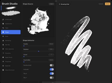
Creating Your Own Custom Chalk Brush
For artists who prefer to craft their own tools, Procreate offers robust brush creation capabilities. To begin, open Procreate and tap the brush icon to enter the Brush Library. Tap the '+' icon to open a new page for brush design. Under 'Shape,' select a base shape with inherent irregularity or texture, like a splattered or speckled pattern, for a chalk effect. Next, go to 'Grain' and choose a texture that resembles chalk dust, with a gritty, uneven pattern.
In the 'Stroke' settings, increase the 'Spacing' and adjust the 'Scatter' sliders. Within 'Taper' settings, control how the brush behaves at the start and end of each stroke. Crucially, test your brush on a new canvas. If the effect isn't quite right, return to the settings and tweak them. Once satisfied, tap 'About this brush' to name it, for example, "My Pro Chalk." Creating a chalk brush in Procreate is a blend of art and technique, where each adjustment brings you closer to that perfect, tailor-made chalk effect.
Exploring Pre-made Brush Sets
For those who prefer to skip the brush creation process, numerous pre-made Procreate chalk brush sets are available. These sets can offer a wide variety of textures and effects, catering to different artistic needs.
- Procreate Inking Brushes: While not exclusively chalk, these can be excellent for outlining and adding definition.
- Chalk Brush Procreate Sets: Many kits are specifically designed for lettering, packed with brushes that mimic various chalk textures.
- Procreate Texture Brushes: Sets focused on texture can provide diverse options for adding grit, grunge, and grain to your artwork, perfect for illustrations or hand lettering.
- Grit, Grunge, and Grain Brushes: These comprehensive sets offer a broad range of textures for adding character and depth.
- Comprehensive Chalk Brush Kits: Some kits go beyond basic chalk, including pencils, charcoal, pastels, smudgers, and dusters, offering a complete suite for recreating traditional media in a digital format.
Alternative Tutorial Resources
For visual learners, video tutorials offer a step-by-step demonstration of Procreate chalk lettering techniques. Channels like Envato Tuts+ often provide comprehensive walkthroughs, showcasing the entire process from initial sketch to final rendering. These videos can be invaluable for understanding brush dynamics, layer management, and color application in the context of chalk art.
When starting a new canvas for chalk art, a custom size of 3000 x 3000 pixels at 300 DPI is often recommended to ensure sufficient detail for printing or high-resolution display. A light grey color with a Medium Airbrush can be used for a rough sketch, establishing the main shapes. For a refined sketch, the Chalk Pencil brush from a dedicated chalk lettering pack is ideal, with "Streamline" adjusted for smoother lines and varied pressure to create line weight variations.
Merging sketch layers and setting the Layer Mode to "Linear Burn" with reduced opacity allows the sketch to be visible yet faded enough to draw over. Outlining can be done with brushes like the "1930's Inker," again with "StreamLine" increased for cleaner lines. Creating each main shape on a new layer facilitates easier editing. The ColorDrop tool is efficient for filling outlined shapes. For softer, chalkier effects, brushes like "Solid Chalk Rounded" can be used for outlining and manual coloring.
Adding depth and realism involves utilizing clipping masks. For instance, coloring facial features on a layer underneath the line art but above the base color, or adding textured blush on a new layer above the initial blush layer. Shading can be achieved with brushes like the "Noise Brush" set to a clipping mask and layer mode like "Multiply." Highlights are effectively added on a new layer set to "Add" mode, using brushes like the "Noise Brush" or "Subtle Grain" for soft light effects.
Hair and foliage can also be rendered with similar layering techniques, using clipping masks for shading and highlights, and drawing loose strands on separate layers. A solid background color placed behind all layers, followed by merging and general color edits using tools like "Curves" and adding noise, can unify the artwork.
The subscription-based marketplace Envato Elements offers unlimited access to Procreate brush sets, Photoshop and Illustrator add-ons, premium fonts, and more, providing a vast resource for digital artists seeking to expand their toolkits.
Ultimately, the creation of chalk art in Procreate is a journey of exploration, experimentation, and continuous learning. By combining specialized brushes, thoughtful techniques, and a patient approach, you can achieve stunningly realistic and artistically compelling chalk-inspired digital creations.