For digital artists aiming to translate their creations into tangible prints, a solid understanding of color spaces and their application within software like Clip Studio Paint (CSP) is paramount. While the vibrant world of digital displays operates within the RGB (Red, Green, Blue) color model, the realm of print necessitates a shift to CMYK (Cyan, Magenta, Yellow, Black). This transition, though seemingly straightforward, often presents challenges for users, particularly those accustomed to other digital art programs. Clip Studio Paint, a powerful tool favored by many illustrators and comic artists, offers robust features to navigate this process, from previewing CMYK colors to exporting print-ready files.
The Fundamental Difference: RGB vs. CMYK
At its core, the distinction between RGB and CMYK lies in their additive and subtractive color models, respectively. RGB, the standard for digital displays, functions by emitting light. Your monitor, through the interplay of red, green, and blue sub-pixels, generates a vast spectrum of colors. When these lights combine, they create brighter hues, with the maximum intensity of all three resulting in white. This additive process allows for a wider gamut of bright and saturated colors.
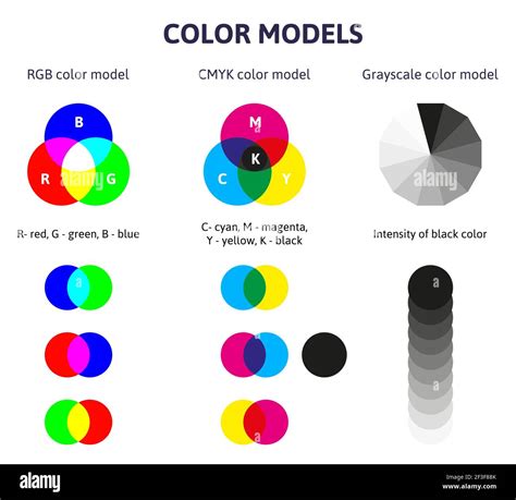
CMYK, on the other hand, is the foundation of subtractive color printing. When you see a color printer, it utilizes cyan, magenta, yellow, and black inks. These inks are applied to paper in precise patterns and densities. Instead of emitting light, CMYK works by absorbing certain wavelengths of light and reflecting others. White light, when it hits the paper, is partially absorbed by the inks, and the remaining reflected light is what we perceive as color. Therefore, in CMYK, adding more ink subtracts more light, leading to darker colors. The white of the paper serves as the base, and the inks progressively "subtract" from this white. This subtractive nature means that the range of colors achievable in CMYK is generally more limited and less saturated than in RGB, a crucial point to remember when creating artwork intended for print.

A common pitfall for new digital artists is failing to account for this difference. Creating artwork solely in RGB and then attempting to print it can result in desaturated and noticeably darker colors than what was seen on screen. This discrepancy arises because the monitor's light-emitting capabilities cannot be replicated on paper, which lacks its own light source. Therefore, for any artwork destined for physical reproduction, whether through a home printer or a professional service, understanding and preparing for CMYK is essential.
Clip Studio Paint's Approach to CMYK
While Clip Studio Paint primarily operates in the RGB color space internally, it provides powerful tools to simulate and prepare artwork for CMYK output. This means you can continue to work with the wider color range of RGB during your creative process, and then utilize CSP's features to preview how those colors will translate to CMYK. This approach is particularly beneficial as it allows for color adjustments to be made with the full RGB gamut before committing to the more restricted CMYK range.
One of the primary ways to achieve this is through the use of Color Profiles. These profiles are essentially sets of data that describe how colors are represented and reproduced under specific conditions, such as on a particular type of paper or through a specific printing standard. Clip Studio Paint includes a variety of these profiles, which can be quite extensive and sometimes intimidating due to their specificity. They often cater to different regions and printing conditions, such as "coated" (glossy) or "uncoated" (matte) paper stocks.
To access and apply a CMYK preview, you can navigate to the "View" menu and select "Preview Settings." Within this dialog, you will find a dropdown menu for "Profile for preview." This is where you can select a specific CMYK color profile. For instance, if you are working with a professional printer, it is highly recommended to consult with them directly to determine which color profile they recommend for your project. They can provide guidance based on their printing equipment and the paper stock they will be using. For demonstration purposes, selecting a profile like "CMYK : Japan Color 2001 Coated" or "EUROPE ISO Coated FOGRA27" allows you to see a simulation of how your RGB artwork will appear when converted to CMYK.
Once a profile is selected and confirmed, your canvas will display a preview of your artwork in that chosen CMYK color space. It's important to note that this is a preview, and your working file remains in RGB. To turn off the CMYK preview and return to your standard RGB view, you can again go to "View" > "Color Profile" and deselect the "Preview" option. This ability to toggle between RGB and CMYK previews is invaluable for making informed decisions about color choices and ensuring your artwork translates effectively to print.
Setting Up Your Canvas for Print
Beyond color profiles, proper canvas setup is critical for print production. When creating a new document in Clip Studio Paint with the intention of printing, several settings warrant careful attention. These are typically found within the "New" document dialog, often under the "Print" settings.
The "Unit" option allows you to choose between centimeters (cm), millimeters (mm), or inches (in), which is essential for working with industry-standard print dimensions. The "Resolution" setting is paramount for print quality. For most professional printing, a resolution of at least 300 dots per inch (dpi) is recommended. Higher resolutions, such as 600 dpi, can yield even finer detail, depending on the printing technique and desired output quality.
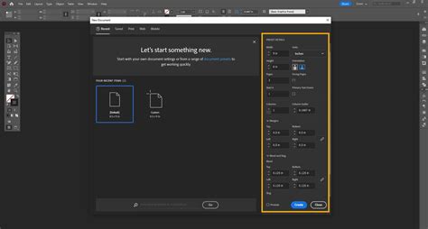
The "Basic expression color" option determines the overall color mode of your artwork, with choices typically including Color, Grayscale, and Monochrome. For full-color prints, "Color" is the appropriate selection. The "Binding (finish) size" refers to the final dimensions of your artwork. Clip Studio Paint offers templates for common sizes like A4, but you can also input custom dimensions.
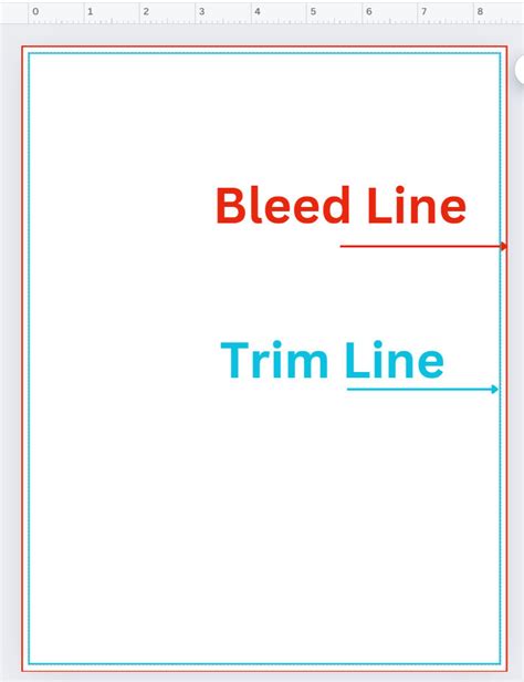
A crucial element often overlooked is the "Bleed width." This refers to an extended area of your artwork that goes beyond the final trim size. When artwork is printed and then cut to its final dimensions, there's a small margin of error in the trimming process. If your artwork extends to the very edge of the paper, any slight misalignment during trimming could result in unprinted white edges. The bleed area ensures that even if the trim is slightly off, the artwork will still extend to the edge of the final print. The required bleed width can vary significantly between print services, so it's vital to check with your chosen printer for their specific recommendations, which might range from 2mm to 5mm or more.
The "Default border (inner) size" and "Safety margin" options are more specific to certain types of print work, particularly comics where they can define panel areas and safe zones for text and important elements. For general illustrations, the bleed width is typically the most critical setting to configure in conjunction with your printer's specifications.
Exporting Your CMYK Files
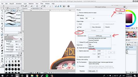
Once your artwork is complete and you've previewed it in your chosen CMYK profile, the next step is to export it in a format suitable for printing. Clip Studio Paint offers several export options, but for CMYK output, "Export (one layer)" and selecting formats like PNG or TIFF are common choices.
In the export settings window, you will find the "Expression color" option. Here, you must select "CMYK color" to ensure the exported file is indeed in the CMYK color space. It's also important to pay attention to the "Scale ratio from original data," which should generally be left at 100% unless you have a specific reason to resize.
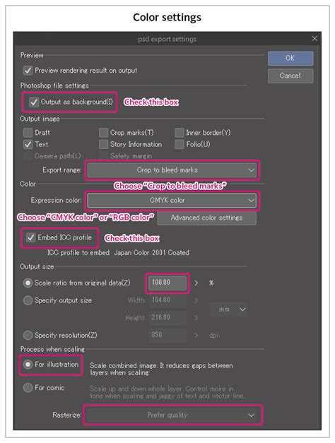
For more advanced print workflows, particularly those involving professional printers or specific color requirements, exporting as a TIFF file is often preferred. TIFF (Tagged Image File Format) is a lossless format that preserves image quality and supports CMYK color.
Advanced CMYK Considerations: Spot Colors and Overprinting
While the standard CMYK export handles full-color process printing, some print projects may require special considerations, such as spot colors or specific overprinting techniques. Spot colors are pre-mixed inks that are used for specific hues, often to achieve brighter or more precise colors than what can be reliably reproduced with CMYK process inks. Think of vibrant neon greens or metallic golds; these are often achieved with spot colors.
Clip Studio Paint does not natively support spot colors in the same way that some other professional print software does. However, artists can employ workarounds to prepare files for spot color printing. This typically involves creating separate files or layers that indicate where the spot color should be applied. One method involves creating a selection of the areas that should receive the spot color, inverting the selection, and then potentially using a black layer or specific color to mark these areas. This information is then communicated to the printer, who uses it to lay down the spot ink.
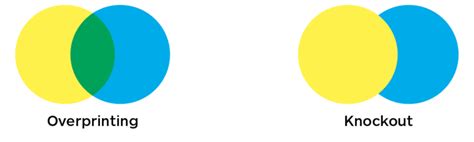
Overprinting refers to the technique where one ink is printed on top of another. For instance, you might want a specific green color to be printed over a black background. If the black is not "knocked out" (removed) from the area where the green is printed, the two inks will mix, potentially creating a darker, richer green. Conversely, if the black is knocked out, you'll see the green printed directly on the paper, with the black ink absent from that area. The decision to overprint or knock out depends on the desired visual effect and the interaction between the inks.
When preparing files for spot colors and overprinting, it's often necessary to export separate files for each color plate. For example, you might export one TIFF file for the black ink and another TIFF file for the spot color plate. Providing a preview image alongside these separate plate files is highly beneficial for the printer to understand the intended final appearance. Additionally, naming conventions for these files should be clear, indicating the final print size and the color plate each file represents.
Color Conversion and Rendering Intents
The process of converting colors from RGB to CMYK can be managed with different "Rendering Intents." These intents dictate how the software handles colors that exist in the RGB gamut but fall outside the reproducible range of the chosen CMYK profile.
- Perceptual: This intent attempts to preserve the overall visual relationship between colors by compressing the entire color gamut. It's often used for photographic images where maintaining the subtle tonal gradations is important.
- Saturation: This intent prioritizes color saturation, aiming to keep colors as vibrant as possible within the CMYK gamut. It can sometimes lead to less accurate color reproduction but can be effective for graphics and illustrations where bold colors are desired.
- Relative Colorimetric: This intent maps colors accurately from the source to the destination gamut, preserving the white point of the source. Colors outside the gamut are mapped to the nearest reproducible color.
- Absolute Colorimetric: Similar to Relative Colorimetric, but it also adjusts the white point of the source to match the white point of the destination. This is often used for proofing to simulate how colors will appear on a specific output device.
While Clip Studio Paint's rendering intents might be accessed through the "Rendering intent" dropdown within preview settings or export options, the "Saturation" option is often recommended for general illustration work where maintaining vibrancy is a priority. However, the "Rendering intent" can significantly impact the final printed colors, so experimenting and consulting with your printer is advisable.
Finalizing and Exporting for Print
Before exporting, it's good practice to save your work as a .clip file, and then potentially as a new file with a different name to signify it's the CMYK-prepared version. This ensures your original RGB artwork is preserved.
When exporting, particularly for professional printing, consider the file format. TIFF is often preferred for its quality preservation. Ensure that the "CMYK color" option is selected in the export settings. If you are printing at home, you might opt for a high-quality JPEG or PNG, but always ensure the resolution is set appropriately (300 dpi or higher).
Mastering Color Profiles RGB, CMYK, and Pantone for Perfect Printing
Navigating CMYK settings in Clip Studio Paint might seem complex initially, but by understanding the fundamental differences between RGB and CMYK, utilizing the preview features, and paying close attention to canvas setup and export options, digital artists can confidently prepare their artwork for successful print reproduction. Always remember to communicate with your print provider, as their specific requirements will ultimately guide the most effective preparation of your files.