In the vibrant world of visual communication, color is paramount. It evokes emotion, conveys information, and defines brand identity. For anyone involved in design and printing, understanding the fundamental principles of color reproduction is crucial. While digital screens dazzle with the additive RGB (Red, Green, Blue) color model, the tangible realm of print relies on a different, yet equally powerful, system: CMYK. This article delves into the intricacies of the CMYK color model, explaining its mechanics, its significance in the printing industry, and how it differs from its digital counterpart.
What is CMYK?
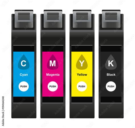
CMYK is an acronym representing the four primary ink colors used in the subtractive color model for printing: Cyan, Magenta, Yellow, and Key (which is black). This four-color printing process is the cornerstone of modern commercial printing, enabling the reproduction of a vast spectrum of hues on physical media.
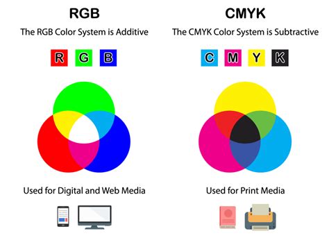
The CMYK model is known as a subtractive color model. This means that colors are created by subtracting certain wavelengths of light from white light. When these four inks are applied to a white surface, they absorb specific parts of the light spectrum and reflect the remaining wavelengths, which our eyes perceive as color. White is the color of the substrate itself (typically paper), and black is achieved by combining the inks. In contrast, the RGB model, used for digital displays, is additive, where colors are created by adding light.
The Mechanics of Subtractive Color
In the CMYK system, each of the primary colors-cyan, magenta, and yellow-plays a specific role in absorbing light:
- Cyan (C): Absorbs red light, reflecting blue and green light.
- Magenta (M): Absorbs green light, reflecting red and blue light.
- Yellow (Y): Absorbs blue light, reflecting red and green light.
When these inks are combined in varying percentages, they subtract different parts of the light spectrum. For instance, layering cyan and magenta inks absorbs both red and green light, resulting in the perception of blue.
The Crucial Role of Black (Key)
While theoretically, combining 100% cyan, magenta, and yellow inks should produce black, in practice, the result is often a dark, muddy brown due to impurities in the inks. To achieve true, deep blacks and enhance contrast and detail, black ink (K) is essential. The "K" in CMYK stands for "key," a term historically used for the black printing plate in traditional four-color printing processes, as it provided the sharpest details and defined the darkest areas of an image. The inclusion of black ink also allows for greater efficiency, as it can be used to create dark tones without requiring excessive amounts of the other three inks, which can lead to oversaturation and ink-bleed issues on the paper.
CMYK vs. RGB: A Tale of Two Models
The fundamental difference between CMYK and RGB lies in their purpose and how they create color.
RGB (Red, Green, Blue): This is an additive color model primarily used for digital displays like monitors, televisions, and smartphone screens. Colors are created by adding light. When red, green, and blue light are mixed at their maximum intensity, they produce white. The absence of light results in black. RGB is ideal for anything viewed on a screen because it generates brighter, more luminous colors by emitting light.
CMYK (Cyan, Magenta, Yellow, Key/Black): This is a subtractive color model used for printing. Colors are created by subtracting light using inks. When all four CMYK inks are applied at their maximum percentages, they absorb nearly all light, resulting in black. The absence of ink leaves the white of the paper visible. CMYK is designed for physical materials that absorb light rather than emit it.
While RGB colors can appear brighter on screen, CMYK can reproduce colors more accurately for print. This distinction is crucial for designers; a design created solely in RGB may not translate accurately to print, leading to desaturated or unexpected color shifts.
The Printing Process: Halftoning and Color Reproduction
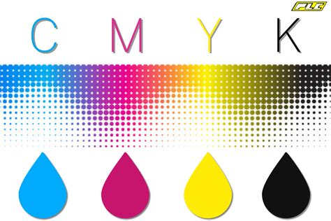
The magic of CMYK printing lies in its ability to create a vast array of colors from just four inks. This is achieved through a technique called halftoning (or screening).
Halftone Dots: Building Blocks of Color
Halftoning involves printing tiny dots of cyan, magenta, yellow, and black ink in varying sizes and densities. When viewed from a distance, these dots overlap and mix optically, creating the illusion of continuous tones and a wide spectrum of colors.
- Larger, closely spaced dots create darker areas.
- Smaller, more spaced-out dots result in lighter shades.
The density and arrangement of these dots are meticulously controlled to achieve the desired color and tonal depth. Industrial offset printing typically requires a high resolution of 300 dots per inch (dpi) to ensure that these minuscule dots blend seamlessly and produce a high-quality image.
Types of Halftone Dots
Two primary methods are used for creating halftone dots:
Amplitude-Modulated (AM) Dots: These dots vary in size while maintaining a fixed spatial frequency, arranged in a regular grid. They are widely used in conventional printing and are effective for text and graphics, providing consistent tonal gradients. However, they can sometimes lead to moiré patterns or loss of fine details.

Frequency-Modulated (FM) Dots: Also known as stochastic dots, these dots have a fixed size but vary in their spatial frequency. They are randomly distributed, which helps to eliminate moiré patterns and allows for finer detail reproduction, resulting in sharper images and more vibrant, saturated colors that closely resemble continuous-tone images. However, FM dots require precise calibration and can be more challenging to control, with potential for a grainy appearance in lighter areas.

Principles of Color Reproduction
The principles governing how these dots create color are based on two main techniques:
Overlapping Halftone Dots: This is the most common method where dots of different CMYK inks are layered on top of each other. The transparency of the inks and their precise alignment are critical for accurate color mixing. For example, layering cyan and magenta dots creates blue.
Juxtaposed Halftone Dots: In this method, dots of different colors are placed side by side. The perception of a new color is achieved through optical blending as the viewer's eye mixes the colors from a distance. This technique can help maintain brightness and avoid over-saturation but may result in less color depth compared to overlapping dots.
CMYK Color Space and Gamut Considerations
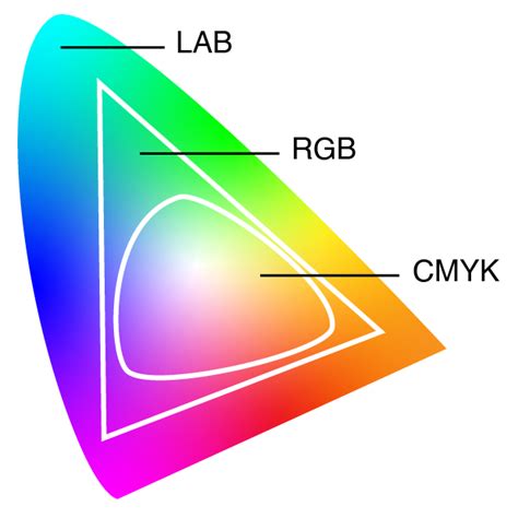
The collection of colors that a particular color model can produce is known as its gamut. The CMYK color space has a smaller gamut compared to the RGB color space. This means that some of the bright, vibrant colors achievable on an RGB screen cannot be accurately reproduced using standard CMYK inks.
When designers create artwork intended for print, it's essential to work within the CMYK color space or to be aware of potential shifts when converting from RGB to CMYK. Software like Adobe Photoshop offers a CMYK preview mode that helps visualize how colors will appear once printed.
Understanding CMYK Values and Conversions
CMYK values are typically expressed as percentages, ranging from 0% to 100% for each ink. For example:
- White: 0% Cyan, 0% Magenta, 0% Yellow, 0% Black (0,0,0,0).
- True Black: Often achieved with 100% Black (0,0,0,100), but "rich black" for deeper tones might combine other inks, such as 60% Cyan, 60% Magenta, 60% Yellow, and 100% Black (60,60,60,100).
- Bright Red: A common CMYK equivalent for a vibrant red might be 0% Cyan, 99% Magenta, 100% Yellow, and 0% Black (0,99,100,0).
Converting between RGB and CMYK requires careful consideration. While automated conversion tools and software can perform this task, subtle adjustments are often needed to maintain color fidelity. Understanding the limitations of the CMYK gamut is key to selecting palettes that will translate well from screen to print.
When to Use CMYK
The CMYK color model is the industry standard for virtually all printing applications. You should use CMYK for any design that will be physically printed, including:
- Business cards and stationery
- Brochures, flyers, and posters
- Product packaging
- Magazines and books
- Billboards and banners
- T-shirts, mugs, and promotional merchandise
For designs intended for digital display only (websites, social media graphics, digital advertisements), the RGB color model is appropriate.
Beyond CMYK: Spot Colors and Color Management
While CMYK can produce a vast array of colors, there are instances where even more precise color matching is required, particularly for branding. In such cases, spot colors are used.
Spot Colors and Pantone Matching System (PMS)
Spot colors are pre-mixed inks that are not created by layering CMYK inks. The most well-known system for spot colors is the Pantone Matching System (PMS). Pantone offers a standardized library of colors, allowing designers to select and specify precise hues that can be consistently reproduced across different printing methods and locations. By incorporating Pantone colors into a CMYK workflow, designers can achieve higher color accuracy and maintain brand consistency.
Color Management and Profiles
The way colors appear can vary significantly between different devices and printing processes. Color management systems and ICC profiles are used to ensure color consistency. These systems help map colors accurately between devices, such as monitors, scanners, and printers, ensuring that the colors you see on your screen are as close as possible to the colors that emerge in print. Understanding and applying appropriate color profiles is crucial for achieving predictable and high-quality results.
Conclusion: Mastering CMYK for Print Success
A solid understanding of the CMYK color model is not just beneficial but essential for anyone involved in graphic design, marketing, or print production. By comprehending how CMYK works, its relationship with RGB, and the principles of halftoning, designers can bridge the gap between digital creation and physical output. This knowledge empowers creators to produce high-quality, color-accurate printed materials that effectively communicate their vision and uphold brand integrity. Whether you're designing a simple business card or an elaborate packaging campaign, mastering CMYK is a fundamental step toward achieving professional and impactful print results.