If you’ve ever designed a logo that would be printed on business cards, flyers, or other marketing materials, then you know just how important a role the CMYK color model plays. CMYK is a color model system that’s the foundation for all print design. Understanding this model is essential for designers because it ensures color accuracy and high-quality resolution in printed materials. This comprehensive guide will delve into the intricacies of the CMYK color space, explaining its definition, its crucial role in printing, and how it differs from other color models, ensuring your designs translate flawlessly from screen to paper.
What is the CMYK Color Model?
The CMYK color model is a cornerstone of the printing industry, enabling the creation of a vast spectrum of colors through the precise combination of four fundamental inks: Cyan (C), Magenta (M), Yellow (Y), and Key (K).
- Cyan (C): A bluish-green hue.
- Magenta (M): A purplish-red shade.
- Yellow (Y): A vibrant, pure yellow.
- Key (K): Black.
The designation "K" for black originates from the historical printing process where a "key plate" was used. This plate, typically carrying the black ink, was instrumental in defining the sharpest details and the deepest shadows within an image. Over time, "key" became synonymous with black in the printing world, also serving to prevent confusion with other colors or terms like "blue."
In the printing process, these four colors work in concert. Designers manipulate varying percentages of cyan, magenta, and yellow inks to generate a wide array of colors. The black ink is then incorporated to impart depth, contrast, and richness to the printed output.
For instance, a specific combination like C = 0%, M = 50%, Y = 100%, K = 0% will yield a bright, vivid orange. To achieve a standard black, often referred to as "true black" or "regular black," only the key (black) color is applied at its full intensity: C = 0%, M = 0%, Y = 0%, K = 100%. For a more profound and substantial black, a blend of cyan, magenta, and yellow is combined with the key black ink. This is known as "rich black" and is commonly used for large areas of solid black in printing, with a typical recipe being C = 60%, M = 60%, Y = 60%, K = 100%. This technique ensures that large black areas are not only deep but also free from any unwanted color casts.
RGB vs. CMYK: Understanding the Fundamental Differences
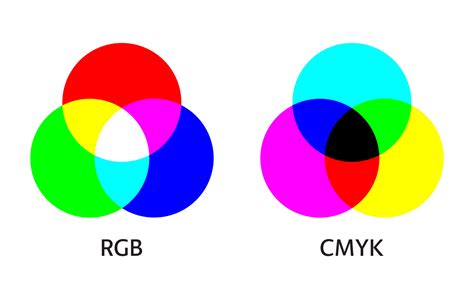
The distinction between the CMYK and RGB color models is fundamental to understanding color reproduction across different media. While CMYK is the standard for printed materials, the RGB (Red, Green, Blue) color model is the language of screens and digital displays.
The Additive vs. Subtractive Nature
The core difference lies in how they create color. RGB is an additive color model. This means that colors are produced by adding light together. When red, green, and blue light are combined at full intensity, they create white. Black, conversely, represents the absence of light. This additive process results in a broad spectrum of vibrant hues, making RGB ideal for digital applications such as monitors, smartphones, and televisions.
CMYK, on the other hand, is a subtractive color model. In this system, colors are generated by subtracting light from a white surface, typically paper. The inks - cyan, magenta, yellow, and black - absorb certain wavelengths of light and reflect others. White is the color of the substrate (the paper itself), and black is achieved by combining all the inks. This subtractive process is inherently suited for physical media where light is reflected off the surface.
Color Gamut and Vibrancy
Another significant difference is their respective color gamuts - the range of colors each model can represent. RGB boasts a significantly wider color gamut, capable of displaying over 16 million shades. This allows for the creation of exceptionally bright, saturated, and luminous colors that are characteristic of digital displays.
CMYK's color gamut is considerably smaller, typically encompassing around 16,000 shades. This limitation is due to the physical properties of inks and the printing process. Consequently, the intensely vibrant and saturated tones that appear brilliant on an RGB screen can often look flatter or less intense when converted to CMYK for printing. This is why a direct, unadjusted translation from RGB to CMYK can lead to unexpected color shifts and a less impactful printed result.
Device Dependency
Both RGB and CMYK are considered device-dependent color spaces. This means that the exact appearance of a color can vary depending on the device or medium used to display or print it.
- RGB: Different monitors, with varying resolutions, calibration, and display technologies, will render RGB colors slightly differently.
- CMYK: The specific inks used, the type of paper, the printing press, and its calibration all influence the final CMYK output.
This device dependency underscores the importance of color management and conversion processes to ensure the closest possible match between what is seen on screen and the final printed product.
Why is CMYK Essential for Printing?
The CMYK color model is not merely an option for print design; it is an essential component that ensures predictable and high-quality results. Its importance stems from its ability to provide color consistency and accurate color reproduction across various printing applications.
Ensuring Color Consistency
For businesses and brands, maintaining a consistent visual identity is paramount. Whether it's a logo on a business card, a brochure, or a large-format banner, the colors must remain uniform to protect brand integrity. CMYK's subtractive color model, when applied correctly, offers a standardized approach to ink application. This guarantees that prints on different materials - paper, fabric, or other substrates - exhibit consistent colors, aligning with the original design specifications. This consistency is critical for brand recognition and the professional presentation of marketing materials.

Accurate Color Reproduction
While RGB excels at displaying luminous, vibrant colors, it cannot directly translate these to a physical print. CMYK is the language that printers understand. By using CMYK, designers provide the printing press with the specific ink formulations and percentages required to recreate the intended colors. This direct mapping minimizes guesswork and reduces the likelihood of disappointing color deviations.
Professional print providers rely on CMYK to achieve accurate color reproduction. File types that natively support CMYK are crucial for this process. Among the most suitable are:
- Portable Document Format (PDF): PDFs are highly versatile and widely compatible with various design and printing software, making them an excellent choice for CMYK files.
- Adobe Illustrator (AI) files: AI files, being vector-based, are ideal for creating scalable graphics and inherently support the CMYK color mode, preserving sharp lines and accurate colors.
- Encapsulated PostScript (EPS): Similar to AI files, EPS files are vector-based and can effectively store CMYK color information, making them suitable for print design.
When to Use CMYK Colors
The decision to use CMYK colors is directly tied to the intended output of your design. If your creation is destined for physical reproduction via printing, CMYK should be your primary color model. This applies to a wide array of printed materials, including but not limited to:
- Business Cards: Ensuring your brand colors are accurately represented on a tangible object.
- Posters and Billboards: Large-format prints where color accuracy is crucial for impact and brand recognition.
- Stationery: Letterheads, envelopes, and other branded office supplies.
- Swag: T-shirts, mugs, pens, and other promotional merchandise.
- Flyers and Brochures: Marketing collateral that needs to make a strong visual impression.
- Product Packaging: Critical for brand appeal and product differentiation on shelves.
- Menus: For restaurants and cafes, where appealing food imagery relies on accurate color.
- Banners: Both indoor and outdoor banners that require vibrant and consistent colors.
For brands that operate in both the digital and print realms, having a robust color strategy is essential. This involves ensuring that colors defined for digital use (typically RGB) have corresponding, accurate CMYK values for print. Design platforms like Figma are excellent for UI design, but for print outputs, specialized plugins or careful conversion processes are necessary to translate projects and marketing materials into CMYK for printing purposes.
CMYK vs Pantone vs RGB - What's the difference? Why does it matter? When to use each?
Converting RGB to CMYK: Navigating the Transition
While RGB colors shine on digital screens, their appearance can undergo noticeable changes when translated into the CMYK color space for printing. The transition from RGB to CMYK is a critical step that requires careful attention to maintain the integrity and impact of your original design.
The Nature of Color Shifts
The primary reason for color shifts during RGB to CMYK conversion lies in the difference in their color gamuts. As mentioned earlier, RGB can represent a far broader range of colors, including many highly saturated and luminous hues that simply cannot be accurately reproduced using CMYK inks. When these out-of-gamut RGB colors are converted, the software attempts to find the closest CMYK equivalent. This process can lead to:
- Loss of Vibrancy: Bright reds, electric blues, and intense greens can appear more muted or duller in CMYK.
- Hue Shifts: The actual shade of a color might change slightly. For example, a vibrant orange in RGB might lean more towards a reddish-brown in CMYK.
- Black Appearance: The deep, absolute black of an RGB screen (0,0,0) is difficult to achieve with CMYK inks alone and often requires the use of "rich black" formulations.
Strategies for Effective Conversion
To mitigate these shifts and ensure the best possible print outcome, designers employ several strategies:
Start with CMYK: Whenever possible, design directly in the CMYK color mode if the final output is intended for print. This allows you to see a more accurate representation of the final colors from the outset.
Use Color Management Systems: Professional design software often includes color management tools. These systems use ICC profiles (International Color Consortium profiles) to define how colors are represented by specific devices (monitors, printers). By applying the correct ICC profiles, you can achieve more accurate conversions.
Understand Your Printer's Capabilities: Different printing presses and ink sets have varying capabilities. Consulting with your print provider about their specific CMYK color profile or recommended settings can be invaluable. They can often provide you with a profile or guide you on how to prepare your files for optimal results.
Fine-Tuning Colors: After an initial conversion, it's essential to review the colors carefully. You may need to manually adjust certain hues, saturation, or brightness levels in the CMYK document to compensate for the gamut differences and bring them closer to your original RGB vision. This often involves subtle adjustments rather than drastic changes.
Utilize "Rich Black" Appropriately: For solid black areas, especially those that are large or intended to be a dominant feature, using a "rich black" mix (e.g., C=60, M=60, Y=60, K=100) will produce a deeper, more opaque black than pure black ink alone. However, be cautious with rich black for text, as it can sometimes lead to registration issues where the different ink colors don't align perfectly, making text appear slightly fuzzy. For small text, 100% K is usually preferred.
Previewing CMYK Proofs: Many software applications allow you to simulate how your RGB colors will look in CMYK. While not a perfect substitute for a physical proof, these simulations can provide a valuable preview of potential color shifts.
Maintaining Color Consistency with Figma and Beyond
Color consistency is a challenge that spans across different design applications and output media. While Figma is a powerful tool for digital design, ensuring brand colors remain consistent from screen to print requires a systematic approach.
The Challenge of Cross-Media Consistency
The common question, "Why do my brand colors look different in print versus on screen?" highlights the inherent difficulty. As established, screens use RGB (additive light), and print uses CMYK (subtractive ink). These fundamental differences mean that a color that glows on a monitor might appear subdued on paper.
The issue is compounded by the fact that every device interprets color differently. Your laptop screen, your phone, a scanner, or the specific printer and paper stock used for your project - each has its own characteristic "profile" that influences how it displays or reproduces color. This is why a brand color can appear subtly different across various digital images, print products, or even different printing methods.
Strategies for Color Management
To combat these variations and maintain brand color integrity, designers and brands employ several key strategies:
Brand Guidelines with Defined Values: The most crucial step is to establish comprehensive brand guidelines. These guidelines should specify the exact color values for your brand's primary and secondary colors across different color spaces:
- RGB: For digital applications (web, social media, digital ads).
- CMYK: For print applications (brochures, packaging, business cards).
- Pantone (PMS): For critical applications where exact color matching is essential and color consistency across different printers and substrates is paramount. Pantone provides a standardized system with unique reference numbers for thousands of colors, ensuring a reliable benchmark.
Calibration of Digital Devices: Regularly calibrating your monitors and other digital devices is essential. Calibration ensures that the colors you see on your screen are as accurate as possible, providing a more reliable basis for design decisions. Software and hardware calibration tools can help achieve this.
Exporting in the Right File Formats: As discussed, using file formats that properly support CMYK (like PDF, AI, EPS) is vital when preparing designs for print. Incorrect file formats or export settings can lead to significant color loss or distortion.
Leveraging Tools and Plugins: For platforms like Figma, which are primarily RGB-focused, plugins can be invaluable. Tools designed to convert Figma projects or specific assets to CMYK can assist in preparing files for print. However, it's important to remember that these are often approximations, and a final review and potential adjustment by a print professional is recommended.
Understanding LAB Color Space: The LAB color space (also known as CIELAB) is a device-independent color model developed by the International Commission on Illumination (CIE). It is designed to encompass all colors visible to the human eye. LAB consists of three components:
- L* (Lightness): Represents lightness, from 0 (black) to 100 (white).
- a*: Represents the green-red axis, from green to red.
- b*: Represents the blue-yellow axis, from blue to yellow.
Because LAB is not tied to any specific device, it serves as a universal reference point or translator. Designers can use LAB as an intermediary step to convert colors between different device profiles (e.g., from an RGB monitor profile to a CMYK printer profile) with greater accuracy. This workflow helps ensure that brand colors remain consistent, whether they are viewed on a digital screen or reproduced in print. The formula can be thought of as: LAB + device profile = accurate color match.
Working with Expert Print Providers: Ultimately, the quality of the printed output depends heavily on the expertise of your print provider. Professionals in the printing industry have a deep understanding of color management, ink technologies, and substrate interactions. Collaborating with them ensures that your files are prepared correctly and that the final printed product meets your expectations for color accuracy and consistency. They can often provide CMYK color charts and values specific to their printing process.
By implementing these strategies, designers and brands can navigate the complexities of color reproduction and ensure that their visual identity remains strong and consistent across all media, from the glowing screen to the tangible print.
Frequently Asked Questions About CMYK
Why do my brand colors look different in print compared to on screen?This is primarily because screens and print use fundamentally different color modes. Screens use RGB, which relies on emitting light, resulting in luminous and vibrant colors. Print uses CMYK, which works by subtracting light with inks, leading to a more physical and often less saturated appearance. Each printing process also has its own color gamut, meaning some shades that glow on screen simply cannot be replicated with ink.
Which color space should I use for my brand?Both are essential. You should use RGB for all digital applications, such as websites, social media, and digital advertisements. For any product that will be physically printed - brochures, packaging, business cards, signage - you must use CMYK. Strong brand guidelines should define exact values across both color types.
Can CMYK ever match RGB exactly?Not always. The RGB color spectrum is significantly wider than CMYK's. Many highly saturated and bright tones achievable in RGB cannot be recreated using CMYK inks. Designers strive to find the closest CMYK equivalent to ensure reliable color reproduction, but some vibrancy will inevitably be lost.
Why does a PDF proof look different on my screen?Even when a PDF file contains CMYK data, your monitor is still an RGB-based device. When you view the PDF on your screen, the CMYK data is converted back into RGB for display. This conversion process, while an attempt to accurately represent the CMYK colors, can lead to slight differences compared to how those colors would appear when actually printed. Regular calibration of digital devices helps to minimize these discrepancies.
What is LAB and why does it matter?LAB is a universal color system designed to be device-independent. It acts as a neutral reference point, allowing for accurate color translation between different devices and color spaces, including RGB and CMYK. It matters because it helps ensure color accuracy and consistency across digital images and print products by providing a common ground for color measurement and conversion.
How can I keep colors consistent across different media?To maintain consistent colors across various media, you should:
- Use comprehensive brand guidelines: These should include specific RGB, CMYK, and Pantone references for all brand colors.
- Calibrate digital devices regularly: Ensure your monitors and other screens display colors as accurately as possible.
- Export in the correct file formats: Use CMYK-supporting formats like PDF for print.
- Work with expert print providers: Choose printers who understand color management and can advise on achieving the best results.
- Consider using Pantone references: For critical applications where exact color matching is vital.
What’s Pantone and do I need it?Pantone is a proprietary, standardized color-matching system. It assigns a unique reference number to thousands of specific colors. Pantone is essential when color accuracy and consistency are critical, especially for logos and brand elements that must appear identical across different printing methods, materials, and geographical locations. It provides a universal language for color.