The nuances of color reproduction, particularly in print, can be a complex landscape for designers. While achieving an exact color match is often an elusive goal, understanding the underlying principles and utilizing recommended values can lead to highly satisfactory results. This article delves into the specific challenges and solutions for rendering the color gray, and other key colors, within the CMYK color model, providing practical guidance for designers aiming for accurate and impactful print outputs.
Understanding the CMYK Color Model for Gray
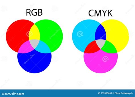
The CMYK color model, comprising Cyan, Magenta, Yellow, and Key (Black), is the standard for subtractive color mixing used in printing. Unlike RGB, which combines light to create colors on screens, CMYK works by absorbing light. When designing for print, understanding how these four inks interact is crucial for achieving desired color outcomes.
For the color gray, the CMYK values are relatively straightforward to define. A neutral gray, often represented by the hex code #808080 in digital spaces, translates to a specific CMYK formula. In the CMYK colorspace, a neutral gray is achieved with 0% Cyan, 0% Magenta, 0% Yellow, and 50% Black. This means that the gray is created solely by the black ink, with no contribution from the other process colors.
When discussing "gray color codes" for design purposes, designers often look for specific values across different color systems. For a standard gray, the Hex code is #808080. In the RGB color space, this translates to R: 128, G: 128, B: 128. For HSL, it's H: 0°, S: 0%, L: 50%, and for HSV, it's H: 0°, S: 0%, V: 50%. However, for print projects, the CMYK values are paramount: C: 0%, M: 0%, Y: 0%, K: 50%. This percentage representation highlights that gray, in its purest form in CMYK, is a function of black ink density.
Variations of Gray and Color Palettes
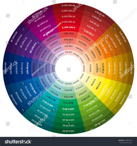
While a pure neutral gray is defined by the absence of Cyan, Magenta, and Yellow, the concept of "gray" in design can encompass a much broader spectrum. Designers often explore "gray color palettes" to introduce subtle variations and depth into their work. These can range from cool grays with a hint of cyan to warm grays with a touch of magenta or yellow.
Monochromatic color palettes, for instance, rely heavily on variations of gray, using different percentages of black ink to create lighter and darker shades. This approach can be highly effective for creating sophisticated and understated designs. The principle of "color values gradually decrease" as you progress through a series, moving towards white, is a fundamental concept in achieving these tonal shifts.
Beyond Gray: CMYK Challenges and Solutions for Other Colors
The challenges of color reproduction extend beyond gray, with certain colors posing more significant hurdles in CMYK printing. Understanding these challenges allows designers to proactively adjust their artwork.
Black: While neutral gray is achieved with 50% black ink, achieving a deep, rich black requires a more nuanced approach. Standard Black is simply the Key (K) component of CMYK. However, Rich Black is created by blending all the CMYK colors. This combination, often involving a percentage of Cyan, Magenta, and Yellow alongside Black, results in a richer, more saturated tone that appears deeper and more opaque on the printed page. The specific percentages for Rich Black can vary, but a common starting point is C: 60%, M: 40%, Y: 40%, K: 100%.
Red: Red can be a notoriously tricky color to reproduce accurately in CMYK. It can often appear orange or rusty when printed. When this happens, you need to look at your levels of magenta and yellow. If your red looks too pinkish, you have mixed in too much magenta. Achieving a true red typically involves a high percentage of magenta and a moderate percentage of yellow, with minimal or no cyan and black. For example, a vibrant red might be C: 0%, M: 100%, Y: 100%, K: 0%.
Green: Green is produced by mixing Cyan and Yellow. To achieve vibrant green results, set the values to equal parts and make them dense. For instance, a bright green could be C: 100%, M: 0%, Y: 100%, K: 0%. However, it's important to note that the density of the inks and the paper stock can influence the final appearance.
Yellow: When working with yellow, be careful when making it darker. It can easily become more of a sage or mustard color. This is because yellow ink is often more transparent than cyan or magenta. To deepen yellow without losing its hue, subtle adjustments to cyan and black might be necessary, but this should be done with caution to avoid dulling the color.
Blue: In CMYK, blue is one of the most challenging colors to reproduce accurately. This is due to the way cyan and magenta inks combine. To achieve a good blue, we suggest you use even and balanced mixtures, such as 100% Cyan and 50% Magenta, with no Yellow or Black (C: 100%, M: 50%, Y: 0%, K: 0%). Variations in these percentages will shift the blue towards purple or teal.
Purple: Fortunately, Regal purple tones are CMYK friendly. Purple is created by mixing Magenta and Cyan. The ratio of these two colors will determine the specific shade of purple. For a deep, rich purple, you might use C: 70%, M: 100%, Y: 0%, K: 0%.
Pink: Pinks in CMYK printing are all about the magenta. For stand-out pink colors, the magenta levels should be high, and the yellow, cyan, and black low. A vibrant pink could be C: 0%, M: 100%, Y: 0%, K: 0%. Adding a small percentage of yellow can shift the pink towards coral, while adding cyan can move it towards fuchsia.
Metallic Colors in CMYK
It's crucial to understand that CMYK is a subtractive color model using process inks. Therefore, we cannot provide a realistic metallic gold finish in CMYK printing. While we can produce a flat or NMM (non-metallic metal) representation of gold by simulating its appearance with CMYK inks, it will lack the reflective sheen of actual metallic inks or foils. Similarly, you cannot also obtain a metallic silver finish in CMYK printing for the same reasons. For true metallic effects, specialized metallic inks or post-press finishing techniques like foil stamping are required.
Color Models Explained (Additive & Subtractive) | Digital Color
The Impact of Monitor Settings and Print Processes
It is essential to note that your monitor settings may affect what you see on your screen compared to your physical prints. Monitors display colors using the additive RGB model, which emits light, while printers use the subtractive CMYK model, which absorbs light. This fundamental difference means that the colors displayed on screen are an approximation of the final printed output. Therefore, relying on calibrated monitors and understanding the limitations of CMYK is key.
Furthermore, the specific printing process, including the type of paper used, the ink densities, and the printing press itself, can all influence the final color reproduction. Some colors are more challenging to reproduce than others due to the inherent properties of the inks and how they interact.
Designing with Confidence
While exact color matching can be difficult, by understanding the principles of the CMYK color model and utilizing recommended values for key colors like gray, red, green, blue, and purple, designers can significantly improve the accuracy and impact of their printed designs. The ability to "want your colors to pop off the page" is achievable through careful planning and an informed approach to color selection within the constraints of print production. Exploring color palettes and understanding how different color systems translate to print is a vital skill for any designer. The journey of "color-dreaming" in design is a continuous process of learning and refinement.