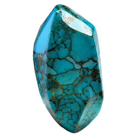
Turquoise blue, a captivating hue that evokes the serene depths of tropical waters and the vibrant energy of exotic gemstones, holds a significant place in the designer's palette. Its unique position on the color wheel, a refreshing blend of blue and green, allows it to convey a sense of calm, tranquility, and invigorating vibrancy simultaneously. To effectively wield this versatile color in print and digital media, a thorough understanding of its color space conversions, particularly its CMYK values, is paramount.
Decoding Turquoise Blue: From RGB to CMYK
In the digital realm, colors are often defined by their RGB (Red, Green, Blue) values. For the specific shade of Turquoise blue, represented by the hex code #00ffef, its RGB composition is striking: 0% red, 100% green, and 93.7% blue. This high concentration of green and blue, with no red component, is what gives it its characteristic cool, aquatic feel.
However, for print design, where colors are created by mixing inks, the CMYK (Cyan, Magenta, Yellow, Black) color model is essential. The conversion from RGB to CMYK is not always a direct one-to-one translation, as each model operates on different principles. For #00ffef, the CMYK values are 100% cyan, 0% magenta, 6.3% yellow, and 0% black. This means that to achieve this specific turquoise in print, a significant amount of cyan ink is required, with only a minimal addition of yellow to subtly shift the hue, and no magenta or black inks are needed. This CMYK formulation, C:1, M:0, Y:0.06, K:0, precisely captures the essence of Turquoise blue in a subtractive color system.
The hexadecimal color #00ffef, also known as Turquoise blue, is composed of 0% red, 100% green, and 93.7% blue in the RGB color space. In contrast, its CMYK representation is 100% cyan, 0% magenta, 6.3% yellow, and 0% black. This specific formulation ensures that the vibrant and refreshing quality of turquoise is accurately reproduced across different media.
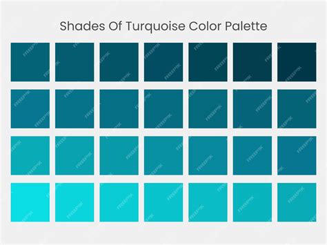
The Nuances of Color Variation: Shades, Tints, and Tones
Understanding how to manipulate a base color like turquoise blue allows for a vast expansion of its expressive potential. The subtle adjustments through the addition of black, white, or gray can lead to a spectrum of related colors.
A shade is achieved by adding black to any pure hue. For turquoise blue, adding black would result in darker, more muted versions, perhaps reminiscent of the deep ocean or twilight skies. These shades can introduce a sense of depth and sophistication to a design.
Conversely, a tint is created by mixing white into any pure color. Tinting turquoise blue would produce lighter, airier versions, akin to a pale sky or a delicate seafoam. These tints are excellent for creating backgrounds, highlighting elements, or evoking a sense of lightness and spaciousness.
A tone is produced by adding gray to any pure hue. Adding gray to turquoise blue would result in more subdued, sophisticated versions of the color. Tones can be incredibly useful for achieving a balanced and harmonious color palette, offering a softer alternative to the pure hue without sacrificing its inherent character.
Exploring the Turquoise Spectrum: Related Hues and Palettes
Turquoise blue is not an isolated color but rather a central point within a rich spectrum of related hues. Variations within this blue-green blend can offer different emotional and aesthetic impacts.
- Aqua (#00fff0): Aqua shares a strong connection with Turquoise Blue through a similar blue-green blend, representing the refreshing essence of clear water. It is often perceived as slightly lighter and more luminous.
- Tiffany Blue (#81d8d0): With its cool, elegant appeal, Tiffany Blue offers a slightly softer and more muted version of Turquoise Blue, inviting a sense of refined sophistication. This iconic shade is instantly recognizable and associated with luxury and exclusivity.
- Sea Green (#2E8B57): While incorporating more green, Sea Green maintains the calm, aquatic feel found in Turquoise Blue, echoing the tranquility of marine environments. It leans more towards the green side of the spectrum but retains the soothing, natural essence.
- Aquamarine (#66f1c2): Aquamarine embodies a lighter and brighter perspective of Turquoise Blue, channeling the serene, translucent beauty of oceanic hues. It is often perceived as more delicate and shimmering.
To complement Turquoise blue and create dynamic and harmonious designs, consider pairing it with a variety of colors:
- Coral (#FF8559): Coral adds warmth and vibrancy, creating a lively and eye-catching combination that energizes designs. The contrast between the cool turquoise and warm coral is particularly striking.
- Navy Blue (#000080): Navy blue provides a strong, grounding contrast that enhances Turquoise blue's brightness while maintaining a sophisticated look. This classic pairing offers a sense of depth and stability.
- Sand (#Cbbd93): Sand introduces an earthy, neutral tone that balances the vibrancy of Turquoise blue, evoking a relaxed, beach-inspired feel. This combination creates a natural and serene atmosphere.
- Charcoal (#4A4A4A): Charcoal offers a modern, sleek contrast, allowing Turquoise blue to shine and adding depth to your palette. This pairing is sophisticated and contemporary.
- Lemon (#FFF700): Lemon introduces a bright, cheerful contrast, creating a fresh and dynamic partnership that enhances Turquoise blue’s playful undertones. This combination is energetic and optimistic.
Conversely, while Turquoise blue is vibrant and captivating, certain color combinations can lead to visual discord:
- Burgundy (#660033): Burgundy, with its deep, dark tone, can overpower the lively energy of turquoise blue, creating a heavy and unbalanced visual tension. The richness of burgundy can overwhelm the coolness of turquoise.
- Orange (#FFA500): The boldness of orange may clash with turquoise blue’s cool and calm nature, making the combination feel chaotic and overly contrasting. These colors sit opposite each other on the color wheel, creating a high-contrast, potentially jarring effect.
- Scarlet (#ED2100): Scarlet’s intense warmth directly opposes the cool demeanor of turquoise blue, leading to a conflict rather than a harmonious blend. Similar to orange, scarlet’s strong red undertones create a strong opposition.
- Neon Pink (#FF13F0): Neon pink’s bright and flashy appearance competes for attention with turquoise blue, creating a dissonant and overwhelming visual effect. Both colors are highly saturated and can create a visual battle for dominance.
Controversial Color Theory: RYB vs CMY Color Wheel - What are the REAL Primary Colors?
Color Harmonies and Accessibility Considerations
Turquoise blue can participate in various color harmonies, each offering a distinct aesthetic.
- Complementary: Pairing turquoise blue with its direct complement on the color wheel (a shade of orange-red) creates high contrast and visual excitement.
- Split-Complementary: Using colors adjacent to turquoise blue's complement provides a strong contrast with less tension than a direct complementary scheme.
- Monochromatic: Utilizing different shades, tints, and tones of turquoise blue itself creates a sophisticated and serene monochromatic palette.
- Analogous: Employing colors that are next to turquoise blue on the color wheel (blues and greens) results in a harmonious and tranquil composition.
- Triadic: Selecting three colors evenly spaced on the color wheel, including turquoise blue, offers a vibrant yet balanced palette.
- Square: Using four colors evenly spaced on the color wheel provides a rich and diverse palette with good contrast.
Beyond aesthetics, accessibility considerations play a crucial role in UX and UI design color choices. Ensuring sufficient contrast between text and background is vital for readability, especially for users with visual impairments. For instance, when #00ffef is used as a background color with white text, the contrast ratio is 1.27:1, which is considered a "Fail" for both large and normal text according to Web Content Accessibility Guidelines (WCAG). Conversely, using #00ffef as text on a white background (#FFFFFF) results in a contrast ratio of 16.55:1, which is highly accessible. Figma, a popular design tool, offers plugins in its Community to help designers ensure their creations meet Web Content Accessibility Guidelines.

The hue angle of #00ffef is 176.2 degrees, with a saturation of 100% and a lightness of 50%. These HSB (Hue, Saturation, Brightness) values provide another way to define and understand the color's characteristics. The hexadecimal color #00ffef could theoretically be obtained by blending #00ffff (a pure cyan) with #00ffdf, demonstrating how subtle variations in its components can lead to this specific vibrant turquoise.
Ultimately, understanding the CMYK values of turquoise blue, alongside its RGB, HSB, and its relationships with other colors, empowers designers to create impactful and visually coherent designs across all mediums. Whether aiming for a serene ocean escape or a bold, energetic statement, turquoise blue offers a rich palette of possibilities.