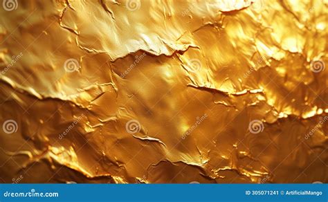
The allure of gold, with its inherent luxury and sophistication, has long captivated designers. Its shiny, lustrous finish, sitting between yellow and orange on the color wheel, shimmers with a reflective surface that speaks of opulence. However, translating this tangible metallic sheen into the digital realm of print design, specifically through the CMYK color model, presents a significant challenge. There isn’t a single, universal CMYK code for gold because the CMYK color model cannot accurately replicate the reflective and metallic properties of actual gold. CMYK is based on mixing cyan, magenta, yellow, and black inks to produce colors, but these inks do not have the ability to reflect light like metallic gold does. This fundamental limitation means that achieving a true representation of metallic gold in print is an exercise in approximation and careful selection.
The Impossibility of True Metallic CMYK
The core of the problem lies in the very nature of the CMYK color model. CMYK, an subtractive color model, relies on the physical mixing of four ink colors - Cyan, Magenta, Yellow, and Key (Black) - to create a spectrum of hues. When light hits a printed surface, these inks absorb certain wavelengths and reflect others. Metallic inks, on the other hand, incorporate actual metallic particles, typically aluminum or bronze, which physically reflect light, creating the characteristic shimmer and depth associated with gold. CMYK inks, by their very composition, lack this reflective capability. Therefore, any CMYK "gold" is an illusion, a carefully calibrated blend of inks that mimics the appearance of gold rather than its actual reflective quality.
CMYK vs Pantone vs RGB - What's the difference? Why does it matter? When to use each?
This distinction is crucial for designers. While a CMYK mix can approximate a golden hue, it will never possess the dynamic gleam or the subtle variations in light reflection that real metallic gold exhibits. The choice of paper or substrate, the printing process itself, and even the ambient lighting conditions under which the printed piece is viewed will further influence how the CMYK approximation of gold is perceived.
Factors Influencing CMYK Gold Representation
The quest for the perfect CMYK gold is not a one-size-fits-all endeavor. Several factors come into play, necessitating a nuanced approach to color selection:
- Specific Shade of Gold: The desired outcome dictates the CMYK mix. Are you aiming for a bright, vibrant yellow gold, a more subdued antique gold, or a reddish-gold hue? Each of these variations will require a different combination of CMYK inks. For instance, a brighter gold might lean more heavily on yellow and magenta, while an antique gold might incorporate more black and perhaps a touch of cyan to mute the vibrancy.
- Printing Substrate: The type of paper or material being printed on significantly impacts the final color. Coated papers tend to produce sharper, more vibrant colors, while uncoated papers can absorb ink, leading to a duller, more muted appearance. The absorbency and texture of the material will influence how the CMYK inks lay down and interact with light.
- Lighting Conditions: The environment in which the printed piece is viewed plays a critical role. Under bright, direct light, a CMYK gold might appear more luminous than it would in dim or indirect lighting. Designers must consider the intended viewing context to ensure the chosen CMYK mix is effective.
- Context within the Design: The role of gold in the print itself is paramount. Are you printing golden letters, an abstract ornament, or a detailed picture of golden jewelry? The surrounding colors and the scale of the golden elements will influence the perceived richness and authenticity of the CMYK approximation. For example, printing golden text on a black background will create a vastly different visual effect than printing it on white.
Achieving the Closest Approximation: Color Palettes and Variations
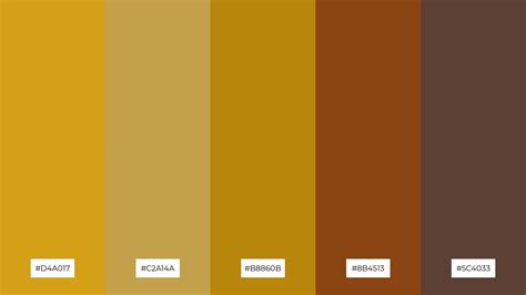
Given these complexities, designers often rely on established color palettes and experiment with various CMYK mixes to achieve what they consider the closest representation of gold. The hexadecimal code #D3AF37 is often cited as a reference point for a rich, golden hue in digital contexts, which can then be translated into CMYK.
To inspire your next design, understanding these related shades and their characteristics is beneficial:
- Gold (#efbf04): This digital representation shares a warm and lustrous tone with metallic gold, embodying a golden hue that hints at opulence and elegance, making it perfect for conveying luxury.
- Brass (#b5a642): Brass evokes a metallic sheen similar to metallic gold, offering a slightly deeper, more muted golden hue that embodies an antique and refined appearance.
- Ochre (#CC7722): Ochre possesses a warm, earthy tint with a hint of gold metallic color, reflecting a rustic yet luxurious tone that resonates with metallic palettes.
- Amber (#ffbf00): Amber captures a bright, reflective surface with its golden hue, reminiscent of natural golden tones found in metals, adding a vibrant touch to a metallic finish.
When working with CMYK, achieving these desired effects involves careful calibration. For instance, a common starting point for a rich gold might involve a significant amount of yellow, a moderate amount of magenta, a smaller amount of cyan, and a controlled amount of black to add depth without making it appear muddy. The exact percentages will vary depending on the specific shade and the printing conditions. Designers often use color swatch books and digital tools that provide CMYK values for various golden tones.
Harmonious Pairings and Contrasting Colors
The effectiveness of any CMYK gold representation is amplified by the colors it is paired with. Thoughtful color combinations can enhance the perceived richness and sophistication of gold, while clashing colors can detract from its impact.
Complementary Colors for Metallic Gold:
- Aubergine (#372528): This deep purple-brown hue brings out the richness and luxurious tone of Metallic gold, enhancing its opulence and adding depth to any palette.
- Emerald (#50C878): The vibrant green of Emerald creates a striking contrast with the golden hue, evoking a sense of sophistication and balance within a metallic gold palette.
- Peacock Blue (#096c6c): This teal shade, with its shiny texture, offers a bold yet harmonious partner to the lustrous appearance of Metallic gold, creating a regal and compelling combination.
- Burgundy (#660033): The dark, wine-like tone of Burgundy complements the metallic finish of gold with its warm and rich undertones, perfect for a cohesive and elegant design.
- Slate Gray (#6d8196): The subtle neutrality of Slate Gray allows the reflective surface of Metallic gold to stand out, providing a modern and sleek background that highlights gold’s luxurious tone.
Colors to Avoid When Using Metallic Gold:
While metallic gold exudes luxury, certain colors can create a disharmonious or overpowering effect:
- Neon Pink (#FF13F0): The vibrant hue of neon pink can overpower the elegant subtleness of metallic gold, creating a disharmonious and flashy combination.
- Bright Yellow (#FFED29): Bright yellow competes with metallic gold, causing visual tension as both colors fight for attention given their similar energetic brightness.
- Neon Green (#2CFF05): The stark, vivid nature of neon green creates jarring contrast against the opulent charm of metallic gold, resulting in a visually abrasive pairing.
- Scarlet (#ED2100): The bold intensity of scarlet can clash with metallic gold’s warm glow, as they both vie for dominance, potentially creating an overwhelming visual impact.
It's worth noting that while Burgundy was listed as a complementary color, its specific shade and application are critical. A very dark, almost black Burgundy might indeed overshadow gold, whereas a richer, more reddish-brown Burgundy can complement it effectively. This highlights the nuanced nature of color interaction.
Beyond CMYK: Alternatives for True Metallic Effects
For designs where a true metallic gold effect is non-negotiable, alternative printing methods are available:
- Metallic Inks: Specialized metallic inks, which contain actual metallic flakes, can be used in the printing process. These inks provide a genuine shimmer and depth that CMYK cannot replicate.
- Foil Stamping: This technique involves applying a thin layer of metallic foil to the printed material using heat and pressure. Foil stamping offers a highly reflective and luxurious gold finish.
- Digital Metallics: Some digital printing technologies offer metallic inks or effects that can simulate the look of metallic finishes with greater accuracy than traditional CMYK.
Design Considerations and Accessibility
When designing with gold, especially in digital interfaces, accessibility is a crucial consideration. The Web Content Accessibility Guidelines (WCAG) provide standards for color contrast to ensure that text and interactive elements are legible for users with visual impairments. Tools and plugins, such as those available in Figma's Community, can help designers ensure their color choices meet these guidelines.
For instance, a contrast checker might reveal that #D3AF37 text on a #FFFFFF background has a contrast ratio of 9.96, which is generally considered excellent for readability. Conversely, the same gold text on a very dark background might require careful adjustments to maintain sufficient contrast. Designers must balance the aesthetic appeal of gold with the functional requirement of accessibility.
The Art of Illusion: Mastering CMYK Gold
Ultimately, achieving a convincing CMYK gold is an art form that relies on a deep understanding of color theory, the limitations of the CMYK model, and the specific context of the design. It involves a process of trial and error, leveraging color palettes, understanding color harmonies, and being mindful of potential clashes. While true metallic gold remains elusive in standard CMYK printing, the skillful manipulation of cyan, magenta, yellow, and black inks can create visually striking approximations that effectively convey the warmth, richness, and sophistication associated with this timeless hue. The key lies in acknowledging the illusion and mastering its execution to inspire and captivate the viewer.