The world of color, particularly as it pertains to printing, is often understood through the lens of the CMYK color model. This acronym, standing for Cyan, Magenta, Yellow, and Key (which refers to black), represents the four primary inks used in the vast majority of professional color printing processes. Understanding how these inks interact, and critically, how white is represented within this subtractive system, is fundamental for anyone involved in graphic design, print production, or even just appreciating the mechanics behind the colorful world we see on printed materials.
The Foundation of CMYK: A Subtractive Approach
The CMYK color model is a subtractive color model. This means that colors are created by subtracting, or absorbing, certain wavelengths of light from a white or light background. When white light, which contains all the colors of the visible spectrum, strikes a surface, the inks applied to that surface absorb specific colors and reflect others. The colors we perceive are those that are reflected. This is in direct contrast to additive color models, such as RGB (Red, Green, Blue), which are used for digital displays. In additive models, colors are created by emitting light, with white being the combination of all primary colors of light, and black being the absence of light.
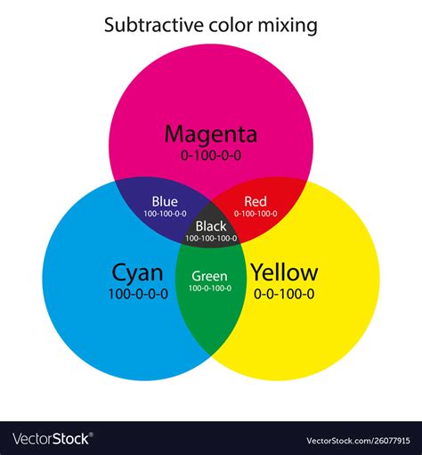
In the CMYK system, each of the primary inks has a specific role in absorbing light. Cyan ink absorbs red light, magenta ink absorbs green light, and yellow ink absorbs blue light. By combining these inks in varying proportions, a wide spectrum of colors can be produced. For instance, pairwise combinations of cyan, magenta, and yellow inks can produce red, green, and blue.
Defining White in the CMYK Model
Within the subtractive CMYK model, white is not an ink that is applied; rather, it is the inherent color of the substrate, typically paper. Therefore, to achieve white in a CMYK print, no ink is applied to that area of the paper. This means that the CMYK code for white is represented by the absence of all inks. Consequently, the CMYK values for white are 0% Cyan, 0% Magenta, 0% Yellow, and 0% Black (0,0,0,0).
This is a crucial distinction from the RGB model, where white is achieved by combining the maximum intensity of red, green, and blue light (255, 255, 255). In CMYK, the "lower values mean lighter colors," which is the inverse of how RGB functions. When you see a white area in a printed design, it signifies that the printing press has skipped applying any ink in that specific location, allowing the white of the paper to show through.
The Role of Black Ink (Key)
The "K" in CMYK stands for Key, which refers to black ink. While theoretically, a deep black could be achieved by mixing equal and full amounts of cyan, magenta, and yellow inks, this is rarely the case in practice. Mixing these three inks to produce black often results in a muddy, brownish hue rather than a true, rich black. Furthermore, using large amounts of all three inks can lead to oversaturation of the paper, causing issues with drying and smudging.
The addition of black ink, or "key," provides several advantages. Firstly, it allows for the creation of true blacks and a wider range of neutral grays by balancing the CMYK values. Secondly, it can be used to "underpaint" or "knock out" areas where color is applied, ensuring that the black text or graphics remain sharp and distinct. This is particularly important for text and fine lines, where the clarity of black ink is paramount. The use of black ink also reduces the amount of cyan, magenta, and yellow ink needed, leading to cost savings and improved print quality.
Halftoning: Creating the Illusion of Continuous Tone
A key technique in CMYK printing is halftoning, also known as screening. Since printing presses apply ink in discrete dots, achieving continuous tones (smooth gradients and subtle color variations) requires a clever visual trick. Halftoning allows a printer to produce the perception of intermediate colors and shades by varying the size and spacing of small ink dots.
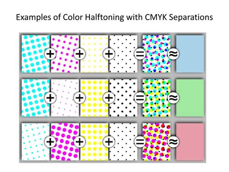
When viewed from a typical reading distance, the human eye blends these closely spaced dots of primary colors, creating the illusion of a solid color or a shade that falls between the primary inks. For example, a light shade of red might be created by using small dots of magenta ink with larger gaps between them, allowing more of the white paper to show through. Similarly, deeper shades are achieved with larger, more densely packed dots. This process is essential for reproducing photographs and complex artwork accurately.
CMYK vs. Spot Colors
It's important to distinguish CMYK printing from spot color printing. CMYK is referred to as "process color" printing because it uses a standardized set of inks to reproduce a wide range of colors. This allows for the economical printing of full-color images using a single set of four plates.
Spot color printing, on the other hand, uses pre-mixed inks, each designed to produce a specific, fixed color. These are often used for logos, branding, and specific design elements where precise color matching is critical and a wider color gamut might be required than what CMYK can achieve. Some printing presses have the capability to combine both process (CMYK) and spot colors within a single print job, offering greater flexibility.
Gamut Differences: RGB vs. CMYK
A significant consideration when moving from digital design to print is the difference in color gamut between RGB and CMYK. The gamut refers to the range of colors that a particular color model or device can reproduce. The RGB color space, used for digital displays, generally has a wider gamut than the CMYK color space used for printing.
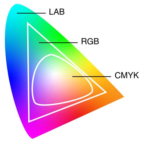
This means that some vibrant colors that appear on your computer screen may not be reproducible when printed using standard CMYK inks. For example, intensely saturated reds or blues that are easily displayed on an LED screen might appear duller or less vibrant in print. When a design created in RGB is converted to CMYK, color management systems and conversion algorithms attempt to map these out-of-gamut colors to the closest reproducible CMYK equivalents. This is why designers often use CMYK preview modes in software like Adobe Photoshop to visualize how their colors will appear once printed and to make adjustments accordingly.
Color Management and Profiles
Because both RGB and CMYK are device-dependent color spaces, meaning their appearance can vary based on the specific device or printing press used, accurate color reproduction relies on color management systems. These systems utilize International Color Consortium (ICC) profiles. An ICC profile is a set of data that characterizes a color input or output device, ensuring that colors are translated consistently across different devices and media.
When preparing a file for print, selecting the correct ICC profile for the intended printing process and paper type is crucial. This helps to ensure that the colors you see on your screen are as close as possible to the colors that will be printed. Without proper color management, the conversion from RGB to CMYK can lead to unexpected and undesirable color shifts.
Understanding CMYK Values and Conversions
The CMYK color model codes are specified in percentages, ranging from 0% to 100% for each of the four inks. As established, 0% for all inks represents white. Conversely, black is typically achieved through a combination of inks, with the "rich black" often involving a significant percentage of black ink alongside some cyan, magenta, and yellow to deepen the tone.
How to Convert RGB to CMYK in Photoshop (No Color Loss!)
Converting colors between different models, such as from hexadecimal (used in web design) or RGB to CMYK, is a common task. This can be done using various software tools, including design applications like Adobe Photoshop, Illustrator, and InDesign, or through online conversion utilities. These tools employ algorithms to calculate the appropriate CMYK percentages that best approximate the target color within the CMYK gamut. It's important to remember that these conversions are often approximations, especially for colors that fall outside the CMYK gamut.
White in Design and its Cultural Significance
While the technical definition of white in CMYK is the absence of ink, the conceptual understanding of white holds significant cultural and psychological weight. White is an achromatic color, meaning it possesses no hue. Historically, white has been a symbol of purity, goodness, spirituality, and sacredness across many cultures. Ancient civilizations often depicted deities in white to signify their divine nature. In Western cultures, white is famously associated with weddings, symbolizing innocence and purity, whereas in some Asian cultures, it can represent mourning and loss.
In color psychology, white can evoke feelings of peace, tranquility, and cleanliness. It's often used in healthcare settings to convey safety and hygiene. In UI and UX design, white space is vital for enhancing readability, creating harmony, and directing user focus. It provides a clean, minimalistic aesthetic that can make other design elements pop.
However, the perception and use of white can also lead to feelings of emptiness or isolation in stark, monochromatic environments. Its meaning is fluid and can change depending on cultural context and individual interpretation.
Practical Applications and Considerations
When creating designs intended for print, understanding CMYK is not just a technical requirement but a practical necessity. For marketing materials like brochures, business cards, and flyers, consistent and accurate color representation is vital for brand recognition and a professional image. CMYK printing is often more cost-effective for large-volume print runs compared to spot color printing.
The choice of paper and its finish can also significantly impact the final appearance of CMYK colors. Glossy paper can make colors appear more vibrant due to its reflective surface, while matte paper can absorb more light, resulting in softer tones.
Working with expanded CMYK systems, such as those that include additional inks like orange, green, and violet (e.g., CMYKOGV), can extend the printable gamut and produce even more vibrant and nuanced colors. However, these are less common than the standard four-color process.
Ultimately, mastering the CMYK color model, understanding its subtractive nature, the representation of white, the role of black ink, and the implications of color gamuts, is essential for achieving high-quality, accurate, and visually appealing printed materials. The interplay between the technical specifications of CMYK and the broader meanings of color continues to shape how we communicate visually.