Color balance is a fundamental concept in photography and image processing, playing a crucial role in producing accurate and visually appealing images. Understanding and mastering the color balance tools in Photoshop allows creatives to bring out the most vibrant and accurate colors in their images. Color balance is an adjustment that affects the overall mixture of colors in an image, aiming to achieve realistic and accurate colors. In Photoshop, color balance is achieved by adjusting the intensities of the cyan, magenta, and yellow tones. The adjustment can be performed using the Color Balance adjustment feature, which allows us to individually fine-tune colors in highlights, shadows, and mid-tones.
The Science Behind Color Balance
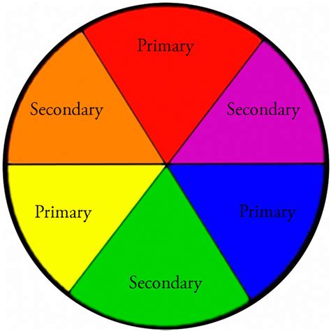
The color spaces used for displays (RGB) and printing (CMYK) are inherently different, and this disparity can lead to variations during the conversion process, resulting in inconsistent colors. The Color Balance tool's original purpose was to fine-tune an image's colors after converting the color space. You'll notice that many color adjustment tools are based on these six colors: Red, Green, Blue, Cyan, Magenta, and Yellow. In the "Color Balance" tool, there are three primary adjustment options that correspond to the primary colors of light: Red, Green, and Blue.
Navigating the Color Balance Panel in Photoshop
The Color Balance panel in Photoshop is designed for intuitive control over an image's color distribution, aiming for a balanced color effect. According to Adobe, the Color Balance command controls an image's color distribution, achieving a balanced color effect. The panel consists of three main workspaces: a dropdown menu, three sliders, and an option.
Tonal Range Selection (Dropdown Menu): This dropdown menu allows you to select the tonal range for adjustment based on brightness. The available options are Shadows, Midtones, and Highlights. It's important to note that when you choose Midtones, it doesn't mean that the highlights and shadows are completely unaffected. This option provides a way to apply a trend-like adjustment. For a deeper understanding of shadows, midtones, and highlights, you can refer to resources on how to read a histogram.
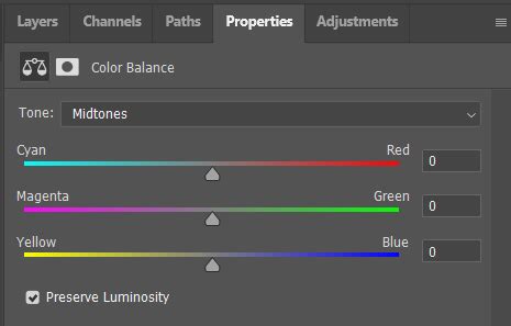
Color Sliders: These three sliders are the core of the Color Balance tool, controlling the color bias in the image. Each slider represents a pair of complementary colors: Cyan/Red, Magenta/Green, and Yellow/Blue.
- When you slide the first slider (Cyan/Red) to the left, the image becomes more cyan. Slide it to the right, and it becomes more red.
- The second slider (Magenta/Green) works similarly: sliding left increases magenta, and sliding right increases green.
- The third slider (Yellow/Blue) adjusts the balance between yellow and blue.These sliders directly modify the color tone of the image by altering the intensity of these color pairs. The values displayed above the sliders show the color changes for red, green, and blue channels. These values can range from -100 to +100.
Preserve Luminosity Checkbox: In the bottom left corner of the Color Balance dialog box, there is a checkbox labeled "Preserve Luminosity," which is selected by default. This is a critical option for maintaining the overall brightness of your image. If you do not select "Preserve Luminosity," when you drag one or more sliders to the right, you'll notice that the image tends to become brighter, even leaning towards white. Conversely, dragging one or more sliders to the left will make the image darker, tending towards black. In most cases, when retouching images, it's advisable to keep "Preserve Luminosity" selected to maintain the overall brightness of the image.
Achieving Desired Color Effects with Color Balance
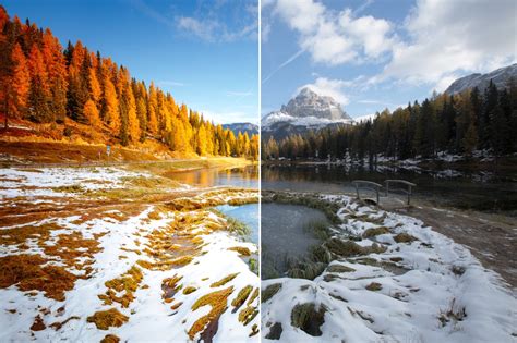
The Color Balance tool is crucial for making precise adjustments to an image's color. Simply adjusting the color sliders won't fully unleash the magic of Color Balance. You can choose different brightness levels to adjust the Color Balance. For example, take a look at the photo below, and then examine the final result with a noticeable contrast between cool and warm tones.
Shadows, midtones, and highlights correspond to the darker areas, middle-toned areas, and brighter areas of an image, respectively. You can try resetting the Color Balance settings and then readjusting them. Each image is unique and may require different settings to achieve the desired outcome.
Color balance can be used to correct color imperfections in your image. You can also use color balance to create dramatic effects by changing the overall mixture of colors used in your composite. For instance, if you have a photo of a brilliant sunset and want to supercharge the brilliance of the oranges, pinks, and yellows, Color Balance is your tool. Conversely, if you have a photo of an individual standing in the rain and want to boost the blues to convey a sense of melancholy, Color Balance can help achieve that mood.
Correcting Color Casts and White Balance
White balance is one of the most basic and yet trickiest aspects of photography. Although the white balance you’ve set in-camera may look good most of the time, in other cases, you’ll need to correct it in post-processing. Inaccurate white balance settings can lead to dusty or muddy-looking colors and can make images appear flat, with less subject separation.
Your White Balance is WRONG! 3 Hacks to Set it Accurately – Photoshop
When you use the wrong white balance, a common problem is a color cast in your image. This can make the image appear almost monochrome in a particular color, with a dramatically warm or cool cast. For example, a photo taken with an in-camera white balance of 8000K (which is a slightly warm setting) on an overcast day might appear overly warm and orange. On the other hand, even with the same setting, a photo taken in different lighting conditions might still lean in a warm direction, causing the sky to look faded and colors to appear muddy.
Accurate daylight settings, on the other hand, lead to vibrant colors. White balance also affects saturation. For instance, during the golden hour, using a warmer white balance can lead to higher saturation, while a cooler white balance can result in a more muted image. These are different artistic interpretations, and by using white balance creatively, you can take images that match your photographic vision.
Methods for White Balance Correction in Photoshop
There are many ways to adjust white balance using Photoshop, ranging from simple to advanced.
Adobe Camera Raw (ACR)
Adobe Camera Raw (ACR) is a plugin that allows you to import RAW images into Photoshop and make basic adjustments. You can even adjust non-RAW images like JPEGs by clicking “Filter > Camera Raw Filter” in the top menu bar. When you open an image in ACR, the white balance adjustment is near the top, called Temperature. You can adjust the white balance by moving the Temperature slider. You can also use the eyedropper tool to select a neutral gray portion of the image, and Camera Raw will automatically adjust the white balance (and the Tint) so that the area you click appears as gray. It's generally easier to adjust the white balance of RAW photos, TIFFs, and PSDs, as adjusting JPEGs too far might introduce color problems or compression artifacts.
Automatic White Balance Adjustment Using Curves
Curves are a popular tool in Photoshop that can be used for white balance and color correction, not just exposure and contrast. There's a one-click solution using Curves that works most of the time. To automatically fix the white balance of a photo in Photoshop:
- Add a Curves adjustment layer.
- In the Properties tab, select "Auto Options."
- In the Auto Color Correction Options window, select the “Find Light & Dark Colors” option and click OK.
This automatic correction can be quite effective, especially in recent versions of Photoshop.
Manual White Balance Adjustment Using Curves
For even greater control, you can manually adjust the white balance of an image using Curves.
- Create a Curves adjustment layer.
- You'll see a dropdown list to choose between RGB (the default), Red, Green, and Blue. First, select the Red option.
- When you've selected a specific color channel (like red), the tool alters that color and its complement. For example, increasing red reduces cyan. If an image has a warmer color cast, you'll need to reduce the reds. Drag the red line from the upper right edge down until the reds improve.
- If the image then looks green, bring down the greens as well, similar to how you adjusted the reds.
- If the image still looks slightly warm, add a bit of blue to set the final tone.
After these adjustments, the image should look natural, with whites free of a cast. By choosing RGB, you can see the properties of the adjustment layer with individual color channels adjusted. While auto adjustments often work well, manual adjustments with Curves are invaluable for tricky images, especially those with multiple light sources and different color casts.
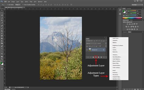
Nondestructive Editing with Adjustment Layers
Photoshop offers various methods to maintain and adjust color balance, such as using adjustment layers. These layers are nondestructive, providing flexibility to make successive tonal adjustments without discarding or permanently modifying data from the image layer. By understanding color balance and applying appropriate adjustments, we can enhance the aesthetics of an image and bring out the true essence of our photographs.
To access the Adjustments panel, click on the adjustment layer button at the bottom of the Layers panel. Similar to Photoshop, Lightroom is another popular Adobe product that provides a streamlined workflow for editing photos. By incorporating the use of adjustment layers in our editing process, we can ensure a non-destructive workflow, allowing us to make changes to the image without affecting the original layer.
The Color Balance adjustment layer allows us to easily make changes in a nondestructive manner. To begin, you can add a color balance adjustment layer by clicking on the adjustment layer icon at the bottom of the Layers panel. By providing a mask with the adjustment layer, we are able to control the areas of the image that will be affected by our color adjustments. Using the Color Balance adjustment layer, we have the opportunity to adjust colors separately for shadows, mid-tones, and highlights.
If you're working with smart objects, such as images imported from Adobe Camera Raw, you can still utilize the Color Balance adjustment layer. The Color Balance adjustment layer in Photoshop is a powerful and flexible way to adjust the colors within your images.
Beyond Color Balance: Other Color Adjustment Tools
While Color Balance is a powerful tool, Photoshop offers other methods to refine colors:
- Selective Color: This technique allows you to target specific colors in the image and adjust them individually. To use selective color, create a Selective Color Adjustment Layer. Here, you can modify the primary and secondary colors in your image, making them more vibrant or muted as needed.
- Levels: Levels help in adjusting the tonal range of an image by changing the intensity of shadows, midtones, and highlights. You can use the Levels Adjustment Layer to make these changes. Midtones are the middle values between the darkest shadows and the brightest highlights of an image. Adjusting midtones has a great impact on the overall appearance and color balance of a photograph. Shadows and highlights also play a significant role in making our images look more appealing. The Shadows/Highlights Adjustment tool can help emphasize or reduce detail in the dark and light areas of an image.
- Photo Filter: This option lets you apply a hue adjustment to your image, simulating the effect of a physical color filter. You can choose from pre-set warming or cooling filters, or select a custom color. The Density slider controls the amount of color applied. Selecting "Preserve Luminosity" is again recommended here.
- Hue/Saturation: While Color Balance focuses on adjusting the relative intensities of primary and secondary colors, Hue/Saturation deals with changing the hue and saturation of specific color ranges or the entire image.
- Camera Raw Filter: Another approach to improve color balance is by using the Camera Raw filter. This feature enables access to Adobe Camera Raw's interface within Photoshop, providing a comprehensive range of adjustment options, including white balance.
If Color Balance adjustments don't seem to be working, it might be because the image has other underlying issues that need to be addressed first, such as exposure or contrast problems.
Practical Application and Workflow
When retouching portraits, aiming for natural-looking skin tones is crucial. Repeat the steps for adjusting Color Balance for Midtones and Shadows if needed, always paying close attention to how color casts affect the shadows on your subject’s face. To assess the effectiveness of your edits, the Layers panel provides a handy trick: click the eyeball icon next to the Color Balance Adjustment Layer to toggle visibility.
Sometimes, an image might require additional adjustments beyond Color Balance. In these cases, Levels Adjustment Layers can be a helpful next step. They provide precise control over the overall brightness and contrast of your image. Think of Levels as a histogram that shows the distribution of light and shadows in your photo.
Embrace experimentation, as color correction is subjective. Remember that the Color Balance Adjustment Layer is always editable, allowing you to revisit and refine your adjustments.
The Role of Hardware in Editing
If you find the manual adjustments in Photoshop a bit cumbersome, consider giving a device like TourBox a try. TourBox's configuration software, TourBox Console, comes with all of Photoshop's adjustment layers built-in, including Color Balance. Imagine controlling TourBox with one hand, effortlessly creating various adjustment layers, and swiftly adjusting parameters using the dedicated controls on TourBox. This can significantly streamline your workflow, especially for repetitive tasks.
In summary, understanding color balance techniques in Photoshop allows us to enhance our images effectively. With the right knowledge and practice, we can drastically improve our photographs' visual appeal and ensure they communicate the intended message, whether for personal or professional use.