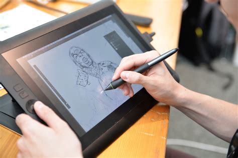
Embarking on a digital art journey in Procreate often begins with the desire to move beyond simply replicating the colors seen in the real world. When a captivating color palette sparks your creative fire, the next crucial step is translating that inspiration into a cohesive and visually appealing artwork. This tutorial will guide you through the process of effectively utilizing a chosen color palette within Procreate, from initial sketch to final rendering, ensuring your artwork transcends the conventional and achieves a striking, harmonious aesthetic.
The Foundation: Sketching and Defining Your Canvas
Before diving into the vibrant world of color, a solid foundation is essential. The initial step involves sketching out your composition. This is not merely about outlining your subject matter, but about refining the sketch to create clearly defined areas. These distinct zones will serve as a blueprint for your color planning, allowing you to visualize how different hues and values will interact within your artwork. A well-defined sketch ensures that your subsequent color application is strategic and intentional, rather than haphazard.
Selecting Your Palette: The Art of Deliberate Choice
The heart of this tutorial lies in the judicious selection of a color palette. While the temptation to use an expansive range of colors might be strong, a more impactful approach often involves a limited selection. I’d recommend a palette with a limited number of hues, ideally no more than three, that also encompasses a variety of lighter and darker values.
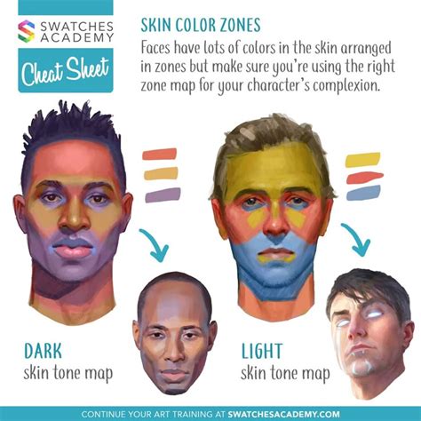
Hue refers to the unique positions on the color spectrum - what we traditionally think of as "colors" like blue, green, yellow, orange, and red. Understanding hues is fundamental to building a cohesive palette.
Value, on the other hand, describes the lightness or darkness of a color or hue. For instance, maroon and pink are both values of red, with maroon being a darker value and pink a lighter one. A palette that includes a range of values is crucial for creating depth, contrast, and dimension in your artwork.
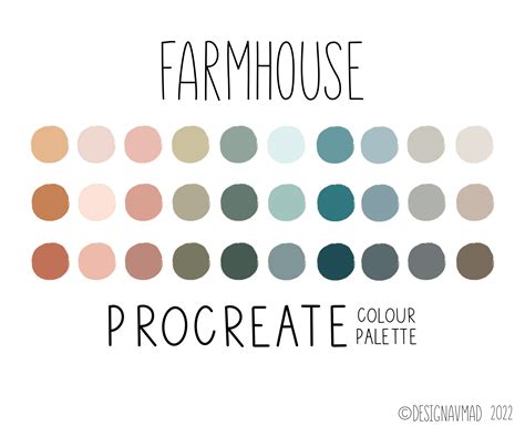
For this tutorial, I’ve chosen a Procreate color palette I created called “Soothing Seconds.” This palette is deliberately limited in hues, primarily featuring blues and magentas, and importantly, it includes several distinct color values: light (such as aqua and peach), medium (like blue and magenta), and dark (including navy and dark purple).
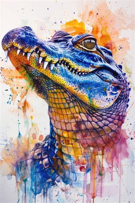
A critical decision at this stage is to select one swatch to serve as your dominant color. This is the hue you will employ most extensively throughout your drawing. Generally, it’s advisable to choose a medium value for your dominant color. This strategic choice provides ample flexibility for introducing both highlights and shadows later in the process. For the alligator illustration featured here, I decided to make the medium blue my dominant color.
Crafting a Color Plan: Visualizing Harmony
With your sketch and chosen palette in hand, the next pivotal step is to create a color plan. This exercise allows you to visualize how your selected colors will interact with each other in a scale that mimics your final artwork. It’s a quick yet powerful method for ensuring that all the chosen colors will harmonize effectively.
To begin, draw a large swatch of your dominant color in a corner of your canvas. This will serve as your anchor. Now, consider how you can integrate the other colors from your palette. For example, recognizing the need for lighter accents and details, I selected the aqua blue. I then drew a small swatch of aqua overlapping the dominant blue to observe their juxtaposition.
Next, I contemplated using the navy for linework details, recognizing its darker value. I applied a few lines of navy over the blue swatch to see how this contrast would appear. I then experimented with the pink, wondering if it could be effectively used for the scales along the alligator’s back. To test this, I drew small nubs on top of the blue swatch. Finally, I considered how to incorporate the magenta. As an intensely vibrant color, magenta naturally draws a lot of attention. With this in mind, I decided to use it very sparingly, perhaps for accents like the toenails. This systematic approach to planning ensures a cohesive and intentional color scheme, preventing potential clashes and enhancing the overall aesthetic appeal.
Bringing Your Vision to Life: The Coloring Process
Once you are satisfied with your color plan, it’s time to translate it into your illustration. I began by filling the body of the alligator with the medium blue, my chosen dominant color. On a separate layer, I then rendered the back scales in pink. The pink, being a lighter value than the blue, effectively pops and creates a pleasing contrast. The aqua color was then applied to the underbelly of the alligator, and the magenta was used for the toenails. I also started to incorporate the navy for some of the linework details.
While I hadn't initially planned a color for the teeth, I noticed the light peachy-yellow swatch within the palette and felt it would be an excellent choice for the teeth. This color, being lighter in value than both the aqua and medium blue, ensured it would be visible against these underlying colors.
For detail lines on the alligator’s back, I decided against using navy again, as it was quite dark. Instead, I opted for the medium purple from the palette. I was pleased with the result, but if I had been dissatisfied, Procreate offers powerful adjustment tools. The HSB (Hue, Saturation, Brightness) sliders within the Adjustments menu are invaluable for fine-tuning colors. I frequently experiment with these sliders when colors aren’t quite looking right. To facilitate such adjustments, I make it a practice to place different elements - such as linework, body, legs, and smaller details - on separate layers. This layered approach significantly simplifies the process of making color corrections or changes.
Adjustments Tools in Procreate: Color Adjustments in Procreate Explained 🌈
To add further dimension, I wanted to introduce highlights to make certain areas, like the legs, stand out more prominently. However, my initial palette didn’t contain a suitable highlight color. To address this, I selected the medium blue and, using Procreate’s color wheel, I chose a color that was just slightly lighter. Similarly, for subtle shadows on the underbelly, I employed the same technique, selecting a darker version of the aqua to create gentle shading.
The Final Masterpiece: A Testament to Palette Planning
The result of this deliberate process is the finished artwork. It’s often surprising how well a well-planned color palette can elevate an illustration, especially when venturing into unconventional color choices. For artists who, like myself, sometimes struggle with employing "non-real" colors, starting with a harmonious color palette and meticulously planning the color application beforehand proves to be an incredibly effective strategy. This approach empowers you to play with color, experiment with the unexpected, and ultimately create something truly unique and visually compelling.
Expanding Your Color Horizons: Resources and Inspiration
The journey into the world of color palettes is an ongoing exploration. To further enhance your creative endeavors, consider exploring a variety of resources.
Curated Color Palettes
Dozens of color palettes, meticulously crafted from a diverse range of inspirational images, are available. These palettes offer a wealth of fun, bright, and often unexpected color combinations. When selecting a palette, remember that you are not obligated to use every single swatch. The key is to choose the colors that best serve your specific artwork and artistic vision.
Inspirational Pinterest Boards
For those seeking to push the boundaries of conventional color schemes, a dedicated Pinterest board filled with animal illustrations rendered in unusual and striking color palettes is available. This board serves as a rich source of inspiration, encouraging bold and adventurous color choices in your own work.
Essential Procreate Brushes
The artwork featured in this tutorial was created using brushes from the "Gouache Paintbox" set. This set, along with numerous others, is available as part of a comprehensive Master Bundle, which includes 14 sets comprising 284 brushes, offering a wide array of tools to enhance your digital art workflow.
Navigating Procreate's Color Tools: A Deeper Dive
The experience of opening Procreate can sometimes feel like being a kid in a candy store, with an overwhelming array of color choices. Selecting the right colors can be as daunting as choosing between a rich chocolate sundae and a vibrant rainbow sherbet. This section aims to guide you through the delightful process of creating and managing color palettes in Procreate, transforming that vast selection into a harmonious and purposeful collection that perfectly aligns with your artistic needs.
Creating Custom Palettes
To begin creating your own color palette, tap the color icon located at the top-right corner of your Procreate canvas. This action opens the Color Panel. At the bottom of this panel, you will find several tabs; select the ‘Palettes’ tab. To initiate a new palette, tap the ‘+’ icon. You will then be prompted to give your new palette a name that resonates with your project or current mood.
Procreate offers various methods for selecting colors within the Color Panel, including the Disc, Classic, Harmony, or Value sliders. Once you have chosen a color that appeals to you, simply tap and hold a square within your newly created palette to add it. Continue this process to fill your palette with colors that complement each other or align with your project’s theme. If you decide to adjust a color already in your palette, you can do so by tapping and holding it.
Exploring and Modifying Premade Palettes
Within the Palettes tab, you can scroll through a selection of premade palettes. These offer a starting point and can be customized to your liking. You have the flexibility to add or remove colors from these existing palettes, tailoring them to create your own unique color schemes. If your initial color selections appear somewhat lackluster, understanding the underlying reasons why a Procreate palette might look dull can offer valuable insights for brightening your color choices and achieving more vibrant results.
Creating a custom color palette in Procreate is akin to mixing paints on a physical palette; it is an essential step in imbuing your artwork with coherence, mood, and a distinct personality. With your custom palette established, you are well-equipped to paint digital masterpieces that truly reflect your artistic voice and vision. Remember, the most effective palette is one that not only suits your aesthetic but also ignites your creativity. Happy coloring, and may your Procreate journey be as vibrant and inspiring as the palettes you create! 🎨🌈💖
Understanding Swatches and Palette Views
Swatches are the individual saved colors within a palette, represented by colored squares. Tapping any swatch will set it as your currently active color. Palettes can be viewed in two distinct modes: Compact and Cards.
Compact View is the default setting and displays small swatch squares. This view allows you to see a larger number of palettes and swatches on your screen simultaneously. In Compact view, each palette row consists of 10 swatches, with the palette name displayed to the left, above each palette. A palette that is currently in use will feature a checkmark within a blue circle next to its name.
Cards View offers a more expanded perspective, featuring larger swatch squares. In this view, each palette row comprises three swatches. Each swatch in Cards view also displays an approximated name of the color, such as "Blue Green." You have the ability to change these names to be more unique and descriptive, for instance, "Sea Green." Similar to Compact view, the palette name is located on the left-hand side above each palette, and an active palette is indicated by a checkmark in a blue circle.
Managing Your Palettes
You can replace existing swatches if there are no empty spaces within a palette. Furthermore, you can create your own palette from scratch, providing ample space for your custom swatches. To move a swatch within a palette, simply tap and drag it to your desired position. To delete a color from your palette, press and hold the swatch, then tap ‘Delete’.
A palette is fundamentally a collection of swatches. The Procreate Palette Library empowers you to create, save, share, and import color schemes. To create a new palette, tap the ‘+’ icon, typically found in the top right corner of the Palettes tab. By default, new palettes are named ‘Untitled’.
Sharing and Exporting Palettes
Procreate facilitates sharing through Drag-and-Drop functionality or directly from within the Palettes tab. To duplicate a palette, tap the three dots to the right of the palette name and select the ‘Duplicate’ option. Each palette has a title at the top left. To reorder your palettes, press and hold a title and drag it to the desired position. To delete a palette, tap ‘Delete’ and confirm the action.
Importing Palettes from External Sources
Procreate offers several methods for importing palettes:
New from Camera: Tap the ‘+’ symbol in the top right-hand corner of the Palettes tab and select ‘New from Camera’. Point your device’s camera at your subject, and Procreate will generate a palette of swatches from the captured image. The ‘Visual’ and ‘Indexed’ buttons allow you to switch between two modes. Visual mode builds a palette from the area directly in front of the palette display, while Indexed mode captures visual information from the entire screen. Experiment with both to see the differences in swatch colors produced. Once satisfied, tap the shutter button to capture and save the swatches. Initially, your custom-made palette will be titled ‘Color palette’.
From Image Files (.JPG, .PNG): Open the Color Panel and tap the Palettes tab. Upon tapping, you will navigate to the Files app. Tap any .JPG or .PNG file, and Procreate will create a customized palette from the colors within that image. The initial title for these palettes will be ‘Palette from image’.
From Photos App: Similar to importing from image files, open the Color Panel, tap the Palettes tab, and navigate to the Photos app. Tap a photo, and Procreate will generate a custom palette from the colors within it, initially titled ‘Palette from image’.
Adobe® Color Palettes (.ASE, .ACO): Procreate supports the import of Adobe® Swatch Exchange (.ASE) and Adobe® Color files (.ACO). Open the Color Panel, tap the Palettes tab, and navigate to the Files app. Tap an .ASE or .ACO file to import the palette. The palette’s title will be its original exported name.
Exporting Your Palettes
To export a palette, touch and hold it to pick it up, then drag it to any compatible location to export it as a .swatches file. You can also perform bulk exports by picking up one palette and then tapping others to add them to the stack. Alternatively, in the Palettes tab, tap the three dots to the right of the palette name and select ‘Share’ to open the iOS sharing interface.
By mastering these tools and techniques, you can ensure that your color choices in Procreate are not only aesthetically pleasing but also strategically aligned with your artistic intentions, leading to more impactful and cohesive digital artworks.