The ability to manipulate text, transforming it from a rigid straight line into a dynamic, flowing element, is a cornerstone of effective graphic design. Whether crafting a distinctive logo, designing an eye-catching editorial layout, or building an engaging user interface, curved text offers a powerful way to inject style, personality, and visual interest. This tutorial delves into the essential techniques for achieving this effect in Adobe Illustrator, providing a clear path for both beginners and experienced designers to elevate their typography.
Understanding Text Curvature: More Than Just a Curve
At its core, curving text means reshaping a linear block of characters into a non-linear form. This can manifest as a gentle arc, a complete circle, a flowing wave, or any custom contour imaginable. This process is often colloquially referred to as "bending text" or "typing on a path." The versatility of this technique allows designers to seamlessly integrate text within specific shapes, add a touch of whimsy to a design, or create a sophisticated visual narrative.
When to Embrace Curved Text in Your Designs
The applications for curved text are as varied as the designs themselves. Its utility extends beyond mere aesthetics, often serving crucial functional purposes.
- Logo and Badge Design: Curved text is indispensable for fitting text snugly within the circular or arched confines of many logos, badges, and emblems. This ensures a cohesive and balanced visual identity.
- Packaging Design: To enhance brand appeal and provide clear product information, text is frequently curved to follow the contours of product packaging, creating a more dynamic and engaging presentation.
- Editorial Layouts: In magazines, brochures, and other print media, curved text can break up monotony, highlight key phrases, or create visually striking compositions that draw the reader's eye.
- Web and UI Design: For websites and user interfaces, curved text can be used to guide users, emphasize calls to action, or add a unique stylistic element to buttons, banners, and other interactive components.
- Illustrative Integration: When incorporating text into an illustration, curving it to match the flow of the artwork can create a more harmonious and integrated design, making the text feel like an organic part of the visual narrative.
- Adding Imagination and Excitement: Beyond functional requirements, curved text is a simple yet effective way to inject imagination and excitement into otherwise basic designs, transforming them into something memorable.
Method 1: Applying the Warp Effect in Adobe Illustrator
One of the most straightforward methods to curve text in Adobe Illustrator involves utilizing the built-in Warp effect. This approach is ideal for creating predefined curved shapes quickly and efficiently.
- Prepare Your Text: Begin by opening your Adobe Illustrator project and ensuring the text you wish to curve is ready on your artboard.
- Select the Text: Using the Selection Tool (the black arrow icon on the left-hand toolbar), select the text object you want to modify.
- Access the Warp Menu: Navigate to the top menu bar and click on
Effect. From the dropdown menu, hover overWarp. - Choose a Warp Style: A submenu will appear, presenting a variety of warp options, each dictating the type of curve your text will adopt. For a basic arc, select
Arc. - Configure Warp Options: A dialog box will now appear, offering specific controls for the chosen warp style. Here, you can fine-tune the effect:
- Style: This dropdown confirms the selected warp shape (e.g., "Arc"). You can also change the style from this menu if you decide on a different curvature.
- Bend: This slider controls the intensity and direction of the curve. Moving it to the left will bend the text downwards, while moving it to the right will bend it upwards.
- Orientation: Within the "Bend" options, you can choose between "Horizontal" and "Vertical" orientation. This significantly alters how the text warps, with "Horizontal" typically creating an arc and "Vertical" creating a more pronounced vertical distortion.
- Distortion: Under "Distortion," you'll find two sliders: "Horizontal Distortion" and "Vertical Distortion." These allow for further manipulation of the text's shape along the horizontal and vertical axes, adding subtle or dramatic alterations to the curve.
By adjusting these settings, you can achieve a wide range of curved text effects with the Warp tool, from subtle undulations to dramatic, sweeping arcs.
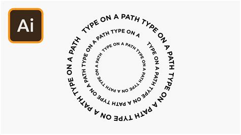
Method 2: Typing Text onto a Curved Path in Adobe Illustrator
For greater creative control and the ability to conform text to any custom shape, the Type on a Path tool is the preferred method. This technique allows text to flow precisely along a vector line.
- Create Your Path: Open your Illustrator project and select a drawing tool from the left-hand toolbar. For a simple curve, the Ellipse Tool is a good starting point. Hold down the
Shiftkey while dragging to create a perfect circle. Alternatively, you can use the Pen Tool or the Curvature Tool to draw any custom path you envision. - Prepare the Path: If you've drawn a shape, you might have a fill color applied. For text to flow correctly, it's often best to remove the fill and apply a stroke, making the path a clear guide.
- Select the Type on a Path Tool: Navigate to the toolbar and locate the Type Tool (shortcut
T). Click and hold the Type Tool icon to reveal its options, then select theType on a Path Tool. - Activate Text Input: Click directly on the path you've created. Your cursor will transform, indicating that you are now ready to type.
- Type Your Text: As you type, the characters will automatically mold to the contour of the path. The text will begin at the point where you initially clicked.
- Adjust Placement and Flow:
- Starting Point: The text begins where you first clicked on the path. If you need to adjust this starting point, you can later use the Direct Selection Tool.
- Path Limits: You will notice three vertical markers along the path that indicate the boundaries of your text. The outer two define the start and end points of the text on the path, while the center marker allows you to flip the text to the other side of the path.
- Editing Text: To edit the content of the text, simply select it with the Type Tool and make your changes.
- Moving Text: To reposition the text along the path, select it with the Selection Tool (V). Then, click and drag the thin blue vertical line that appears at the beginning of your text. This will allow you to slide the text along the path.
- Editing the Path: To modify the shape of the path itself, use the Direct Selection Tool (A). Click on the path's anchor points or segments to reshape it, and the text will dynamically adjust.
Master the Type On A Path Tool in Adobe Illustrator Tutorial
Advanced Text on Path Editing and Options
Once your text is placed on a path, Illustrator provides a suite of options to refine its appearance and behavior.
Editing Text on a Path
- Content and Font: Remove placeholder text like "Lorem Ipsum" and replace it with your desired message. Select the text and then choose your preferred font, size, and weight using the Properties Panel or the Contextual Task Bar.
- Precise Alignment: The Direct Selection Tool (A) is crucial for fine-tuning text placement. Hover over the leftmost vertical delimiter until your cursor changes to a diagonal arrow. Click and drag to move the text precisely along the path. The rightmost delimiter controls the end point, and the center delimiter flips the text to the opposite side of the path.
Modifying the Path
- Reshaping: Using the Direct Selection Tool (A), click on the path itself (not the text or its delimiters). You can then manipulate the anchor points and path segments to alter the curve's shape, and the text will follow these changes.
- Type on a Path Options: For more granular control, select the text on the path and navigate to
Type > Type on a Path > Type on a Path Options. This dialog box offers several powerful settings:- Preview: Enable this to see your changes in real-time.
- Flip: This option reverses the text's orientation along the path, effectively turning it upside down relative to its original flow.
- Spacing: Adjust the kerning (space between individual characters) or tracking (overall spacing of the text block) to achieve perfect letter-by-letter or group spacing.
- Align to Path: This setting influences how the text aligns with the curvature of the path, offering options for baseline alignment or for each character to follow the path's contour more closely.
Copying Paths
If the path you've created is an integral part of your design and you need to use it for other purposes or create a duplicate for a mirrored text effect, it's essential to copy it.
- Select Path Anchor Points: With the Direct Selection Tool (A), click and drag to select all the anchor points of your path.
- Copy and Paste: Use the keyboard shortcuts
Command + C(Mac) orControl + C(PC) to copy the path, and thenCommand + V(Mac) orControl + V(PC) to paste it. - Position the New Path: Drag the newly pasted path to its desired location. You can then use this duplicate path for additional text or other design elements.
An Alternative: Curving Text in Linearity Curve
For users seeking a more streamlined and perhaps simpler interface for typographic manipulation, Linearity Curve presents a compelling alternative to Adobe Illustrator. While sharing similar principles, its workflow can feel more intuitive for certain tasks.
- Create Your Shape: Begin by drawing a shape that will serve as the path for your text. This could be a circle, an arc, or any custom shape using Linearity Curve's drawing tools.
- Add Your Text: Activate the Text Tool and drag out a text box. Type your desired content within this box.
- Apply Text to Path: Once you've formatted your text to your liking using the Inspector panel (which offers access to font libraries, including Google Fonts and custom fonts), select both the text object and the shape you created.
- Link Text to Path: Navigate to the
Pathtab within the Linearity Curve interface. At the bottom of this tab, you will find thePlace Text on Pathbutton. Clicking this will cause your text to conform to the selected path.
This method is remarkably straightforward and effective for applying text to any vector path within Linearity Curve.
Creative Examples and Inspiration
The possibilities for curved text are virtually endless. Consider these ideas to spark your creativity:
- Retro Badges: Use circular or arched text to mimic the style of vintage badges and seals.
- Dynamic Headlines: Employ wavy or flowing text for headlines in editorial designs to create a sense of movement and energy.
- Product Branding: Curve text around product names or taglines on packaging for a premium and cohesive look.
- Illustrative Integration: Weave text into illustrations, making it part of the scenery or character design.
- Geometric Designs: Combine straight-line text with curved elements for a modern, geometric aesthetic.
By mastering these techniques in Adobe Illustrator and exploring alternatives like Linearity Curve, you gain the power to transform ordinary text into extraordinary design elements, adding depth, style, and impact to your creative projects.
tags: #curving #text #illustrator