Designing a T-shirt is an art form that blends creativity with technical skill, and Adobe Photoshop stands as the premier tool for bringing these visions to life. Whether you're aiming for a vintage aesthetic, a bold graphic statement, or a sophisticated logo, Photoshop offers a robust suite of tools to achieve professional-quality results. This tutorial will guide you through the process, from setting up your document to applying final touches that give your designs an authentic, polished look.
Setting Up Your Canvas for Print
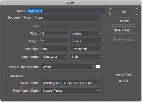
Before diving into the creative process, it's crucial to establish the correct document settings for T-shirt printing. The common dimensions for the printable front of a T-shirt are typically 12x14 inches. Therefore, begin by creating a new document in Adobe Photoshop with these dimensions. For any artwork intended for print, maintaining a high resolution is paramount to ensure crisp, clear output. Setting the resolution at 300 pixels per inch (ppi) is a standard practice. Furthermore, since T-shirt artwork will likely be printed, it's advisable to set the color mode to CMYK. While this specific design might only utilize white and red, working in CMYK from the outset ensures that your colors will translate accurately to the printing process, minimizing unexpected shifts.
Incorporating Vintage Illustrations as Design Foundations
For those who may not be accomplished illustrators, leveraging pre-existing assets is a smart approach. This tutorial demonstrates how to create cool-looking vintage logo designs by combining antique illustrations with visually interesting text styles and layouts. These types of graphics are highly sought after for T-shirt applications. A fantastic resource for such assets is "The World's Greatest Vintage Collection," which boasts over 1000 high-quality vintage illustrations. This collection offers incredible value, encompassing a vast array of elements, textures, patterns, and even a font.
To begin, select an antique illustration from "The World's Greatest Vintage Collection" to serve as the bedrock of your design. These illustrations have been meticulously restored from old books, offering a rich source of historical artistry. It's recommended to open the EPS version of the chosen illustration, as this vector format allows it to be rendered at any required dimension without loss of quality. While it may default to a standard size, vector files are inherently scalable.
Once the illustration is open in Photoshop, double-click its layer to access layer styles and add a "Color Overlay." For a specific vintage red hue, input the CMYK values: 20c, 100m, 100y, 0k. Adhering to specific ink values when working in CMYK is a good habit, ensuring your colors will print as intended. If the illustration appears slightly too large, it can be safely scaled down, even if it has been rasterized.
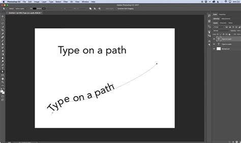
Mastering Typography with "Type on a Path"
Creating compelling text elements is crucial for any T-shirt design. Photoshop's "Type on a Path" feature is exceptionally useful for this purpose. Start by selecting the Rounded Rectangle shape tool. In the top toolbar, maximize the corner radius to 1000. Crucially, change the dropdown menu from "Shape" to "Path." Now, draw your desired shape on the canvas.
Next, switch to the Type tool. Hover your cursor over the path you've created; you'll notice the cursor change to the "Type on a Path" icon. Click to begin typing your brand name. For this tutorial, a fictional brand named "Sleeping Serpent Supply Co." is used, employing various styles of the "Trade Gothic" font.
To precisely center the text relative to the path, select the Path Selection Tool. This tool allows you to reposition the text along the path. To ensure perfect alignment, drag a guide out from the rulers and allow it to snap to the center of the canvas. The shortcut CMD+T (or Ctrl+T on Windows) will reveal the bounding box handles, making it easy to verify if the text and the canvas are centrally aligned. Since each path can accommodate only one text element, use the CMD+J (or Ctrl+J) shortcut to duplicate the text layer and its associated path.
To achieve a specific layout, you might need the text to appear on the inside of the path. If the text initially appears on the outside and needs to be reversed, there's a clever trick to move it to the inside. Further adjustments to the font, such as size, leading, or kerning, can be made as needed. To create space for additional elements below the illustration, you can move this text element vertically.
Layering Text and Decorative Elements for a Balanced Design
Building a visually rich design often involves layering multiple text elements and decorative accents. Select the Type tool again and type out another text element in an empty area of your canvas. Vintage-style logo designs often benefit from "catchwords" like "Established" or "Trademark." Employing another variant of the Trade Gothic font, such as the "Heavy" normal version, can introduce stylistic variation while maintaining a cohesive typography.
To add decorative flair, create a new layer specifically for drawing outlining shapes. Choose the Line tool and change the dropdown in the top toolbar to "Shape." Hold down the ALT key (or Option key on Mac) and nudge the shape; this action will duplicate it onto a new layer. Position this duplicated line underneath your text element.
To efficiently replicate entire sections, hold down the Shift key and click on all the layers that constitute your text element and the decorative lines. Then, use the shortcut CMD+J (or Ctrl+J) to duplicate this entire group. This duplicated block can then be placed in the space below the illustration.
For another textual component, use a rectangle to outline the text. Ensure you maintain the same 10px stroke setting as used previously. A quick way to create this is to make a copy of an existing "Type on a Path" layer, scale it down, and then edit the wording. The visual hierarchy of text elements can be expertly manipulated by varying their sizes, weights, and even font styles.
When working with script fonts, particular care is needed to ensure that the letters flow smoothly into one another. Zooming in and configuring the character settings is essential. Utilizing the "Optical" kerning mode can be beneficial, followed by adjusting the tracking to achieve a close approximation. You can then position your cursor between specific letter pairs and make manual adjustments using the ALT+left/right cursor keys.
Adding Borders and Applying Vintage Effects
A unifying border can bring all the elements of your T-shirt design together. Create a new layer and use the Rounded Rectangle tool to draw a surrounding border around your entire composition. To facilitate easy movement and alignment of all design components, select all layers from the top to the bottom in the Layers panel by holding Shift and clicking. Then, move the entire design to the center of the canvas.
To imbue your artwork with a more authentic vintage appearance, apply specific effects. One highly effective technique is to subtly round off the corners of your fonts. This can simulate the effect of bleeding ink, a common characteristic of vintage printing. Highlight the main text layer and navigate to Filter > Noise > Median. Repeating this process for every other text layer will ensure a consistent distressed look.
Utilizing Textures for an Authentic Worn-In Look
To truly capture the essence of an aged T-shirt, incorporating textures is indispensable. Resources like "Washed and Worn textures" are invaluable for this purpose. These textures are designed to give your artwork the appearance of an old tee that has experienced cracked and flaking ink from years of being washed and worn.
Begin by grouping all your design layers into a single folder. This keeps your project organized and allows you to apply effects to the entire design simultaneously. Apply a layer mask to this group. Next, open one of your chosen "Washed and Worn" textures and copy it. Hold down the ALT key (or Option key on Mac) and click on the layer mask within your grouped design; this will allow you to edit its contents directly. By placing the texture within the mask, you precisely control where the distressed effect is applied, ensuring it interacts naturally with your design elements.
Creating Realistic T-Shirt Mockups
A T-shirt template is an excellent way to showcase your latest designs effectively. To create a realistic mockup, begin by photographing your chosen white T-shirt against a dark background. This contrast will aid in isolating the shirt from its surroundings. Open this photograph in Adobe Photoshop.
Ensure there is good contrast between the dark and light areas of your photograph. Use Image > Adjustments > Curves to create an "S" shaped curve. This adjustment helps to enhance the tonal range and define the shirt's form. Duplicate your photograph layer and then delete the "Background copy" layer. This preserves the original photo while allowing you to work on a modified version.
Create EASY Drag & Drop Mockup in Photoshop!
Refining the T-Shirt Shape and Color
The next critical step is to accurately define the shape of the T-shirt. Select the Pen Tool and ensure that "Paths" is selected in the options bar. Carefully trace along the edge of your T-shirt. Precision is key here; the more accurate your tracing, the more convincing the final mockup will be. Take your time with this process.
Create a new layer positioned above your photograph layer. Go to Edit > Fill and fill your selection with a color of your choice. This layer will represent the base color of your T-shirt.
To remove the T-shirt from its background, select the T-shirt path. Then, navigate to Select > Modify > Expand. The number of pixels you expand by will depend on the quality of your photograph; a range of 1-5 pixels is typical. For this example, expanding by 2 pixels is suggested. Following this, go to Select > Modify > Feather. Again, the feathering amount (1-5 pixels) depends on your photograph's quality. Feathering by 1 pixel is recommended for this image. Click OK.
Create a new layer and place it below your T-shirt path layer. Go to Edit > Fill and fill this layer with white. This creates a clean white background for your isolated T-shirt. Arrange your layers as follows: the T-Shirt Creases layer should be on top, followed by your T-Shirt Colour layer, and then the white background layer.
Double-click your T-Shirt Colour layer and check the "Color Overlay" box. Click on the colored box within the Color Overlay options and choose your desired garment color. This allows you to easily change the T-shirt's color.
Integrating Your Design into the Mockup
Now, open your latest T-shirt design file. Drag and drop this design into your T-shirt mockup template. Position your design layer beneath the T-Shirt Creases layer and resize it accordingly to fit the dimensions of the T-shirt. Ensure it aligns naturally with the contours and folds of the fabric.
To present multiple design variations or to easily manage your mockup, group all the layers of your mockup together and then duplicate this group a number of times. This allows for quick iteration and comparison of different designs on the same T-shirt template.
The easiest way to make your design look believable on the shirt is to place your design over the shirt and adjust the transfer mode. This will allow the shadows of the shirt to come through, giving you a look that is believable enough for most people. However, if you truly desire to simulate the texture and folds of a real shirt, you can explore more advanced techniques such as using transform options or even the Liquify effect. These methods require more effort and the results can vary significantly, so experimentation is key. Every situation is unique, and results will definitely vary from project to project. Experiment with all the tools available to achieve the most realistic outcome.
This comprehensive approach, combining foundational design principles with advanced Photoshop techniques and realistic mockup creation, empowers you to produce T-shirt designs that are not only visually appealing but also ready for professional production. The ability to manipulate illustrations, craft compelling typography, apply authentic textures, and present your work in a compelling mockup is a skill set that can transform your creative output.