Halftones are a cornerstone technique in screen printing, enabling the reproduction of intricate details and tonal variations that would otherwise be impossible with standard flat colors. They are the unsung heroes behind the realistic photographic images you see on garments, transforming continuous-tone imagery into a series of dots that, when viewed from a distance, create an optical illusion of smooth gradients and shades. This process, while seemingly straightforward, involves a complex interplay of mathematics, software, and printing physics.
What Exactly Are Halftones?
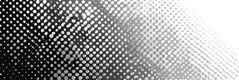
At their core, halftones are a mathematical dot pattern used to represent the grayscale value of a color. Instead of using a single, solid color, a halftone process breaks down an image into tiny dots of varying sizes or spacing. This principle is based on a fundamental optical illusion: the human eye, with its limited optical resolution, perceives these closely spaced dots as continuous tones when viewed from a typical reading or viewing distance. As the Getty Center explains, a representation of a continuous-tone image is in fact an optical illusion based on the limited optical resolution of the human eye. This allows printers to achieve a remarkable range of shades and details using a limited palette, often just a single ink color.
Historically, before the advent of halftone printing, reproducing photographic images in print was a significant challenge. Newspapers and publications often relied on woodcut or wood-engraving techniques. These methods, while capable of reproducing images, resulted in a look that resembled hand-drawn sketches rather than photorealistic depictions. Commercial printers sought a practical method to realistically reproduce photographs onto printed pages, but most mechanical printing processes were limited to printing solid areas of ink or leaving blank spaces, lacking the ability to render a photographic range of tones.
The Genesis of Halftone Printing
The concept of halftone printing has a rich history, with several key figures contributing to its development. William Fox Talbot (1800-1877) is credited with originating the idea of halftone printing. Over the ensuing decades, various screens were proposed. William Leggo developed an early version known as the leggotype while working for the Canadian Illustrated News. A significant breakthrough came in 1881 when Frederic Ives of Philadelphia patented the first truly successful commercial method. Although Ives devised a way to break images into dots of varying sizes, his method did not initially involve a screen. In 1882, Georg Meisenbach in Germany patented the "autotype" halftone process, which he named Autotypie. His invention built upon the earlier ideas of A. J. and J. W. Swan and utilized single-lined screens that were rotated during exposure to create cross-lined effects. The relief halftone process proved to be an almost immediate success. The development of halftone printing methods for lithography appears to have followed a largely independent path, with companies like A. Hoen & Co. making contributions in the 1860s.
Prior to the widespread adoption of digitized images, specialized photographic techniques were employed to break down grayscale images into discrete points. One of the earliest methods was "screening," which involved suspending a coarse-woven fabric screen before the camera plate during exposure. This screen would break up the incoming light into a pattern of dots through a combination of interruption and diffraction effects. Other techniques involved using a "screen" composed of parallel bars, known as a Ronchi ruling, which was then combined with a second exposure using the same screen oriented at a different angle. Another approach utilized a screen-plate with crossing lines etched onto its surface.
Creating Halftones: The Role of Software and Parameters
In modern screen printing, the creation of halftones is primarily facilitated by Raster Image Processing (RIP) software. While design programs like Adobe® Photoshop can also generate halftones, dedicated RIP software is often considered the most efficient and straightforward method. Most standard screen print designs consist of one to three flat colors or spot colors, lacking shading or tonality. However, for designs incorporating elements like drop shadows, subtle shading, or realistic effects, halftones become indispensable for achieving the desired depth and detail. Any instance where a spot color value is not at its full 100% is recognized by the software as a tonal value, triggering the application of a halftone effect.
When venturing into the world of halftones, several key parameters come into play:
Lines Per Inch (LPI)
LPI represents the number of lines of dots that intersect within a single square inch. A design with larger dots will naturally have fewer lines and thus a lower LPI. The optimal LPI is often determined by the mesh count of the screen being used. A common guideline suggests dividing the mesh count by 5 to determine a suitable LPI. For those aiming for greater detail and a more refined darkroom process, dividing the mesh count by 4 can yield a higher LPI. For example, using a 160 mesh screen, dividing by 5 would result in approximately 32 LPI, while dividing by 4 would yield 40 LPI.
A crucial aspect to understand is the relationship between LPI and resolution. You cannot achieve more detail on the printed shirt than what is present in the original image at a resolution that is 2.5 times the LPI. Therefore, the resolution of your source file must be carefully matched to the intended output resolution.
Dots Per Inch (DPI)
DPI, also commonly referred to as Pixels Per Inch (PPI), is a measure of the resolution of a digital image. While LPI defines the density of dots in the printed halftone, DPI refers to the pixel density of the digital file that will be converted into halftones. A higher DPI in the source image generally allows for finer detail reproduction in the halftone.
Screen Angle
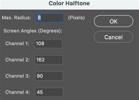
The angle of halftones refers to the slight rotation applied to the dot grid. Dots aligned at right angles (0°, 90°, 180°, and 270°) can interfere with the mesh threads, leading to undesirable printing artifacts. Angles that bisect the mesh, such as 45°, allow the dots to fall between the mesh threads, minimizing interference. A commonly recommended angle for optimal results is 22.5°, as it effectively misses the majority of the mesh threads and knuckles.
The ULTIMATE Halftone Effect Tutorial in Photoshop!
Dot Shape
While the round dot shape is the most prevalent and often suitable for images with light tones, especially skin tones, halftones can be created in various shapes, including elliptical and square. Elliptical dots can be beneficial for images with numerous objects, while square dots are best suited for highly detailed images but are generally not recommended for skin tones due to their tendency to create harsh transitions at the 50% tonal value.
The Challenge of Dot Gain
One of the most common and frustrating issues encountered in halftone printing is "dot gain." This phenomenon occurs when the halftone dots, as they are printed, expand or grow larger than their intended size. This expansion is a natural consequence of the pressure applied during the printing process, whether it's the squeegee passing over the screen or the ink spreading on the substrate. Dot gain is more pronounced in screen printing, particularly on textiles, due to the thicker inks and the porous nature of the fabric.
The increased pressure from the squeegee, combined with the absorption and spreading of ink into the substrate, causes the dots to enlarge. This can lead to images appearing oversaturated, with areas that should fade looking too dark, and an overall loss of fine detail. While dot gain is an inherent aspect of printing, it is also consistent and controllable.
Mitigating Dot Gain
Managing dot gain requires careful calibration at various stages of the printing process. In software like Adobe® Photoshop, settings can be adjusted to simulate expected dot gain. Within the "Color Settings" or "Spot Custom Dot Gain" options, users can input a percentage to represent the anticipated gain, often starting with a value around 90% in the 50% range. It's important to note that different printing substrates and ink types will exhibit varying degrees of dot gain. T-shirt printing, for instance, can experience as much as 40% dot gain in the 50% dot size, whereas commercial graphic printing might see a more realistic 20% dot gain. Accurate dot gain settings in software are crucial; without them, printers may resort to minimal pressure, which can result in under-saturated shadows and flat-looking prints.
Calibration also extends to the output devices, whether using film positives or a direct-to-screen (CTS) system. RIP software typically offers adjustments to precisely control the output of dot patterns. Tools exist to measure dot values, but traditional trial and error, coupled with reference charts, can also be effective. The goal is to ensure that a 10% dot in the digital file actually prints as a 10% dot on the output medium.
The physical components of the printing setup also play a significant role. Screen tension is critical; screens should be consistently taut to ensure predictable ink release and minimize pressure-induced dot gain. Squeegees must be kept sharp and in good condition, as dull edges can dramatically increase dot gain. The durometer, or stiffness, of the squeegee also influences the amount of dot gain.
Halftones in Color Printing
Halftoning is not limited to grayscale images; it is also fundamental to reproducing full-color photographs. In color printing, the process involves separating the image into its component colors (typically Cyan, Magenta, Yellow, and Black - CMYK). Each of these color separations is then converted into a halftone pattern. A significant challenge in color halftoning arises from the need to physically position these different colored dot patterns in close proximity to fool the eye into perceiving a single, blended color.
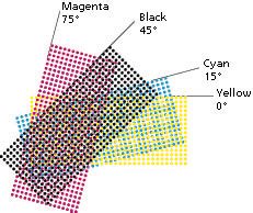
When multiple halftone screens are combined, potential issues like distracting visual effects and moiré patterns can emerge. These problems are mitigated by rotating the screens relative to each other at specific angles. The screen angle, measured in degrees, dictates this rotation. For instance, using angles like 22.5°, 45°, 75°, and 105° for CMYK separations helps to minimize moiré and create a more harmonious blend of colors.
Beyond the Basics: Advanced Concepts and Applications
Amplitude Modulation vs. Frequency Modulation
The creation of halftone screens can be achieved through different modulation techniques. Amplitude Modulation (AM) is the most common method, producing a regular grid of dots whose size varies to represent tonal values. In contrast, Frequency Modulation (FM), also known as stochastic screening, uses dots of a consistent size but varies their spacing. This method can produce finer detail and reduce moiré patterns, but it can also be more susceptible to ink spread.
Inverse Halftoning (Descreening)
In certain situations, it becomes necessary to reconstruct a continuous-tone image from its halftone version. This process, known as inverse halftoning or descreening, is complex because information is lost during the halftoning process. Different original images can produce the same halftone, making a perfect reconstruction challenging. Applications for descreening include editing halftone images, which is difficult due to the discrete nature of the dots, and improving image quality that has been degraded by the halftoning process itself, such as the introduction of moiré patterns or the loss of subtle tonal transitions.
Various algorithms exist for inverse halftoning, including low-pass filtering, wavelet decomposition, and increasingly, machine learning approaches using neural networks and generative adversarial networks (GANs). These advanced methods aim to remove the halftone pattern while preserving or even recovering lost details and tonal variations.
The Evolution of Halftone Tools
The accessibility of halftoning has evolved significantly. While early methods relied on specialized photographic techniques and later on dedicated RIP software, digital tools have made it more manageable for designers and artists. In the 1980s, the development of imagesetters and laser printers brought halftoning capabilities to a wider audience, though early laser printers with lower resolutions were limited in their LPI output.
For artists seeking to incorporate halftone effects into their work without complex software, digital brush packs and texture tools have emerged. These tools allow for the creation of halftone patterns directly within design software, offering a more intuitive and artistic approach to adding tone and depth to illustrations and graphic designs. Christopher Sperandio, an artist and university professor, notes the ease with which modern tools allow artists to add complex tone and variety to their art without the need for expensive materials or intricate manual processes. The advice for artists is to have a plan and add tone gradually, recognizing that even a modest application of halftone effects can significantly enhance a piece.