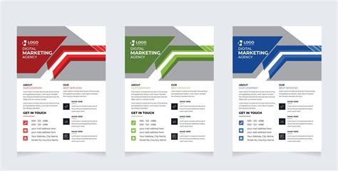
In today's dynamic marketing landscape, flyers remain a powerful and popular tool for reaching target audiences, especially when organizing events or promoting services. A well-designed flyer can effectively communicate essential information and capture attention, making it an indispensable asset for businesses, organizations, and individuals alike. Adobe Photoshop, a leading image editing and graphic design software, offers a robust and efficient platform for creating professional-quality flyers. This guide will walk you through the process, from initial setup to final touches, providing insights and techniques to help you design flyers that are both informative and visually striking.
The Foundation: Setting Up Your Document
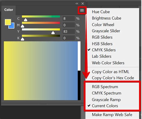
Before diving into the creative process, establishing the correct document settings is crucial for ensuring your flyer looks its best in print. For any design intended for professional printing, it is imperative to work in the CMYK color mode, as this accurately represents the colors that will be produced by printing presses. RGB, while vibrant for screen displays, can lead to unexpected color shifts when printed.
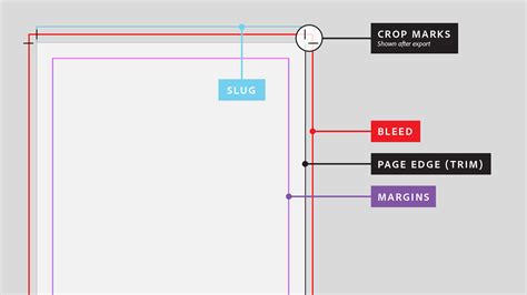
When creating a new document, select "International Paper" from the preset dropdown or manually enter dimensions. Standard flyer sizes for professional printing often include A5 (216 x 154 mm) or US Letter (8.5 x 11 inches or 216 x 279 mm). A critical element for print is the "bleed," which is an extra margin of 3 mm (or 0.125 inches) added to each edge of your document. This ensures that no white borders appear when the flyer is trimmed to its final size. You can create guides by dragging from the rulers (Ctrl+R or Cmd+R) to mark this bleed area, ensuring all essential design elements remain within the safe zone.
Resolution is another key factor. For professional print quality, set your document's resolution to 300 pixels per inch (PPI). This density of pixels ensures that text and images appear sharp and clear, even at close viewing distances. For flyers intended solely for digital distribution, a resolution of 72 PPI is generally sufficient.
Designing the Header: Establishing Brand Identity
The header of your flyer is often the first point of visual contact and plays a significant role in establishing your brand identity. This section typically includes your company logo and name. When incorporating a logo, it's best to use a high-resolution file, preferably in PNG format with a transparent background, or a vector format like AI or SVG, which can be scaled without loss of quality.
If you are designing for a corporate client, it's highly recommended to use their established brand colors. You can extract color codes from their logo using the eyedropper tool or by referencing their brand guidelines. For instance, if a logo uses the color code #0596c2, this can be applied to other design elements to create a cohesive look. However, avoid overwhelming the design with too many colors; a limited and harmonious color palette is more effective.
You can enhance the header with simple graphic elements. For example, using the line tool to add a subtle line beneath the company name or motto can provide visual separation and structure. The pen tool can be employed to create more complex, custom shapes that add a unique flair to the header area, such as a subtle curve or angle that complements the overall design. Remember to apply stroke and fill colors that align with your chosen color scheme.
Incorporating Visuals: Engaging Your Audience
Images are powerful storytelling tools and can significantly enhance the appeal of your flyer. Whether you're promoting a coaching center with course details or advertising an event, relevant and high-quality images are essential.

Photoshop offers versatile methods for integrating images. You can place images directly into your document using "File > Place Embedded." To create visually interesting compositions, consider masking images within specific shapes. For example, you can draw a rectangle or a circle using the shape tools and then use a clipping mask to confine the image to that shape. To do this, place your image layer above the shape layer, right-click on the image layer, and select "Create Clipping Mask." This technique allows you to create clean, framed visuals that fit seamlessly into your design.
For a more dynamic effect, you can apply filters and adjustments to your images. A Gaussian Blur can soften backgrounds or create depth. Brightness/Contrast adjustments, applied as a clipping mask to an image layer, can fine-tune its appearance. Experimenting with gradients, either as overlays or within shapes, can also add a professional touch.
Structuring Content: Text and Typography
Effective typography is crucial for conveying information clearly and attractively. When adding text, consider the hierarchy of information. Headlines should be prominent, using larger font sizes and bold weights. Subheadings and body text should be legible and easy to read.
Photoshop's Horizontal Type Tool (T) offers extensive control over typography. You can select from a vast array of fonts, adjust their size, leading (line spacing), kerning (space between specific character pairs), and tracking (overall space between characters). For a professional look, consider using font families like Proxima Nova, which offers various weights and styles.
When adding multiple lines of text, it's good practice to place each line on a separate layer. This provides greater flexibility for positioning and editing. Using the Move Tool (V) allows you to precisely place text elements. For key information like contact details or event specifics, ensure the text is clear and concise.
Consider using color strategically for text. High-contrast colors, such as dark text on a light background or vice-versa, improve readability. Drop shadows can be applied to text layers (Layer > Layer Style > Drop Shadow) to make them stand out against busy backgrounds, but use this effect judiciously to avoid a cluttered appearance. Setting the opacity of the drop shadow between 50-75% often yields the best results.
Crafting the Footer: Essential Contact Information
The footer of your flyer is typically where you place crucial contact information and calls to action. This section should be clear, concise, and easy to find.
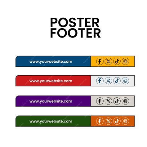
You can design a custom footer using shape tools and the pen tool, similar to how you might design the header. Adding relevant icons for phone, email, website, or social media can visually represent contact methods and make the information more digestible. Ensure these icons are consistent in style and size.
For contact details, use a legible font and size. If you have a website or social media presence, include those details prominently. A clear call to action, such as "Visit our website," "Call us today," or "Register now," guides the audience on the next step.
Exploring Design Concepts and Inspiration
Beyond the step-by-step process, understanding various design concepts can elevate your flyer creation.
Color Theory in Design
The choice of colors significantly impacts how a flyer is perceived. Harmonious color schemes often utilize three colors that form an equilateral triangle on the color wheel. Complementary colors (opposite each other on the wheel, like blue and orange) can create strong visual contrast.
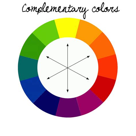
If using intense colors, balance them with more subdued hues or subtle patterns to avoid overwhelming the viewer. Black and white can be used effectively to highlight accent colors and create a sophisticated composition. Experimentation with gradients can also add depth and visual interest.
Layout and Composition
Consider the overall layout and how elements are arranged. White space, or negative space, is crucial for preventing a cluttered design and allowing key elements to breathe. Different flyer styles cater to various purposes:
- Minimalist: Clean lines, ample white space, and a focus on a single key message.
- Bold and Modern: High contrast, strong typography, and dynamic graphics.
- Vintage-Inspired: Retro color palettes, textures, and typography.
- Product-Focused: Showcasing product images prominently, often with clear pricing or offer details.
- Corporate: Professional color schemes, clear branding, and structured information.
Utilizing Templates and Inspiration
While designing from scratch offers maximum creative freedom, leveraging templates can be a significant time-saver, especially for those new to Photoshop. Many platforms offer professionally designed flyer templates that can be customized to your needs. These templates often come with pre-set color schemes, typography, and layouts, providing a solid foundation.
Even if you don't use a template directly, browsing examples of "simple and elegant flyer handbills" or "exclusive design concepts" can provide valuable inspiration for layout, color combinations, and graphic elements. Observing how other designers organize information and use visual assets can spark new ideas for your own projects.
Advanced Techniques and Tools
Photoshop offers advanced features that can further refine your flyer design.
Layer Management and Smart Objects
Efficiently managing layers is key to a smooth workflow. Grouping related layers (e.g., all text elements for a section, or all elements of the header) can keep your Layers panel organized. Using Smart Objects for images and vector elements ensures that you can scale and transform them multiple times without degrading their quality.
Filters and Adjustments
Filters like "Gaussian Blur" can be applied as Smart Filters, allowing you to adjust their intensity or even remove them later without permanently altering the underlying image. Adjustment layers, such as "Brightness/Contrast," "Hue/Saturation," or "Color Balance," provide non-destructive ways to modify the color and tone of your design elements. Applying these as clipping masks ensures they only affect the intended layer.
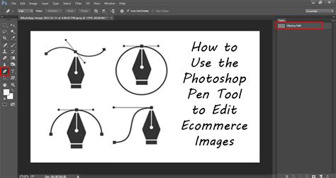
Vector Shapes and Paths
The Pen Tool (P) is invaluable for creating custom shapes, masks, and intricate paths. While it has a learning curve, mastering the pen tool allows for precise control over curves and angles, enabling you to create unique graphic elements that stand out. Bézier curves, manipulated with anchor points, are fundamental to this process.
Alternative Software and Tools
While Adobe Photoshop is a powerful industry standard, other software options can also be used for flyer design.
Adobe Express
Adobe Express is a user-friendly, web-based and mobile application that offers a streamlined approach to flyer creation. It provides thousands of professionally designed templates categorized by purpose, making it easy to find a starting point. Its drag-and-drop interface, along with a library of stock images, icons, and fonts, allows for quick customization. Adobe Express is particularly beneficial for users with limited design experience, offering a free plan with access to many of its features.
Edraw Max
Edraw Max is presented as a more affordable alternative to Adobe Photoshop, particularly for diagrammatic software. It offers various saving options and is available across different operating systems. For users who require a wide range of diagramming and design tools at a lower cost, Edraw Max could be a viable option.
Luminar Neo
Luminar Neo is highlighted as an effective application for editing photos and creating collages, suggesting it could be a useful tool for enhancing images intended for flyers, potentially in conjunction with other design software.
Finalizing and Exporting Your Flyer
Once your flyer design is complete, it's time to prepare it for its intended use.
File Formats for Print and Digital
For professional printing, it's best to export your flyer as a print-ready PDF. The "Save As" option in Photoshop allows you to choose "Photoshop PDF" and select a "High Quality Print" preset, which generally includes appropriate settings for commercial printing. Ensure your master PSD file with all layers intact is also saved for future edits.
For digital use (e.g., social media sharing, email distribution), JPG or PNG formats are suitable. JPGs are good for photographic images, while PNGs preserve transparency and are ideal for graphics or logos.
Preparing for Commercial Printing
When sending your flyer to a commercial printer, it's always advisable to request a test print. This allows you to review the colors, text clarity, and overall layout before committing to a large print run. Understanding CMYK color mode, proper resolution (300 PPI), and bleed requirements is crucial to prevent costly printing mistakes. Using Pantone swatches (Window > Swatches) can ensure precise color matching if specific brand colors are critical.
The Importance of Practice and Dedication
Ultimately, the quality of your flyer design is a reflection of your dedication and practice. Photoshop is a sophisticated tool with a vast array of features, and becoming proficient takes time and consistent effort. By experimenting with different tools, techniques, and design concepts, you will develop your skills and efficiency. The more you practice creating flyers, the more adept you will become at translating your ideas into visually compelling and effective marketing materials that resonate with your target audience.