Photopea, a powerful and free online image editing application, offers a robust set of tools for photo manipulation and graphic design. Among its fundamental features, the ability to control layer opacity is paramount for achieving nuanced visual effects, creating depth, and enhancing the overall aesthetic of a design. This tutorial delves into the intricacies of changing image opacity in Photopea, providing clear, step-by-step instructions suitable for beginners and offering insights valuable for experienced designers. We will explore various methods, from the straightforward opacity slider in the Layers panel to more advanced techniques within Layer Styles, ensuring a comprehensive understanding of this essential graphic design skill.
Understanding Layers and the Layers Panel in Photopea
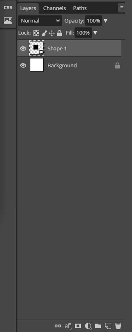
At the core of any complex image editing project in Photopea, as well as in many other advanced image editors, lies the concept of layers. Each PSD document, for instance, is meticulously constructed from individual layers. Typically, you will find yourself editing just one layer at a time, focusing on specific elements within your composition. The Layers panel serves as the central hub for managing the layer structure of your document. It presents a comprehensive list of all layers present, accompanied by their visual thumbnails, offering a quick overview of your project's architecture.
When dealing with documents that contain a multitude of layers, the ability to efficiently locate and select the precise layer you intend to work with becomes crucial. Scrolling through an extensive list can be a time-consuming and frustrating experience. To mitigate this, Photopea, mirroring the functionality of other industry-standard image editors, provides a streamlined approach to layer organization through the creation of folders. These folders can contain individual layers, and they also have the capability to house other nested folders, allowing for hierarchical organization. Selecting a folder, for example, by simply clicking on it, automatically selects all of its constituent content, even if those layers are not explicitly highlighted in the panel itself. This feature significantly aids in managing complex projects and maintaining a clear workflow.
Beyond organization, the Layers panel offers access to several fundamental properties of each layer that can be readily modified. Each layer is assigned a name, a vital attribute that assists in deciphering the structure of large and intricate documents. By double-clicking on the name of any layer, you can easily enter a new, more descriptive name, enhancing clarity and accessibility. Furthermore, the Layers panel supports drag-and-drop functionality, allowing you to reorder layers with intuitive ease. This capability is instrumental for tasks such as placing layers into folders, extracting them from existing folders, or even nesting one folder within another. For the removal of unwanted layers, a readily accessible garbage bin button allows you to delete all selected layers simultaneously. To introduce new organizational structures, the New Folder button, positioned conveniently, will add an empty folder directly above the currently selected layer. An additional, highly convenient method for duplicating layers involves dragging them to a designated "another panel" using the Move tool, a technique that streamlines workflow and reduces the need for repetitive actions.

The Essence of Opacity: Definition and Significance
The meaning of opacity can be considered in terms of anti-transparency. Another word for opacity is opaque. How opaque something is directly refers to how little light is allowed to transfer through it. The more opaque, the less light. There are various definitions or meanings for Opacity, ranging from extremely technical explanations to very simple ones. While there are several definitions for Opacity, for the purposes of image editing, we will define it much simpler. This question typically refers to simply changing the opacity for the object within the active image layer. There are other, more advanced places for which to change opacity.
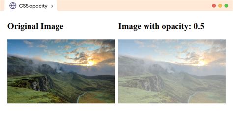
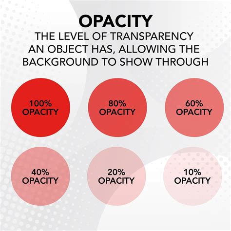
Opacity is a fundamental property that dictates the level of transparency of a layer or an object within an image. It essentially controls how much of the underlying content is visible through the current layer. A fully opaque layer (100% opacity) completely conceals anything beneath it, while a fully transparent layer (0% opacity) allows everything behind it to show through unimpeded. Values between these extremes create varying degrees of transparency, enabling a wide range of visual effects.
In the context of digital imaging and graphic design, opacity is not merely a technical parameter; it is a powerful creative tool. It is used to make images more visually appealing to viewers by introducing subtleties and depth. As a beginner, concepts like layering and composition might seem like abstract terms found only in tutorials. However, as one progresses and gains a deeper understanding of graphic design principles, learning to effectively work with opacity becomes an integral part of the daily routine when working with digital images.
Opacity can be strategically employed to draw a viewer's attention to a specific area within an image. For instance, if you aim to create an effect where the inside of a coffee cup appears green instead of white, but you desire a less solid, more natural-looking green, using opacity is a key solution. By reducing the opacity of the green layer, you allow the underlying texture or color of the coffee cup's interior to subtly show through, creating a more realistic and visually engaging effect. This technique draws attention to that specific spot within the image with a subtle effect achieved with minimal effort.
Furthermore, the interplay of opacity with layer blending modes is a potent combination that can yield surreal and captivating effects, especially when merging multiple digital images into a single, cohesive composition. When embarking on the journey into the world of graphic design or photo editing, our initial understanding is limited by our current knowledge. We often encounter designs and think, "Wow, I wish I could come up with ideas like that." Mastering opacity is a significant step towards achieving such creative aspirations.
How to Edit a Layer's Transparency in Photopea | Photopea
Practical Application: Changing Opacity in Photopea
Photopea offers several straightforward methods for adjusting the opacity of a layer, catering to different user preferences and workflows. These steps are designed to be easy to follow, even for Photopea beginners, making it an accessible tool for learning and experimentation.
Method 1: Using the Opacity Slider in the Layers Panel
This is the most common and direct method for altering layer transparency.
Open Image in Photopea: Begin by opening your desired image file in Photopea. You can do this by navigating to
File > Openand selecting your image.Show Layers Window: If the Layers panel is not already visible, go to the top menu and click
Window > Show Layers. This will display the panel, typically on the right side of your workspace.Select the Layer: In the Layers panel, identify and click on the specific layer whose opacity you wish to adjust. The selected layer will be highlighted.
Adjust the Opacity Slider: Locate the "Opacity" slider within the Layers panel. This slider is usually found near the top of the panel, above the list of layers. You can adjust the opacity by:
- Dragging the slider: Click and drag the slider handle to the left to decrease opacity (increase transparency) or to the right to increase opacity (decrease transparency).
- Typing a value: You can also directly type a numerical percentage value into the box next to the slider. For example, typing "50" will set the opacity to 50%.
As you adjust the slider, you will see the effect on your image in real-time, allowing for immediate visual feedback.
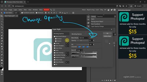
Method 2: Using Layer Styles for Advanced Opacity Control
For more intricate control and to explore blending options in conjunction with opacity, the Layer Style window offers a more advanced approach.
- Select the Layer: Ensure the target layer is selected in the Layers panel.
- Access Layer Style: There are a couple of ways to open the Layer Style window:
- Double-click the layer: Double-click directly on the layer itself (not its name or thumbnail) in the Layers panel.
- Layer Styles Menu: Right-click on the layer and select "Layer Style" from the context menu, or navigate to
Layer > Layer Style.
- Navigate to Blending Options: Within the Layer Style window, look for "Blending Options" in the left-hand menu. Select it.
- Adjust Opacity: On the right side of the Blending Options, you will find the "Opacity" setting. Similar to the Layers panel slider, you can adjust this value by dragging or typing a percentage.
- Explore Blending Effects: Directly above the opacity option within this window, you will find "blending effects." It is important to learn these blending effects in conjunction with the use of Opacity to fully utilize the tools at your disposal. These effects allow for sophisticated interactions between layers, and opacity plays a crucial role in how these interactions manifest visually.
The Layer Style window can be moved out of the way by left-clicking and holding the cursor onto its title bar. This allows you to see the effects of your adjustments on the image more clearly.
Advanced Opacity Techniques and Creative Applications
The fundamental act of changing opacity in Photopea opens doors to a wide array of creative possibilities, transforming simple images into compelling visual narratives. Mastering these techniques is not just about technical proficiency; it's about understanding how to manipulate light, depth, and focus to evoke specific emotions and guide the viewer's eye.
Common Effects Achieved with Opacity Adjustment
- Background Blur: A popular and easily performed effect involves creating a duplicate of the image layer, placing this duplicate on top of the original, applying a blur effect to the duplicate, and then reducing its opacity. This creates a softened background that makes the foreground elements stand out, drawing attention to the main subject.
- Color Tints: As demonstrated in the coffee mug example, opacity is key to applying subtle color overlays. Instead of a harsh, solid color, reducing the opacity of a color layer allows the underlying textures and details to remain visible, creating a more integrated and nuanced color effect.
- Ghosting Effect: While slightly outside the scope of absolute beginner tutorials, the ghosting effect is a compelling application of opacity. This involves selecting an object that appears to be in motion, copying and pasting it into a new layer, and then significantly reducing its opacity to create an ethereal or spectral appearance. This is particularly effective in conveying a sense of movement or a lingering presence.
- Gradient Fades: An excellent and easy-to-perform option is to use opacity to create smooth transitions. For instance, when modifying the horizon of a background image, you can use a gradient layer with reduced opacity to seamlessly blend or fade elements, creating a more natural and visually pleasing sky or landscape.
- Watermarking: A common practice for protecting images or branding content is to place a logo or text overlay onto an image. By reducing the opacity of the watermark layer, it becomes a non-distracting but visible part of the image, serving its purpose without detracting from the primary visual content. However, it is important to note that using opacity for watermarking primarily keeps the honest people honest; this method is easily removable and not a robust security solution.
Opacity and Layer Styles: A Powerful Combination
The Layer Styles feature in Photopea, accessed via the "Blending Options," offers a sophisticated environment where opacity interacts with a multitude of effects. These styles, which can include drop shadows, inner glows, bevels, and more, are automatically redrawn when the layer is modified, ensuring consistency. The list of styles can be folded and unfolded using the arrow on the right side, and styles are added and managed within the Layer Styles window. Clicking the checkbox of each style enables or disables it, offering granular control. Photopea also allows you to load and save styles, and you can "Define New" styles to add them to a gallery for future use. Understanding how opacity influences these layer styles is crucial for achieving professional-grade results. For example, reducing the "Fill Opacity" (a distinct setting from layer opacity) within Blending Options can make the actual content of the layer transparent while still retaining its layer styles like strokes or shadows, leading to highly specialized visual outcomes.
The Importance of Opacity in Visual Composition
Learning and even mastering the use of opacity is a necessity for any graphic designer or photo editor. Opacity is utilized in virtually every image and adjusted in most edited images at some point. It significantly impacts the viewer's experience with the image. Not every image created or edited will be the standout piece on a webpage or display, but it plays a crucial role as part of the overall composition that makes everything work together harmoniously. By understanding and skillfully applying opacity, designers can create images that are not only aesthetically pleasing but also effectively communicate their intended message and evoke the desired emotional response.
Working with Transparency Channels and File Formats
Beyond the immediate visual layer opacity, Photopea also supports more advanced concepts related to transparency, particularly concerning file formats and the management of "extra channels."
Alpha Channels and Transparency
Digital color images are fundamentally composed of three primary color channels: Red, Green, and Blue (RGB). However, for decades, it has been a popular practice to store an "unrelated" grayscale image as a fourth channel within a file. This is particularly common in formats like TGA, DDS, or PNG. The purpose of this fourth channel, often referred to as an "alpha channel" or "transparency channel," is to provide an additional layer of information that governs transparency. This practice helps to avoid the need for multiple files, which is especially beneficial in contexts like video games, where such a file can be directly converted into a texture on the graphics accelerator.
Photopea allows you to work with these alpha channels. You can convert transparency into a selection, and then save that selection as a channel. This enables you to edit two separate images â the layer with opaque pixels and the channel governing its transparency â independently. When exporting files in formats that support transparency, such as PNG, DDS, or TGA, Photopea provides an option like "extra channel as opacity." This setting determines how the alpha channel information is interpreted and embedded into the exported file, directly influencing the transparency of the final image.
Steps for Working with Transparency as a Channel
These steps are applicable in Photopea.com and share similarities with workflows in Adobe Photoshop:
- Open Your File: Navigate to
File > Openand select your image file. - Load Transparency as Selection: Go to
Select > Load Selection. Choose the layer that contains the transparency you want to work with, and ensure "Layer Transparency" is selected as the source. - Save Selection as Channel: With the transparency now loaded as a selection, go to
Select > Save Selection. This will create a new channel that precisely represents the transparent areas of your selected layer. You can now edit this channel independently. - Export with Extra Channel: When exporting your file (e.g.,
File > Export As > PNG), look for an option such as "extra channel as opacity." Enabling this will embed the transparency information from your saved channel into the exported file, ensuring that the transparency is preserved correctly in applications that support it.
By understanding and utilizing these advanced features, you can achieve a greater level of control over image transparency, leading to more sophisticated and professional results.
Conclusion: Mastering Opacity for Professional Design
Mastering the use of opacity in Photopea is a fundamental skill that significantly elevates the quality and impact of your digital designs. Whether you are creating subtle overlays, professional watermarks, or complex blended compositions, the ability to precisely control transparency is indispensable. This tutorial has provided a comprehensive overview of how to change opacity using both the intuitive Layers panel slider and the more advanced Layer Styles window. Furthermore, we have touched upon the underlying concepts of transparency channels and their role in various file formats, offering a deeper understanding of how opacity functions within the broader landscape of digital imaging.
Your next step is to open Photopea and actively practice these opacity adjustments on your own images. Experiment with placing text over photos, creating effective watermarks, or seamlessly blending multiple graphics. By consistently applying these techniques, you will not only become more proficient with Photopea but also develop a keener eye for visual composition and a more sophisticated approach to digital art. The journey of mastering opacity is ongoing, and with each adjustment, you move closer to achieving truly professional and visually stunning results.