The digital art realm offers boundless possibilities for creators, and Procreate on the iPad stands as a powerhouse for illustration and design. Among its many capabilities, hand-lettering and typography have emerged as incredibly popular and commercially viable skills. This guide delves into the art of using fonts within Procreate, from the foundational techniques of hand-lettering to the seamless integration of custom typefaces, empowering both beginners and seasoned artists to elevate their digital creations.
The Art of Hand-Lettering in Procreate: From Sketch to Illustration
Hand-lettering in Procreate is a rewarding and accessible illustration technique, even for those who believe they lack good handwriting. The key is to approach letters as visual elements, akin to illustrations, rather than mere text. This perspective shift unlocks a world of creative potential.
Getting Started: Essential Tools and Mindset
To embark on your hand-lettering journey in Procreate, you need an iPad, the Procreate app, and a drawing tool. For absolute beginners, even your finger can be a starting point. The fundamental principle is to view words and letters as illustrations, not just something you write on a page. This mindset is crucial for creating visually engaging hand-lettered pieces.
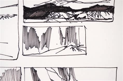
Thumbnail Sketching and Composition: Laying the Foundation
Every successful illustration begins with a plan, and hand-lettering is no exception. The thumbnail sketch is a loose, initial drawing to transfer your ideas onto the screen. Within Procreate, a bright red color and a brush like "Peppermint" can make your sketch stand out clearly.
Start by writing out the quote you intend to letter. For instance, "Do what you love." This initial writing helps you understand the natural flow and shapes of the letterforms. Most hand-lettered compositions are not confined to a single line; they are carefully arranged to create visual interest and appeal. Experiment with mixing different lettering styles, such as cursive and block fonts. You might find that a word like "Love" looks particularly striking in cursive, allowing you to arrange other words around its form. This stage is about exploration; there's no wrong way to sketch.
Once you've settled on a composition, isolate it onto its own layer using the Selection tool. Swipe down with three fingers, navigate to your Layers panel, swipe left on the original sketch layer, and delete it. This leaves you with your chosen composition. If your sketch is diagonal, use the Transform tool to adjust its size and position on your canvas. For enhanced precision during refinement, consider turning on Procreate's drawing grid.
Refining Your Sketch: Adding Clarity and Structure
Thumbnail sketches are often rough. Refining your sketch involves using a thicker brush to create a clearer guide for your final illustration, ensuring better precision and alignment with your chosen composition.
To do this, reduce the opacity of your thumbnail sketch layer by tapping "N" next to the layer name and adjusting the opacity scrubber. Create a new layer for your refined sketch and select a larger brush. This refined sketch doesn't need to be perfect but serves as a much clearer blueprint for the illustration process.
Creating Your Hand-Lettering Illustration: Bringing it to Life
This is where the creative magic happens. Select a brush that offers the texture you desire for an organic, hand-drawn feel. Create a new layer specifically for your illustration and begin tracing over your refined sketch.
Procreate's versatility allows you to explore various color palettes and brushes to match your personal style. It's highly recommended to create a new layer for each distinct element of your illustration. For example, in the quote "Do what you love," you might place "Do what you" on one layer and "Love" on another. This layering facilitates easier manipulation later on. The intentional sloppiness in a hand-drawn style can enhance its charm and authentic feel.
Elevating Your Hand-Lettering: The Drop Shadow Effect
To add depth and a faux-3D effect to your hand-lettered piece, a drop shadow is an excellent technique. Duplicate the layer of the element you want to shadow. Select your desired color for the shadow from the palette. Drag the colored circle from the top left of the screen onto the lettering. Continue dragging until all letters are recolored. Then, move this duplicated, recolored layer underneath the original. Some edges might appear disconnected; ensure these are connected to create a unified shadow.
How to create a simple drop shadow in procreate
Leveraging Procreate's Text Tool for Precision and Style
While hand-lettering offers a unique artistic touch, Procreate's Text tool provides a powerful avenue for creating clean, precise lettering, especially for block or bubble letter styles.
Tip 1: Using the Text Tool for Traceable Bases
The Text tool is invaluable for generating perfectly proportioned letter bases. Type out your desired text, selecting a font that aligns with your aesthetic. Even simple fonts can serve as excellent foundations. Lower the opacity of this text layer and then trace over it on a new layer. This method eliminates the guesswork involved in letter spacing and alignment, providing a solid starting point. Experimenting with different fonts can also help you discover new lettering styles and vibes for your artwork.
Tip 2: Typing and Tracing Longer Quotes
For longer quotes, the type-and-trace method is a game-changer. Type the entire quote using the Text tool and arrange it to fit your canvas. Lock the text layer to prevent accidental movement and then trace over it on a new layer. This allows you to focus on embellishments like swirls, stars, or doodles, adding your unique artistic flair without worrying about the underlying structure.
Tip 3: Utilizing Drawing Guides for Alignment
Drawing Guides are essential for maintaining neatness and alignment in your lettering. Access them via Actions (wrench icon) > Canvas > Drawing Guide. Customize the grid size to suit your lettering scale. Use this grid as a visual aid to ensure your letters are perfectly aligned, preventing wonky spacing. For angled or curved layouts, consider using the Symmetry tool or creating custom grid designs.
Understanding and Importing Fonts in Procreate
Procreate offers a robust system for managing and utilizing fonts, both pre-installed and custom. This allows for a vast expansion of your typographic capabilities.
Default and System Fonts
Your iPad comes equipped with a substantial library of nearly a hundred built-in fonts that can be freely used in your artwork. These typefaces span a wide spectrum, from playful to professional, cursive to capitalized, and handwritten to typewritten styles. To explore these fonts, add text to your document, navigate to the Edit Text panel, and browse through the Font list. Procreate also includes three default fonts: Eina (a neutral sans-serif), Impact (a bold, condensed sans-serif), and Jack Armstrong BB (a playful, comic-inspired font). You also have access to all system fonts available on your iOS device.
Importing Custom Fonts: A Step-by-Step Process
Adding custom fonts to your Procreate library can significantly enhance your designs, injecting personality and character into your text-based artwork.
Font File Basics: Fonts are typically stored in files with formats such as TrueType Font (TTF) or OpenType Font (OTF). OTF files are generally preferred as they are more modern and can contain advanced typographic features, though Procreate's support for these features may evolve.
Obtain Font Files: Acquire font files from various online resources, both free and paid. Download these files to your iPad. They might be in OTF, TTF, or commonly, a zip format.
Unzipping and Organizing: If your font is in a zip file, you can easily uncompress it using the iPad's Files app. Simply tap and hold the zip file and select 'uncompress'. The Files app is ideal for managing these files. Create a dedicated folder within "On My iPad" or "On My iPhone" for your Procreate fonts to maintain organization.
Importing into Procreate: There are a couple of primary methods for importing fonts:
- Direct Import: Open Procreate, create or open a canvas, and add text (Actions > Add > Add Text). In the text settings panel, tap the "Aa" icon, and then select "Import Font" in the top right corner. Navigate through your Files app to the location of your font file and tap on the .otf or .ttf file. Procreate will typically open, and the font will be instantly installed.
- Drag and Drop (iPadOS Split View): Open the iPadOS Files app in Split View alongside Procreate. Navigate to your font folder, and drag and drop your chosen font file directly into Procreate.
- Manual File Placement: Open the iOS Files app, locate your font file, and tap and hold it. With another finger, navigate to "On My iPad" (or "On My iPhone") > Procreate > Fonts, and then place the font file there.
Understanding Font Licensing
When you acquire a font, you'll receive an End User License Agreement (EULA). This document outlines the permitted and prohibited uses of the font. Key license types include:
- Personal Use: For non-commercial projects.
- Commercial Use: For projects intended for sale or profit.
- Desktop: Covers personal and commercial use, often with limitations on the number of users or machines.
- Web: Typically requires an estimate of website views, influencing the cost.
It is crucial to understand these licenses to ensure you are using fonts legally and ethically.
Exploring Diverse Font Styles and Their Applications
The world of typography offers a vast array of styles, each with its unique character and suitability for different design contexts.
Serif Fonts: Classic Elegance and Readability
Serif fonts, characterized by small strokes at the ends of larger strokes, evoke a classic and elegant feel, often resembling calligraphy. They encompass a broad category, from traditional calligraphic styles to older forms like blackletter.
- Balzak: Offers an organic feel and convincing texture, reflecting modern calligraphy's freer style. Created by PeachCreme.
- Super Brush font bundle: Mimics the feel of a brush pen without the physical tool, including bonus swash files. Designed by Rangga Subekti of Subectype Studio.
- Malice Stencil: Combines hand-lettering and calligraphy for a mysterious and elegant aesthetic, seen in packaging and posters. Created by Gabriel Martinez Meave of Sudtipos.
- Slight: Features an extreme right slant, ideal for elegant applications like wedding invitations or premium stationery. Created by Up Up Creative.
- Decorata: Boasts intricate detail within each letter, with eight styles designed to add sophistication. A collaboration between Martina Flor and Neil Summerour of Positype.
- Huai: A font with sharp corners and fluid curves, offering a warm, playful, and fun feel across 12 styles. Created by Potch Auacherdkul.
- Mogan: Presents a classic design inspired by historical lettering but with a modern presentation, balancing curves and swashes. From Heritage Type Co.
- Matrona: Features bold letters of uniform height, with a design spanning over 30 years of type design expertise from Hubert Jocham.
- LiebeHeide: Captures the charm of a handwritten note, enhanced by the texture and color of a blue ballpoint pen using color font technology. Created by Ulrike Rausch of LiebeFonts.
- Amatic: A unique, condensed, all-caps font with slender forms and rough edges.
- Northwell Regular/Clean: A perfect blend of handwritten and brush script, with Northwell Regular offering dry brush strokes and Northwell Clean providing a solid, smooth edge. From Set Sail Studios.
- Calder: A bundle of bold sans-serif styles designed to complement a looser script style, from Inhouse Type Foundry.
- Lumios: Rendered as if crafted by a brush marker, with an additional "Lumios Marker Design Elements" style available. Designed by Elena Genova and published by My Creative Land.
- Luminaire: A script font that, despite its casual vibe, maintains sophistication, with imperfections adding to its organic appeal. Inspired by pop culture, urban culture, and handwriting. From Winston Type.
- Bourton Hand Script: A playful, non-traditional script font available in Light and Bold styles, with unique lowercase letter designs. Designed by Kimmy Kirkwood of Kimmy Design Co.
- Seventies: Captures a retro '70s feel with fat bottom curves and high contrast, available in six styles. Created by Maximiliano Sproviero of Lián Types.
- The Honest Designers Script: A Design Cuts exclusive collaboration, showcasing Ian Barnard's signature hand-lettered style with a distinctive slant and beautiful connections.
- Alex Brush: A personal favorite with playful, wispy end strokes and a slight angle that gives the font a dancing quality across the screen. Designed by Rob Leuschke of TypeSETit.
Sans-Serif Fonts: Modern Clarity and Versatility
Sans-serif fonts, lacking the decorative strokes of serifs, offer a clean, modern, and highly versatile aesthetic, suitable for a wide range of applications.
- Eina: A neutral and versatile sans-serif font.
- Baloo: Features a roundness that gives it a bouncy appearance, available in multiple languages. Created by the EK Type collective, focusing on contemporary Indian typefaces.
Script Fonts: Elegance, Flair, and Expressiveness
Script fonts are often associated with elegance and flair, but they can also convey casualness and expressiveness.
- Balzak: As mentioned, it reflects modern calligraphy's freer style.
- Super Brush font bundle: Directly mimics brush pen lettering.
- Malice Stencil: Blends hand-lettering and calligraphy for a unique blend of mystery and elegance.
- Slight: Its extreme slant lends itself to sophisticated designs.
- Huai: Offers a playful and fun script-like feel with its sharp corners and fluid curves.
- LiebeHeide: Specifically designed to replicate the look and feel of a ballpoint pen.
- Amatic: A condensed font with a unique handwritten character.
- Northwell Regular: Offers a textured, dry brush script feel.
- Lumios: Replicates the look of brush marker lettering.
- Luminaire: A sophisticated script with organic imperfections.
- Winston Type: Inspired by Spencerian scripts, featuring detailed capital letters.
- Bourton Hand Script: A playful, non-traditional script with unique character.
- The Honest Designers Script: Known for its signature hand-lettered style with a distinctive slant.
- Alex Brush: Features playful wispy tails and a dancing quality.
Font Collections and Bundles
Many designers and foundries offer font collections or bundles that provide a variety of styles within a cohesive theme, offering excellent value and creative options.
- Super Brush font bundle: Includes multiple brush pen fonts and swashes.
- Calder: A collection of bold sans-serif styles designed to complement script styles.
Final Tips for Lettering Success in Procreate
To further refine your lettering skills and ensure polished results:
- Check Your Spelling: It's easy to overlook typos when engrossed in the creative process. Always double-check your text before finalizing.
- Take Your Time: Precision is key in lettering. Embrace the process and avoid rushing to achieve the best outcome.
- Develop Your Unique Style: Experiment with shapes, flourishes, textures, and color to create lettering that is distinctly yours.
By mastering hand-lettering techniques and effectively utilizing Procreate's font management capabilities, artists can create stunning, professional-quality typographic designs. Whether you're crafting inspirational quotes for sale or adding a personal touch to your digital artwork, this comprehensive guide provides the foundation for success.