Fonts are the unsung heroes of visual communication, transforming raw text into a powerful medium for conveying information and evoking emotion. For designers working with Affinity Designer, understanding how to effectively select, install, and utilize fonts is paramount to creating impactful and aesthetically pleasing designs. This guide will delve into the intricacies of font management within Affinity Designer, from basic text creation to leveraging advanced features like glyphs, ensuring you can harness the full typographic potential of your software.
Installing Fonts for Affinity Designer: A System-Wide Approach
Before you can begin to explore the typographic landscape within Affinity Designer, it's crucial to understand how fonts are integrated into the software. The primary method for accessing fonts in Affinity Designer, whether you're on a PC, Mac, or even an iPad, is through your operating system's font management. This means that if you want to use a font in Affinity Designer, you must first install it on your computer or device.
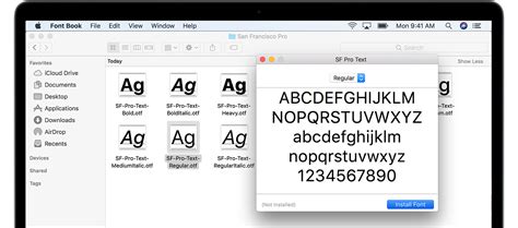
The process of installing fonts is generally straightforward and handled by your operating system. For Windows users, this typically involves downloading font files (such as .ttf, .otf, or .ttc formats), right-clicking on them, and selecting "Install." On macOS, you can often double-click a font file to open it in Font Book, where you can then click "Install Font." For those using Affinity Designer on an iPad, font installation is also managed through the operating system. You might need to use a file management app and then open the font file to install it.
A common point of confusion arises when users install fonts while Affinity Designer is already open. In such cases, the software may not immediately recognize the newly installed fonts. To resolve this, it's best practice to close Affinity Designer completely and then reopen it after installing new fonts. This ensures that the application refreshes its font cache and can access the latest additions to your system's typeface library. If you find that a font is still not appearing, double-check that the font file is in a valid format and has been installed correctly through your operating system's procedures.
Accessing and Selecting Fonts within Affinity Designer
Once your fonts are installed on your system, Affinity Designer provides several intuitive ways to access and utilize them within your projects. The most direct methods are located at the top of the software interface, within the main toolbar, and more comprehensively within the Character panel.
When you have any text selected in your Affinity Designer document, you will notice a toolbar at the top of the application window. This toolbar prominently features font selection options. The "Font Family" dropdown menu is your primary gateway to your installed typefaces. You can either scroll through the extensive list of available fonts or, for quicker access, begin typing the name of the font you wish to use, and the software will filter the list accordingly.
For a more detailed and organized approach to typography, the Character panel is indispensable. This panel, often accessible from the "View" menu or a dedicated icon, provides a centralized location for managing all aspects of your text. Within the Character panel, you'll find the "Font Family" dropdown, mirroring the one in the toolbar, allowing you to select your desired font. This panel is particularly useful for accessing Affinity Designer 2 features and for fine-tuning various typographic attributes.
Utilizing Text Tools for Creative Expression
Affinity Designer offers two primary text tools, each suited for different design needs: the Artistic Text tool and the Frame Text tool. Understanding their distinct functionalities will enable you to choose the most appropriate tool for your specific task.
The Artistic Text tool is ideal for creating short bursts of text, such as headlines, titles, or single words that require emphasis. When you select this tool, found on the left-side toolbar, and click and drag on your canvas, you are essentially defining the size of your text as you create it. This tool offers greater flexibility for manipulating individual characters and applying unique stylistic treatments. For instance, a "fancy and fun font" works exceptionally well for headings when using the Artistic Text tool, allowing its decorative qualities to shine without overwhelming larger blocks of content.
The Frame Text tool, conversely, is designed for longer passages of text, such as body copy, paragraphs, or lengthy descriptions. When using the Frame Text tool, you draw a bounding box, or frame, within which your text will flow. This tool is particularly beneficial for maintaining consistent text formatting across a document. For optimal readability, a font that is "easy to read" is best suited when using the Frame Text tool. This ensures that your audience can comfortably consume larger amounts of information without visual fatigue.
Regardless of which text tool you choose, Affinity Designer provides robust options for refining your text. Once you have selected your font and typed your content, you can easily adjust the font size directly from the top toolbar. If your chosen font includes various weights and styles, such as Bold, Italic, or Light, these can be selected under the "Font Style" option, also located on the top toolbar. Furthermore, you can resize your text by clicking and dragging the corner handles of the text bounding box, offering precise control over its dimensions. Centering text or aligning it to other elements is also a simple matter of using the alignment options available in the context-sensitive toolbars or the Paragraph panel.
Exploring the Richness of Glyphs
Many modern fonts are not just collections of letters and numbers; they also contain a wealth of additional characters known as glyphs. These can include alternative letterforms, ligatures (where two or more characters are joined into a single symbol), swashes, ornaments, and other stylistic embellishments. Utilizing glyphs can elevate your typography from standard to truly unique and expressive.
Affinity Designer provides direct access to these special characters, allowing you to incorporate them seamlessly into your designs. To access the glyphs available for a particular font, you will typically need to use the Text Styles panel or a dedicated Glyphs panel (depending on your Affinity Designer version and workspace setup). When you have a text object selected and a font chosen, you can explore the available glyphs.
For example, if you are using a hand-lettering font like "Toddler Tantrums," which is often characterized by playful and varied letterforms, you might find numerous alternative characters for common letters. Replacing a standard 'a' with a more elaborate swash version, or using a ligature to connect two letters in a visually interesting way, can add a distinct personal touch to your design.
To use a glyph, you would typically select the glyph from the panel and then either double-click it or use an "insert" function. This will place the selected glyph directly into your text cursor's current position. It's important to note that not all fonts contain extensive glyph sets. However, for fonts that do, exploring these hidden treasures can unlock a new level of typographic creativity. If you're interested in learning more about the fundamentals of working with text in Affinity Designer, a comprehensive tutorial on text basics can provide a deeper understanding of these concepts.
The Synergy of Fonts and Design Intent
The choice of font is intrinsically linked to the message and purpose of your design. A font is not merely a visual element; it carries inherent characteristics that can influence how your audience perceives the content. Therefore, selecting the right font is a critical design decision that requires careful consideration of your project's goals.
When employing the Frame Text tool for body copy, the primary objective is legibility. A font that is clean, well-spaced, and possesses clear letterforms will ensure that your readers can engage with the text comfortably, even for extended periods. Overly decorative or condensed fonts can quickly lead to eye strain and a diminished reading experience. Therefore, prioritizing readability with a straightforward sans-serif or a classic serif font is often the most effective strategy for such applications.
Conversely, the Artistic Text tool offers a canvas for more expressive typographic choices, particularly for headlines, logos, or decorative elements. Here, the aesthetic qualities of the font can take center stage. A "hand lettering font" or a font with unique flourishes can grab attention and set a specific tone for your design. For instance, a playful, rounded font might be perfect for a children's product advertisement, while a sharp, geometric font could be ideal for a modern technology brand. The key is to ensure that the font's personality aligns with the overall brand identity and the emotional response you aim to elicit from your audience.
Consider the example of "Toddler Tantrums" font mentioned earlier. Its name suggests a playful, perhaps slightly chaotic, but undoubtedly fun aesthetic. This font would likely be a poor choice for a legal document but could be exceptionally effective for a children's party invitation, a whimsical illustration, or a brand targeting a young, energetic demographic.
Ultimately, the effective use of fonts in Affinity Designer involves a thoughtful interplay between the tool used, the font's inherent characteristics, and the intended message of the design. By mastering the installation, selection, and application of fonts, along with exploring advanced features like glyphs, you can significantly enhance the visual impact and communicative power of your creative work.