Color management is a critical, albeit often complex, facet of graphic design. It can be the crucial differentiator between a visually stunning piece and a print disaster. In Adobe InDesign, understanding and manipulating color modes is paramount to achieving predictable and desirable results, whether for digital display or professional printing. Unlike some design applications where color mode is set globally for an entire document, InDesign offers granular control, allowing color modes to be specified at the object level. This flexibility ensures that as you design, you can utilize the color spaces best suited for individual elements, with the final conversion to the output colorspace occurring during the export process.
The Foundation: Understanding Color Modes in InDesign
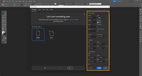
When you initiate a new document in InDesign, the initial setup plays a significant role in establishing the default color environment. Specifically, if you select a preset from the "Print" section, InDesign will intelligently default to using the CMYK color mode. This is a practical simplification designed to streamline the user experience for print-focused projects, making color selection more intuitive. However, it's crucial to remember that these defaults and presets are primarily for user convenience and faster color picking. Regardless of the new document preset or the "Intent" setting you choose, InDesign empowers you to select colors using virtually any color space you desire.
For those who prefer not to navigate the complexities of the Color Picker dialog box, InDesign offers the Color panel. This panel provides an alternative method for entering new color values and offers a minimized preview of any adjustments you make. It's a more direct way to manipulate color values numerically.
Advanced Color Management: Spot Colors and the Swatches Panel
When your design requires specialized color modes, such as the precise and consistent hues offered by Pantone spot colors, the Swatches panel becomes your indispensable tool. If the Swatches panel is not readily visible in your workspace, you can easily make it accessible. Navigate to the "Window" menu, hover over the "Color" submenu, and then click on "Swatches."
Within the Swatches panel, clicking the "New Swatch" button located at the bottom of the panel will introduce a new swatch to your list. This is where you define the characteristics of your custom color. In the "Color Type" dropdown menu, you have the critical choice between "Process" and "Spot." Process colors, like CMYK, are made up of multiple inks that are combined during the printing process to create a wide spectrum of colors. Spot colors, on the other hand, are pre-mixed inks, each with its own unique identifier, typically from systems like Pantone. When you define a color in your InDesign document as a Spot Color, it will be assigned to a separate printing plate, necessitating a distinct print run for that specific color. Pantone, for instance, is an international color-matching system that assigns standardized color pigments a unique number. Pantone colors are often more complex than CMYK colors, potentially being made up from a combination of 13 base pigments, rather than the 4 used in CMYK.
Following the "Color Type" selection, you will open the "Color Mode" dropdown menu. This is where you specify the color model for your swatch, such as RGB, CMYK, or Lab. As previously mentioned, the ultimate decisions regarding color mode are made during the export process, when you convert your InDesign document to another format for sharing and display.
The Export Process: Finalizing Color for Output
The final conversion of colors to their intended destination colorspace occurs when you export your InDesign document. To initiate this, open the "File" menu and select "Export." Choosing "Adobe PDF (Print)" from the export options provides a significant degree of flexibility during the export process. Here, you can name your file and then click "Save." This dialog box is where you'll encounter crucial settings related to color conversion, including the ability to select output profiles and rendering intents.
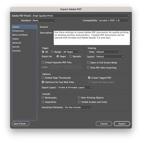
During export, all images and colors within your document are converted to the destination colorspace you've selected for the output file, irrespective of their original color mode. This ensures consistency across your final output. The "Color" options within the export dialog allow for various adjustments. For instance, you can select "Proof" under the "Print" settings, which often involves using a specific color profile, such as an "absolute colorimetric rendering intent." This process converts color data to RGB values using the selected color profiles, aiming to simulate how colors will appear on a desktop printer.
It's important to understand that color management is a complex interplay between your design software, the chosen color profiles, and the output device. CRDs (Color Rendering Dictionaries) are essentially PostScript equivalents of color profiles, guiding the conversion process. The accuracy of the color conversion can vary among printers, and it's essential to consider this when preparing files for professional printing. InDesign offers tools to help manage these variations, including the ability to specify resolution, screen frequency, and halftoning methods.
For print preparation, it is strongly advised to be sure you are working with CMYK. When possible, try to make sure you are designing with CMYK at the beginning of the design process. This proactive approach minimizes unexpected color shifts during conversion.
Understanding RGB vs. CMYK for Different Outputs
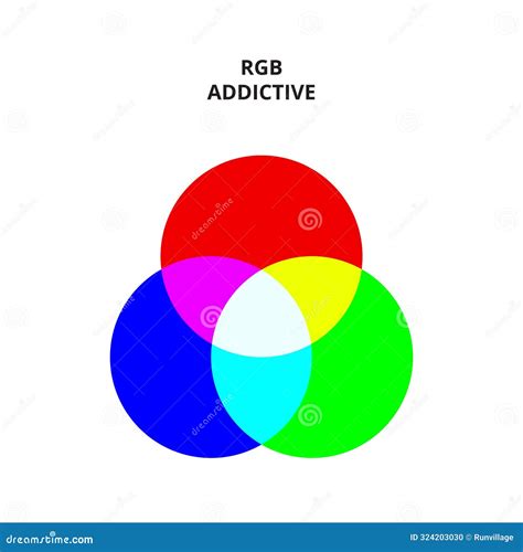
The fundamental difference between RGB and CMYK lies in their application. 'RGB' stands for Red, Green, and Blue. Because RGB color is created via colored light, not colored ink, it is optimized for digital and web design. Therefore, you should only use an RGB Color Mode when creating designs for digital publishing (e.g., eBooks) or for online use (e.g., websites).
Conversely, 'CMYK' stands for Cyan, Magenta, Yellow, and Key (which is Black). When you set colors in your InDesign document to CMYK color swatches, you create a Process Separation. This means that all the CMYK colors on your layout will be printed onto one plate during the printing process, in one single print run. This is the standard for professional printing.
Working with Color in InDesign: Practical Techniques
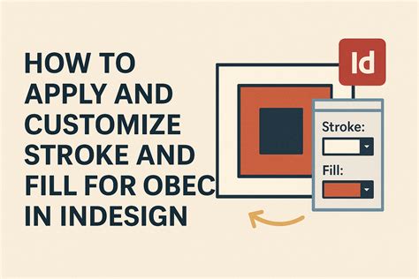
InDesign provides a versatile set of tools for applying and manipulating color. You can apply color to objects by targeting either their "stroke" (the border) or their "fill" (the background). This selection is typically made using the Fill or Stroke box in the Toolbox or within a panel.
You can select colors from the Swatches panel, the Gradient panel, or by opening the Color Picker. The Color Picker allows you to choose colors from a visual color field or specify them numerically using various color models like RGB, HSB, or CMYK. You can even save these chosen colors as swatches for future use, ensuring consistency throughout your project.
Drag-and-Drop Color Application
An efficient method for applying colors or gradients is through drag-and-drop functionality. You can drag swatches directly from the Swatches panel onto an object or its fill/stroke box. This eliminates the need to first select the object and then apply the color, speeding up your workflow.
The Color Panel for Precise Adjustments
While the Swatches panel is recommended for managing your color palette, the Color panel offers more granular control for mixing colors. You can choose a Lab, CMYK, HSB, or RGB color model within the Color panel menu and use sliders to fine-tune color values. Any color you create in the Color panel can be added to the Swatches panel at any time. It's important to note that if an object is using a named swatch, editing its color directly in the Color panel will only affect that specific object, not the original swatch.
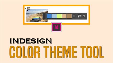
Extracting Color Themes
InDesign's Color Theme tool provides a powerful way to generate color palettes directly from your artwork. You can extract color themes from selected areas, images, or entire objects within your InDesign document. This tool allows you to sample colors from an image, the whole image, or even the entire layout. The generated color themes, consisting of five different colors, can then be added to your Swatches panel, honoring the document's intent and automatically converting to the appropriate color space.
Using Hexadecimal Color Codes
For precise color matching, especially when working with web-inspired palettes or specific brand guidelines, InDesign supports the use of hexadecimal RGB color codes. You can apply these codes within the Color Picker, when creating a New Swatch, or when editing an existing swatch. This ensures that you can accurately replicate colors specified by their hex values.
The Eyedropper Tool for Sampling
The Eyedropper tool is invaluable for sampling colors from existing objects, including imported graphics. You can use it to sample fill or stroke colors, and even copy type and transparency attributes. By default, the Eyedropper tool copies the appearance of the target object. However, you can adjust its behavior through the Eyedropper tool's options to control precisely which attributes are sampled.
Organizing Colors with Color Groups
As your projects grow in complexity, managing a large number of swatches can become challenging. Color groups offer a structured way to organize your color schemes and to exchange frequently used color swatches across applications. You can create color groups by selecting swatches or page items and then creating a new color group. These groups can be duplicated, renamed, or ungrouped. Furthermore, color groups can be saved and imported as .ase (Adobe Swatch Exchange) files, facilitating seamless color workflow between InDesign, Illustrator, and other Adobe applications.
Considerations for Print Output
When preparing files for professional printing, understanding concepts like halftoning is crucial. A halftone is a simulation of continuous-tone imagery through the use of dots of varying size or spacing. The halftone dot gets larger, resulting in a darker shade of gray. The printer uses a halftone screen to create these dots. When the spacing between dots is too tight, it can lead to banding or a loss of detail in gradients.
To mitigate issues with gradients, especially those that are very dark or involve subtle transitions, it's often recommended to "shorten" the length of dark gradients. This involves increasing the percentage of change within the gradient, effectively making the transition more pronounced and less prone to banding. Using shorter gradients, generally less than 7.5 inches, can also help achieve smoother results.
Proofing and Color Simulation
For print documents, selecting "Proof" under the "Print" settings in the export dialog is a valuable step. This allows you to simulate how your colors will appear when printed on a specific output device. By selecting the appropriate color profile for your intended printer, you can gain a more accurate preview of the final printed output.
Blending Modes and Their Impact
InDesign's blending modes offer sophisticated ways to interact with colors and transparency. Modes like "Normal," "Multiply," "Screen," and "Overlay" can dramatically alter how objects interact with the colors beneath them. For example, "Multiply" darkens the base color by multiplying it with the blend color, while "Screen" lightens the base color by screening it with the blend color. It's important to be aware that applying certain blending modes, such as "Difference," "Exclusion," "Hue," "Saturation," "Color," and "Luminosity," to objects with spot colors can introduce unwanted colors into your document, so caution is advised.
How To Utilise Layers And Blending Mode In Adobe InDesign
By mastering these color management techniques and understanding the nuances of different color modes, you can ensure that your designs translate effectively from the screen to the printed page, achieving the desired aesthetic and professional quality.