Navigating the nuances of digital art often involves refining the visual impact of your creations. For comic artists, illustrators, and digital painters, achieving the desired mood and clarity in a piece is paramount. When the initial coloring doesn't quite hit the mark, the prospect of extensive redrawing can be daunting. Fortunately, Krita, a powerful open-source digital painting application, offers robust tools to address these challenges. Adjustment layers, in particular, provide a non-destructive and flexible approach to modifying tone, color, and contrast, akin to photo editing but applied to your unique artwork. This guide delves into how to effectively adjust contrast in Krita, exploring both fundamental techniques and advanced workflows.
The Power of Adjustment Layers in Krita
Adjustment layers are a cornerstone of modern digital art workflows. As Ian MacLean, a seasoned professional with 16 years in the gaming industry, notes, "Adjustment layers allow users to adjust the tone, colour, contrast, of your artwork. It is almost like editing a photo, but with art." This means you can experiment with different visual styles, enhance the readability of your panels, or simply tweak the overall feel of your artwork without permanently altering the base layers. This non-destructive editing capability is invaluable, allowing for revisions and fine-tuning at any stage of the creative process.
For instance, "when you colour your comic, or any art work, you might not be happy with how to colour looks but don’t want to erase and start again. Well that’s where adjustment layers come in." This sentiment highlights the primary benefit of these layers: preserving your foundational work while enabling significant visual transformations. Whether you're aiming for a dramatic, high-contrast look or a softer, more subdued aesthetic, adjustment layers provide the control needed.
Adjusting Contrast with Curves and Levels
Two of the most fundamental and powerful adjustment layers for manipulating contrast are "Curves" and "Levels." These tools offer direct control over the tonal range of your image.
Levels Adjustment
The Levels adjustment layer allows you to remap the intensity values in your image. You'll see a histogram representing the distribution of pixels across the tonal spectrum, from black to white. By adjusting the black, gray, and white sliders, you can:
- Deepen blacks: Move the black slider to the right to make darker areas darker, increasing overall contrast.
- Brighten whites: Move the white slider to the left to make lighter areas brighter.
- Adjust midtones: The gray slider controls the gamma, affecting the mid-range tones without drastically altering the highlights and shadows.
This is particularly useful for correcting images that are too dark, too light, or have a washed-out appearance. For example, if your artwork appears a bit flat, a simple adjustment to the Levels can push the darks further into shadow and the lights into brilliance, thereby increasing the perceived contrast.
Curves Adjustment
The Curves adjustment layer offers even more granular control than Levels. It also uses a histogram but presents it as a graph with an input (original tonal values) on the x-axis and an output (new tonal values) on the y-axis. A diagonal line represents the default mapping. By clicking and dragging points on this line, you can create custom curves to precisely control how different tonal ranges are affected.
- Increasing contrast: An "S" shaped curve, where the lower part of the curve is pulled down and the upper part is pulled up, will darken shadows and brighten highlights, thus increasing contrast.
- Decreasing contrast: Conversely, an inverted "S" shape will lighten shadows and darken highlights, reducing contrast.
- Targeted adjustments: You can add multiple points to the curve to affect specific tonal ranges independently. For instance, you might want to slightly brighten the midtones while deepening the shadows, a complex adjustment that would be difficult with Levels alone.
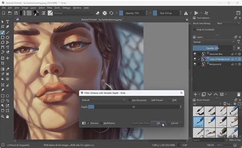
When "it's confirmed by pressing 'Create Filter Mask'," the Curves adjustment can be readjusted later, offering the same non-destructive benefits as other adjustment layers. This flexibility is crucial for artists who want to experiment with different looks or refine their adjustments over time.
Advanced Contrast Manipulation: High-Pass Filtering and Blending
Beyond the direct tonal adjustments, Krita offers more sophisticated methods for manipulating contrast, particularly for achieving specific artistic effects or correcting subtle imperfections.
High-Pass Filtering for Subtle Adjustments
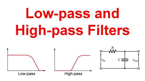
High-pass filtering, often used for sharpening, can also be employed to subtly adjust contrast, especially when dealing with "apparent large area brightness variations." As noted, "slow changes can be faded with high pass filtering." Applying Gaussian High-pass Filtering can reduce contrast by emphasizing edges and details rather than broad tonal shifts.
The process involves:
- Duplicating the layer: Create a copy of the layer you wish to adjust.
- Desaturating the duplicate: Convert the duplicated layer to grayscale.
- Applying High-Pass Filter: Apply the High-Pass filter (Filter > Enhance > High Pass Filter) with a radius that captures the desired level of detail. This will reveal edges and details as gray.
- Blending the layer: Set the blending mode of this high-pass filtered layer to "Overlay" or "Soft Light." This will reintroduce color and detail while the filter itself has effectively reduced contrast in the broader areas.
This technique can be used to "fade slow brightness changes." While high-pass filtering "reduces contrast" in the sense that it doesn't forcefully push blacks to pure black or whites to pure white, it can be used to selectively enhance or de-emphasize tonal variations.
Using High-Pass for Transparency Masks and Color Mixing
The output of a high-pass filter can also serve as a transparency mask, enabling controlled color mixing. "We are going to use the result as a transparency mask to make controlled mix between the dark red color and lighter more yellow color."
The workflow might look like this:
- Prepare the base layer: Desaturate and apply a high-pass filter to your artwork.
- Create color layers: Insert two new paint layers below the filtered layer. Name them "Bright Top" and "Dark Bottom."
- Fill with colors: Fill the "Bright Top" layer with your desired brightest color and the "Dark Bottom" layer with your darkest color.
- Use as mask: Use the desaturated, high-pass filtered layer as a transparency mask for these color layers. This will blend the two colors based on the tonal values revealed by the filter.
This method, however, "unfortunately will remove nearly all apparent surface roughness." To reintroduce this, an "embossed version of the desaturated and high-pass filtered layer" can be created and overlaid at a reduced opacity or with a suitable blending mode. This adds back some of the perceived texture and detail.
Experimenting with blending modes like "Overlay" and applying "Curves" or "Levels" adjustment layers to these color layers or the mask itself can further refine the outcome.
Gradient Maps: A Flexible Alternative for Color and Contrast
For artists looking for a more integrated approach to color and contrast, the Gradient Map adjustment is a powerful tool. This method can replace the manual mixing of layers with a single, readjustable filter.
The process typically involves:
- Desaturate and boost contrast: Start with a desaturated version of your artwork and potentially boost its contrast using Levels or Curves.
- Apply Gradient Map: Apply the Gradient Map filter (Filter > Map > Gradient Map). This filter maps the colors of a gradient to the tonal values of the image. Darker pixels in the source image will be colored by the beginning of the gradient, while lighter pixels will be colored by the end.
- Adjust the gradient: The gradient editor allows you to select colors and their positions. By carefully choosing colors and their placement on the gradient, you can influence both the color scheme and the contrast of the final image.
The Gradient Map can be applied as a Filter Mask, making it "readjustable." This offers a "simpler and much more flexible than the mix between 2 layers version." However, it's important to be aware of the "extreme sensitivity of the gradient map dialog to insert and move the gradient stops." Precise adjustments are key to achieving the desired effect.
GRADIENT MAPS for adding color?! (you'll never recover)
This technique is capable of producing "weird and mild colorize" effects, offering a broad spectrum of creative possibilities for altering the mood and visual appeal of your artwork.
Embracing Experimentation for Optimal Results
Ultimately, mastering contrast adjustment in Krita is an iterative process that encourages experimentation. As Ian MacLean's insights suggest, "We’ll take another look at colour and see how we can change the feel of a panel by playing with adjustment layers in Krita." The tools available, from the straightforward Levels and Curves to the more complex High-Pass filtering and Gradient Maps, all serve to empower the artist.
Remember that "The transparency mask which controls the mix between the dark and bright color can be edited." This principle extends to all adjustment layers. Don't hesitate to duplicate layers, experiment with different blending modes, and combine various adjustment techniques. The goal is to find the combination that best serves your artistic vision, allowing you to refine your work without the need for extensive redrawing. After exploring these methods, "we will be ready to finish our piece and add text to our comics!"
For those eager to see these techniques in action within a comic-specific context, "Check out episode 10 of Krita for Comics." This resource, alongside the flexibility of Krita's adjustment layers, provides all the necessary components to elevate the visual storytelling in your art.